Loading…
Redward Mono
Redward is the platonic ideal of diachronic type design, offering an animated yet sturdy update to a distinctive lineage of serif typefaces. Drawn by longtime studio collaborator Marc Rouault, Redward is a re-imagining, a re-animating, and a re-contextualizing of Edward Benguiat’s ITC Bookman—a Re-Edward, if you will. Released in Roman and Mono styles in six weights, this take on the classic font style features a distinctive true italic in addition to a fully variable design space that has been drawn and transformed for print and screen. At a glance, Redward is notable for its wide proportions, tall x-height, and sturdy construction that feels reinforced by its slab-like serifs. Designed for both display applications as well as text, this is a typeface that reveals striking characteristics unique to each weight—not to mention the dynamic contrasts between its roman and italic forms. The main idea of the font, says Marc, was “stabilizing a new design within the Bookman style, made bolder with an outline,” drawing influence from street signage found around the world—bodegas, hole-in-the-wall restaurants, and internet cafes. Redward is Marc’s first foray into text-oriented typefaces. The family retains the pronounced, almost brutalist quality that gives his typefaces such a visceral feel. Marc’s designs channel constructed gestures, the letterforms defined by contour rather than stroke, and these exaggerated forms give his work an immediate impact. Redward extends this sensibility into a broader typographic context, and the result is a typeface that combines legibility with personality in new, refreshing ways.
Type Designer: Marc Rouault | Mastering: Calvin Kwok | Kerning: Igino Marini
Version History
Version 1.003Redward Superfamily
▼
▼
Benguiat
Sriracha
▼
▼
Push Pin
Jalapeño
▼
▼
*Wysiwyg
Doenjang
▼
▼
Aa.Burns
Nướcchấm
▼
▼
Souvenir
Mentsuyu
▼
▼
Lubalin®
Erőpistá
Loading…
0
0
0



▼
▼
▼
Black
30
Bar and poetry club Culture Rapide occupies prime real estate on a busy corner on the sloping Rue de Belleville, the main drag of the eponymous Paris district spanning the 19th, 20th, and slivers of the 10th and 11th arrondissements. Poet and proprietor Pilote le Hot, who opened the bar in 2006 and never struggles to fill the terrace, admits to a surprising pastime. “My great pleasure is to respond to our Google reviews.” “You don't like the wine? Great. The beer was hot? It's better when it's hot. You don't like it? I don’t care,” he tells The MICHELIN Guide, exuding a fitting attitude for a quartier with a historically anarchist bent. It’s the birthplace of La Commune—the socialist anarchist group that inspired philosopher Karl Marx, who described it as the first example of a dictatorship of the proletariat. Unlike other Paris districts topping “trendiest neighborhood” lists, Belleville remains in many respects, unchanged.Working class, nonconformist, diverse, it’s been home to waves of immigrants since the 19th century: Eastern European Jewish immigrants, Armenians, Greeks, Algerians, Tunisians, Moroccans, Sub-Saharan Africans, Vietnamese, Chinese, and more. In fact, Edith de Belleville, co-author of the forthcoming Paris Cafés, a Love Story, calls her birthplace a “millefeuille”—the classic French pastry composed of countless mouthwatering layers.
Black
16
Needless to say, one of the reasons Belleville has become a dining destination is the breadth of options. As one MICHELIN Guide Inspector says, “Despite gentrification, the neighborhood has stayed grounded. Its culturally diverse mix and range of spending habits have allowed restaurants to offer accessible price points.” A former wine village, not so long ago deemed a “no-go” zone by a certain conservative U.S. news network, Belleville is brimming with options for locals and visitors alike. Here, we’ve shared top picks from our Inspectors for where to go in Belleville—for an unstuffy MICHELIN Guide-approved meal, as well as sticky, sweet Tunisian pastries, and more. Ask any Paris chef to name Belleville’s institutions, and two restaurants consistently come up: Le Baratin and Lao Siam. Each captures the essence of the neighborhood in its distinct way. Argentina native Raquel Carena and her husband Phillipe Pinoteau opened Le Baratin on a side street off Rue de Belleville in 1987. Well before it became a hub of bistronomie—haute cuisine served in a laid-back, bistro-like environment—it was home to artisan craftsmen, including shoemakers. “They called it rue des Chaussures (shoes),” Carena tells The MICHELIN Guide. In three decades, the environs have evolved but Le Baratin’s cooking has remained steadfast: creative bistro dishes like oxtail Parmentier and rabbit stewed with black olives. Their formula has proven successful—and inspirational. “The menu has never changed,” says Carena, glowing over a simmering saucepan of pigeon in Le Baratin’s slim kitchen.
Black Italic
16
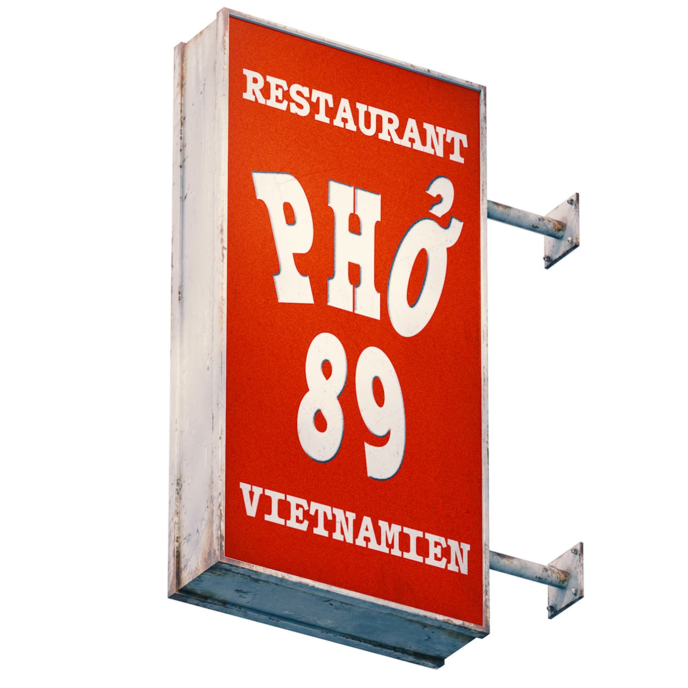
On the rue de Belleville, the area’s main artery, Lao Siam has become the go-to spot for the city’s top industry folks—like Tatiana Levha of Servan and Luis Andrade of Cheval d’Or—who you might spot with their families on Sunday and Monday evenings, nights when many restaurants take their weekly breather. Alexandre Souksavanh, one of three brothers whose parents opened the Thai Laotian favorite in 1985, was raised in Belleville and spent formative years at Lao Siam. “Sometimes my nanny would bring me to the restaurant in the morning. I’d be with the cooks, tasting things with them. After school, I’d do my homework there,” Souksavanh tells The MICHELIN Guide. It makes sense that he and his siblings went on to take the reins. He explains why Lao Siam has become a haunt for the restaurant world’s in-crowd; “They need a place that’s not too complicated. Sure, we’ll tweak a dish if we can improve it, but for the most part, the recipes stay the same.” Their next-door restaurant, Ama Siam, opened in 2020, allows them room to experiment. Asked about his favorite local spots, Souksavanh rattles off a dozen, including Loan for phở, God Bless Brocolli for pizza, and Pacifique for dumplings. On the higher end of the spectrum is Cheval D’Or, which might be the most compelling restaurant in the area right now. Similar to Le Baratin, it’s a restaurant you must experience to understand. “We always tell people, come see for yourselves, and come up with your own ideas and feelings,” says co-owner Crislaine Medina. Together with co-owners Luis Andrade, Hanz Gueco, and Nadim Smair, the team took over a legendary institution that opened in 1987 and was, in its previous iteration, a bistro blending French and Asian influences. “The point of Cheval d'Or is continuing a legacy. We're very much against just breaking everything down and starting completely from zero. The restaurant that opened in 1987—we consider ourselves an extension of it,” says Medina.
▼
▼
▼
Bold
30
La pitaya, également connue sous le nom de “fruit du dragon”, est le fruit de plusieurs espèces de cactus appartenant principalement aux genres Selenicereus et Hylocereus. Originaire d'Amérique centrale et du sud du Mexique, elle est aujourd'hui cultivée dans de nombreuses régions tropicales et subtropicales du monde, notamment au Vietnam, en Thaïlande, en Malaisie, à Taïwan, en Israël, au Nicaragua, en Colombie et dans plusieurs pays d'Asie du Sud-Est. Grâce à son apparence caractéristique, composée d'une peau vivement colorée recouverte de bractées vertes, la pitaya est devenue l'un des fruits exotiques les plus reconnaissables sur les marchés internationaux. Les plantes produisant la pitaya sont des cactus grimpants dont les tiges charnues peuvent atteindre plusieurs mètres de longueur lorsqu'elles sont cultivées sur des supports. Elles fleurissent généralement pendant la nuit et développent de grandes fleurs blanches très parfumées pouvant mesurer jusqu'à trente centimètres de diamètre. Cette floraison nocturne, souvent limitée à une seule nuit, leur a valu le surnom de « reine de la nuit » dans plusieurs régions productrices. La pollinisation est assurée selon les espèces par les chauves-souris, les papillons nocturnes ou les abeilles, tandis que certaines variétés cultivées nécessitent une pollinisation manuelle afin d'obtenir un rendement optimal.
Bold
16
Le fruit présente une chair pouvant être blanche, rouge ou violette selon les cultivars, parsemée de nombreuses petites graines noires comestibles. Sa saveur est généralement douce, légèrement sucrée, avec des notes rappelant le kiwi, la poire ou le melon. La texture est rafraîchissante et peu fibreuse, ce qui en fait un fruit apprécié aussi bien consommé frais qu'utilisé dans les jus, les desserts, les salades de fruits, les sorbets ou les préparations culinaires contemporaines. Les graines, riches en lipides insaturés, apportent une légère sensation croquante sans modifier la douceur de la chair. Le Vietnam est aujourd'hui le premier exportateur mondial de pitayas. Les principales zones de production se situent dans les provinces de Bình Thuận, Long An et Tiền Giang, où les conditions climatiques permettent plusieurs récoltes par an. Une partie importante de la production est destinée à l'exportation vers la Chine, l'Europe, le Moyen-Orient et l'Amérique du Nord. Afin de répondre à la demande internationale, les producteurs utilisent souvent des systèmes d'éclairage artificiel qui prolongent la floraison des cactus pendant les périodes où les jours sont plus courts, permettant ainsi une production presque continue tout au long de l'année. Sur les marchés européens, la pitaya est principalement distribuée par l'intermédiaire des réseaux d'importation spécialisés dans les fruits tropicaux. Les caisses en carton, les palettes, les étiquettes d'expédition, les certificats phytosanitaires et les marquages logistiques accompagnent chaque lot depuis les exploitations agricoles jusqu'aux grossistes, avant d'être redistribués aux primeurs, aux épiceries asiatiques et aux marchés de quartier.
Bold Italic
16
Dans des quartiers multiculturels comme Belleville, la pitaya côtoie quotidiennement les mangoustans, les ramboutans, les longanes, les durians et d'autres produits importés qui témoignent de la diversité des circuits commerciaux contemporains. Au-delà de ses qualités gustatives, la pitaya est également appréciée pour sa valeur nutritionnelle. Riche en eau, en fibres alimentaires, en vitamine C, en magnésium et en composés antioxydants, elle est souvent associée à une alimentation équilibrée. La couleur intense de certaines variétés à chair rouge provient principalement des bétacyanines, pigments naturels également présents dans la betterave. Ces composés sont étudiés pour leurs propriétés antioxydantes et leur stabilité dans différentes applications alimentaires. La culture commerciale de la pitaya s'est fortement développée au cours des dernières décennies grâce à l'amélioration des techniques de production, de conditionnement et de transport réfrigéré. Aujourd'hui, le fruit est devenu un symbole des échanges agricoles internationaux, reliant les exploitations tropicales aux marchés urbains du monde entier. Sa présence dans les étals des primeurs et des épiceries spécialisées illustre l'évolution des habitudes alimentaires ainsi que l'importance croissante des réseaux logistiques mondiaux dans la circulation des produits frais. Les différentes variétés de pitayas se distinguent principalement par la couleur de leur peau et de leur chair. Les fruits à peau rose et chair blanche représentent la majorité de la production mondiale, tandis que les variétés à chair rouge sont particulièrement appréciées pour leur couleur intense et leur teneur élevée en pigments naturels. Certaines espèces produisent également des fruits à peau jaune, plus petits mais souvent considérés comme les plus sucrés. Les producteurs sélectionnent les cultivars en fonction de leur rendement, de leur résistance au transport et de leur capacité à conserver leur fraîcheur pendant plusieurs semaines après la récolte.
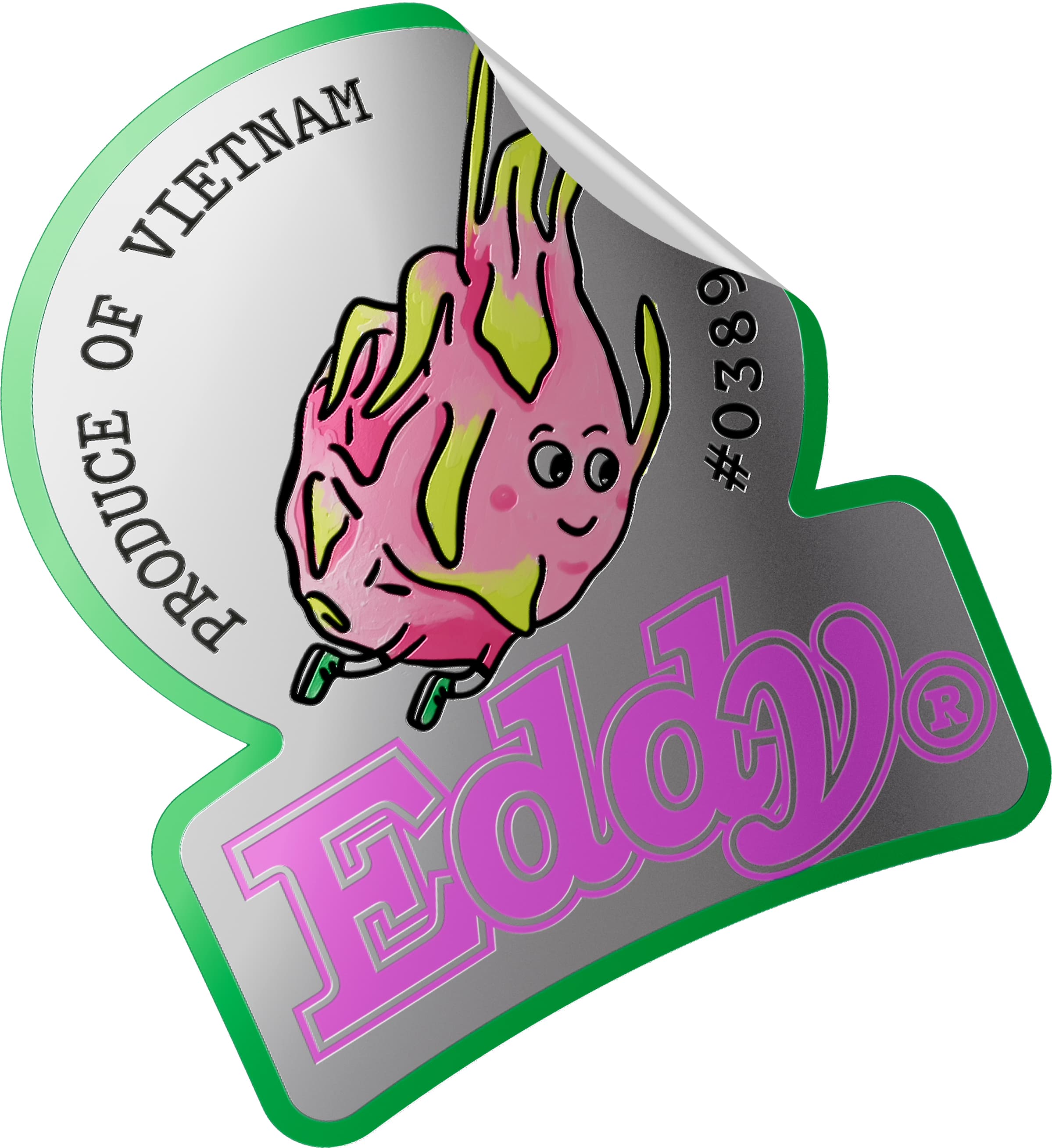
Dragon Fruit illustration by Soline Chailloux
▼
▼
▼
Medium
30
Founded in 1908 by Camillo Olivetti in Ivrea, Italy, Olivetti became one of the most influential manufacturers of typewriters, calculators and office equipment during the twentieth century. From its earliest years, the company distinguished itself not only through engineering innovation but also through an exceptional commitment to industrial design, architecture and visual communication. Unlike many competitors, Olivetti considered every aspect of a product—from its mechanics and ergonomics to its packaging, typography and advertising—as part of a coherent design culture. This holistic approach established the company as a benchmark for modern industrial design and transformed ordinary office machines into internationally recognized design icons. Throughout the post-war decades, Olivetti collaborated with some of the most important architects, graphic designers and product designers of the period. Figures such as Marcello Nizzoli, Ettore Sottsass, Mario Bellini and Giovanni Pintori contributed to a visual language that combined technical precision with elegance and accessibility. The company's factories, showrooms and offices were themselves designed by renowned architects, reflecting Olivetti's belief that architecture, technology and human well-being should exist in harmony. This philosophy distinguished the company from other office equipment manufacturers and reinforced its reputation as a cultural institution as much as an industrial enterprise.
Medium
16
Introduced in 1963 and designed by Marcello Nizzoli, the Olivetti Lettera 32 quickly became one of the most successful portable typewriters ever produced. Compact, lightweight and remarkably durable, it was intended for journalists, writers, students and professionals who required a reliable machine capable of travelling with them. Its aluminium body, carefully balanced keyboard and precise mechanical action offered an exceptional typing experience while maintaining a remarkably compact footprint. The Lettera 32 received numerous international awards and remains part of the permanent collections of several museums, including the Museum of Modern Art in New York. The typewriter's popularity extended far beyond offices and classrooms. Reporters carried it across war zones, authors drafted novels on its keyboard and generations of students used it for essays, letters and manuscripts. Before the widespread adoption of personal computers, portable typewriters such as the Lettera 32 represented an essential tool for written communication, enabling users to produce professional documents almost anywhere. Its distinctive sound, tactile feedback and mechanical rhythm have since become symbols of twentieth-century writing culture. The Lettera 32 was praised for its exceptional balance between portability and mechanical reliability. Its carefully engineered typebars, responsive carriage and compact dimensions allowed users to type efficiently in a wide variety of environments, from newsrooms and libraries to cafés and railway stations. Even decades after production ceased, the machine remains highly regarded among collectors and writers for its distinctive tactile experience, elegant proportions and timeless industrial design, making it one of the defining portable typewriters of the twentieth century.
Medium Italic
16
Olivetti's contribution to graphic design extends well beyond its products. The company commissioned original typefaces, advertising campaigns, exhibition graphics and printed catalogues that demonstrated an extraordinary understanding of visual identity. Graphic designer Giovanni Pintori developed a series of advertisements that rejected conventional product photography in favour of abstract compositions inspired by movement, rhythm and geometry. These campaigns helped define modern corporate communication and continue to influence designers today. Typography occupied a central role within Olivetti's visual culture. Manuals, instruction booklets, packaging and promotional material consistently employed carefully selected typefaces, generous white space and rigorous grid systems. This attention to detail reinforced the perception of Olivetti products as refined objects where engineering and graphic design were inseparable. Even the arrangement of keys, legends and control markings on the machines themselves reflected a disciplined typographic sensibility that remains highly regarded among designers and collectors. Beyond its products, Olivetti established one of the strongest corporate identities of the modern era. Printed catalogues, instruction manuals, technical drawings and promotional material were produced with remarkable consistency, combining rigorous typography with generous layouts and carefully controlled proportions. This systematic approach reinforced the company's reputation for clarity and precision while demonstrating how graphic design could become an essential component of industrial innovation rather than a simple marketing tool.
Mixed Weights
135
iiiiii
▼
▼
▼
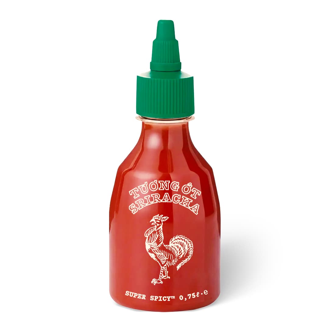
(↑) Redward Mono Regular in context .
Regular
30
The jalapeño is a medium-sized cultivar of the species Capsicum annuum, widely recognized for its distinctive balance of heat, sweetness and fresh vegetal flavour. It takes its name from the Mexican city of Xalapa, in the state of Veracruz, where it has been cultivated for centuries. Although traditionally grown throughout central Mexico, the pepper is now produced commercially across North and South America, Europe and Asia, supplying fresh produce markets throughout the year. Harvested while green or left to mature into a bright red fruit, the jalapeño has become one of the most widely consumed chili peppers in international cuisine. Botanically, the jalapeño belongs to the nightshade family (Solanaceae), which also includes tomatoes, potatoes, eggplants and tobacco. Plants generally grow between sixty and one hundred and twenty centimetres in height, producing multiple fruits during a growing season that may extend over several months depending on climate. Individual peppers typically measure five to ten centimetres in length, displaying smooth skin, thick flesh and a rounded tip. Their moderate size and relatively mild pungency have contributed significantly to their commercial success. Unlike many hotter chili varieties, jalapeños are valued as much for their flavour as for their heat. Fresh peppers are consumed raw, grilled, roasted, stuffed, pickled or fermented, while ripe red fruits are frequently processed into sauces, powders and smoked products. Their crisp texture allows them to retain structural integrity during cooking, making them particularly suitable for grilling and baking. Because of their versatility, jalapeños have become a staple ingredient in both traditional Mexican cuisine and contemporary international gastronomy. Today, the jalapeño represents one of the world's most commercially important chili peppers. Large-scale cultivation employs modern irrigation systems, greenhouse propagation and carefully managed harvesting schedules to ensure consistent production throughout the year. International demand continues to increase as consumers become more familiar with Mexican and Latin American cuisine, making the jalapeño one of the defining agricultural exports of the global fresh produce industry.
Regular
16
The characteristic pungency of the jalapeño is produced by naturally occurring alkaloids known as capsaicinoids, compounds concentrated primarily within the placental tissue surrounding the seeds rather than in the seeds themselves. Depending on cultivar, growing conditions and maturity, jalapeños generally range between 2,500 and 8,000 Scoville Heat Units (SHU), placing them firmly within the mild-to-medium category of chili peppers. This moderate heat level has contributed greatly to their worldwide popularity. Commercial harvesting is performed almost entirely by hand in order to avoid damaging the fruit. After picking, peppers are sorted according to size, colour, weight and external quality before entering refrigerated storage facilities. They are then packed into ventilated cartons bearing harvest dates, grower identification numbers, export labels and country-of-origin markings. These standardized packaging systems allow distributors to transport fresh produce efficiently through international wholesale markets while maintaining traceability throughout the supply chain. Mexico remains the world's largest producer of jalapeños, with important growing regions located in the states of Veracruz, Chihuahua, Sinaloa and Oaxaca. Significant commercial production also exists in Texas, California, New Mexico and several Central American countries. Improvements in greenhouse cultivation and cold-chain logistics have enabled year-round availability in supermarkets and independent greengrocers throughout Europe and North America, transforming what was once a regional crop into a globally traded agricultural commodity. Fresh jalapeños are commonly displayed alongside serrano peppers, poblanos, habaneros and sweet bell peppers in produce markets. Their bright green appearance, smooth surface and consistent size make them particularly attractive for retail presentation. In multicultural neighbourhoods such as Belleville, specialty food stores frequently stock several varieties simultaneously, reflecting the increasing diversity of international food distribution networks and the growing popularity of Latin American ingredients within urban culinary culture.
Italic
16
One of the best-known processed forms of the jalapeño is the chipotle, produced by smoking and slowly drying fully ripened red peppers over hardwood fires. This preservation technique originated centuries ago in central Mexico, where fresh peppers spoiled rapidly in warm climates. Smoking not only extended storage life but also transformed the pepper's flavour, producing the rich, smoky aroma that has since become one of the defining characteristics of Mexican cuisine. Modern chipotle production combines traditional smoking methods with contemporary food-processing standards to ensure consistency, food safety and export quality. After smoking, peppers may be sold whole, ground into powder or preserved in adobo sauce. These products are distributed internationally and have become common ingredients in marinades, soups, sauces, barbecue seasonings and ready-made foods. Their popularity continues to grow as global demand for authentic regional flavours increases. Beyond its culinary significance, the jalapeño has become a recognizable cultural symbol associated with Mexican gastronomy and agricultural heritage. It frequently appears in food packaging, restaurant branding and graphic design, where its instantly recognizable silhouette communicates freshness, spice and authenticity. The pepper's visual identity has contributed to its commercial success just as much as its flavour, making it one of the most identifiable agricultural products in the world. Today, millions of jalapeños travel through complex international supply chains linking farms, packing facilities, refrigerated warehouses, ports and wholesale markets before reaching independent retailers and supermarkets. Every shipment is accompanied by barcodes, export documentation, phytosanitary certificates and traceability labels that record its journey from field to consumer. These ordinary logistical markings—designed purely for efficiency—have themselves become part of the visual language of global food distribution, forming the kind of vernacular typography found on crates, cartons and produce labels throughout markets around the world.
▼
▼
▼
Light
30
Letraset was a British company best known for developing dry-transfer lettering systems that transformed graphic design, advertising and publishing during the second half of the twentieth century. Founded in London in 1959 by Fred McRae, David Henshaw and Stephen Key, the company introduced an innovative method of applying pre-printed characters by rubbing them directly onto paper or illustration board. Before the widespread adoption of digital typography, Letraset sheets became an indispensable tool for designers, architects, illustrators and typographers seeking professional-quality lettering without the need for metal type or photographic composition. The company’s products rapidly gained international recognition for their ease of use and the extraordinary variety of available typefaces. Individual sheets contained complete alphabets, numerals, punctuation marks and symbols carefully arranged for efficient transfer. Characters could be applied one by one with remarkable precision using only a burnishing tool or pencil. This simple yet effective process dramatically reduced production time while allowing designers to experiment freely with composition, spacing and hierarchy directly on artwork. By the late 1960s and throughout the 1970s, Letraset had become synonymous with graphic design itself. Design studios, architectural practices, advertising agencies and publishing houses relied heavily on transfer lettering for layouts, presentation boards, packaging mock-ups and camera-ready artwork. The company’s expanding catalogue featured hundreds of typefaces ranging from traditional serif designs to contemporary sans-serifs, decorative display faces and script lettering. Many designers encountered important type families for the first time through Letraset’s specimen catalogues.Although desktop publishing and digital typography gradually replaced transfer lettering during the 1980s and 1990s, Letraset’s influence remains visible throughout contemporary graphic design. Original transfer sheets have become collectible artefacts, while many of the typefaces first popularised through Letraset continue to exist in digital form. The company’s products occupy an important place in the history of typography, representing the final stage of analogue typesetting before the transition to computer-based design.
Light
16
The dry-transfer process relied on pressure-sensitive adhesive combined with extremely thin printed films. Each character was positioned over the artwork before being rubbed onto the surface using a stylus, burnisher or the rounded end of a pencil. Once transferred, the lettering adhered permanently to paper, card or illustration board while maintaining exceptionally sharp edges and consistent ink coverage. Unlike decals or adhesive stickers, transfer lettering produced virtually no visible carrier film, resulting in a clean and professional appearance suitable for reproduction by photographic printing methods. Letraset collaborated with many leading type designers and foundries to distribute internationally recognised typefaces. Families such as Helvetica, Univers, Futura, Garamond, Baskerville, Gill Sans and countless others became widely accessible through transfer sheets long before affordable digital fonts existed. The company also commissioned original designs that reflected changing graphic trends throughout the 1960s, 1970s and 1980s, expanding its catalogue to include hundreds of styles suitable for editorial, corporate and advertising applications. Beyond typography, Letraset produced a wide range of professional design materials including coloured marker systems, adhesive textures, illustration films and presentation supplies. These products allowed designers to create complete layouts entirely by hand while maintaining high production standards. Before personal computers entered professional studios, such analogue techniques formed the foundation of commercial graphic design, where precision, craftsmanship and manual composition were essential skills acquired through years of practical experience. Letraset specimen books became reference publications in their own right. Designers consulted them not only to select typefaces but also to compare proportions, weights and stylistic characteristics across different families. Carefully printed examples demonstrated alphabets, numerals, punctuation and multilingual character sets while showcasing possible applications through headlines, editorial layouts and advertising compositions. These catalogues significantly influenced typographic education and remain valuable historical documents for researchers studying twentieth-century graphic design.
Light Italic
16
The arrival of Letraset fundamentally changed the workflow of designers working before the digital era. Instead of relying exclusively on specialist typesetting houses, studios could produce polished artwork internally, adjusting spacing, alignment and composition directly on the drawing board. This greater independence encouraged experimentation and accelerated creative processes, making professional typography accessible to smaller agencies, students and independent practitioners alike. The flexibility offered by transfer lettering played a significant role in shaping the visual identity of countless publications and brands throughout the second half of the twentieth century. Graphic designers frequently combined Letraset lettering with technical pens, airbrushing, collage, photomontage and mechanical artwork to create camera-ready originals for offset printing. Headlines, logos, diagrams, exhibition panels, record sleeves, architectural drawings and packaging prototypes often incorporated transfer lettering because of its precision and versatility. Even small adjustments such as kerning or baseline alignment could be performed manually, giving designers an unusual degree of typographic control long before desktop publishing software became available. Although computer-based typesetting eventually rendered transfer lettering obsolete, many contemporary designers continue to admire the tactile qualities associated with analogue production methods. The slight imperfections introduced through manual application, subtle variations in pressure and occasional alignment inconsistencies contributed to a distinctive visual character that is difficult to replicate digitally. For this reason, original Letraset sheets remain popular among collectors, artists and typographers interested in preserving traditional graphic techniques. Today, Letraset represents far more than a historical printing technology. It symbolises a period when typography was assembled by hand through patience, precision and careful observation. The company's products bridged the gap between hot-metal composition and digital publishing, enabling generations of designers to explore typographic form with unprecedented freedom. Its legacy continues through digital revivals of classic typefaces, museum collections, educational archives and the enduring appreciation of analogue craftsmanship within contemporary graphic design.
Mixed Weights
135
ffffff
▼
▼
▼
Thin
30
H. Berthold AG was one of the most influential type foundries in Germany and a major contributor to the development of modern typography. Founded in Berlin in 1858 by Hermann Berthold, the company initially specialized in the manufacture of precision instruments for printing and type measurement before expanding into the production of metal type. During the late nineteenth and early twentieth centuries, Berthold established itself as one of Europe’s largest and most respected foundries, supplying printers, publishers and newspapers with high-quality typefaces distinguished by technical accuracy and exceptional manufacturing standards. Throughout its history, Berthold maintained a strong commitment to typographic innovation and production quality. The company invested heavily in precision engineering, punch cutting and matrix production, enabling it to manufacture type with remarkable consistency across a wide range of sizes and styles. As printing technology evolved from hand composition to mechanical typesetting, Berthold continually adapted its manufacturing processes while preserving the craftsmanship traditionally associated with metal type production. By the beginning of the twentieth century, Berthold operated an extensive international distribution network serving printers throughout Europe and beyond. Its specimen books presented hundreds of text and display typefaces designed for books, newspapers, advertising, technical documentation and commercial printing. These catalogues became essential reference tools for printers and typographers, allowing customers to compare proportions, weights and stylistic characteristics before ordering complete type families. Berthold’s influence extended far beyond Germany. Its typefaces became standard choices for publishing houses, government institutions, industrial manufacturers and educational organizations. The foundry’s emphasis on precision, clarity and systematic design helped establish many of the conventions associated with twentieth-century typography. Today, Berthold remains closely associated with some of the most celebrated typefaces ever produced, many of which continue to exist as digital revivals used by designers around the world.
Mixed Weights
135
111111
000000
Thin
16
Among Berthold's greatest contributions to typographic history was the publication and distribution of influential sans-serif typefaces during the twentieth century. The foundry played a central role in the success of Akzidenz-Grotesk, originally introduced in 1898 and later expanded into one of the most comprehensive sans-serif families of its time. Its neutral appearance, balanced proportions and exceptional legibility made it particularly suitable for advertising, corporate communication, signage and editorial design, establishing a visual language that would profoundly influence modernist typography. Unlike many decorative typefaces popular during the nineteenth century, Berthold's catalogue increasingly emphasized functional design based on clarity, consistency and technical precision. Serif and sans-serif families were systematically expanded through multiple weights, widths and optical sizes, allowing printers to construct sophisticated typographic hierarchies while maintaining visual coherence across complex publications. This rational approach anticipated many of the principles later adopted by digital type families. The foundry also became known for the exceptional quality of its specimen books and technical documentation. Carefully printed catalogues presented complete alphabets, multilingual character sets, ornaments, mathematical symbols and commercial glyphs alongside examples of practical applications. These publications served not only as sales tools but also as educational resources for compositors, printers and graphic designers seeking a deeper understanding of typographic form and composition. As phototypesetting gradually replaced metal composition during the second half of the twentieth century, Berthold successfully adapted many of its classic designs to emerging technologies. The company developed extensive phototype libraries while maintaining the visual integrity of its original metal typefaces. This transition allowed Berthold's designs to remain widely available during a period of rapid technological change, ensuring their continued relevance well into the digital era.
Thin Italic
16
Berthold's legacy is inseparable from the broader history of modern graphic design. Throughout the twentieth century, architects, corporate designers, publishers and public institutions relied upon its typefaces to communicate information with clarity and precision. The restrained character of families such as Akzidenz-Grotesk reflected a philosophy in which typography functioned primarily as an instrument of communication rather than decoration, an approach that would later define much of Swiss and International Style graphic design. Many of the world's most influential designers encountered Berthold typefaces through specimen books, printing houses and educational institutions long before the arrival of desktop publishing. Their widespread availability contributed significantly to the standardization of modern typographic practice across Europe and North America. The foundry's emphasis on systematic design, careful spacing and balanced proportions established benchmarks that continue to inform contemporary type design. Following the decline of traditional metal type manufacturing, Berthold's extensive library became the subject of preservation, digitization and renewed scholarly interest. Numerous classic typefaces originally distributed by the foundry have since been reissued in digital formats, allowing new generations of designers to experience their original proportions while adapting them to contemporary publishing technologies. Museums, archives and private collections continue to preserve original matrices, punches, specimen books and printing equipment documenting the foundry's remarkable contribution to typographic history. Today, Berthold occupies a unique position within the history of typography, representing both the technical mastery of nineteenth-century typefounding and the rational design principles that shaped twentieth-century graphic communication. Its publications, manufacturing standards and influential typefaces remain enduring references for historians, typographers and designers interested in the evolution of printed language. More than a commercial foundry, Berthold helped define an international typographic tradition whose influence continues to be visible across books, newspapers, corporate identities, public signage and digital interfaces worldwide.
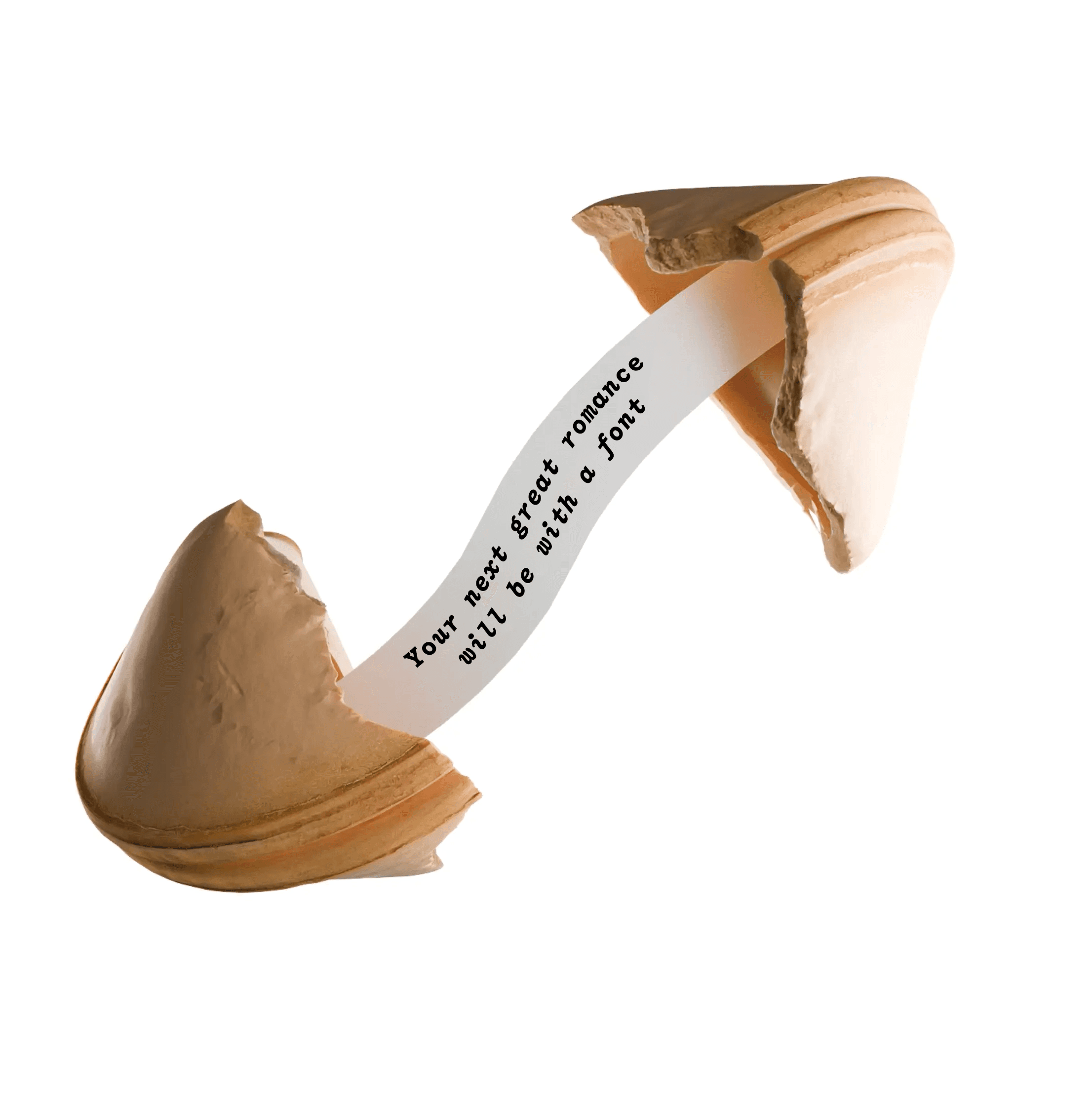
Drawn by longtime studio collaborator Marc Rouault, Redward & Redward Mono is a re-imagining, a re-animating, and a re-contextualizing of Edward Benguiat’s ITC Bookman—a Re-Edward, if you will. Designed for both display applications as well as text, this is a typeface that reveals striking characteristics unique to each weight—not to mention the dynamic contrasts between its roman and italic forms.
Loading…
case
Case-Sensitive Forms
ccmp
Glyph Composition/Decomposition
dlig
Discretionary Ligatures
dnom
Denominators
frac
Fractions
liga
Standard Ligatures
numr
Numerators
onum
Oldstyle Figures
ordn
Ordinals
pnum
Proportional Figures
ss01
Alternate a
ss02
Alternate g
ss03
Alternate @
ss04
Alternate Zero dotted
ss05
White Circled Numbers
ss06
Black Circled Numbers
ss07
Alternate circles and square
ss08
Roman Numerals
subs
Subscript
sups
Superscript
tnum
Tabular Figures
Acheron, Achinese, Acholi, Achuar-Shiwiar, Afar, Afrikaans, Aguaruna, Alekano, Aleut, Algonquin, Amahuaca, Amarakaeri, Amis, Anaang, Andaandi, Anuta, Ao Naga, Apinayé, Arabela, Aragonese, Arbëreshë Albanian, Arvanitika Albanian, Asháninka, Ashéninka Perené, Asu (Tanzania), Atayal, Awa-Cuaiquer, Balinese, Banjar, Bari, Basque, Batak Dairi, Batak Karo, Batak Mandailing, Batak Simalungun, Batak Toba, Bemba (Zambia), Bena (Tanzania), Bikol, Bini, Bislama, Bora, Borana-Arsi-Guji Oromo, Bosnian, Breton, Buginese, Candoshi-Shapra, Caquinte, Caribbean Hindustani, Cashibo-Cacataibo, Cashinahua, Catalan, Cebuano, Central Aymara, Central Kurdish, Central Nahuatl, Chachi, Chamorro, Chavacano, Chayahuita, Chiga, Chiltepec Chinantec, Chokwe, Chuukese, Cimbrian, Cofán, Congo Swahili, Cook Islands Māori, Cornish, Corsican, Creek, Crimean Tatar, Croatian, Czech, Danish, Dehu, Dimli, Dutch, Eastern Arrernte, Eastern Oromo, Efik, Embu, English, Ese Ejja, Esperanto, Faroese, Fijian, Filipino, Finnish, French, Friulian, Gagauz, Galician, Ganda, Garifuna, Ga’anda, German, Gheg Albanian, Gilbertese, Gooniyandi, Gourmanchéma, Guadeloupean Creole French, Gusii, Gwichʼin, Haitian, Hani, Hiligaynon, Ho-Chunk, Hopi, Huastec, Hungarian, Hän, Icelandic, Ido, Iloko, Inari Sami, Indonesian, Interglossa, Interlingua, Interlingue, Irish, Istro Romanian, Italian, Ixcatlán Mazatec, Jamaican Creole English, Javanese, Jola-Fonyi, K'iche', Kabuverdianu, Kaingang, Kala Lagaw Ya, Kalaallisut, Kalenjin, Kamba (Kenya), Kaonde, Karelian, Kashubian, Kekchí, Kenzi/Mattokki, Khasi, Kikuyu, Kimbundu, Kinyarwanda, Kirmanjki, Kituba (DRC), Klingon, Kongo, Konzo, Koyra Chiini Songhay, Koyraboro Senni Songhai, Kuanyama, Kven Finnish, Kölsch, Ladin, Ladino, Langi, Latgalian, Ligurian, Lithuanian, Lojban, Lombard, Low German, Lower Sorbian, Luba-Lulua, Lule Sami, Luo (Kenya and Tanzania), Luxembourgish, Macedo-Romanian, Makhuwa, Makhuwa-Meetto, Makonde, Makwe, Malagasy, Malaysian, Maltese, Mandinka, Mandjak, Mankanya, Manx, Maore Comorian, Maori, Mapudungun, Matsés, Mauritian Creole, Meriam Mir, Meru, Metlatónoc Mixtec, Mi'kmaq, Minangkabau, Mirandese, Mohawk, Montagnais, Montenegrin, Munsee, Murrinh-Patha, Murui Huitoto, Mwani, Mískito, Naga Pidgin, Ndonga, Neapolitan, Ngazidja Comorian, Niuean, Nobiin, Nomatsiguenga, North Ndebele, Northern Kurdish, Northern Qiandong Miao, Northern Sami, Northern Uzbek, Northwestern Ojibwa, Norwegian, Novial, Nyanja, Nyankole, Occitan, Ojitlán Chinantec, Omaha-Ponca, Orma, Oroqen, Palauan, Paluan, Pampanga, Papantla Totonac, Papiamento, Pedi, Picard, Pichis Ashéninka, Piemontese, Pijin, Pintupi-Luritja, Pipil, Pohnpeian, Polish, Portuguese, Potawatomi, Purepecha, Páez, Quechua, Romanian, Romansh, Rotokas, Rundi, Rwa, Samburu, Samoan, Sango, Sangu (Tanzania), Saramaccan, Sardinian, Scots, Scottish Gaelic, Sena, Seri, Seselwa Creole French, Shambala, Sharanahua, Shawnee, Shipibo-Conibo, Shona, Shuar, Sicilian, Silesian, Slovak, Slovenian, Soga, Somali, Soninke, South Ndebele, Southern Aymara, Southern Qiandong Miao, Southern Sami, Southern Sotho, Spanish, Sranan Tongo, Standard Estonian, Standard Latvian, Standard Malay, Sundanese, Swahili, Swati, Swedish, Swiss German, Tagalog, Tahitian, Taita, Tasawaq, Tedim Chin, Tetum, Tetun Dili, Tiv, Toba, Tok Pisin, Tokelau, Toki Pona, Tonga (Tonga Islands), Tonga (Zambia), Tosk Albanian, Tsonga, Tswana, Tumbuka, Turkish, Turkmen, Tuvalu, Tzeltal, Tzotzil, Uab Meto, Umbundu, Ume Sami, Upper Guinea Crioulo, Upper Sorbian, Urarina, Venetian, Veps, Volapük, Võro, Walloon, Walser, Wangaaybuwan-Ngiyambaa, Waorani, Waray (Philippines), Warlpiri, Wayuu, Welsh, West Central Oromo, Western Abnaki, Western Frisian, Wik-Mungkan, Wiradjuri, Wolof, Xavánte, Xhosa, Yagua, Yanesha', Yanomamö, Yao, Yapese, Yindjibarndi, Yucateco, Zarma, Zulu, Záparo