Loading…
Redward
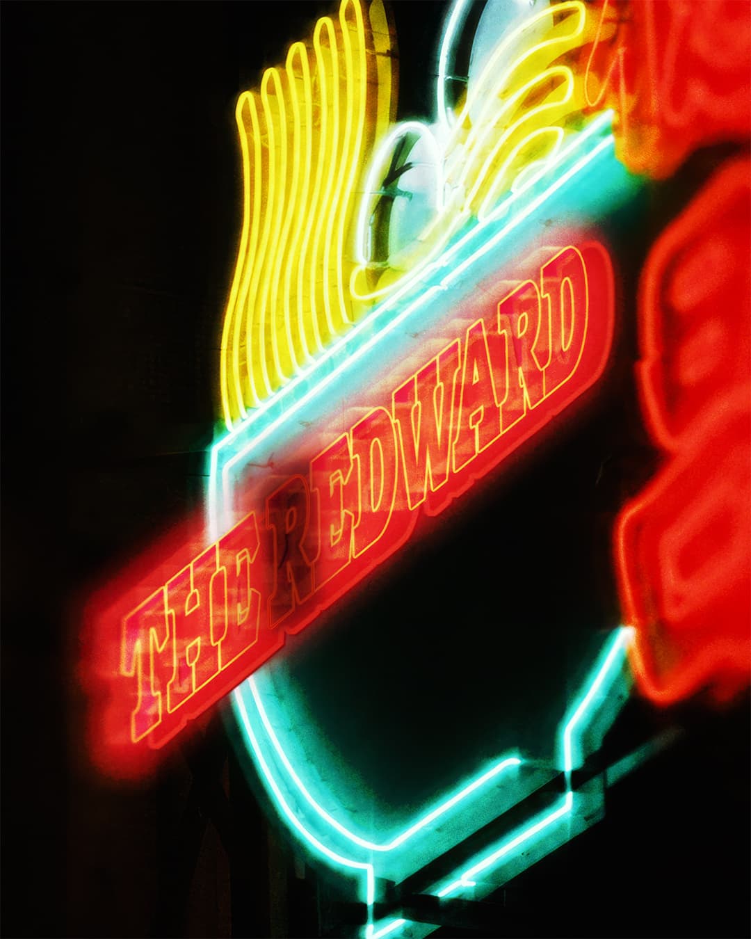
Redward is the platonic ideal of diachronic type design, offering an animated yet sturdy update to a distinctive lineage of serif typefaces. Drawn by longtime studio collaborator Marc Rouault, Redward is a re-imagining, a re-animating, and a re-contextualizing of Edward Benguiat’s ITC Bookman—a Re-Edward, if you will. Released in Roman and Mono styles in six weights, this take on the classic font style features a distinctive true italic in addition to a fully variable design space that has been drawn and transformed for print and screen. At a glance, Redward is notable for its wide proportions, tall x-height, and sturdy construction that feels reinforced by its slab-like serifs. Designed for both display applications as well as text, this is a typeface that reveals striking characteristics unique to each weight—not to mention the dynamic contrasts between its roman and italic forms. The main idea of the font, says Marc, was “stabilizing a new design within the Bookman style, made bolder with an outline,” drawing influence from street signage found around the world—bodegas, hole-in-the-wall restaurants, and internet cafes. Redward is Marc’s first foray into text-oriented typefaces. The family retains the pronounced, almost brutalist quality that gives his typefaces such a visceral feel. Marc’s designs channel constructed gestures, the letterforms defined by contour rather than stroke, and these exaggerated forms give his work an immediate impact. Redward extends this sensibility into a broader typographic context, and the result is a typeface that combines legibility with personality in new, refreshing ways.
Type Designer: Marc Rouault | Mastering: Calvin Kwok | Kerning: Igino Marini
Version History
Version 1.003Redward Superfamily
▼
▼
Belleville
Télégraphe
▼
▼
Jackfruits
Carambola
▼
▼
Lettera ’32
Selectric Ⅱ
▼
▼
Cherimoya
Gochujang*
▼
▼
Rondthaler
E. Benguiat
▼
▼
Shere Khan
Amalickiah
Loading…
0
0
0


▼
▼
▼
Black
30
Un “fortune cookie” est un biscuit servi dans les restaurants chinois et dans lequel est inséré un petit morceau de papier où l’on peut lire une prédiction ou une maxime, une note d'humour parfois. Inventé à San Francisco aux alentours de la Première Guerre mondiale, le principe des biscuits chinois a par la suite été transposé sur Internet, où l’on peut consulter sur de nombreux sites un aphorisme ou une prédiction du jour.
Black Italic
30
Les Triplettes de Belleville is a 2003 animated comedy-drama film written and directed by French filmmaker Sylvain Chomet. The film follows Madame Souza, an elderly woman who raises her grandson Champion and encourages his passion for cycling. When Champion grows up and enters the Tour de France, he is kidnapped during the race and transported overseas. Determined to find him, Madame Souza travels across the Atlantic with her faithful dog Bruno and eventually encounters three eccentric former music-hall performers known as the Triplettes de Belleville. The film is distinguished by its highly stylized visual language, which combines traditional hand-drawn animation with exaggerated character design, surreal environments and a deliberately restrained use of dialogue. Rather than relying heavily on spoken conversation, Chomet constructs much of the narrative through gesture, movement, facial expression, sound effects and music. This approach gives the film a distinctive rhythm and allows its characters and environments to communicate through visual details rather than conventional exposition. The fictional city of Belleville presented in the film is not intended to reproduce the Parisian neighbourhood literally. Instead, Chomet creates an imaginary metropolis inspired by several aspects of twentieth-century France and North America. Its architecture, streets, cafés, advertisements and public spaces are transformed into exaggerated compositions populated by cyclists, commuters, performers and eccentric inhabitants. The visual treatment of Belleville becomes an important part of the film's identity, creating a world that feels simultaneously familiar and fantastical. The film was produced by Les Armateurs in France and received international recognition for its distinctive animation style. It premiered at the Cannes Film Festival in 2003 and was subsequently released internationally, where it received critical acclaim for its originality, visual direction and unconventional storytelling. In the United Kingdom, the film was released under the title Belleville Rendez-vous, referring to the song performed by the three protagonists. Les Triplettes de Belleville received two Academy Award nominations, including Best Animated Feature and Best Original Song. Its success contributed to renewed international attention toward French animation and established Sylvain Chomet as an important contemporary animator and filmmaker. The film's unusual combination of comedy, melancholy, music and visual satire has allowed it to remain a distinctive reference within modern animated cinema, while its interpretation of Belleville has become one of the most recognisable fictional representations associated with the name of the Parisian neighbourhood.
Black
16
Institution bien connue de Belleville, Le Président perpétue depuis 1986 l’esprit des grandes tables chinoises parisiennes. Installé au 120–124 rue du Faubourg du Temple, dans le 11ᵉ arrondissement de Paris, l’établissement accueille depuis plusieurs décennies une clientèle attirée autant par sa cuisine que par son atmosphère spectaculaire. Derrière une façade relativement discrète se découvre un intérieur aux proportions impressionnantes, conçu pour accueillir les repas collectifs et les grandes occasions. Le restaurant s’inscrit ainsi dans une tradition de banquet où le repas devient autant une expérience sociale qu’un moment consacré à la gastronomie. Dès l’entrée, le décor impose une présence particulière. Une grande coupole élégante domine la salle tandis que de larges escaliers structurent l’espace et donnent accès aux différents niveaux de l’établissement. Les immenses tables rondes, équipées de plateaux tournants, occupent une place centrale dans l’organisation de la salle. Cette disposition permet aux convives de partager facilement les différents plats servis au cours du repas, selon une tradition particulièrement associée aux grandes tables chinoises. Les assiettes circulent ainsi d’un convive à l’autre, créant une expérience collective fondée sur le partage et la convivialité. Avec sa capacité d’accueil de plusieurs centaines de couverts, Le Président figure parmi les adresses parisiennes privilégiées pour les repas de groupe, les réunions familiales, les célébrations et les banquets. L’échelle du lieu permet d’accueillir simultanément un grand nombre de convives tout en conservant les codes traditionnels du repas chinois collectif. Les grandes tables circulaires favorisent les échanges entre les participants et donnent au repas une dimension particulièrement conviviale. Au fil des années, Le Président est ainsi devenu une institution associée à la vie commerciale et culturelle de ce secteur de l’est parisien. Son décor monumental, ses grandes salles et son organisation pensée autour du banquet témoignent d’une manière particulière de concevoir la restauration chinoise à Paris. Plus qu’un simple restaurant, l’établissement constitue un lieu de rencontre où architecture intérieure, gastronomie et vie sociale se rejoignent autour d’une même tradition : celle du repas partagé autour d’une grande table.
Black Italic
16
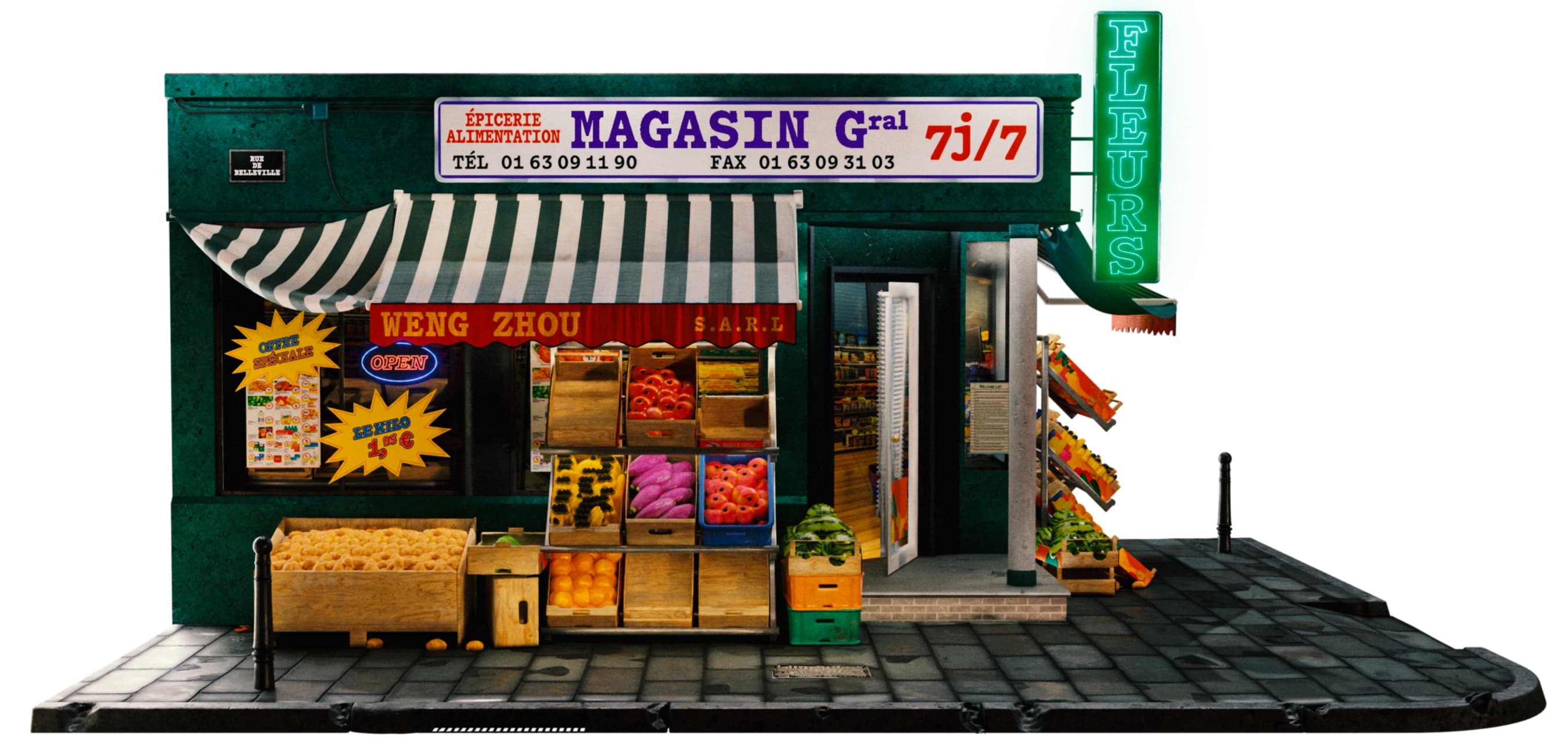
During the 1980s, Parisian artists, musicians and other members of the city's emerging alternative cultural scene began moving to Belleville, attracted by its relatively inexpensive rents, numerous vacant industrial spaces and the distinctive character of its narrow, older streets. While many parts of Paris had undergone extensive architectural modernization during the 1960s and 1970s, Belleville was largely overlooked by these transformations and consequently retained much of its older urban fabric. The area around the Place des Fêtes was one of the major exceptions, having experienced more substantial redevelopment during this period. This contrast between modern interventions and preserved streets helped give Belleville a particular atmosphere that appealed to artists searching for affordable studios, rehearsal spaces and places to live. The availability of large, abandoned or underused buildings also encouraged the development of alternative cultural spaces. Former factories and industrial premises were progressively occupied and transformed into informal artists' studios, rehearsal rooms and art squats. These spaces provided opportunities for musicians, painters, performers and other creative communities to work outside the established cultural institutions of central Paris. The relatively loose and experimental atmosphere of these environments contributed to Belleville's reputation as an important centre for alternative artistic activity during the final decades of the twentieth century. Among the musicians associated with this creative environment were Les Rita Mitsouko, whose early career developed within the alternative cultural scene of Paris. Their presence became part of a broader network of musicians and artists attracted to the neighbourhood's affordable spaces and unconventional atmosphere. The transformation of abandoned industrial buildings into creative spaces also reflected a wider phenomenon occurring in several areas of Paris, where artists helped give new cultural value to buildings that had lost their original industrial functions. Over time, this artistic activity became one of several elements contributing to Belleville's contemporary identity. The neighbourhood developed into a colourful and highly diverse part of Paris, characterized by a mixture of architectural styles, independent businesses, cultural communities and commercial activity. Its multicultural population is particularly visible in the variety of shops, restaurants, markets and street life found throughout the area. Belleville is also home to one of Paris's two traditionally recognized Chinatowns, adding another important dimension to the neighbourhood's cultural landscape and reinforcing its reputation as one of the city's most diverse and distinctive districts.
▼
▼
▼
Bold
30
The dragon fruit is a hardy and succulent cactus, as it is drought resistant, possessing long triangular stems. It often intertwines itself with nearby trees, taking moisture from their bark and climbs 8 to 10 meters from the ground without penetrating the ground. The flower of the dragon fruit is tubular and hermaphroditic due to its dehydration. It only opens once in the night and its aroma attracts insects. It is self pollinating, but it can also pollinate with other plants, with bats being their biggest pollinators in their natural habitat. The formation of the fruit from pollination to harvest takes 4 to 8 weeks depending on the temperatures. The fruit is oval shaped, 10 cm by 6 cm. It presents itself from birth as green, turning yellow or red depending on the cultivar. As it develops, it grows scaly skin. The rind presents groups of sharp and hard spines, detaching with ease. It is a flavorful fruit which contains a smooth, sweet and soft pulp in both yellow and red varieties, but red varieties usually have less sugar.
Bold Italic
30
Ofreciendo una piel escamosa de cuya especial característica surgió su nombre “pitahaya”, que en haitiano quiere decir fruta escamosa. Es una fruta sabrosa que contiene una pulpa suave, dulce y blanda en los cultivares de color amarillo y carmesí en las variedades de piel roja, que suelen contener menos azúcar. El fruto es de forma ovoide con 10 cm de largo por 6 cm de ancho y suele presentar desde su nacimiento un color verde que se torna amarillo o rojo según el cultivar, a medida que se desarrolla. Dicha corteza presenta grupos de espinas duras y agudas que se desprenden con facilidad, debiendo ser quitadas cuidadosamente antes de cosechar el fruto y evitar con ello sus pinchazos.
Bold
16
Le fruit du dragon (thanh long en vietnamien), du taïno «fruit écailleux», est le fruit de différentes espèces de cactus hémiépiphytes, et plus particulièrement de celles de l’espèce Selenicereus undatus. Sur les étals, c'est le nom «pitaya» qui est très majoritairement employé. Le genre Wilmattea a été fusionné avec le genre Hylocereus. Certains botanistes pensent actuellement que le genre Hylocereus devrait à son tour être fusionné avec le genre Selenicereus. Le fruit a été appelé fruit du dragon depuis l'époque de la colonie indochinoise : les colons français ont introduit la plante à la fin du XIXᵉ siècle. Les Vietnamiens ont baptisé son fruit thanh long, qui signifie «fruit du dragon» car sa plante grimpe en s'enroulant sur les troncs d'arbre, évoquant la forme d'un dragon, un monstre mythologique omniprésent dans la culture asiatique. Le fruit du dragon mesure une dizaine de centimètres et pèse environ 350 grammes. Sa chair est comestible et ressemble par sa texture et la présence de petits pépins noirs à celle du kiwi jaune, avec un goût cependant beaucoup plus doux.
Bold Italic
16
The jackfruit is the largest tree fruit, reaching as much as 55 kg (120 pounds) in weight, 90 cm (35 inches) in length, and 50 cm (20 inches) in diameter. A mature jackfruit tree produces some 200 fruits per year, with older trees bearing up to 500 fruits in a year. The jackfruit is a multiple fruit composed of hundreds to thousands of individual flowers; the fleshy petals of the unripe fruit are eaten by humans, in addition to the ripened fruit. The jackfruit tree is well-suited to tropical lowlands and is widely cultivated throughout tropical regions of the world, particularly from South Asia to Southeast Asia and Oceania. Its ripe fruit can be sweet depending on grown variety, which is commonly used in desserts. Canned green jackfruit has a mild taste and meat-like texture that lends itself to being called “vegetable meat”. Jackfruit is commonly used in South and Southeast Asian cuisines. Both ripe and unripe fruits are consumed. It is available internationally, canned or frozen, and in chilled meals, as are various products derived from the fruit, such as noodles and chips.
Mixed Weights
55
AAAAAA BBBBBB CCCCCC DDDDDD EEEEEE FFFFFF GGGGGG HHHHHH IIIIII JJJJJJ KKKKKK LLLLLL MMMMMM NNNNNN OOOOOO PPPPPP QQQQQQ RRRRRR SSSSSS TTTTTT UUUUUU VVVVVV WWWWWW XXXXXX YYYYYY ZZZZZZ
▼
▼
▼
Medium
30
Edward Benguiat (*Oct. 27, 1927—†Oct. 15, 2020) was an American type designer and lettering artist. He designed over 600 typefaces, including Tiffany, Bookman, Panache, Souvenir, Edwardian Script, and the eponymous Benguiat and Benguiat Gothic. He was also known for his designs or redesigns of the logotypes for Esquire, The New York Times, Playboy, McCall’s, Reader’s Digest, Photography, Look, Sports Illustrated, The Star-Ledger, The San Diego Tribune, AT&T, Coke, Estée Lauder, Ford, or in cinema with The guns of Navarone.
Medium Italic
30
“I do not think of type as something that should be readable. It should be beautiful.” Ed treated type design almost as a spiritual practice. He called designing “a way of life” comparing it to composing music: “I stay with the concept for a long time, continually making changes in balance, strokes and shapes.” He also famously quipped. Before typography, Benguiat was a professional jazz percussionist. He was reportedly ranked the third-best drummer in the US by Downbeat Mag. He eventually realized musicians often end up playing weddings and bar mitzvahs, and decided to become illustrator. instead. He was hired as a designer by Esquire magazine in 1953 and subsequently went on to join Photo Lettering Inc. (PLINC) as a Typographic Design Director in 1962. PLINC was founded by Edward Rondthaler and became one of the earliest and most successful type houses to use photo technology (rather than metal type) for producing commercial typography and lettering for the New York advertising and design industry. It is where Benguiat transitioned from freelance/magazine lettering work into serious, systematic type design at scale. They later co-founded ITC in 1970/71.
Medium
16
In the early 1970s, Benguiat redrew and expanded Bookman for ITC, giving it the bold, sturdy, high-legibility character that made it one of the defining typefaces of 1970s–80s advertising and publishing. Not an original Benguiat design from scratch, ITC Bookman is a revival. The original Bookman typeface dates back to the 1860s, created by Alexander Phemister for Miller & Richard, and was later redrawn by various foundries throughout the early 20ᵗʰ century. Extremely popular in book publishing, advertising headlines, and packaging throughout the ‘70s and ‘80s, it became almost synonymous with that era’s “friendly but authoritative” commercial typography (paperback covers, cereal boxes, department store ads etc.). Both ITC Bookman and ITC Benguiat exemplify his broader signature: taking either historical letterforms or invented ones and giving them a generous, expressive, high-x-height quality that reads as both legible and characterful, a hallmark of the library’s dominance. over 1970s–80s print design.
Medium Italic
16
Herb Lubalin loved working for U&lc, saying that it was “every designers dream to be their own client.” Quarterly magazine to showcase typefaces for the International Typeface Corporation (ITC) which was founded in 1970 by H. Lubalin, A. Burns, and E. Rondthaler. Notably, the magazine even included comic strips in its early years — the first issue featured a strip by Ed Sorel, followed by one-off contributions from artist Saul Steinberg and graphic designer Milton Glaser (of Push Pin Studios). He was hired as a designer by Esquire magazine in 1953 and subsequently went on to join Photo Lettering Inc. (PLINC) as a Typographic Design Director in 1962. PLINC was founded by Edward Rondthaler and became one of the earliest and most successful type houses to use photo technology (rather than metal type) for producing commercial typography and lettering for the New York advertising and design industry. It is where Benguiat transitioned from freelance/magazine lettering work into serious, systematic type design at scale. They later co-founded ITC in 1970/71.
Mixed Weights
150
RRRRRR
▼
▼
▼
Regular
30
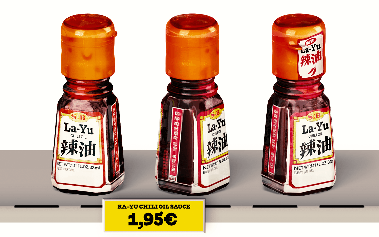
Developed by American breeder Ed Currie, the pepper is red and gnarled, with a bumpy texture and small pointed tail. It was the hottest chili pepper in the world according to Guinness World Records from 2013 to 2023 before it was surpassed by Pepper X, also developed by Currie as a crossbreed of a C. Reaper and a pepper sent to him by a friend. Its heat status is criticized, because independent testing of the pepper has not been performed yet.
Italic
30
The American breeder, began working around 2001 on what would become the Carolina Reaper. It took over 10 years to develop. Sorting through hundreds of hybrid combinations, Currie was finally successful at crossing a “really nastily hot” La Soufrière (Saint Vincent) Habanero pepper from the Caribbean island of Saint Vincent and a Naga pepper/Ghost pepper (locally known as bhüt jolokia) from Assam.
Regular
16
During November of that year, a reporter from NPR visited Currie to try the new pepper. According to Currie : “The reporter ate a small piece of the pepper, rolled around on the floor, hallucinated, and then shared his experiences with the national media.” Currie officially named the pepper: “Smokin' Ed's Carolina Reaper”. The word "reaper" was chosen by Currie due to the shape of the pepper's “sickle-like”“ tail. The Carolina Reaper was certified as the world’s hottest chili pepper on Aug. 11, 2017. Testing was conducted by Winthrop University (SC) during the certification process which showed an average heat level of 1,641,183 SHU for a given batch. Previously the record had been held by the Scorpion at 1,463,700 SHU in comparison. It was later claimed through media outlets such as the Associated Press that an individual Carolina Reaper had a heat level of 2.2 million SHU. Currie eventually bred an even stronger pepper known as “Pepper X” that took the title of “World's Hottest Pepper” on August 23, 2023 that was tested indicating an average rating of 2.69 million SHUs.
Italic
16
The Reaper has been described as having a fruity taste, with the initial bite being sweet and then immediately turning to “molten lava.” The sensory heat or pungency detected when eating a Carolina Reaper derives from the density of capsaicinoids, particularly capsaicin, which relates directly to the intensity of chili pepper heat and Scoville Heat Units. For growing, the pepper has been described as “a good all-rounder to try at home” by James Wong, an English ethnobotanist, who stated that they require growing temperatures of at least 18°C (64°F). He suggested growing the plants in 30–40 cm (12–16 in) pots to restrict growth and produce fruit sooner.[14] When fully ripe, two peppers occupy the palm of the hand. The One Chip Challenge was an internet challenge where participants had to eat an extremely spicy Carolina Reaper chip made by Paqui. After consuming the chip, participants then had to avoid eating or drinking anything afterwards for a set amount of time. The challenge was initially marketed by Amplify Snack Brands before being sold to The Hershey Company and suspended after a customer death in 2023. During the fall season from 2016 to 2023, the chip was sold in various packaging before being declared “sold out”. The formulation changed annually with added peppers such as Trinidad Moruga Scorpions, Sichuans and Naga Vipers. The challenge was tried by celebrities and social media personalities, and received criticism for negative associated health effects. The One Chip Challenge was first promoted in 2016 under the name Carolina Reaper Madness. As the Reaper chips quickly sold out, Amplify started a “1-in-10 chance to win” offer in 2017.
▼
▼
▼
Light
30
Phototypesetting is a method of setting type which uses photography to make columns of type on a scroll of photographic paper. It replaced the metal character with a photographic negative image of the letter (on a filmstrip, glass disc, or grid) projected through a lens onto photosensitive paper or film. The moment a letterform became light passing through an optical system rather than a solid object, it became manipulable the way any photographic/optical image is manipulable.
Light Italic
30
It has been made obsolete by the popularity of the personal computer and desktop publishing which gave rise to digital typesetting. Photo-composition machines replaced metal type with a photographic image of the letters, under control from a keyboard or computer. Rather than a block of metal, the master copy is a piece of film. Each character exists as a tiny photographic negative, stored on a filmstrip, glass disc, or grid, and light is projected through this negative and a lens system to expose the character at the desired size and position.
Light
16
Phototypesetting’s biggest technical departure from hot metal wasn’t just speed. It fundamentally changed the physical relationship between a letterform and its output size. That’s what opened the door to stretching, slanting, and other distortions that were mechanically impossible before. This flexibility was a double-edged sword: it gave printers instant access to a wider range of type styles, but it also normalized visibly distorted letterforms. It replaced the metal character with a photographic negative image of the letter (on a filmstrip, glass disc, or grid) projected through a lens onto photosensitive paper or film. The moment a letterform became light passing through an optical system rather than a solid object, it became manipulable the way any photographic/optical image is manipulable. By the early 1980s, Adobe’s PostScript brought a further leap by describing typefaces as fully device-independent outlines, letting any scaling or distortion be computed on the fly for whatever output resolution was needed. This same outline-based logic carried directly into the first digital fonts and desktop publishing software, cementing programmatic distortion as a permanent, built-in feature rather than a special trick.
Light Italic
16
The technology made it possible to set letters much closer together than metal type ever allowed (since metal sorts have physical bodies that can’t overlap). Designers like Herb Lubalin and Tom Carnase used this new spacing ability to create the tight-not-touching aesthetic over the following two decades, into editorial spreads or logotypes. The idea: letters are packed as close as possible ; kerned so tightly they almost touch, but never actually collide, creating a dense, dynamic, highly controlled look that was simply impossible with hot-metal composition. Metal type is bound by the physical body of each piece of type, so letters can only be pushed so close. Phototype exposes letterforms as images onto photographic paper/film, so there’s no physical object constraining spacing. Designers could overlap letterforms’ bounding boxes freely, letter by letter, entirely by eye or with the phototypesetter’s finer spacing. Once phototypesetters moved to CRT-based digital control (Digiset, Linotron, Videocomp, etc.), the “image” being manipulated was a scan-converted bitmap or vector outline rather than a photographic negative, which made programmatic distortion (arbitrary scale factors, skew angles, even perspective effects) trivially easy to specify in software. This is a direct ancestor of what you now do in InDesign or Illustrator by dragging a bounding box, except today’s tools warn you it’s a bad idea, while phototype-era workflows often had no such friction. By the early 1980s, Adobe’s PostScript brought a further leap by describing typefaces as fully device-independent outlines, letting any scaling or distortion be computed on the fly for whatever output resolution was needed. This same outline-based logic carried directly into the first digital fonts and desktop publishing software, cementing programmatic distortion as a permanent, built-in feature rather than a special trick.
▼
▼
▼
Thin
30
The QWERTY layout was partly designed to slow typists down and pre-vent mechanical jamming. Remington №1 only typed in UPPERCASE letters. Lowercase wasn’t introduced until the Remington №2 in 1878. The QWERTY design is based on a layout included on the Sholes and Glidden typewriter sold by E. Remington and Sons from 1874. The layout became popular with the success of the Remington No. 2 of 1878 and remains in widespread use as a de facto standard on computers, as of 2026. Two prominent alternatives, Dvorak and Colemak, have been developed. In Europe, two types of modified layouts, QWERTZ and AZERTY, are used predominantly for German and French, respectively.
Thin Italic
30
The IBM Selectric “selective” and “electric” was a highly successful line of electric typewriters introduced by IBM in 1961. Instead of the “basket” of individual typebars that swung up to strike the ribbon and page in a typical typewriter of the period, the Selectric had a chrome-plated plastic “element” (frequently called a “typeball”, or less formally, a “golf ball”) that rotated and tilted to the correct position before striking the paper. The element could be easily interchanged to use different fonts within the same document typed on the same typewriter, resurrecting a capability which had been pioneered by typewriters such as the Hammond and Blickensderfer in the late 19th century.
Thin
16
The Selectric also replaced the traditional typewriter's horizontally moving carriage with a roller (platen) that turned to advance the paper vertically while the typeball and ribbon mechanism moved horizontally across the paper. The Selectric mechanism was notable for using internal mechanical binary coding and two mechanical digital-to-analog converters, called whiffletree linkages, to select the character to be typed. The three models of Selectric eventually captured 75 percent of the United States market for electric typewriters used in business. By the Selectric's 25th anniversary, in 1986, a total of more than 13 million machines had been made and sold. By the 1970s and 1980s, the typewriter market had matured under the market dominance of large companies in Europe and the United States. Eventually the Selectric would face direct major competition from electronic typewriters designed and manufactured in Asia, including Brother Industries and Silver Seiko Ltd. of Japan. IBM replaced the Selectric line with the IBM Wheelwriter in 1984, and spun off its typewriter business to the newly formed Lexmark in 1991.
Thin Italic
16
The Selectric typewriter was introduced on 31 July 1961. Its industrial design is credited to influential American designer Eliot Noyes. Noyes had worked on a number of design projects for IBM; prior to his work on the Selectric, he had been commissioned in 1956 by Thomas J. Watson Jr. to create IBM's first house style: these influential efforts, in which Noyes collaborated with Paul Rand, Marcel Breuer, and Charles Eames, have been referred to as the first “house style” program in American business. The Selectric remained unchanged until 1971 when the Selectric II was introduced. The original design was thereafter referred to as the Selectric I. These machines used the same 88-character typing elements. However they differed from each other in many respects: The Selectric II was available with a Dual Pitch option to allow it to be switched (with a lever at the top left of the “carriage” between 10 and 12 characters per inch, whereas the Selectric I was ordered with one “pitch” or the other. Separate elements were available for each pitch. In a few cases the same typeface was available in both pitches, for example, “Courier 72” was the 10-pitch variant of “Courier 12” The Selectric II had a lever (at the top left of the “carriage” that allowed characters to be shifted as much as half a space to the left (for centering text, or for inserting a word one character longer or shorter in place of a deleted mistake), whereas the Selectric I did not. This option was available only on dual-pitch models. Stylistically, the Selectric II was squarer at the corners, whereas the Selectric I was rounder.
Drawn by longtime studio collaborator Marc Rouault, Redward & Redward Mono is a re-imagining, a re-animating, and a re-contextualizing of Edward Benguiat’s ITC Bookman—a Re-Edward, if you will. Designed for both display applications as well as text, this is a typeface that reveals striking characteristics unique to each weight—not to mention the dynamic contrasts between its roman and italic forms.
Loading…
case
Case-Sensitive Forms
ccmp
Glyph Composition/Decomposition
dlig
Discretionary Ligatures
dnom
Denominators
frac
Fractions
liga
Standard Ligatures
lnum
Lining Figures
locl
Localized Forms
numr
Numerators
onum
Oldstyle Figures
ordn
Ordinals
pnum
Proportional Figures
ss01
Alternate a
ss02
Alternate g
ss03
Alternate @
ss04
Alternate Zero dotted
ss05
White Circled Numbers
ss06
Black Circled Numbers
ss07
Alternate circles and square
ss08
Roman Numerals
subs
Subscript
sups
Superscript
tnum
Tabular Figures
Acheron, Achinese, Acholi, Achuar-Shiwiar, Afar, Afrikaans, Aguaruna, Alekano, Aleut, Algonquin, Amahuaca, Amarakaeri, Amis, Anaang, Andaandi, Anuta, Ao Naga, Apinayé, Arabela, Aragonese, Arbëreshë Albanian, Arvanitika Albanian, Asháninka, Ashéninka Perené, Asu (Tanzania), Atayal, Awa-Cuaiquer, Balinese, Banjar, Bari, Basque, Batak Dairi, Batak Karo, Batak Mandailing, Batak Simalungun, Batak Toba, Bemba (Zambia), Bena (Tanzania), Bikol, Bini, Bislama, Bora, Borana-Arsi-Guji Oromo, Bosnian, Breton, Buginese, Candoshi-Shapra, Caquinte, Caribbean Hindustani, Cashibo-Cacataibo, Cashinahua, Catalan, Cebuano, Central Aymara, Central Kurdish, Central Nahuatl, Chachi, Chamorro, Chavacano, Chayahuita, Chiga, Chiltepec Chinantec, Chokwe, Chuukese, Cimbrian, Cofán, Congo Swahili, Cook Islands Māori, Cornish, Corsican, Creek, Crimean Tatar, Croatian, Czech, Danish, Dehu, Dimli, Dutch, Eastern Arrernte, Eastern Oromo, Efik, Embu, English, Ese Ejja, Esperanto, Faroese, Fijian, Filipino, Finnish, French, Friulian, Gagauz, Galician, Ganda, Garifuna, Ga’anda, German, Gheg Albanian, Gilbertese, Gooniyandi, Gourmanchéma, Guadeloupean Creole French, Gusii, Gwichʼin, Haitian, Hani, Hiligaynon, Ho-Chunk, Hopi, Huastec, Hungarian, Hän, Icelandic, Ido, Iloko, Inari Sami, Indonesian, Interglossa, Interlingua, Interlingue, Irish, Istro Romanian, Italian, Ixcatlán Mazatec, Jamaican Creole English, Javanese, Jola-Fonyi, K'iche', Kabuverdianu, Kaingang, Kala Lagaw Ya, Kalaallisut, Kalenjin, Kamba (Kenya), Kaonde, Karelian, Kashubian, Kekchí, Kenzi/Mattokki, Khasi, Kikuyu, Kimbundu, Kinyarwanda, Kirmanjki, Kituba (DRC), Klingon, Kongo, Konzo, Koyra Chiini Songhay, Koyraboro Senni Songhai, Kuanyama, Kven Finnish, Kölsch, Ladin, Ladino, Langi, Latgalian, Ligurian, Lithuanian, Lojban, Lombard, Low German, Lower Sorbian, Luba-Lulua, Lule Sami, Luo (Kenya and Tanzania), Luxembourgish, Macedo-Romanian, Makhuwa, Makhuwa-Meetto, Makonde, Makwe, Malagasy, Malaysian, Maltese, Mandinka, Mandjak, Mankanya, Manx, Maore Comorian, Maori, Mapudungun, Matsés, Mauritian Creole, Meriam Mir, Meru, Metlatónoc Mixtec, Mi'kmaq, Minangkabau, Mirandese, Mohawk, Montagnais, Montenegrin, Munsee, Murrinh-Patha, Murui Huitoto, Mwani, Mískito, Naga Pidgin, Ndonga, Neapolitan, Ngazidja Comorian, Niuean, Nobiin, Nomatsiguenga, North Ndebele, Northern Kurdish, Northern Qiandong Miao, Northern Sami, Northern Uzbek, Northwestern Ojibwa, Norwegian, Novial, Nyanja, Nyankole, Occitan, Ojitlán Chinantec, Omaha-Ponca, Orma, Oroqen, Palauan, Paluan, Pampanga, Papantla Totonac, Papiamento, Pedi, Picard, Pichis Ashéninka, Piemontese, Pijin, Pintupi-Luritja, Pipil, Pohnpeian, Polish, Portuguese, Potawatomi, Purepecha, Páez, Quechua, Romanian, Romansh, Rotokas, Rundi, Rwa, Samburu, Samoan, Sango, Sangu (Tanzania), Saramaccan, Sardinian, Scots, Scottish Gaelic, Sena, Seri, Seselwa Creole French, Shambala, Sharanahua, Shawnee, Shipibo-Conibo, Shona, Shuar, Sicilian, Silesian, Slovak, Slovenian, Soga, Somali, Soninke, South Ndebele, Southern Aymara, Southern Qiandong Miao, Southern Sami, Southern Sotho, Spanish, Sranan Tongo, Standard Estonian, Standard Latvian, Standard Malay, Sundanese, Swahili, Swati, Swedish, Swiss German, Tagalog, Tahitian, Taita, Tasawaq, Tedim Chin, Tetum, Tetun Dili, Tiv, Toba, Tok Pisin, Tokelau, Toki Pona, Tonga (Tonga Islands), Tonga (Zambia), Tosk Albanian, Tsonga, Tswana, Tumbuka, Turkish, Turkmen, Tuvalu, Tzeltal, Tzotzil, Uab Meto, Umbundu, Ume Sami, Upper Guinea Crioulo, Upper Sorbian, Urarina, Venetian, Veps, Volapük, Võro, Walloon, Walser, Wangaaybuwan-Ngiyambaa, Waorani, Waray (Philippines), Warlpiri, Wayuu, Welsh, West Central Oromo, Western Abnaki, Western Frisian, Wik-Mungkan, Wiradjuri, Wolof, Xavánte, Xhosa, Yagua, Yanesha', Yanomamö, Yao, Yapese, Yindjibarndi, Yucateco, Zarma, Zulu, Záparo