Loading…
Sharp Serif in use for The Hudson Transparencies
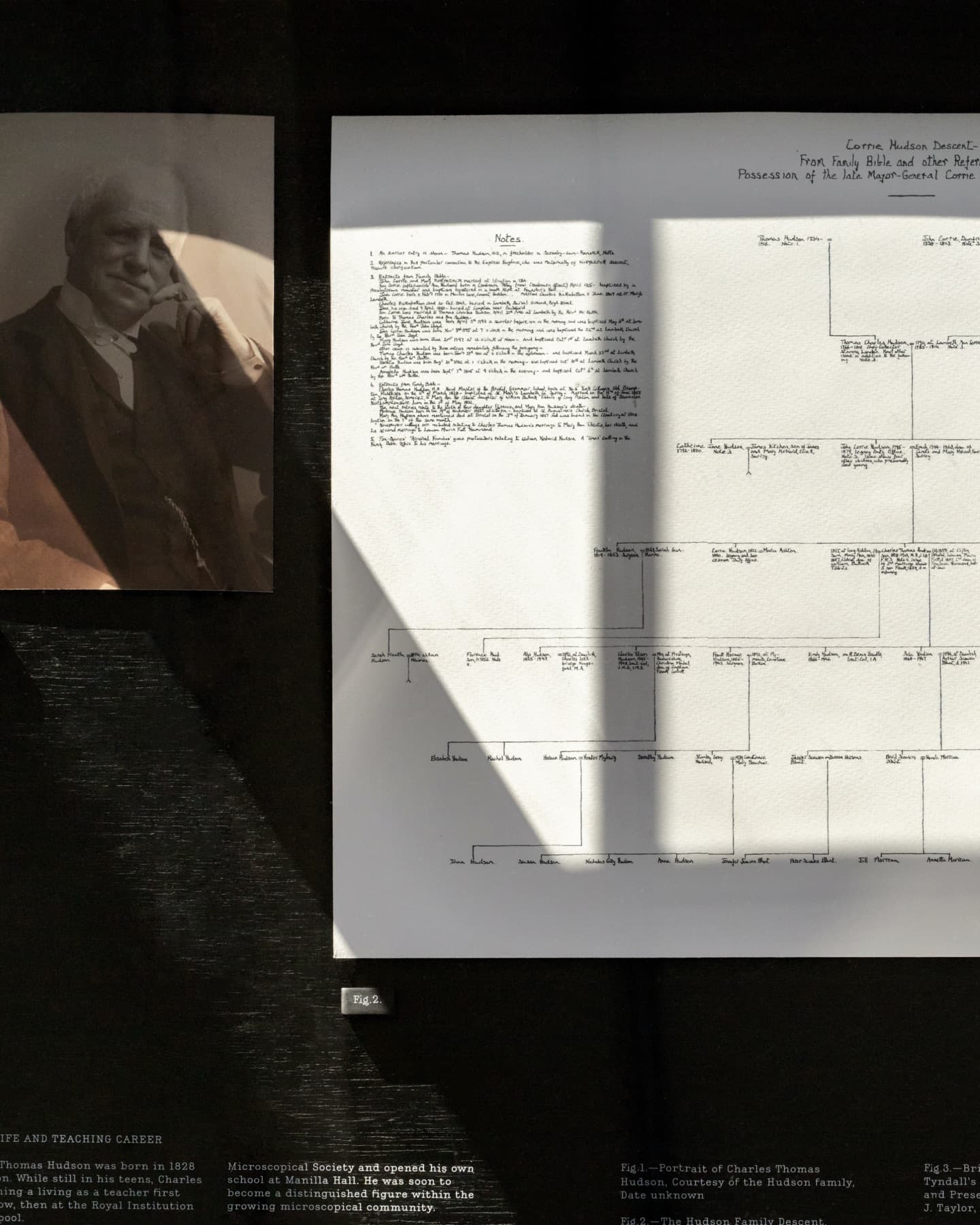
Luke and Jody Hudson-Powell curated a gallery exhibition of their Great, Great Grandfather Charles Thomas Hudson’s detailed scientific transparencies, Sharp Serif Text was the perfect voice for the catalogue and exhibition graphics.
Luke and Jody Hudson-Powell curated a gallery exhibition of their Great, Great Grandfather Charles Thomas Hudson’s detailed scientific transparencies, Sharp Serif Text was the perfect voice for the catalogue and exhibition graphics.
The Hudson Transparencies (Pentagram Paper 52) is a publication that brings together the complete set of its namesake naturalist’s work for the first time in print. Designed by Luke Powell, Jody Hudson-Powell and the team at Pentagram, Sharp Serif Text was chosen as the leading typographic voice of the booklet in addition to the accompanying exhibition of Hudson’s work.
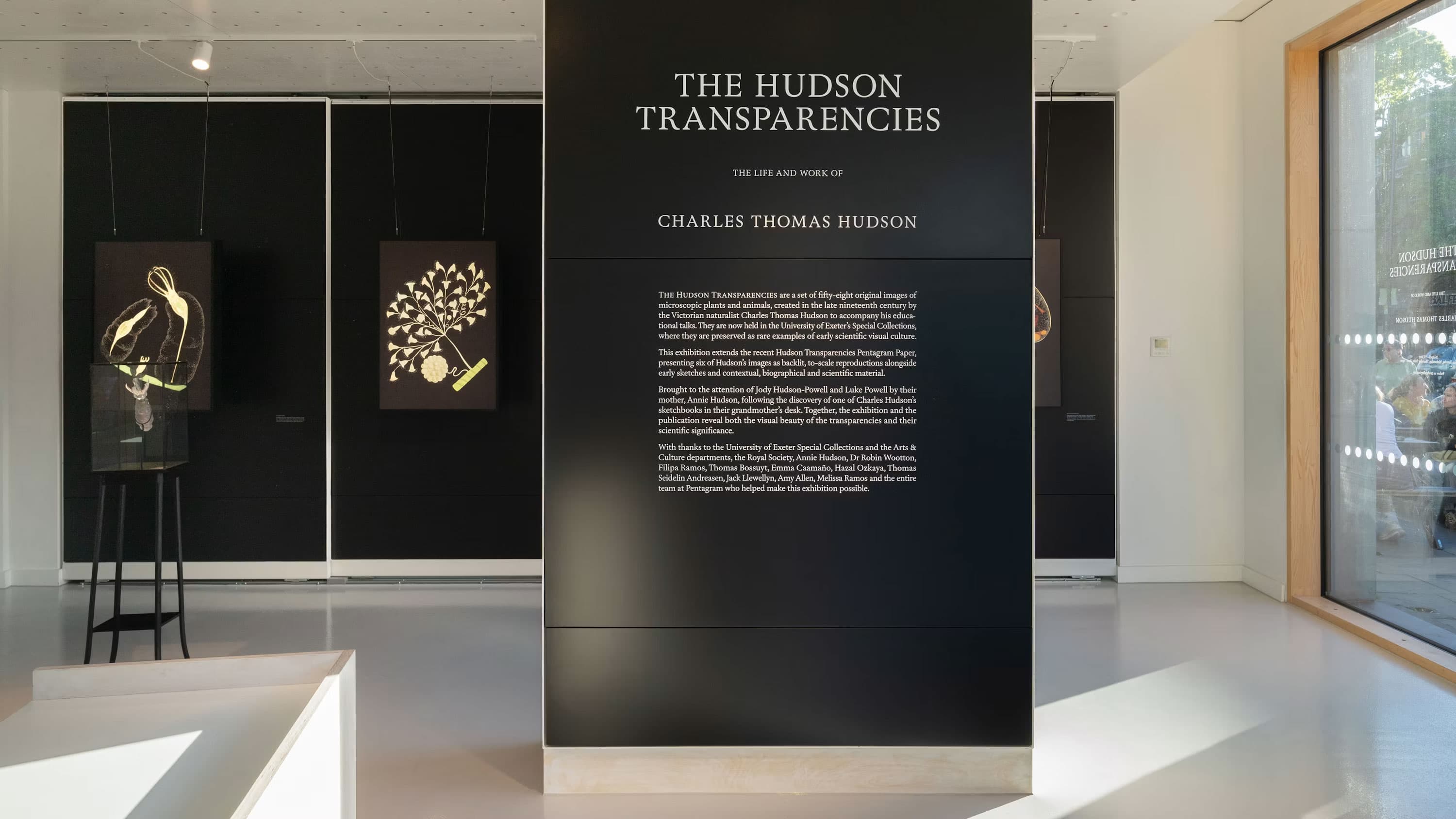
On view at Pentagram London
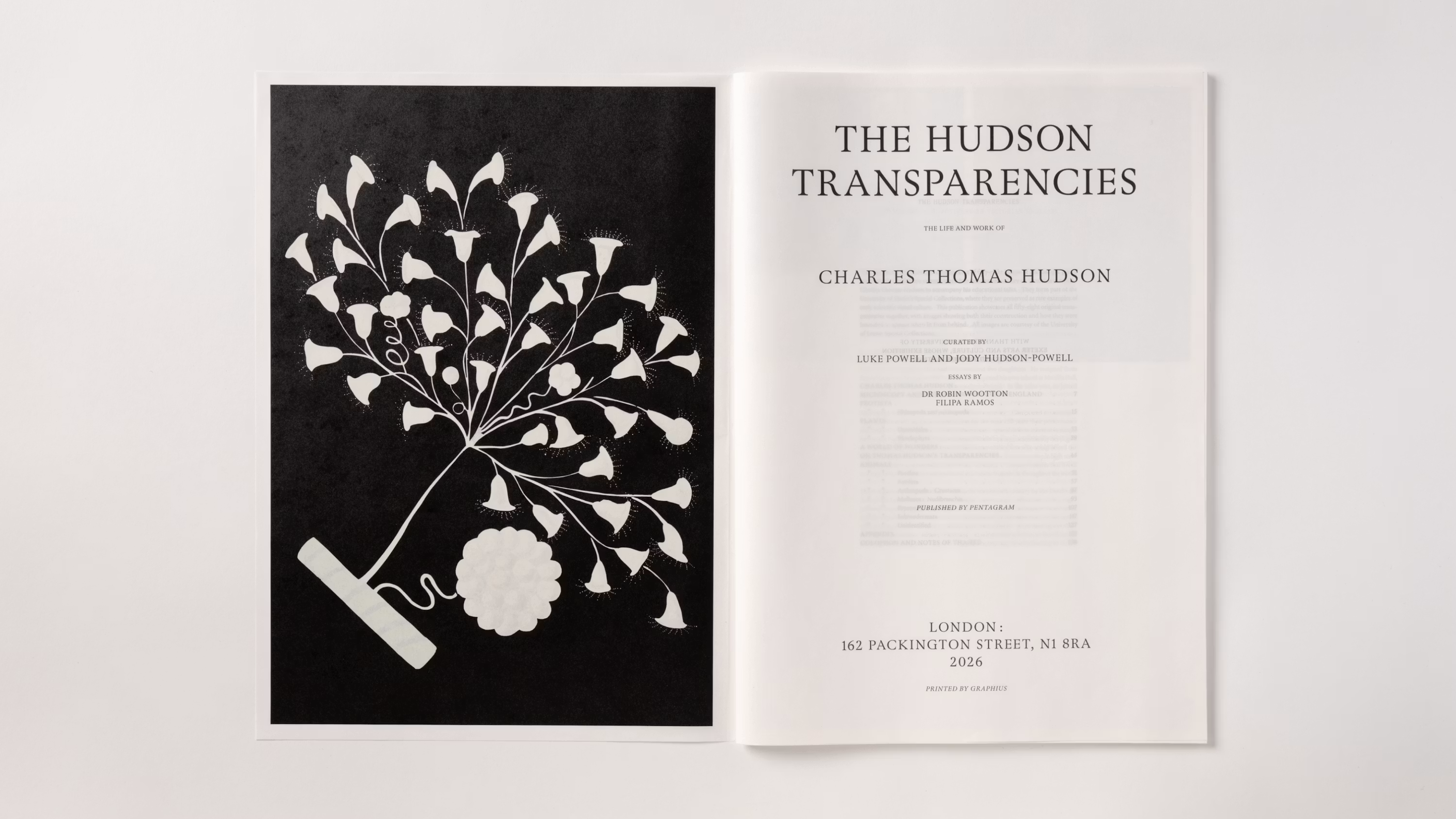
Exhibition Catalogue
The full size artworks enlarge the microorganisms to gigantic proportions – the equivalent of drawing ants the size of elephants
The full size artworks enlarge the microorganisms to gigantic proportions – the equivalent of drawing ants the size of elephants
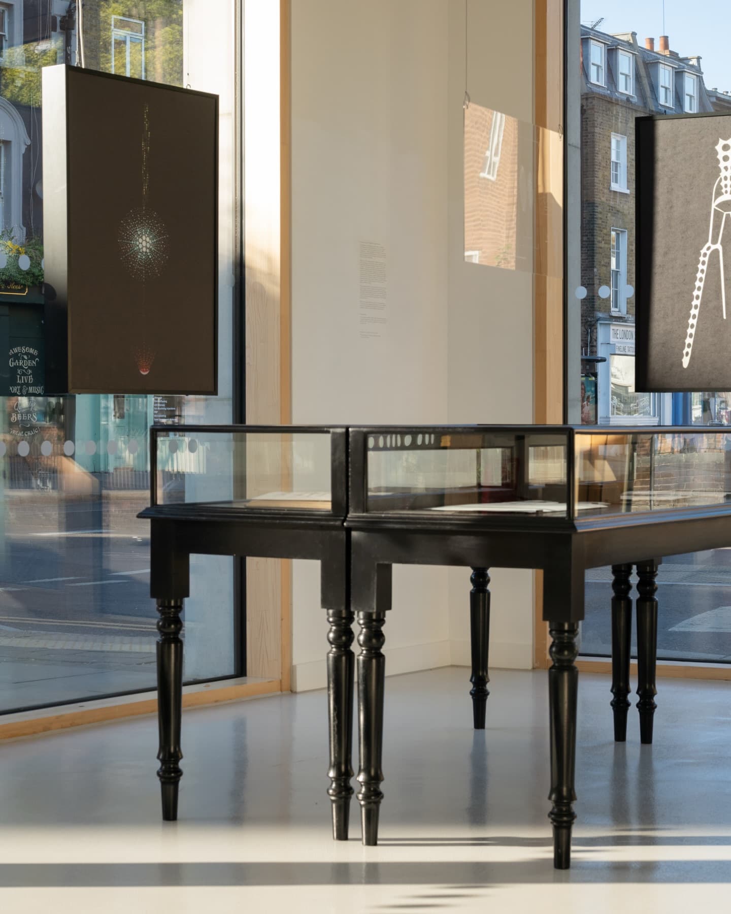
In the late 19th century, Charles Thomas Hudson, a Victorian educator and pioneering microscopist, created a series of 58 hand-crafted illuminated images. Now known as The Hudson Transparencies, these large-scale representations of microscopic aquatic organisms were created to accompany Hudson’s lectures. While advances in industrial mass reproduction had recently made scientific illustrations increasingly visible to the general public, Hudson’s transparencies—which are a sculptural, craft-based chimera—were notable because they could only be viewed in person, until now.
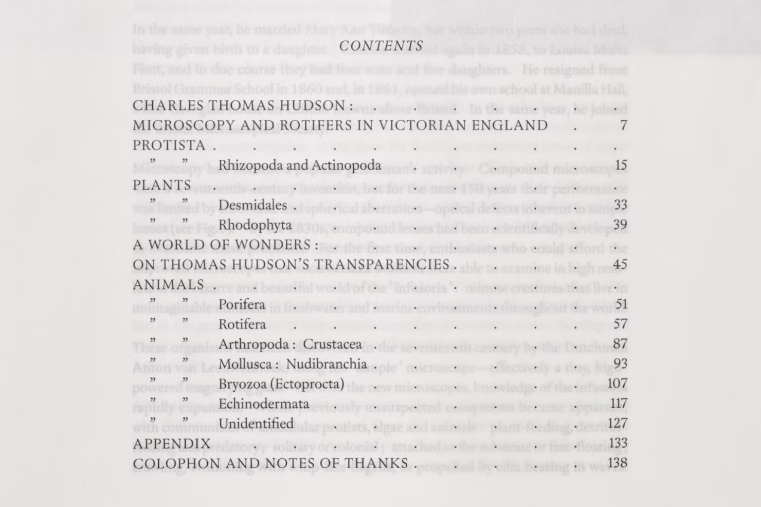
Exhibition Catalogue
Sharp Serif is an ode to the classical models of the 15th-century Italian masters and French renaissance types, alchemically reconfigured for the present day.
Sharp Serif is an ode to the classical models of the 15th-century Italian masters and French renaissance types, alchemically reconfigured for the present day.
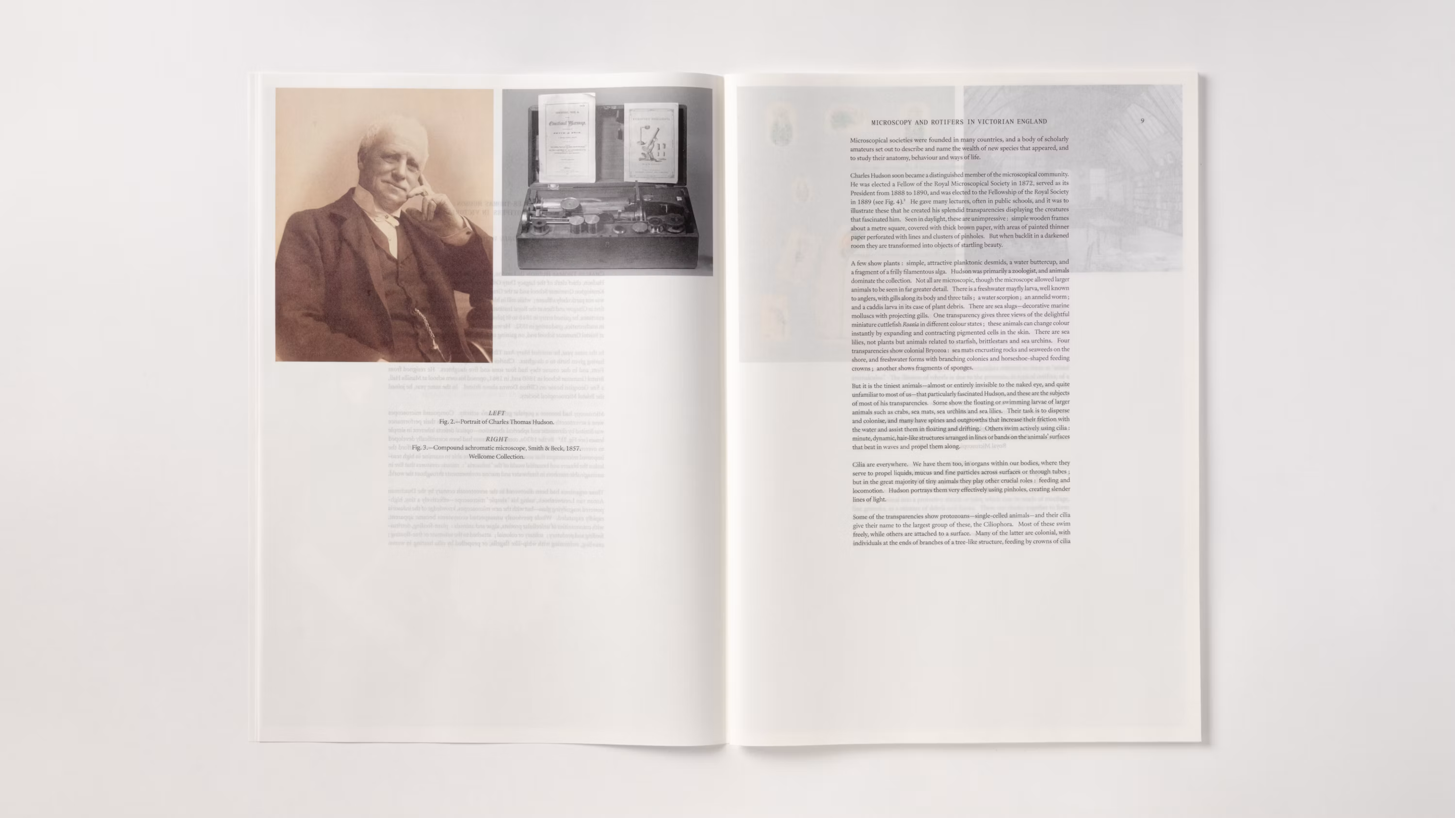
Exhibition Catalogue
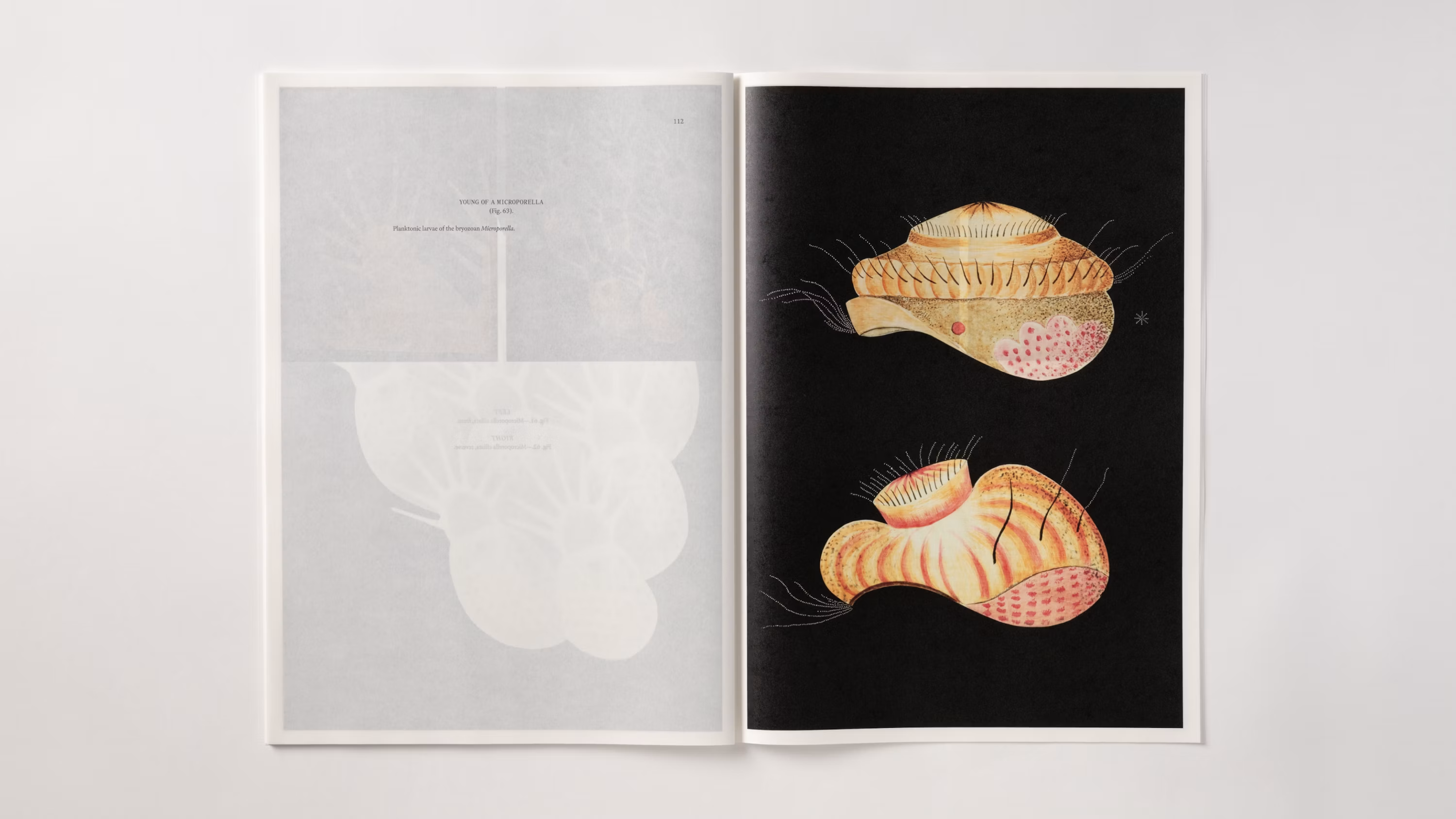
This newly published catalogue of Hudson’s work features specialized printing techniques and paper stocks to convey their illuminated quality, referencing the synthesis that defines the original transparencies and their idiosyncrasies. Sharp Serif Text is used throughout. Used across the board from display to text contexts, the designers deftly employed Lucas Sharp’s ode to the classical models of the 15th-century Italian masters and French Renaissance types. From its surprising (and effective) titling usage to its elegant execution as body text, the result is typography that feels both natural and notable from the booklet page to the exhibition wall.
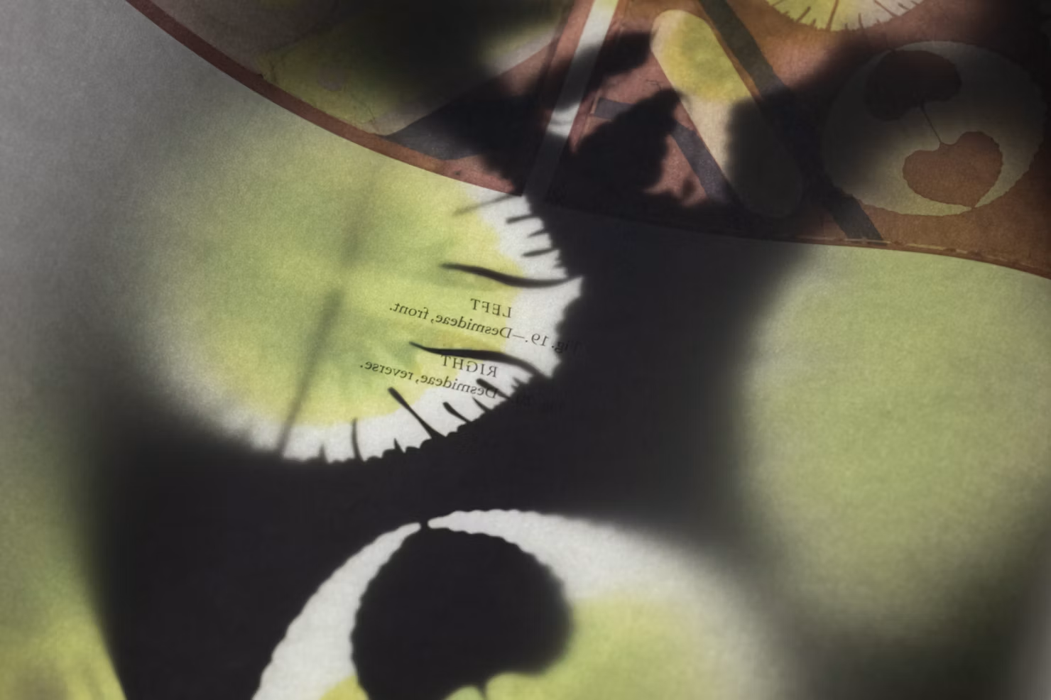
Exhibition Catalogue
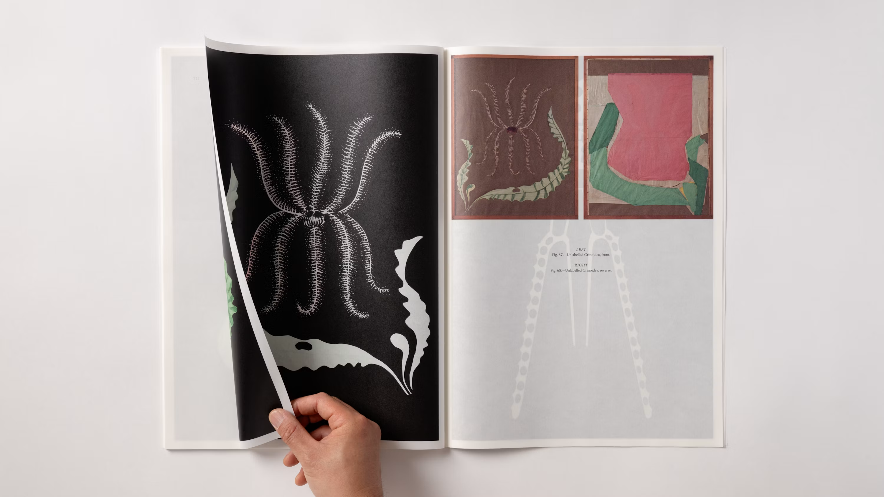
Exhibition Catalogue
Designers Luke Powell, Jody Hudson-Powell, Pentagram
Type Design Lucas Sharp
Featured Fonts
Featured Fonts