Sam's Sans Typeface
The all-new Sams Sans for Sam’s Club by Sharp Type!
The all-new Sams Sans for Sam’s Club by Sharp Type!
Sams Sans is a custom display typeface developed by Sharp Type for Sam's Club as part of the company's 2026 brand refresh. Rather than functioning as a standalone font, it was designed as a core element of the new identity system, supporting applications across advertising, signage, digital experiences, packaging, and the logo itself. That Lucas Sharp and the rest of our team was able to execute a multi-style typeface family in a relatively short amount of time speaks to the exceptional working relationship we have with the creative team at Turner Duckworth.
The defining feature of the typeface is its relationship to the brand's diamond icon. Instead of limiting the diamond to the logo, the designers incorporated its geometry into typographic details, including punctuation and select letterforms. The tittles in letterforms like the /i and punctuation marks like the period incorporate the iconic Sam’s Club diamond into the typeface system. The crossbar of the lowercase /t also cleverly references this shape. These recurring references create a consistent visual language that connects the typography to the broader identity without making the letterforms feel overly stylized.
Developed in close collaboration with the team at Turner Duckworth, we created a complete typeface family with Display, Text, and Mono styles, in addition to a digital/UI cut.
Developed in close collaboration with the team at Turner Duckworth, we created a complete typeface family with Display, Text, and Mono styles, in addition to a digital/UI cut.
Team:
Type Director: Lucas Sharp | Lead Type Designer: Léna Le Pommelet | Type Designers: Huw Williams, Daniel Veneklaas, Kamyab Jafari
| Font Engineer: Calvin Kwok | Kerning: Igino Marini

Sam's Sans
Headline
Sam's Sans
Text
Sam's Sans
Mono
Sam's Sans
UI*
The typeface balances geometric structure with approachable proportions, emphasizing open forms and a closely considered sense of spacing, helping the type remain clear and legible while avoiding the rigidity often associated with purely geometric sans serifs. The shear vertical terminals of the /c and and Angular details are introduced selectively, giving the typeface a distinctive character without compromising readability.
Healthy snack
time favorites
Golden sweet
bonita banana
This is Sam’s Sans It carries the diamond into every message, uniting us in one unmistakable voice. The text and headline styles shares a common foundation, but are intentionally distinct. Text prioritizes clarity and legibility, while Headline draws closer to the wordmark for greater impact
Its range of weights and style delivers function and flexibility without sacrificing character. Our type hierarchy creates impact in special brand moments and clarity in everyday communication.
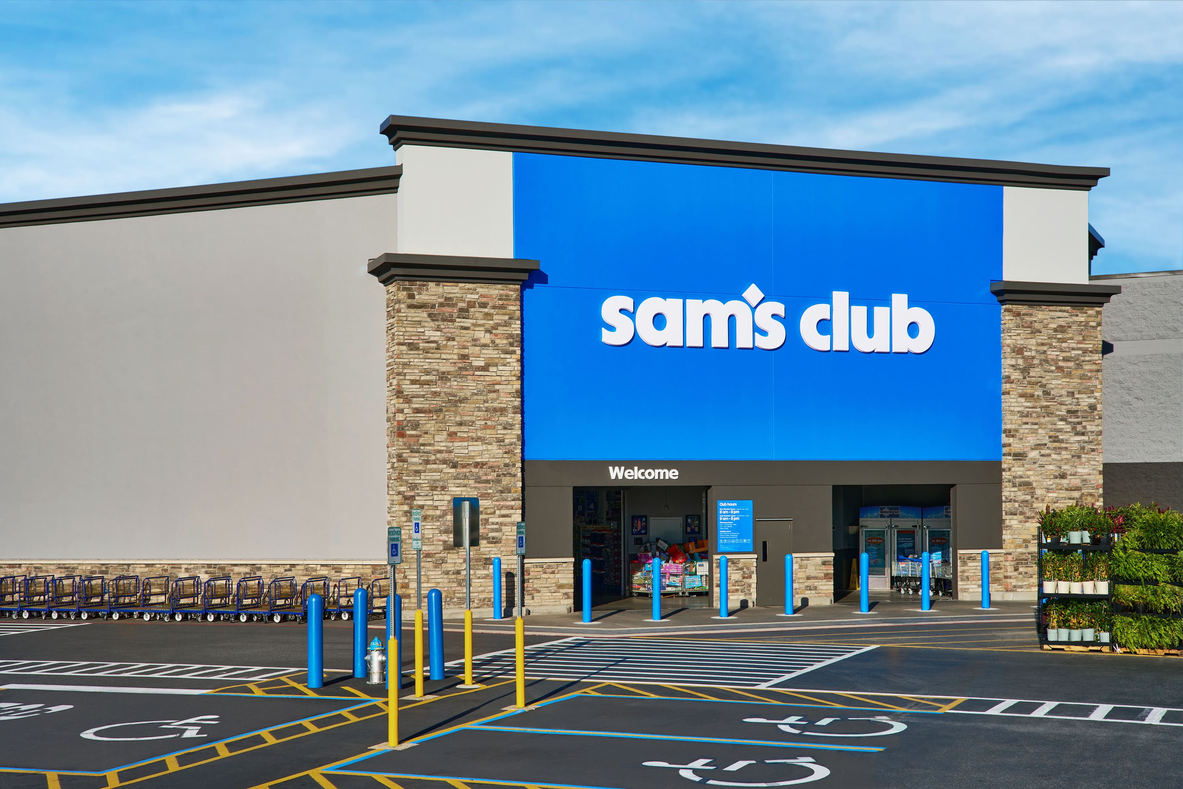
As a display typeface, Sam Sans is intended to establish a recognizable voice across brand communications. Its design reinforces the broader goals of the rebrand by providing a cohesive typographic system that is identifiable, adaptable, and closely integrated with the visual identity so that its application from physical to digital spaces feels seamless.
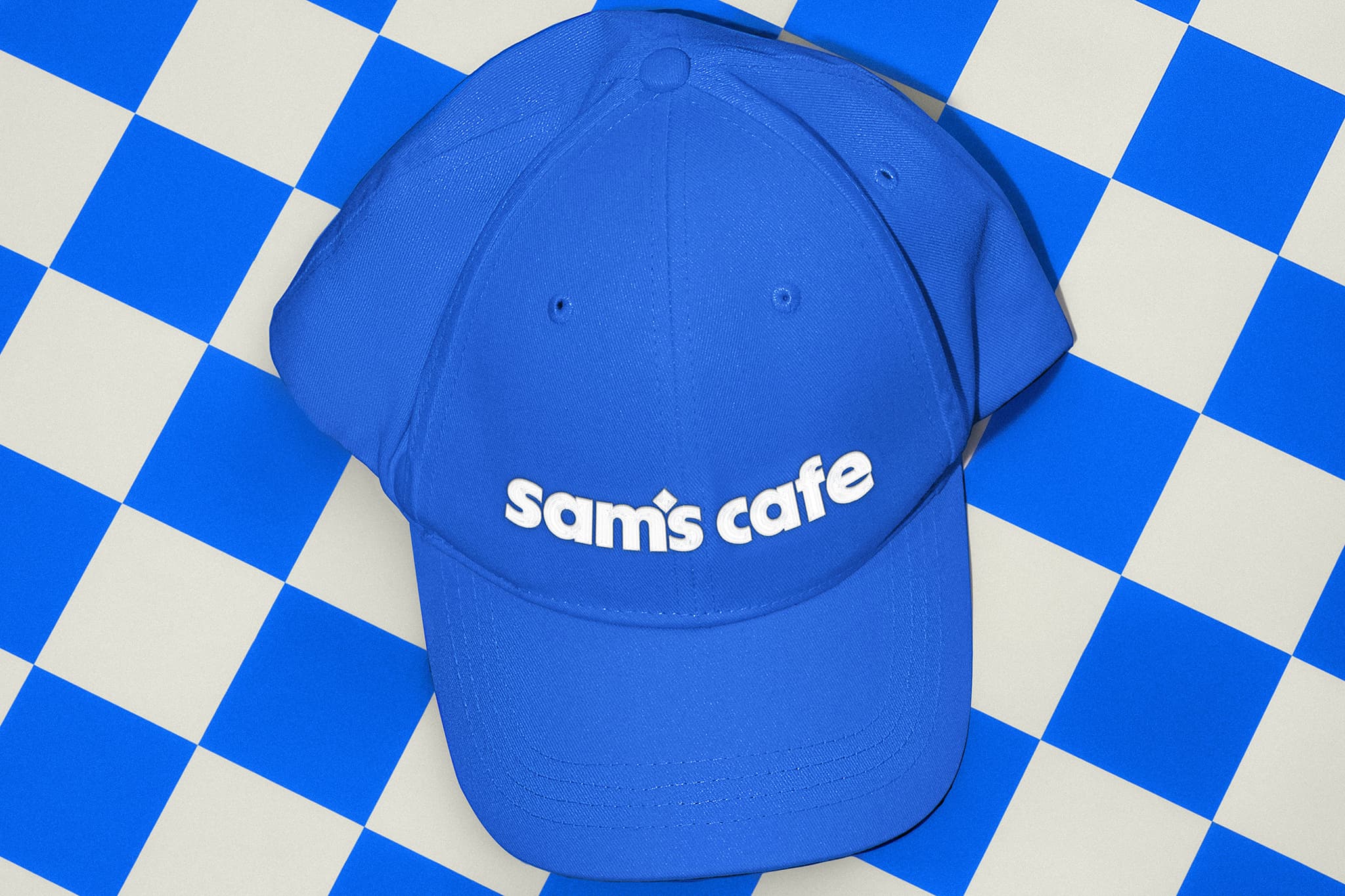
Sam's Club is a membership-based warehouse retailer that focuses on offering a wide selection of products at competitive prices. Since its founding in the United States during the early 1980s, the company has grown into one of the largest warehouse club chains in the world. Its stores are designed around the concept of bulk purchasing, allowing families, small businesses, and organizations to buy everyday essentials in larger quantities. From groceries and household supplies to electronics, furniture, clothing, and seasonal merchandise, the shopping experience emphasizes value, efficiency, and convenience while encouraging customers to think beyond individual purchases.
The warehouse format is central to the identity of Sam's Club. Unlike traditional supermarkets or department stores, locations feature wide aisles, industrial shelving, and merchandise displayed in large quantities. This straightforward presentation reflects a philosophy that prioritizes accessibility, inventory efficiency, and clear communication over decorative retail environments. Large signs, bold typography, and organized departments help customers navigate the space with ease, creating a shopping experience that feels practical, spacious, and easy to understand.
Membership is one of the defining characteristics of the brand. Rather than functioning simply as a method of accessing products, membership creates an ongoing relationship between customers and the club, shaping the way they shop and interact with the company over time. Customers gain access to exclusive pricing, special promotions, and a range of services designed to provide additional value throughout their membership. This structure gives the shopping experience a sense of continuity, encouraging customers to return regularly and making membership an important part of the overall value proposition. The model encourages long-term relationships rather than one-time transactions, creating a community of shoppers who return regularly for both personal and business needs. For individual customers, the warehouse can become part of an established routine, providing access to everyday products alongside larger purchases and occasional discoveries. For business customers, the same model can support recurring purchasing needs and provide a consistent source of products. In both cases, membership connects individual shopping trips to a broader relationship with the brand, reinforcing the idea that value is created through continued participation rather than through a single transaction. By combining large product assortments with consistent pricing strategies, the company has established a retail system centered on reliability, savings, and customer loyalty. The scale of the assortment allows customers to find a wide range of products within the same environment, while pricing provides a practical reason to return and purchase in larger quantities. This combination creates a shopping model where convenience and value are closely connected. The membership structure supports that relationship by giving customers a reason to remain engaged with the club and to make use of its products and services over time. The result is a retail experience built around participation, familiarity, and perceived value. Membership becomes more than an access mechanism; it acts as a foundation for the relationship between the customer and the warehouse club. Regular visits, recurring purchases, exclusive pricing, and access to additional services all contribute to a system designed to reward continued engagement. In this way, Sam’s Club combines the scale and efficiency of warehouse retail with a model focused on reliability, savings, and customer loyalty, creating an experience that can support different shopping needs while maintaining a consistent relationship with its members.
Founded with the idea of delivering greater value through membership, Sam's Club has built its reputation around efficiency, scale, and accessibility. The warehouse format allows products to move quickly from suppliers to customers while reducing unnecessary costs. This approach has influenced everything from store layouts and packaging to pricing strategies and customer service. Rather than emphasizing luxury, the brand focuses on practicality, making everyday shopping simpler for families, professionals, and small businesses. Over the decades, this straightforward philosophy has become one of the defining characteristics of the company's identity.
Walking through a warehouse club is an experience shaped by proportion and organization. High ceilings, long sightlines, and rows of industrial shelving create an immediate impression of scale. Products are displayed in large quantities, encouraging customers to compare, explore, and purchase with future needs in mind. The openness of the space allows shoppers to move naturally between departments while maintaining clear visual connections across the sales floor. Large displays and carefully arranged pallets reinforce the idea of abundance, making quantity itself part of the shopping experience. Signage is intentionally bold and highly legible, ensuring that information remains visible from across the sales floor. Department names, directional cues, pricing, and promotional messages work together to create a clear visual hierarchy. This system helps customers understand where they are, what they are looking for, and how to move through the space without unnecessary interruption. Typography plays an important role in maintaining this clarity, particularly within an environment where information needs to be understood quickly and often from a distance. Every visual element is designed to reduce confusion and support efficient movement, transforming a large retail environment into a space that feels structured and easy to navigate. Repetition across shelving, signage, product displays, and architectural elements creates a consistent rhythm throughout the warehouse. At the same time, changes in scale and density help distinguish one area from another, allowing customers to recognize transitions between departments. The combination of structure, repetition, and visual hierarchy gives the environment a sense of order without removing the feeling of discovery. The result is a retail experience that balances efficiency with exploration. Customers can follow familiar paths, locate essential products, and quickly understand the information around them, while the scale of the warehouse continues to create opportunities for unexpected discoveries. Proportion, organization, quantity, and typography work together to make a large environment approachable. Rather than overwhelming the shopper, the system creates a sense of confidence and orientation, allowing the physical space to communicate clearly while supporting the practical needs of everyday shopping.
CCCC LLLL
UUUU BBBB
Retail design is often invisible when it works well. Customers rarely notice the careful planning behind aisle widths, product placement, lighting, or typography, yet these elements shape every decision they make. At Sam's Club, communication depends on clarity above all else. Large price displays, directional graphics, and consistent visual hierarchy allow members to locate products quickly and understand promotional information without distraction. The result is an environment where functionality becomes part of the overall brand experience rather than an isolated design feature.
Throughout its history, Sam’s Club has adapted to changing shopping habits while maintaining the principles that define warehouse retail. What began as a primarily physical shopping experience has gradually expanded into a connected system of physical and digital touchpoints. The warehouse remains central to the experience, with its scale, product selection, and value-oriented approach, but customers are no longer limited to interacting with the brand while inside the club. Digital tools have introduced new ways to discover products, plan purchases, manage memberships, and access services before, during, and after a visit. Digital memberships, mobile applications, online ordering, and curbside pickup have expanded the traditional shopping experience beyond the physical store. Customers can now browse products, compare prices, renew memberships, and schedule purchases across multiple platforms. These services allow shoppers to make decisions in advance, reducing the amount of time spent searching for information once they arrive at the club. The mobile experience can also provide access to account information, purchase history, available services, and other practical tools that support everyday shopping. At the same time, these technological improvements complement the warehouse model instead of replacing it. The physical club continues to provide the scale, immediacy, and sense of discovery that are fundamental to warehouse retail. Digital platforms extend those qualities by making the experience more accessible and flexible, allowing customers to move between online and physical environments according to their needs. Information that begins on a phone can inform a visit to the warehouse, while a physical shopping experience can lead customers back to the digital platform for future purchases or account management. Together, these channels create a retail experience that combines convenience with the value-oriented philosophy established decades ago. The relationship between physical space and digital tools allows Sam’s Club to respond to changing expectations without losing the characteristics that define its model. Technology becomes an additional layer of the experience: a way to make shopping easier, information clearer, and everyday decisions more efficient while preserving the scale, value, and discovery associated with the warehouse club.
Shopping online gives you the flexibility to explore a wide range of items, compare available options, and organize your purchase before visiting a club or completing an order. Start by searching for a specific item or browsing through the available categories. Product information can include descriptions, pricing, sizes, quantities, availability, and other details that may help you decide what to add to your cart. If you are looking for something specific, use the available search and filtering options to narrow the results. You can also review related items and explore different selections before making a final decision. The information shown online is intended to help you plan your purchase and may change as inventory, pricing, or availability is updated. When you find an item you would like to purchase, review the available information before selecting a quantity. Some items may have different sizes, formats, or purchasing options, and certain products may have limits that apply to individual transactions. If an item is available at a specific location, check the relevant club information before planning your visit. Availability can vary between locations and may change throughout the day. Products shown online may also have different fulfillment options depending on where they are available. If you are shopping for several items, add each selection to your cart and review the complete list before continuing. Keeping your cart organized can make it easier to check quantities, compare prices, and identify anything that may need to be changed before checkout. Your cart provides a summary of the items you have selected and can be updated before you complete your purchase. Review each item carefully, including the quantity and current price shown. If you no longer need an item, you can remove it before continuing. If you need additional units, update the quantity and check whether the total has changed. Promotional pricing, applicable savings, taxes, fees, and other charges may affect the final amount shown during checkout. The information presented before payment should be reviewed carefully because the final total is based on the selections and information available at that time. If an item becomes unavailable or changes in price, the cart may be updated before the transaction can be completed. After reviewing your selections, continue through checkout and confirm the information associated with your purchase. Depending on the items and services selected, you may be asked to provide or confirm account, payment, location, or fulfillment information. Review each step before submitting the transaction. Once your purchase is complete, keep the confirmation information available for future reference. You can return to your account to review the status of the purchase and any information associated with it. If you have questions about a product, price, availability, or transaction, use the relevant support options provided through the website or app. Shopping information and available options may change over time, so always refer to the latest information shown online before completing a purchase.
Finding the right item can begin with a simple search or by exploring categories based on what you need. The website and app provide different ways to browse available selections, making it possible to move between departments, product types, and related items. Search results may include information about current pricing, availability, sizes, formats, and other characteristics that can help you compare options. When several items meet your needs, review the available information before making a selection. You can also explore related categories to discover alternatives or products that may work alongside your original choice. Product information is provided to help you make an informed decision, but availability and pricing may change as inventory is updated. Different shopping needs may require different approaches. A planned purchase might begin with a specific item, while a larger household trip may involve browsing several categories before deciding what to add. Use search and navigation features to move between selections and review the information associated with each item. When available, filters can help narrow results according to relevant characteristics. If you are comparing several options, open the individual item information and review the details before choosing one. Some products may be available through multiple fulfillment methods, while others may depend on location or inventory. Checking this information before adding an item to your purchase can help prevent unexpected changes later. Product pages can provide information about the item, including available sizes, current pricing, descriptions, images, and other relevant details. Depending on the product, additional information may be provided to help you understand how it can be used or what options are available. Review the information carefully, particularly when selecting between different sizes or quantities. If you are purchasing multiple units, confirm the quantity before adding the item to your cart. Some products may have purchase limits or other conditions that apply to individual transactions. If an item is unavailable, related selections may provide an alternative option. Availability is not guaranteed and can change based on location and inventory. When you have finished exploring, review the items you have selected and confirm that they meet your needs. Your selections can be changed before checkout, allowing you to adjust quantities, remove items, or continue browsing. If you are shopping from a saved list, compare the current information with your previous selections before completing the purchase. Prices, inventory, and other product information may have changed since your last visit. The website and app provide the most current information available at the time you are shopping. If you need assistance with a product or cannot find the information you are looking for, use the available support options or contact the appropriate service team for additional guidance.
Your account provides a central place to manage information associated with your online shopping experience. After signing in, you can review available settings, update eligible information, and access purchases or services associated with your account. Keeping your information current can help ensure that the website and app display the appropriate options when you shop or manage an existing purchase. Depending on your account, available settings may include contact information, preferred locations, payment information, communication preferences, and other account features. Review each section carefully before making a change and confirm that the information shown is accurate before submitting an update. Some settings may affect how information is displayed or which services are available during your shopping experience. A preferred location, for example, may influence the inventory or service information shown when you browse products. Communication preferences can determine which types of messages or updates you receive. Payment information may be used during checkout and should be reviewed regularly to make sure that the details are current. If you no longer use a particular option, check whether it can be removed or updated through your account. Changes may take a short amount of time to appear across different parts of the website or app, so review the confirmation provided after submitting an update. Account security is an important part of managing your information online. Use a secure password and avoid sharing your login credentials with other people. If you believe that someone has accessed your account without permission, follow the security instructions provided through the appropriate support channel. When updating sensitive information, review the verification steps carefully before continuing. Some changes may require additional confirmation before they can be completed. If you receive a message about an account change that you did not make, review your account activity and follow the available instructions. Keeping account information accurate and secure helps maintain access to the services and features associated with your membership. Before leaving the account area, review any changes you have made and confirm that the information displayed is correct. If you have updated several settings, check each section individually rather than assuming that all changes were saved together. Some preferences may apply immediately, while others may take additional time to update. If an expected change does not appear, review the account information again before submitting another request. For questions about account access, security, preferences, or available features, use the support options provided through the website or app. The available account settings may change as new features and services are introduced, so check the current options whenever you need to make an important update.
Planning a purchase can help you understand the total cost of the items you need and identify opportunities to make the most of your budget. When browsing online, review current pricing and any applicable information associated with individual items. Some selections may include promotional pricing or other purchase conditions that are shown before checkout. Pricing can vary depending on location, quantity, account status, or other factors, so review the information displayed for the specific purchase you are considering. If you are comparing several options, look at the complete item information rather than relying only on the initial price shown in a search result. This can help you understand differences in size, quantity, format, and overall value. When building a larger purchase, consider the quantities you actually need and review the total as you add items to your cart. The cart provides a useful summary of your current selections and allows you to make changes before completing the transaction. If you increase or decrease a quantity, check the updated total before continuing. Applicable taxes, fees, promotional adjustments, or other charges may affect the final amount. Some purchases may also have specific quantity limits or eligibility requirements. Review these conditions before confirming your selections so that you know how they may affect the transaction. Savings information may appear in different areas of the shopping experience depending on the item or service. If a special price applies, the relevant information should be displayed alongside the product or during checkout. Review the conditions associated with any promotional pricing before completing a purchase. Certain promotions may have specific dates, quantities, locations, or eligibility requirements. Availability may also change while you are shopping. If a promotional price is no longer available, the current amount shown during checkout should be used when reviewing the final transaction. Keeping track of the information shown at the time of purchase can help you understand how the final amount was calculated. After reviewing your selections and the current pricing information, confirm that the purchase fits your intended budget before submitting payment. The final amount shown during checkout reflects the information available at that moment and may include applicable charges associated with the transaction. Once the purchase has been completed, save the confirmation information for reference. If you later need to review a price, transaction, or purchase detail, your account may provide access to the relevant information. Pricing, promotions, inventory, and available services can change over time, so always check the latest information shown online before making a purchase.
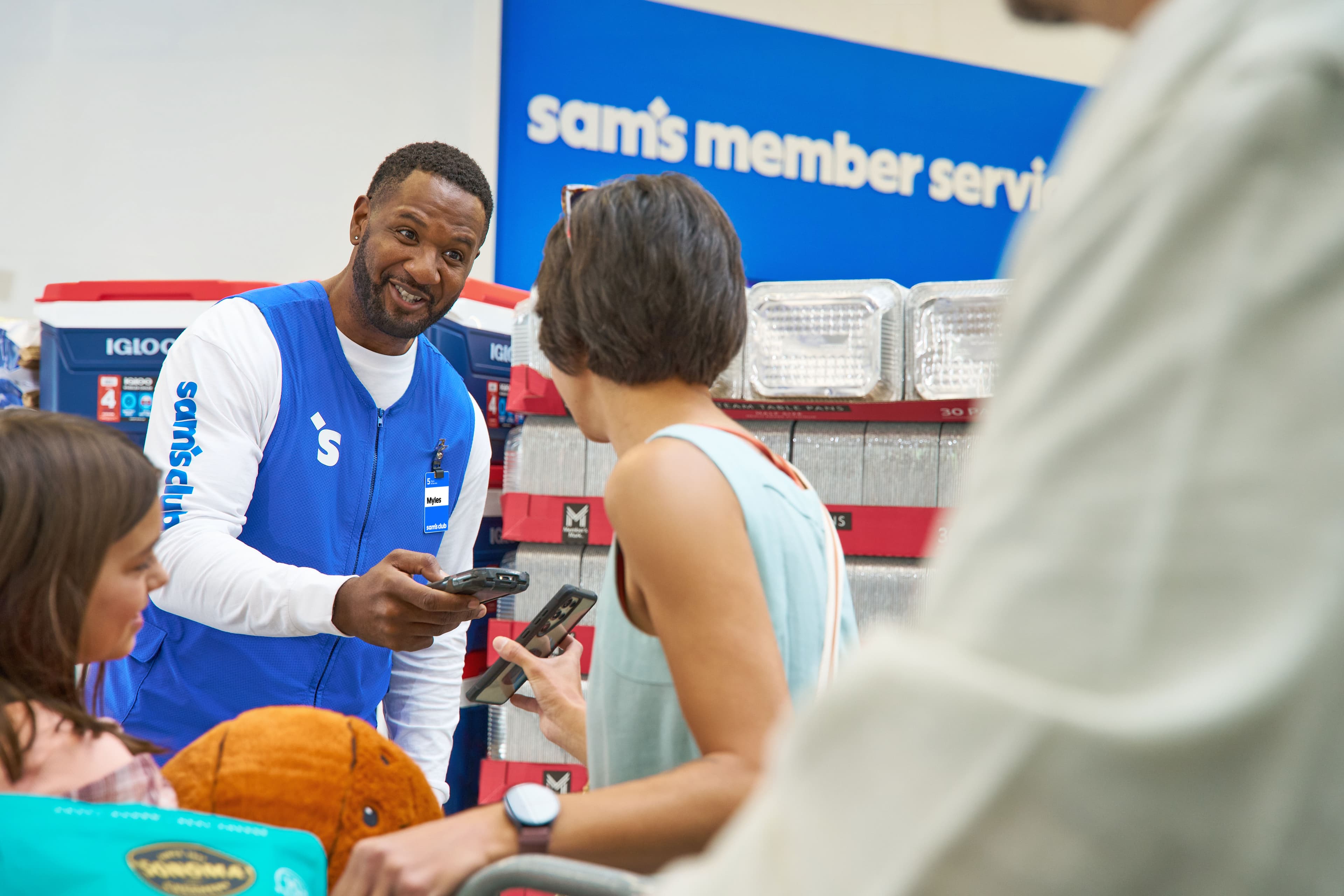
Behind every warehouse club is a sophisticated logistics network responsible for moving thousands of products across regional distribution centers and retail locations. Inventory management, supplier relationships, transportation systems, and demand forecasting work together to keep shelves stocked throughout the year. Although these operations remain largely invisible to customers, they form the foundation of the shopping experience. Reliable product availability depends on coordination at every level, allowing stores to maintain consistency while responding to seasonal demand and changing consumer preferences.
The visual language of a warehouse club relies on confidence rather than decoration. Large geometric forms, strong typography, and generous spacing communicate information with speed and precision. Blue, white, and neutral industrial materials establish a recognizable atmosphere that extends from storefront signage to digital interfaces. Consistency across every touchpoint reinforces familiarity, allowing customers to focus on products rather than navigating unnecessary complexity. This restrained design approach reflects the brand's emphasis on practicality, efficiency, and long-term trust.
Bulk purchasing has become an important part of modern consumer culture, particularly for families and growing businesses. Instead of buying individual items repeatedly, members are encouraged to think in terms of preparation, planning, and long-term savings. Larger package sizes reduce the frequency of shopping trips while offering competitive prices across a broad range of categories. This purchasing model supports both convenience and efficiency, making warehouse retail an attractive alternative for customers seeking reliable access to everyday essentials.
Your order has been received and is now being prepared for fulfillment. Review the information associated with your purchase to make sure that the selected items, quantities, prices, and fulfillment method are correct. You can access your order information through your account and check the latest status as it moves through the fulfillment process. If an item becomes unavailable after your purchase has been submitted, the order information may be updated to reflect a substitution, adjustment, or other available option. Product availability can vary by location and may change between the time an item is added to your cart and the time the order is completed. The information displayed in your account should be considered the most current version of your order. If you need to make a change, review the options available before contacting support. For orders selected for club pickup, check the location, pickup instructions, and available hours before visiting. Pickup information may vary depending on the club, product, and selected service. Some items may require additional preparation time before they are ready for collection. When your order is available, use the confirmation information provided during checkout to help locate the correct purchase. If you are unable to collect an order during the selected period, review the available options for rescheduling or making another arrangement. Keep your confirmation information available until the order has been collected or otherwise completed. For purchases using other fulfillment methods, review the estimated timing and destination information shown in your account. Shipping or service information may change as the order progresses. Your final purchase total may include applicable taxes, service charges, or other fees shown during checkout. Pricing displayed before an order is completed may change when quantities, availability, or other purchase details are updated. Review the final amount carefully before confirming payment. If a promotional price, savings amount, or other adjustment applies to an item, the relevant information should appear with the purchase details. Some products may have quantity limits, eligibility requirements, or additional conditions that affect the final transaction. If an item is removed from your purchase, the total may be recalculated automatically. The amount shown after confirmation represents the transaction information available at that time. Save your confirmation details if you need to reference the purchase later. After completing your order, you can return to your account to review its current status and related information. Depending on the purchase and service selected, you may be able to view fulfillment updates, transaction details, or additional instructions. If you notice an issue with an item, quantity, price, or fulfillment method, check the information provided online before taking further action. Certain purchases may have specific return, exchange, cancellation, or eligibility requirements. These conditions can vary depending on the product and service involved. For questions about an order, use the support options available through the website or app. When contacting support, having your confirmation information available can help locate the relevant transaction and provide the appropriate assistance.
Your membership provides access to products, services, and shopping options available through the club and online. Sign in to review the information associated with your current membership, including account settings, available features, and relevant membership details. Depending on the membership selected, certain pricing, services, shipping options, and other features may vary. Review the information shown in your account before making changes to your membership or selecting a service. The website and app may provide different options depending on your location, account status, and the services currently available. Keeping your account information accurate helps ensure that the information presented during shopping and checkout reflects your current membership. You can update eligible account information online and review the details associated with your membership. When making changes, check each field carefully before submitting the update. If your membership requires renewal, the available renewal information will be displayed through your account. Renewal dates, pricing, and available options may depend on the membership associated with the account. Additional terms may apply to particular services, purchases, promotions, or locations. Information about membership features may also change as new services are introduced or existing features are updated. Before completing a transaction, review the information provided for the relevant service so that you understand any conditions that may apply. If you manage an account for more than one person, make sure that the information shown is accurate before completing changes or making a purchase. Account access should be kept secure, and login credentials should not be shared with other people. If you believe that your account information is incorrect or that someone else has accessed the account, follow the available security and support instructions. Some account changes may require additional verification before they can be completed. Review any confirmation messages carefully after submitting an update. If a change does not appear immediately, check your account again before submitting the same request more than once. Membership information may also affect how products, services, and pricing are presented during the shopping experience. When signed in, the website or app may display information relevant to your account and current membership. Review the information provided before completing a purchase, particularly when a service or price is dependent on membership status. If you have questions about your membership, account access, renewal, or available services, use the support options provided online. The most current information should always be checked through the appropriate account or service page. Membership features, pricing, and available services may change over time, so information previously viewed or saved may not represent the current terms.
Before completing a purchase, review the items, quantities, prices, applicable taxes, and final amount shown at checkout. Make sure that the information displayed matches the products and quantities you intended to purchase. Product availability and pricing may vary by location and can change before an order is submitted. If you have selected a specific fulfillment method, confirm that the option shown matches your intended purchase. Some products may have quantity limits, eligibility requirements, or additional terms that appear during checkout. Review these details carefully before confirming the transaction. If the information changes while you are completing the purchase, check the updated total and item information before proceeding. When applicable, promotional pricing or savings may be displayed with the relevant item or purchase information. The amount shown during checkout may reflect the current pricing available for the selected products and account. If an item is removed from the purchase or becomes unavailable, the total may change. Changes in quantity can also affect the final amount. Review the summary carefully before submitting payment, particularly when purchasing multiple quantities of the same item. Some products or services may be subject to additional conditions that are presented before the transaction is completed. If a requirement applies to a particular item, follow the instructions provided during checkout. The final amount shown before payment represents the transaction information available at that time. Depending on the purchase, this amount may include taxes, fees, or other applicable charges. After completing the transaction, keep the confirmation information available for reference. You may be able to review purchase history, transaction information, or other account details online. If you notice an issue with a purchase, first check the information provided in your account and compare it with the confirmation information associated with the transaction. If additional assistance is required, follow the support instructions provided through the website or app. Having the relevant transaction information available can make it easier to locate the purchase and review the details. Certain products and services may have separate return, exchange, cancellation, or eligibility requirements. Review the applicable information before making a purchase so that you understand any conditions associated with the transaction. These requirements may vary depending on the product, service, location, or fulfillment method selected. Information available during checkout should be reviewed carefully because it may contain important details about the purchase. If you make changes before submitting the transaction, verify the updated summary before confirming payment. Once the purchase has been completed, return to your account to review the available confirmation and transaction information. Keeping a record of the purchase can be useful if you need to reference the transaction, request support, or review its status at a later time.
Services available through the club and website may include pickup, shipping, pharmacy, optical, automotive, floral, food, and other specialized options. Availability can vary by location, product, service, and operating hours. Before visiting a club, check the information shown online for the service you need. Different locations may provide different services or have different schedules, requirements, and availability. Information shown through the website or app can help you determine whether a particular service is currently available and what steps may be required before visiting. Review the relevant information carefully before making a selection or traveling to a location. Some services require an appointment, account access, additional information, or specific eligibility requirements. If an appointment is required, review the available times and confirm the location before submitting your request. Service hours may differ from regular club hours and can change during holidays or special circumstances. Certain services may also require information to be provided before the appointment or transaction can be completed. When using an online service, review each step carefully before submitting a request or confirming a selection. If the information shown does not match your intended service or location, return to the previous step and verify the available options before continuing. Information about available services, locations, pricing, and requirements is provided to help you make decisions before completing an action. If a service is temporarily unavailable, additional information may be provided through the website or app. Some services may have separate terms and conditions that apply to individual transactions. Review these conditions before completing a purchase or request. Service availability can also depend on inventory, operating hours, staffing, location, or other circumstances. If you are planning a visit specifically for a service, check the latest information shortly before arriving to make sure that the service remains available. For the most current information, review the relevant service page before making a purchase or visiting a location. If you need additional assistance, use the contact or support options provided with the service. When contacting a club or support team, include the relevant information about your request whenever possible. This can include the location, service, appointment information, or transaction details associated with your question. Availability and service details are subject to change without notice. The website and app should be used as the primary reference for current service information, available locations, operating hours, and requirements.