Loading…
Carlyle Script
Sharp Type was approached by Studio Matthew Roland Bannister to draw a Custom Complementary Typeface for the Carlyle
Sharp Type was approached by Studio Matthew Roland Bannister to draw a Custom Complementary Typeface for the Carlyle
The Carlyle Hotel is a New York City icon. Opened in 1930, the luxury hotel was built in an art deco style by architects Sylvan Bien and Harry B. Prince in Manhattan’s Upper East Side. Its enduring appeal to U.S. presidents, foreign royalty, and well-heeled locals and tourists alike over the past century is a testament to tradition as a brand. One salient example of this has been its word mark, the Carlyle crest: its elegant cursive lettering was hand-drawn in 1930 and has remained virtually unchanged ever since. Last year, Sharp Type was approached by Studio Matthew Roland Bannister to draw a custom complementary typeface, and Type Director Lucas Sharp tapped our in-house type designer My-Lan Thuong to execute the project.
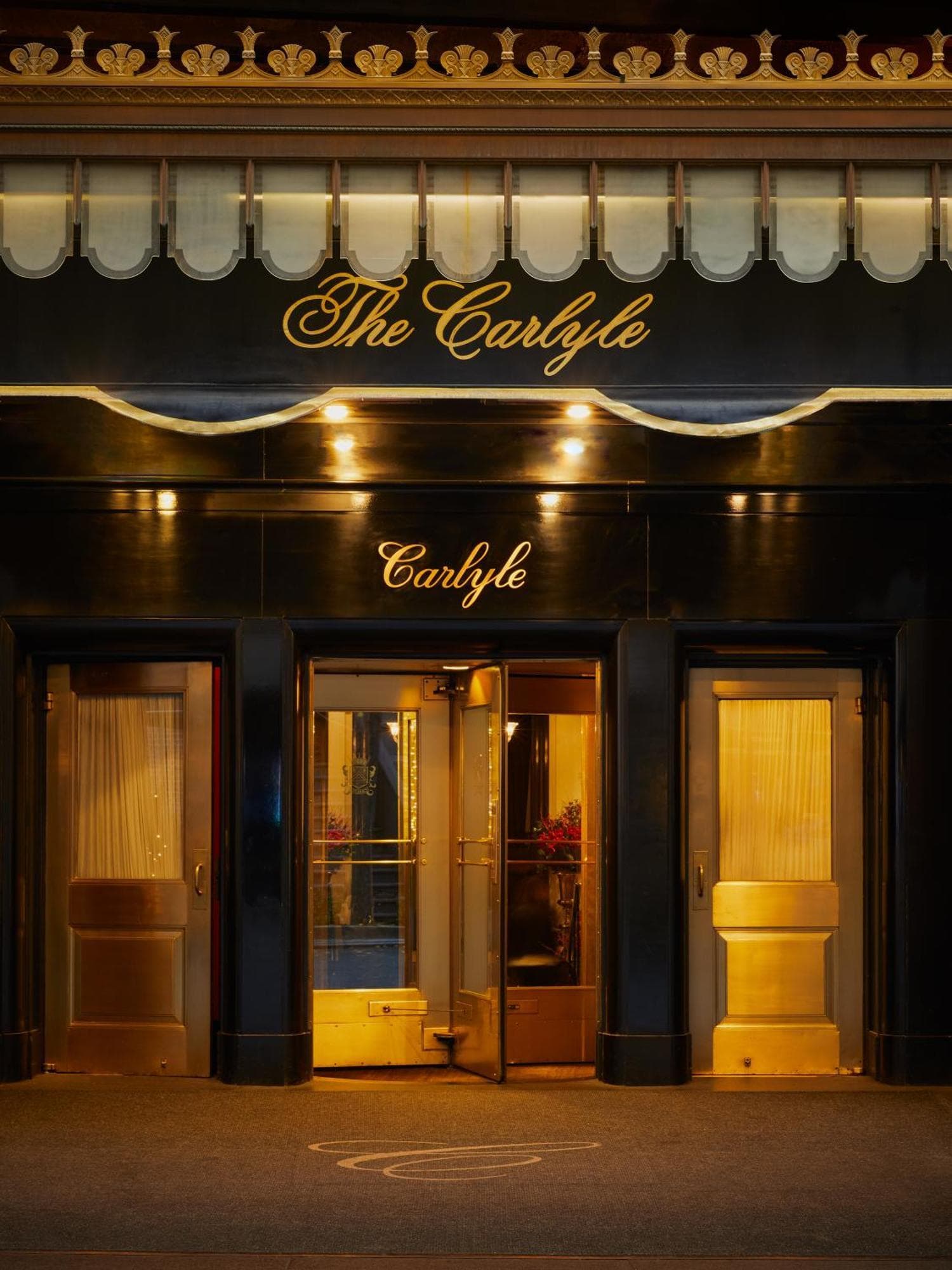
Entryway featuring two different previous versions of the logomark, note the /y, /h and alternative swashes on the /C.
Legacy
Legacy
The Carlyle wordmark had been subtly refined over the years, but for all intents and purposes, it has remained a consistent thread throughout the guest experience over the past decades. The typeface then, would have to distill its hand-drawn idiosyncrasies into a proper system including extended Latin characters, practical symbols and a wide range of alternates to ensure consistency through broad use in digital and material applications.
▼
▼
Development
Development
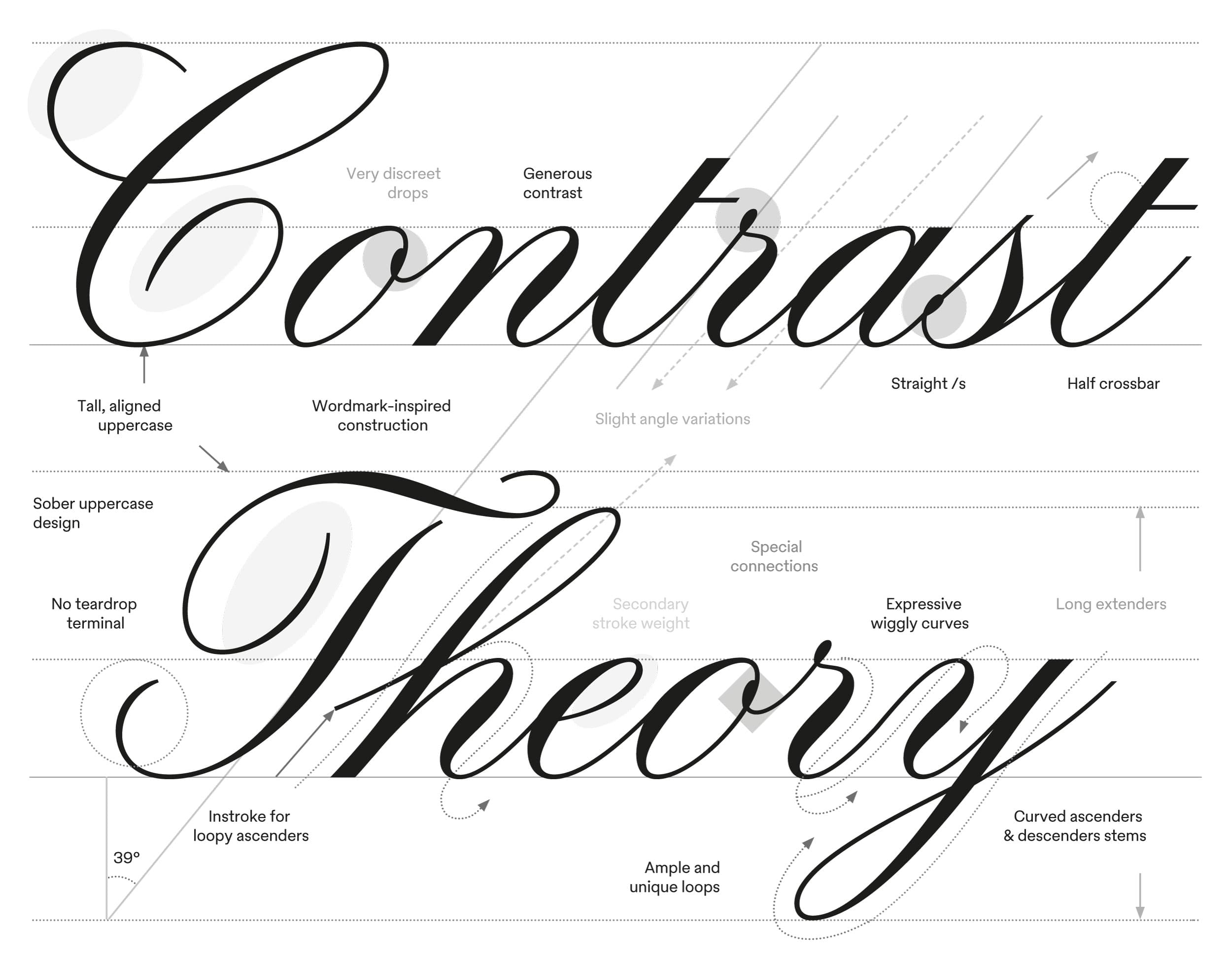
My-Lan established a system of connected letterforms, which was critical at the start. She focused on the lowercase letters first, identifying /n as a primary character for determining overall width and contrast, and /o /v /r /s /l /e to fine-tune the flow and the repertoire of connections and flow. The final system relies on two to six contextual alternates per letter, with an exception for complex letters like /r or /s, which require up to eighteen variants to connect effortlessly with their neighbors.
Carlyle Script
250
n o v r s l e
Contextual alternate examples.
si ss sz
Contextual alternate examples.
ri ro rx
Contextual alternate examples.
ea es ez
Contextual alternate examples.
ve vi vr
▼
▼
▼
The client had emphasized a desire for a “serious” and "non-decorative" aesthetic throughout the design process, Special attention was given to typographic elements such as drops or loops on characters such as /o, /v, /r and /s to ensure proper connectivity while avoiding an overly ornamental feel. The ball terminals were also made as discreet as possible on the uppercase.
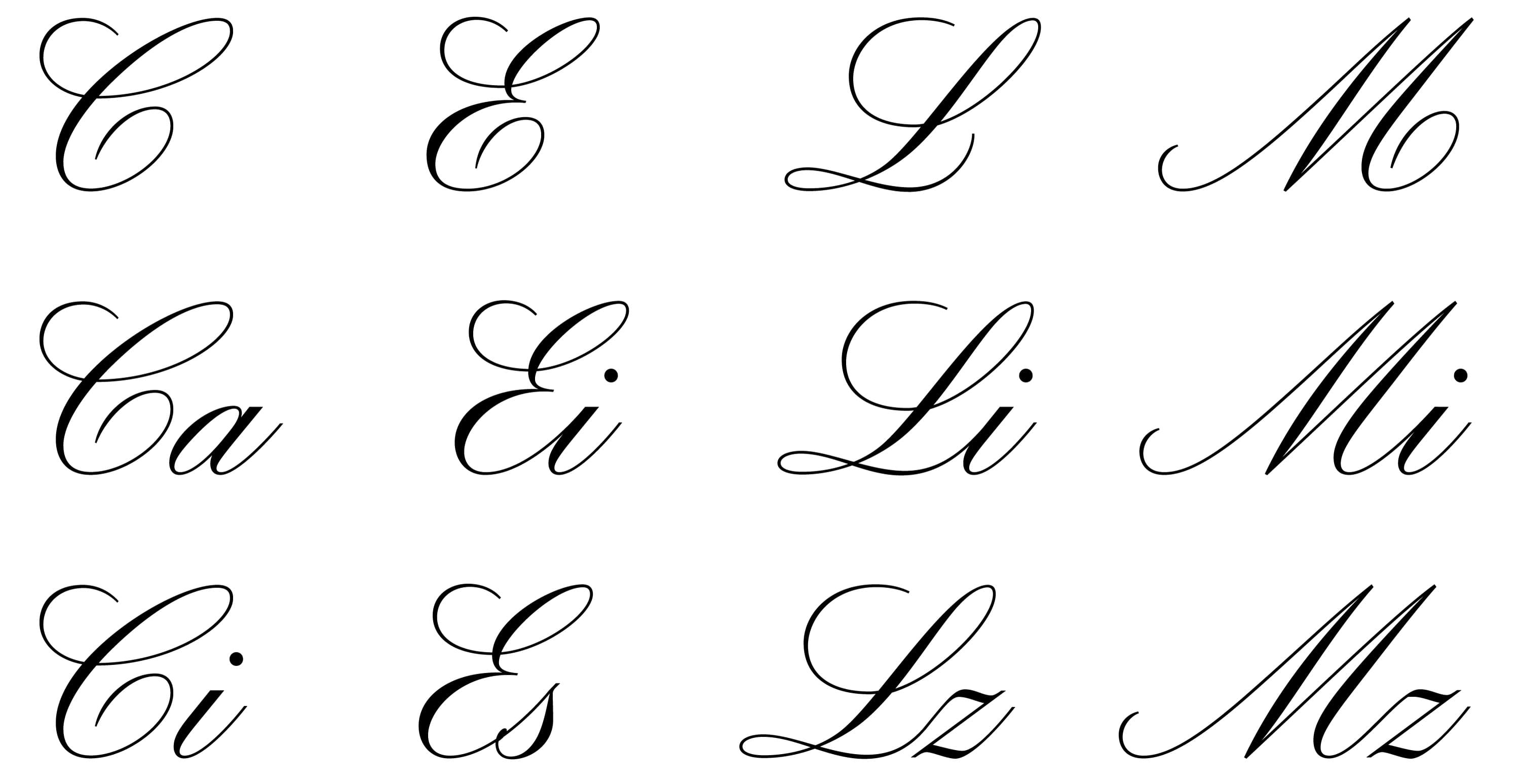
Another notable technical feature involved removing traditional curls at the end of specific uppercase letters—such as /C, /E, /L and /M—to facilitate a direct flow into subsequent lowercase letters. This required the development of numerous versions of each uppercase letterform. The uppercase /A might be the design highlight here, however, requiring an extensive set of contextual alternates, in addition to the sober /O and /Q)
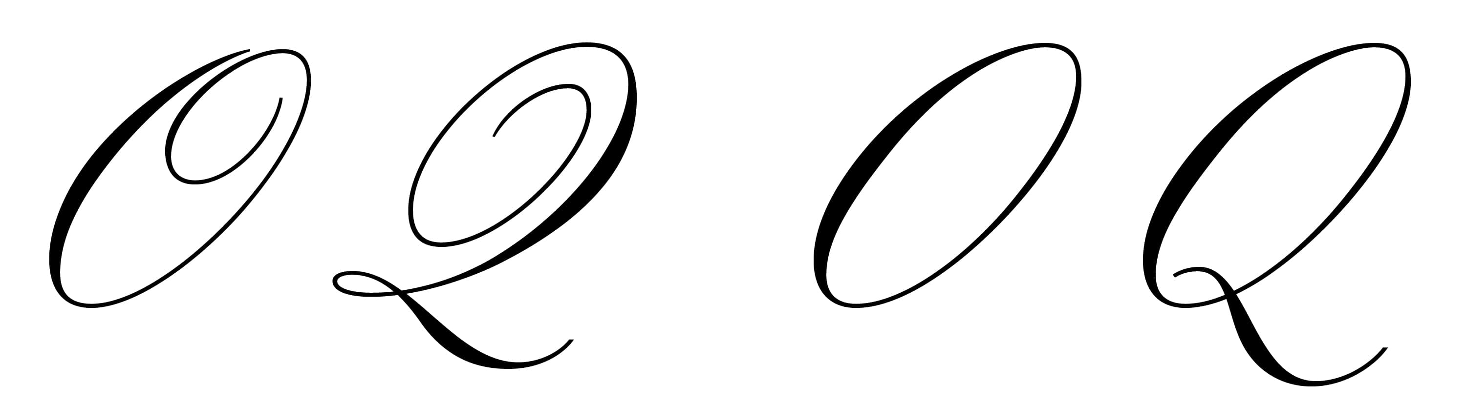
Alternate /O and /Q shown on right.
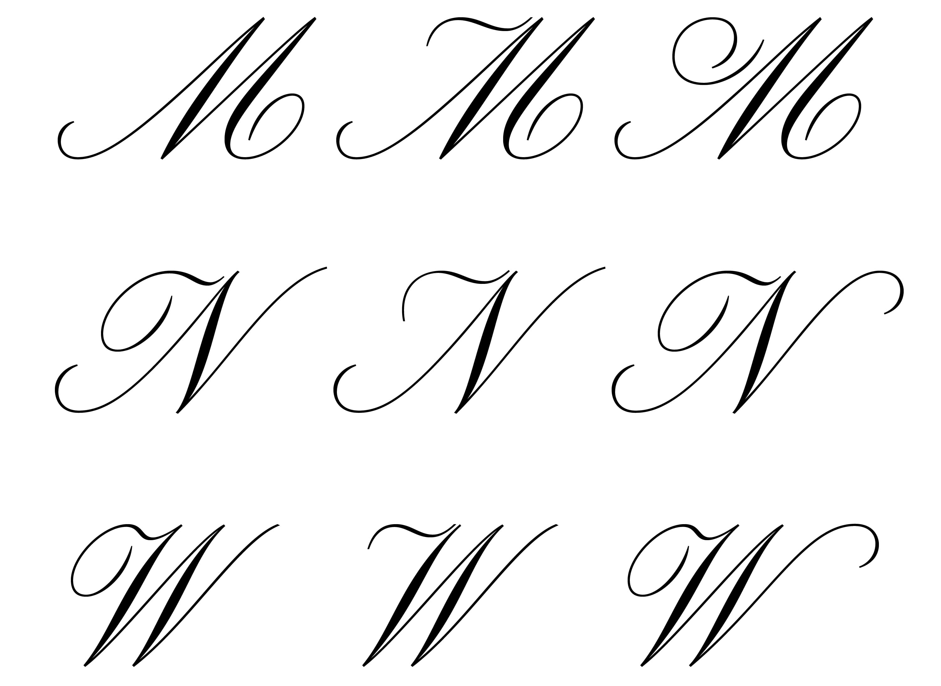
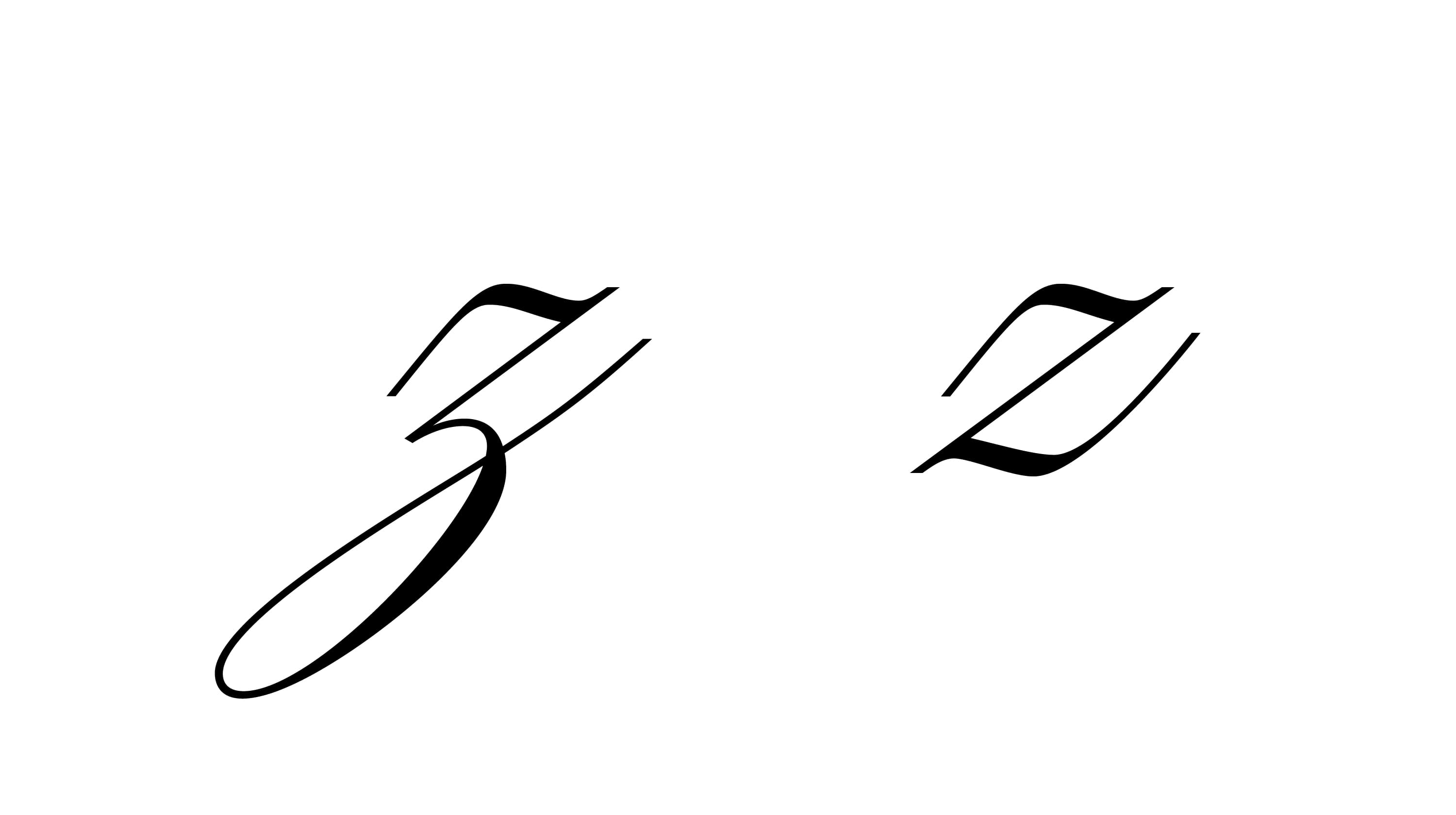
To break the systematic feel, many stylistic alternates and additional elements were added to the main typeface. Different contexts might require different shapes. To name a few: The /G and /z exists in both descending and aligned forms, the /M /N and /W can display two or three different ornamental entry stroke, and the N/W can also extend over the following lowercase, the /w and /y can connect either with a bridge or a flat top, the /h can become loopless, loops are different for each ascender and descender… We have also added two sets of divider lines, based on historical reference. This extra layer resulted from a joint desire to push the design further, an excitement to explore more possible shapes, the will for a complex and playful system and, ultimately, a shared vision towards perfectionism.
The project was delivered in December of 2025 and the typeface has since been used in various branding contexts, most notably during a Met Gala event hosted at The Carlyle in the spring. Its rhythmic finesse works as an independent typeface while sitting alongside the hotel’s original crest in easy harmony. Type enthusiasts are likely well-aware of My-Lan’s Carta Nueva, a virtuosic digital reimagining of a pointed-nib 19th century specimen, which Sharp Type released in 2021. With connected scripts, each typeface requires its own unique system of connections, and while the end result is markedly different from Carta Nueva, it’s not difficult to see My-Lan’s unmistakable rigor conveyed in this project.
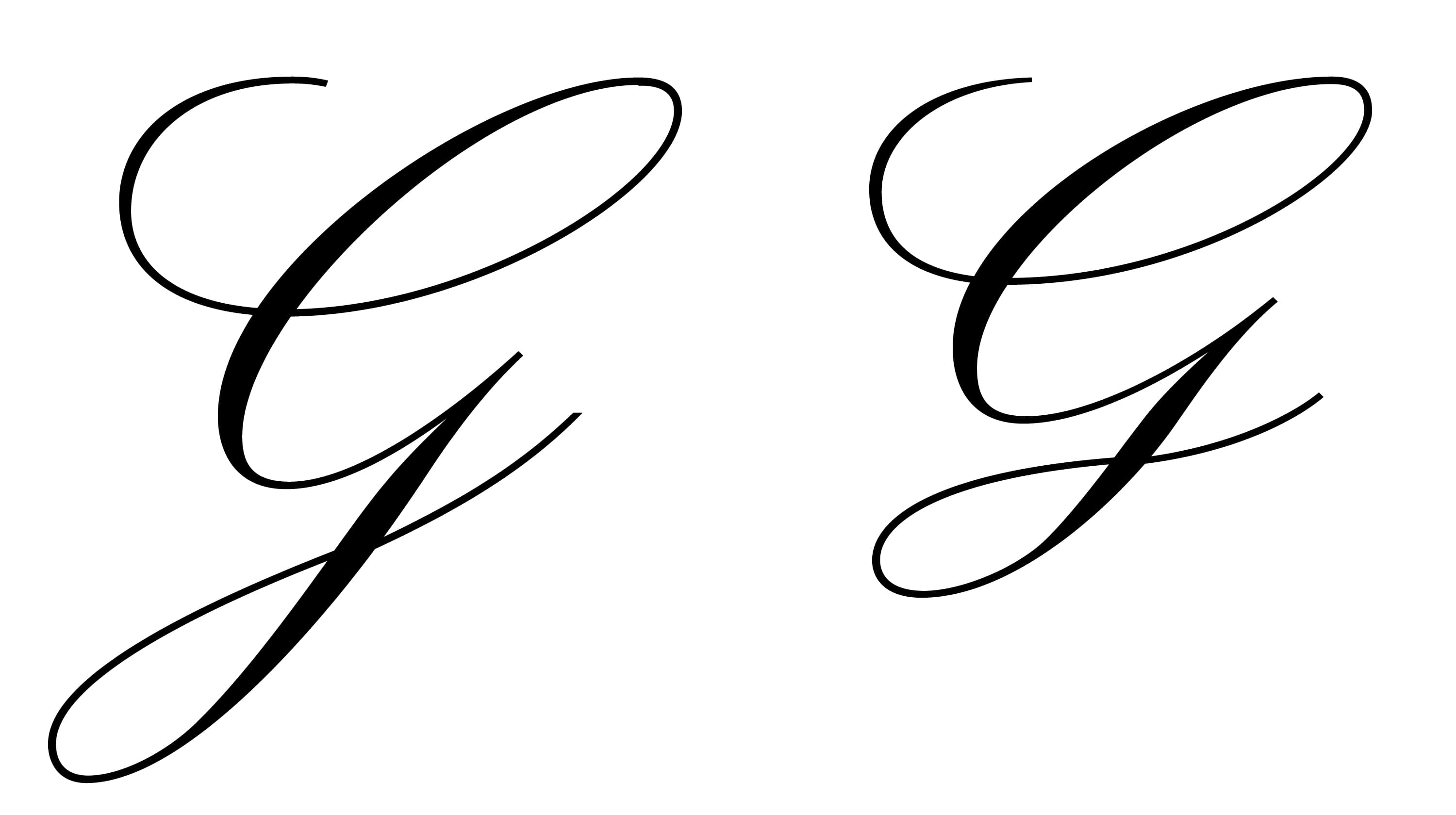
The /G and /z exists in both descending and aligned forms
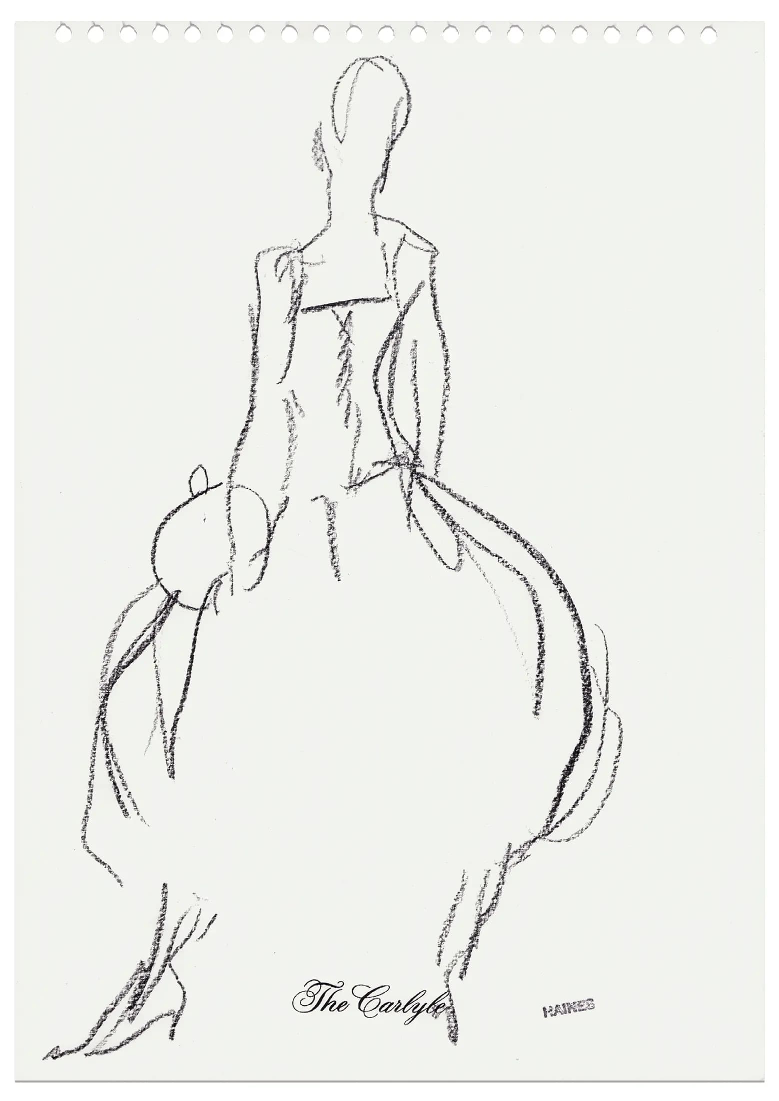
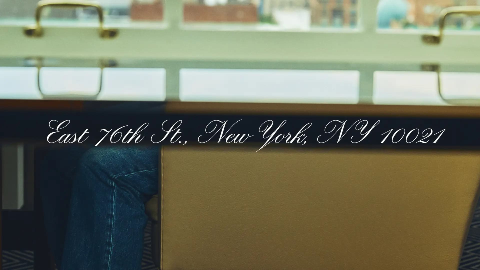
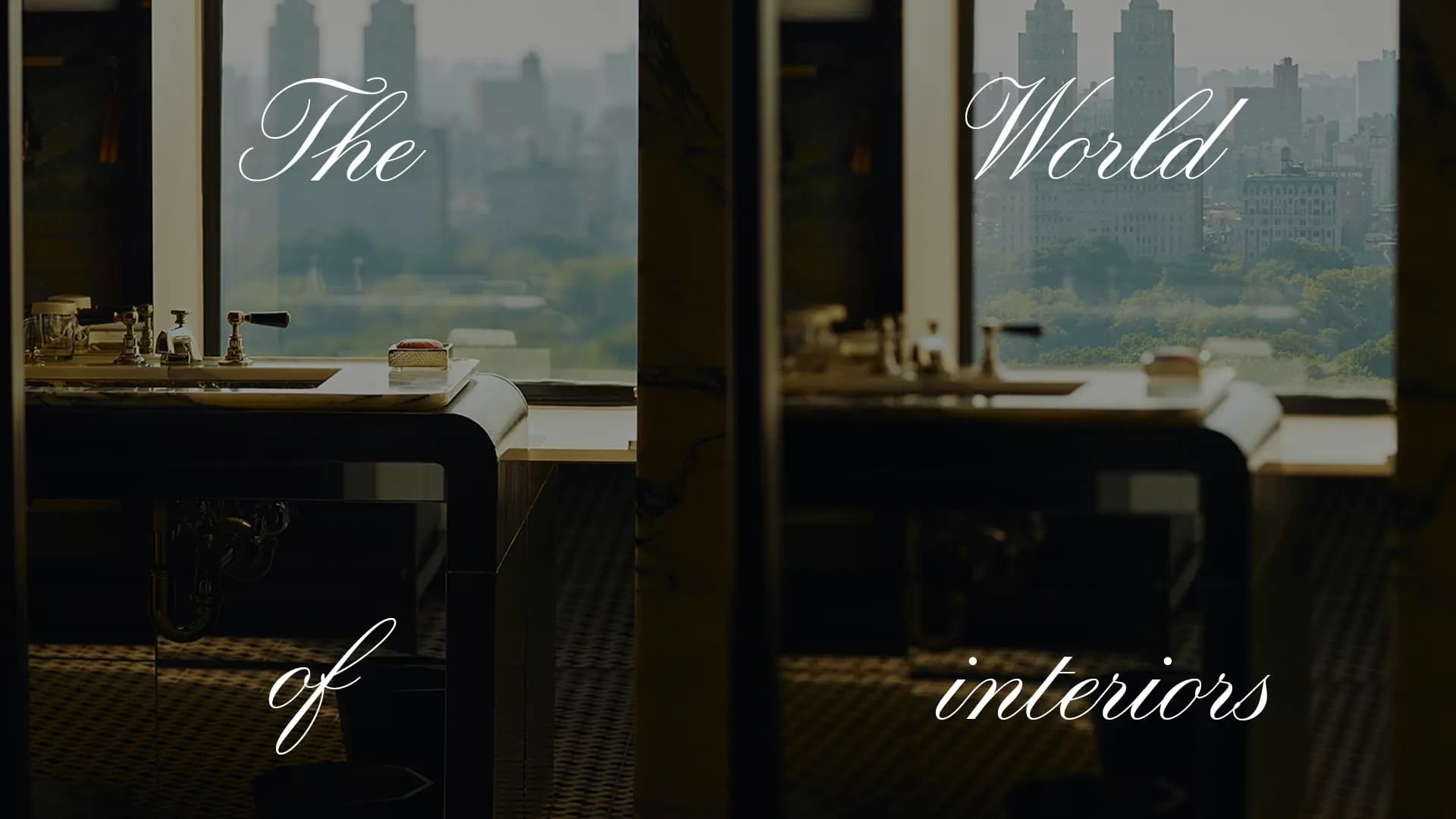
Met Gala Event materials making first use of the new Carlyle Script.
Type Design My-Lan Thuong
Type Director Lucas Sharp
Agency Matthew Roland Bannister
Related
Related