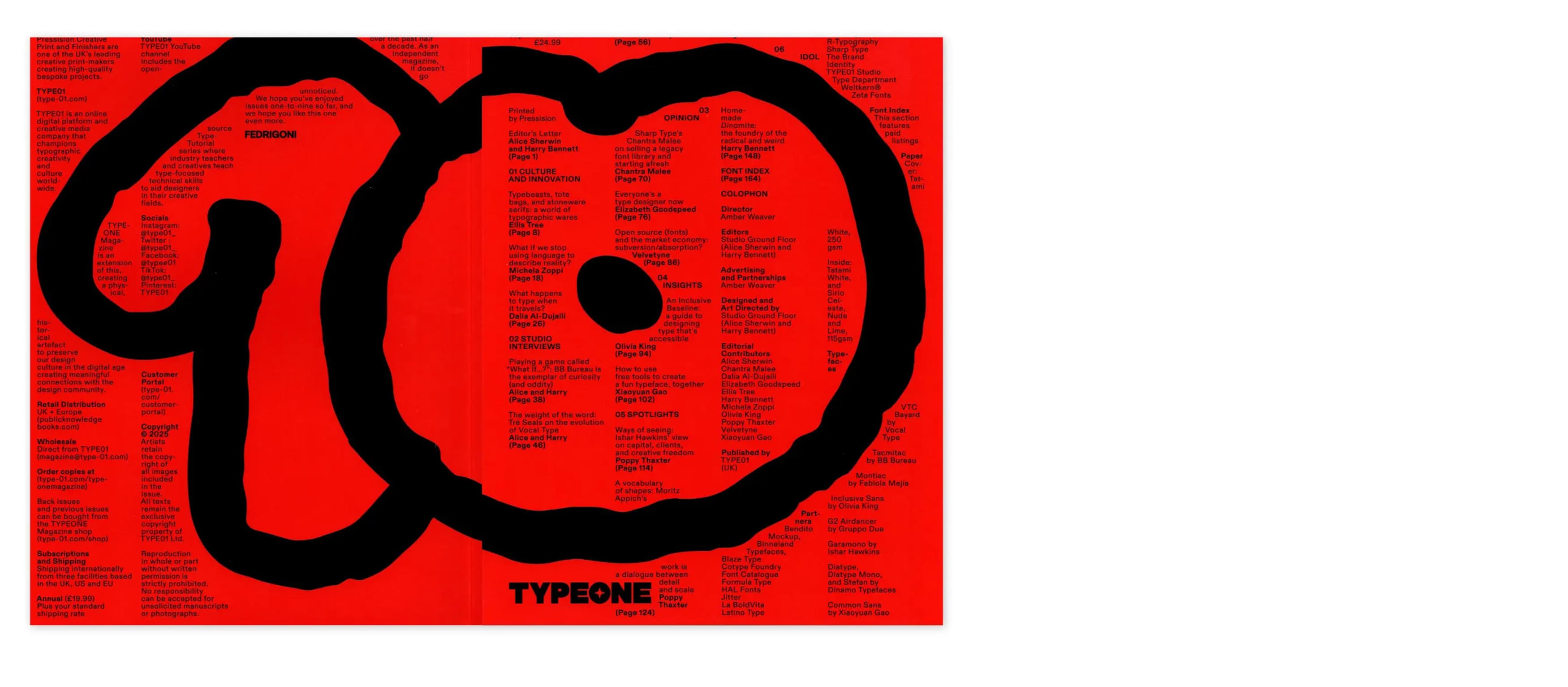
Sharp Type On Defining Tomorrow’s Type Standards—Today
Lucas Sharp interviewed in GRÀFFICA Issue 41
Lucas Sharp interviewed in GRÀFFICA Issue 41
Before we dive into YouTube, we’d love to situate Sharp Type in your own words. You operate comfortably across retail releases, bespoke corporate work, and type that functions as a system component inside products. How do you define Sharp Type today—and what do you want your practice to be known for over the next few years?
L.S – The next few years are about clearance and renewal for us. We've maintained a strong position in the boutique type foundry space for over a decade, and looking ahead, we want to harness the scale and creative strength we've built over that time. We’ve gone from 2 to 10 people and learned a lot in that time and our team is exceptionally strong. We've always been known for the creativity and ambitious scale of our projects, so going into this year and into the future, we're building typefaces to a new standard, both technically and creatively, that are totally unburdened by what came before. Now that we are drawing a whole new library of fonts from scratch, its incredibly freeing to be able to take a second look at some of these styles and bring fresh eyes and an extra decade’s worth of experience to them in a totally unencumbered way.
“We’ve gone from 2 to 10 people and learned a lot in that time and our team is exceptionally strong.”
“We’ve gone from 2 to 10 people and learned a lot in that time and our team is exceptionally strong.”
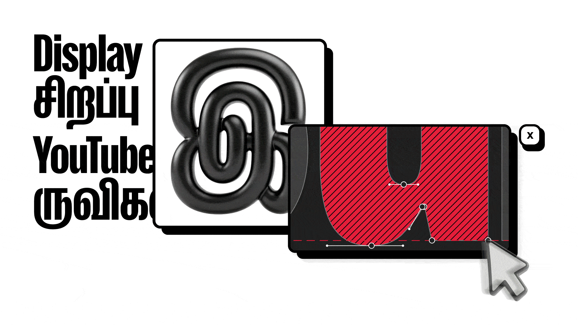
The YouTube typeface is a striking example of typography as platform infrastructure: it needs to live in mobile and desktop UI, product surfaces, marketing, motion, and countless micro-contexts. When a client at YouTube’s scale commissions a new typeface, what is the primary problem you are hired to solve: brand consistency, screen performance, system scalability, global language coverage—or something else that outsiders often miss?
The scale of the brand refresh was really daunting and all respect goes to the design team. When you have something with so much brand equity like YouTube, you really want to kind of dig the roots into that and grow out from there. So when it came to the type system, we were really going off of the classic logotype and drawing something that could be incorporated as a natural extension of that element into a larger design system while also feeling fresh and eye-catching. Since YouTube display is really a brand font and doesn’t have to do much in the actual product, we were able to focus almost exclusively on aesthetics without having to put a ton of energy into engineering screen performance, etc.
Beyond just the technical and cultural challenge of building such an ambitious multi-script typeface with global language coverage, the fundamental problem with a project like this is to achieve brand coherence but also stand out, to make it feel different from other high-end boutique fonts in the genre while also being distinctly YouTube. This doesn’t seem like a daunting challenge, but its a pretty easy aspect to mess up. A lot of times you can get stuck in gimmicky stuff that might make for a nice diagram in the case study but doesn’t actually result in something with a compelling aesthetic.
One detail that fascinated us editorially is how your presentation materials were widely read as a broader YouTube redesign. In other words: typography alone was persuasive enough to shift public perception of YouTube’s identity. From your point of view, what does that episode reveal about the real power of type in a platform brand? Where does a typeface begin and a “rebrand” start—especially in digital products where typography and UI are inseparable in the user’s mind?
Well, not to invalidate your question, but the typeface was part of a pretty significant brand refresh, and I think that this perception speaks to a big aspect of the success of that project. It’s true that the typeface was the real stand-out noticeable new thing, but even though the color barely changed and the classic logo remained intact, there was an insanely robust design and motion system that integrated a lot of previously fragmented sub-brands into something cohesive and super compelling. The motion design was a huge aspect of this, so while a lot of it came down to just seeing this cool new font, so much of the new brand’s impact was HOW the font was used.

Let’s talk about design intent. YouTube needs a typeface that feels recognisably “YouTube” without becoming loud or stylistic to the point of fatigue—because users see it constantly. How did you approach the question of personality versus neutrality? What kinds of typographic decisions carry the most brand weight in a product environment— proportions, rhythm, spacing, terminals, overall colour, or behaviour in motion?
The type is really the aspect I can speak to, and there we were really growing the aesthetic language out of the classic YouTube logo, which is just one of those elements that has too much brand equity to mess with. While we approach our craft rigorously and pride ourselves on our technical expertise, it was really fun to just focus on a display font for this project, because it allowed us to really push the aesthetics in an unencumbered way. So blasting off from the logotype we used the basic specifications of those letters as a recipe and really leaned in to the details, emphasizing, exaggerating, just finding ways to make the bouma pop. YouTube display being a typeface tuned for those brand-voice titular settings, we were really looking for ways to make it ownable and unique without being gimmicky. If I had to point out one detail i’m really proud of, its the super exaggeratedly open apertures in letters like the /a /c /e, etc.
“While we approach our craft rigorously and pride ourselves on our technical expertise, it was really fun to just focus on a display font for this project, because it allowed us to really push the aesthetics in an unencumbered way.”
“While we approach our craft rigorously and pride ourselves on our technical expertise, it was really fun to just focus on a display font for this project, because it allowed us to really push the aesthetics in an unencumbered way.”
Ever since Berton Hasabe drew Druk, the whole condensed sans thing thing has been a big staple of the contemporary typographic palette, and the models have coalesced around this classic “impact” style that favors super tight apertures to maintain the bar-code style texture. Whatever font the original YouTube logo was set in was obviously drawn before this era, and leaning into this detail so hard really differentiates it from this trendy aspect of the genre in a visually compelling way that is authentically YouTube. You end up with this nice peppering of white space in the word shape that you don’t really see in this genre many other places these days.
A core challenge in global product typography is multiscript coherence: maintaining a consistent “aroma” across writing systems without flattening each script’s cultural logic. In a project like YouTube, what does “keeping the same style” actually mean in practice? Is coherence achieved through formal similarity, shared proportions, text texture and rhythm, spacing strategy, or a more abstract sense of tone?
This is a big topic, I would say all of the above with the additional consideration of understanding the fundamental methods of writing (tools/techniques) underlying each unique script and their conventions, as well as the relative semiotic meanings of that particular genre of type within the constituency of each language group. Without understanding how the language is actually written (Latin–pointed-nib diagonal stroke ductus, Japanese–ink brush, etc.) you cant really draw it in a way that feels natural to it’s native readers, and even then you should always work with a native designer to check your work if you ever attempt to go outside your own language group(s). Global typeface production has been a big focus of ours for the last 5 years and we have built an incredible network of collaborators who we work with in a very holistic way. We like to think of these projects as one unified whole and not just a Latin-centric nexus with international appendages, so when we are designing the Latin, as that often comes first (we are a western foundry generally working with western clients), we are thinking about how the construction decisions can reconfigure and rhyme in different ways that can redound to the benefit of the entire system during not after the Latin development.
Projects like this inevitably require complex collaboration: script specialists, engineering, QA, mastering, and constant alignment with internal design and product teams. How do you direct a project at that scale without losing coherence? Which decisions must be centralised, and where do you deliberately defer to script experts or local typographic logic?
Our approach to multi-script typography is a reaction to the flattening homogeneity of first-wave globalization aesthetics. Rather than each script conforming as closely as possible to the specifications of a base Latin design, we develop global script systems holistically, giving each script its due while maintaining a cohesive overall texture and style.
Depending on our level of expertise with a given script, we either approach it directly with the guidance of a consultant, or work with a native designer who executes the artwork. When we undertake to draw a non-Latin script ourselves (I’m personally obsessed with Hiragana) we work iteratively with a native designer who checks our work, suggests ideas, and marks up proofs. When we collaborate with a native designer on a script, we stay deeply involved from the research phase through final execution: suggesting historical models to draw from, weighing construction decisions, checking curve integrity, and ensuring the artwork meets our quality standard.
Both of these collaborative arrangements are fluid and dynamic. We rely on our native collaborators for what convention dictates, but we look for opportunities to be inventive where we can. And because we're building a global type system, we test them side by side in the context of one anoher.
Moving slightly beyond YouTube: the industry has spent years describing variable fonts as the standard that would change everything, yet adoption still feels uneven. From your practical experience, what is actually being used today—and what remains more theoretical? Where are the real blockers: tools, workflows, performance, or the culture of how design systems are built and maintained?
For me, the variable axis always made the most sense in type based mediums, whether as animation in video or browser experiences, so I was big psyched to see that AfterEffects finally added time-based VF support. I agree that uptake has been slow, but I also think its up to type designers to find creative ways to utilize the tech. Our last typeface Rotina by Erik Marinovich and myself had a weight, slant, and Tracking axis which was a novel thing I think designers will find incredibly useful. The tracking axis lets you go from normal letter spacing to super tight-but-not-touching spacing without having to go in and manually kern as you would normally have to. Another cool thing I’ve seen is putting a standard and a monospaced variant into a single variable font with a “mono” axis to get a really interesting semi-mono feel.
Finally, from a foundry perspective: we are living in a moment of abundance—huge libraries, subscriptions, bundles, marketplaces, and now AI-driven tools entering the typographic ecosystem. In this context, where do you believe a contemporary foundry creates lasting value: authorial voice, engineering and performance, systems thinking, deep collaboration with product teams, or a new combination that the industry is only beginning to name?
Yeah I think type design as a service has never been more important, especially as the industry consolidates and expands simultaneously. There is a lot of competition out there but the cream will always rise to the top. And most importantly: there is always a more beautiful way to draw something because the aesthetic zeitgeist is always in flux. When a font is finished, the curves and strokes are fixed in place, but the eyes that perceive them are not. Things don’t look the same as time goes by, and if you want to have stunningly beautiful type you have to keep drawing it for the now.
Related Articles
Related Articles