EC Pinheiros Magazine & Sharp Grotesk
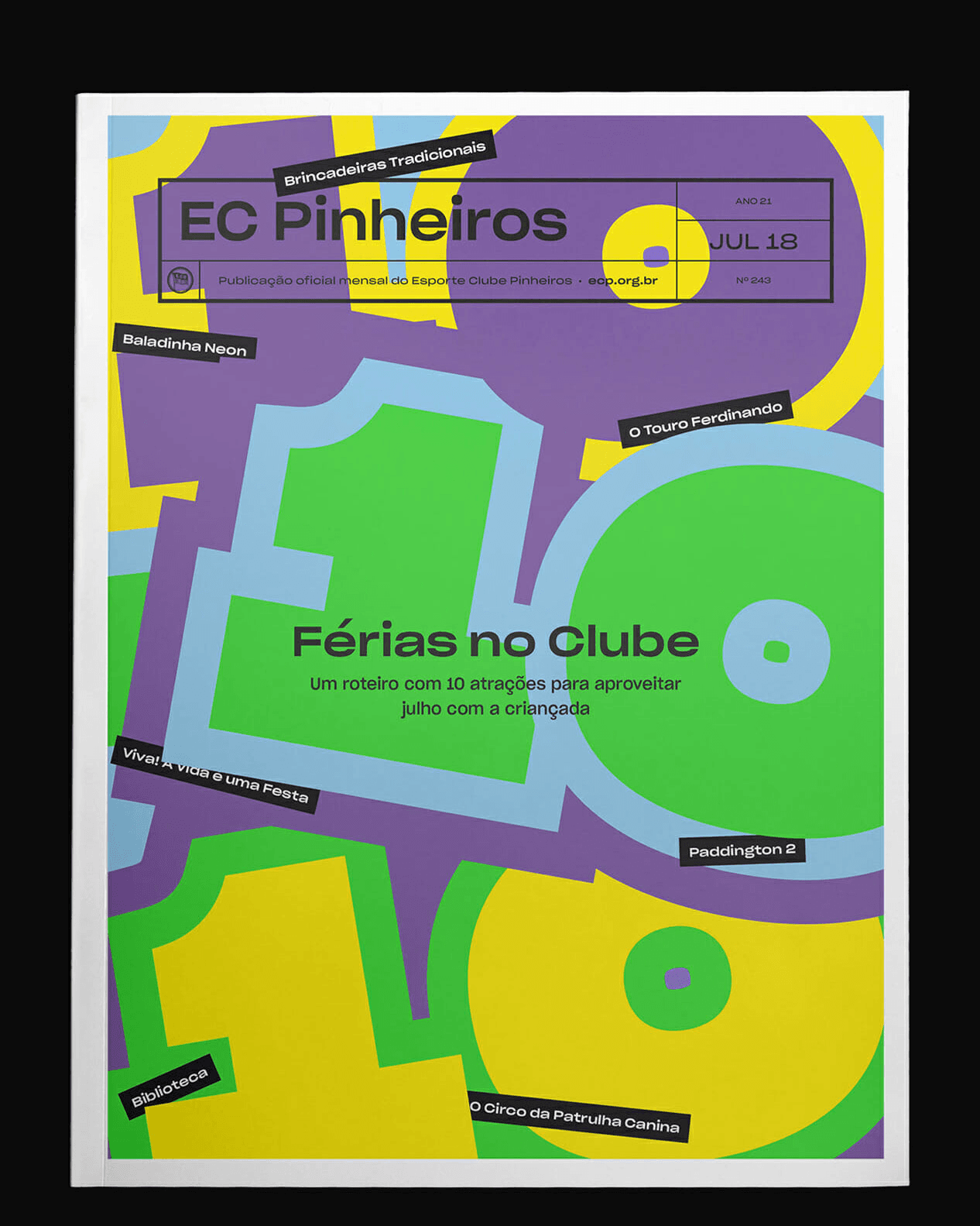
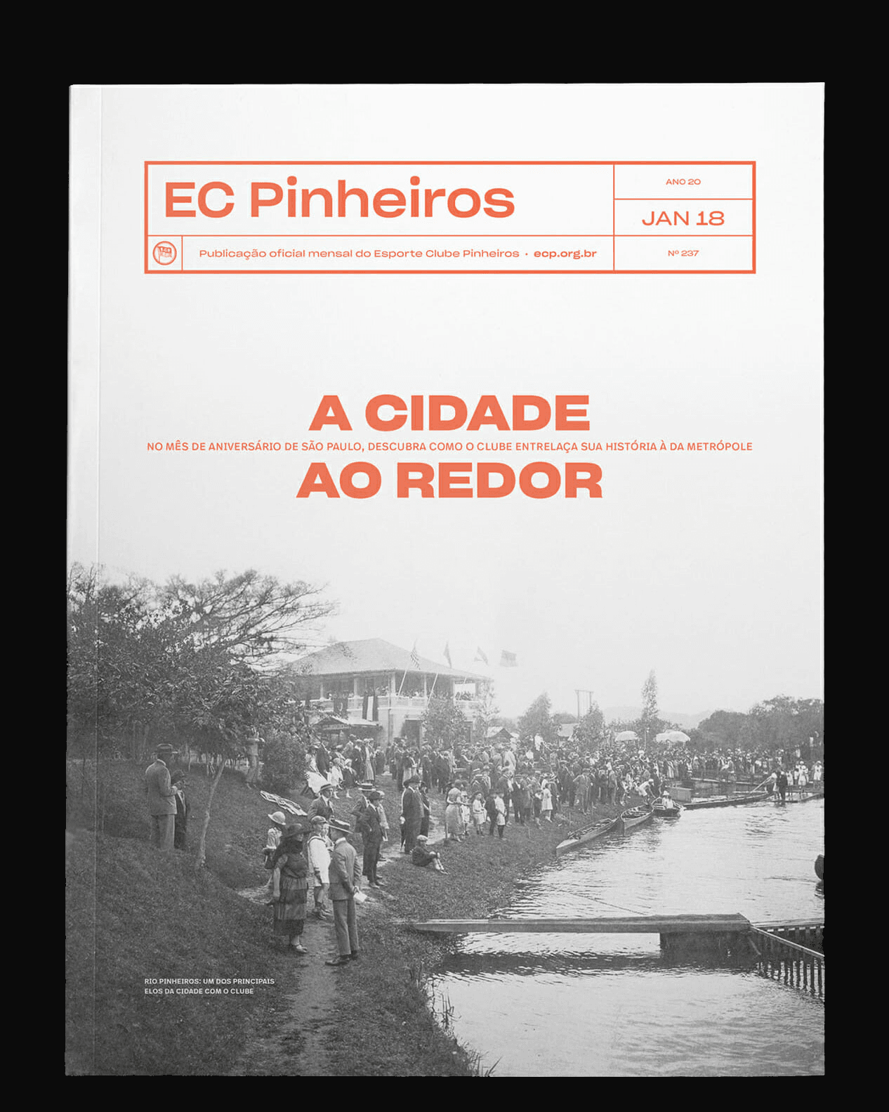
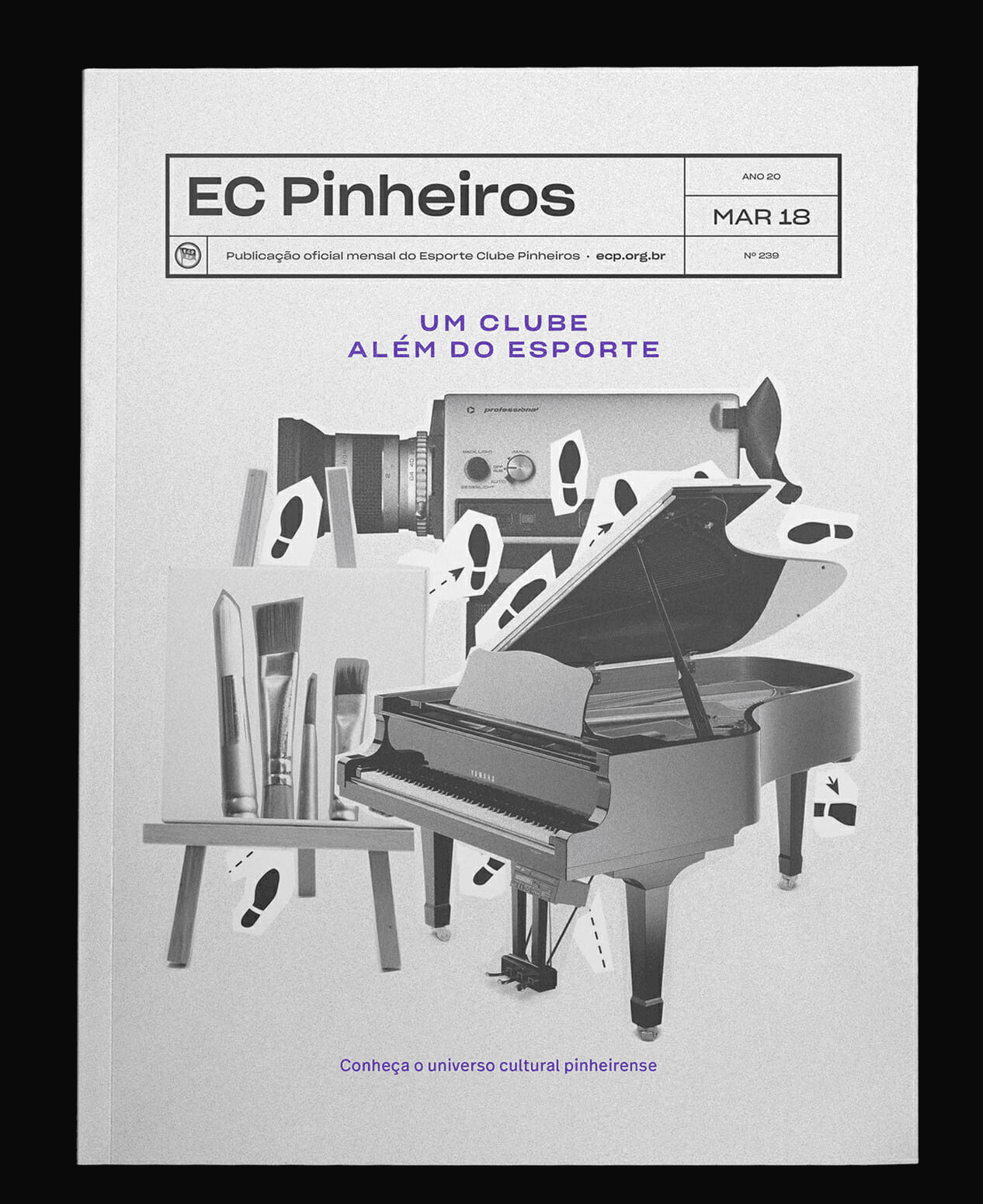
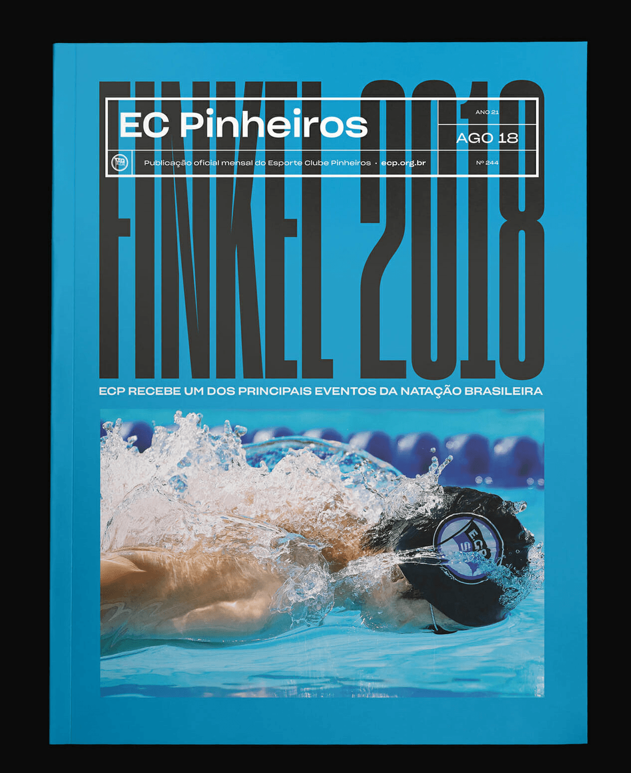
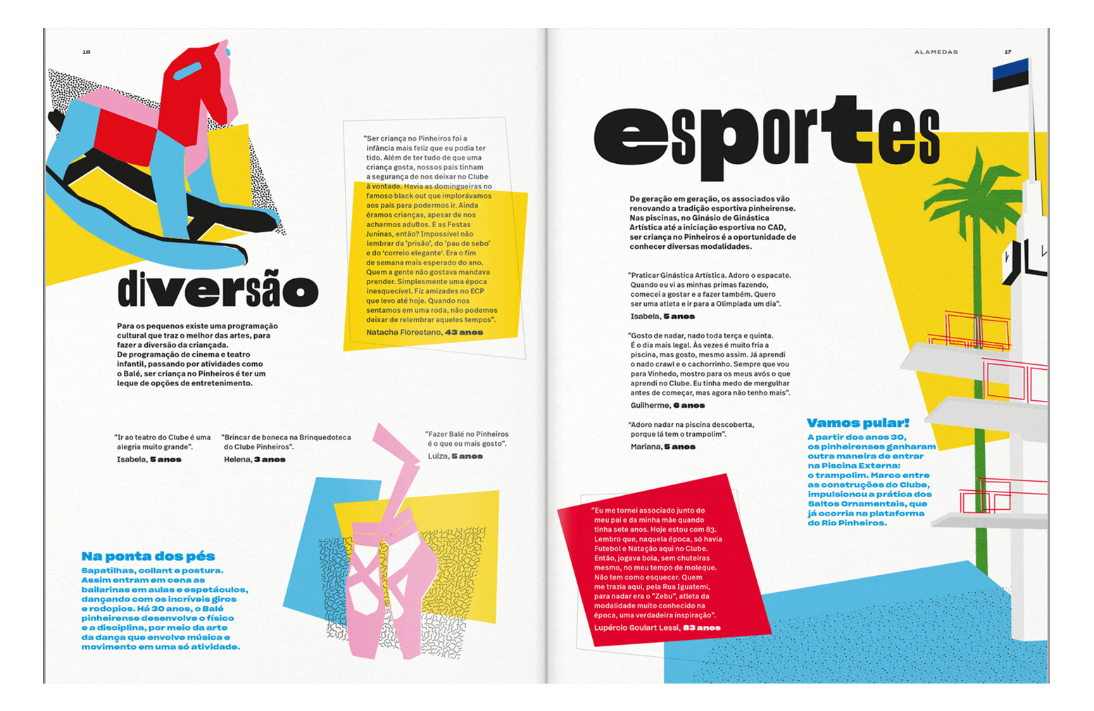
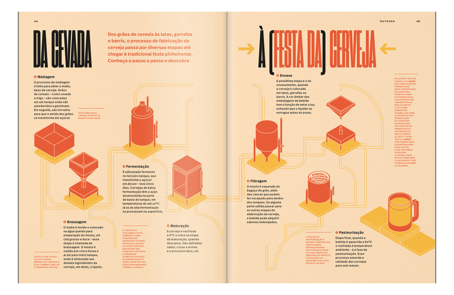
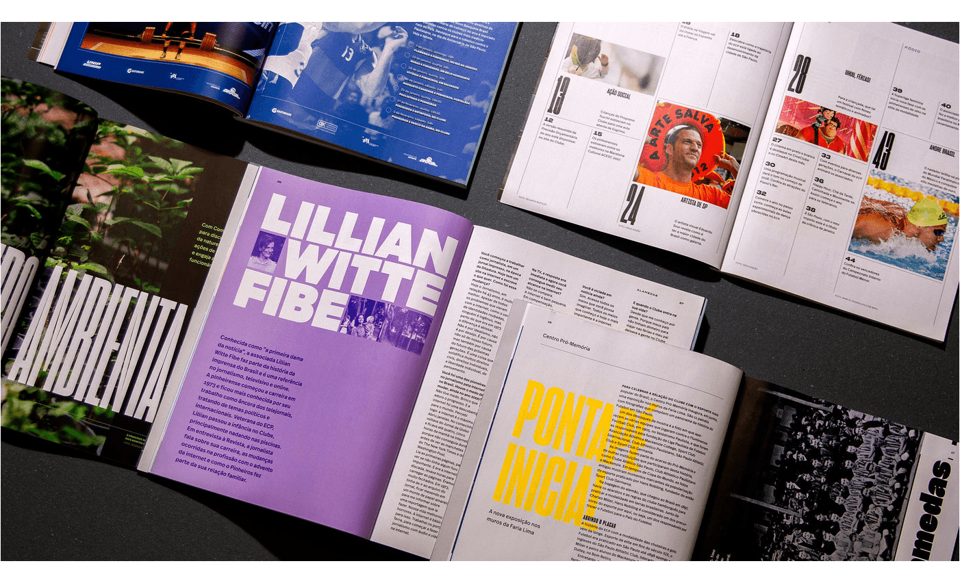
EC Pinheiros is a monthly publication guide that covers Esporte Clube Pinheiros, the largest multi-sport club in Latin America. From 2017 to 2019, the Brazilian studio Polar has designed and art directed the magazine using Sharp Grotesk as a primary typeface. According to the studio, one of the challenges was graphically embracing the club’s eclectic daily life. Part of its solution was found in the magazine’s typography. Sharp Grotesk’s wide range of width and weight informed a system that captured this eclecticism while unifying and creating a strong visual hierarchy for the content.
EC Pinheiros is a monthly publication guide that covers Esporte Clube Pinheiros, the largest multi-sport club in Latin America. From 2017 to 2019, the Brazilian studio Polar has designed and art directed the magazine using Sharp Grotesk as a primary typeface. According to the studio, one of the challenges was graphically embracing the club’s eclectic daily life. Part of its solution was found in the magazine’s typography. Sharp Grotesk’s wide range of width and weight informed a system that captured this eclecticism while unifying and creating a strong visual hierarchy for the content.
Client: EC Pinheiros Magazine
Designer: PolarTypeface: Sharp Grotesk
Show us your latest project using our typefaces by getting in touch or tagging us on social media.
IG: @sharp_type TW: @SharpTypeCo