Cordier Script for Theaterbaren
Neo-Baroque grandeur meets neo-Rococo interiors, classical Greek and Roman ornament, and Art Nouveau vitality.
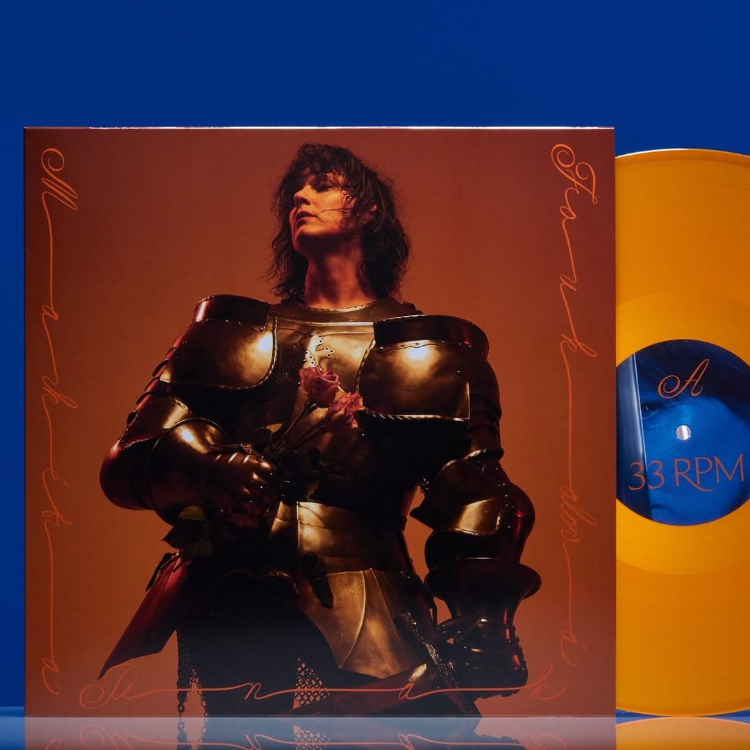
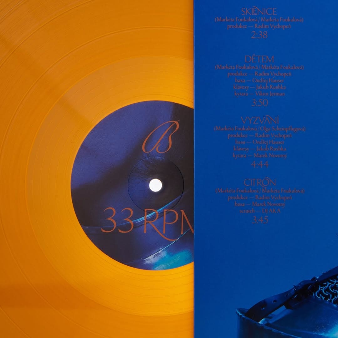
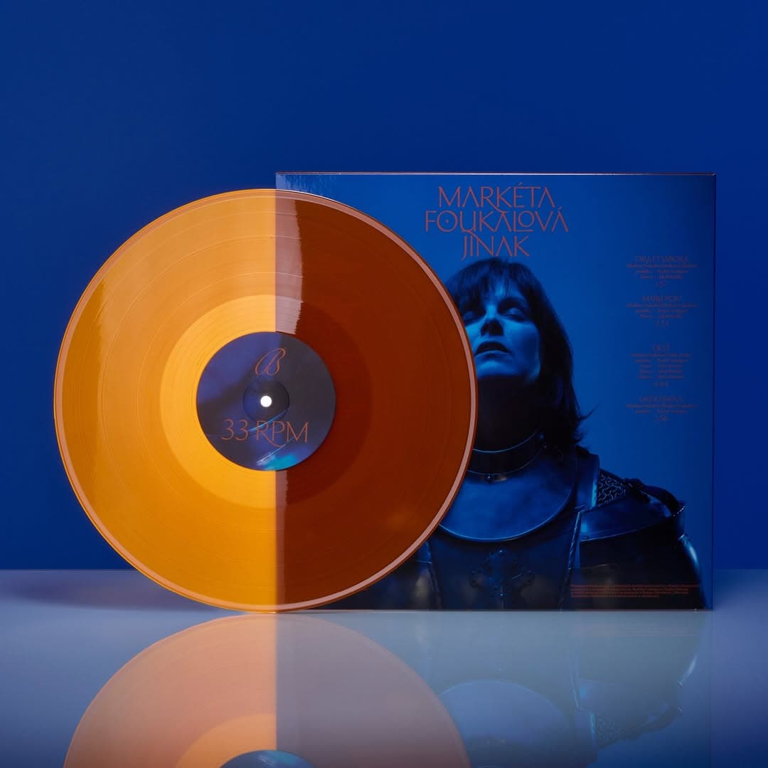
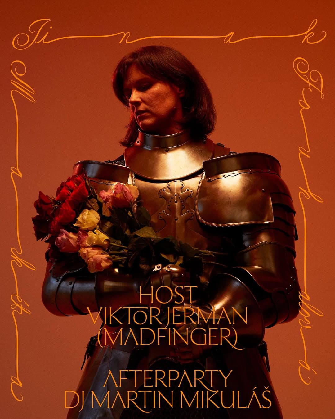
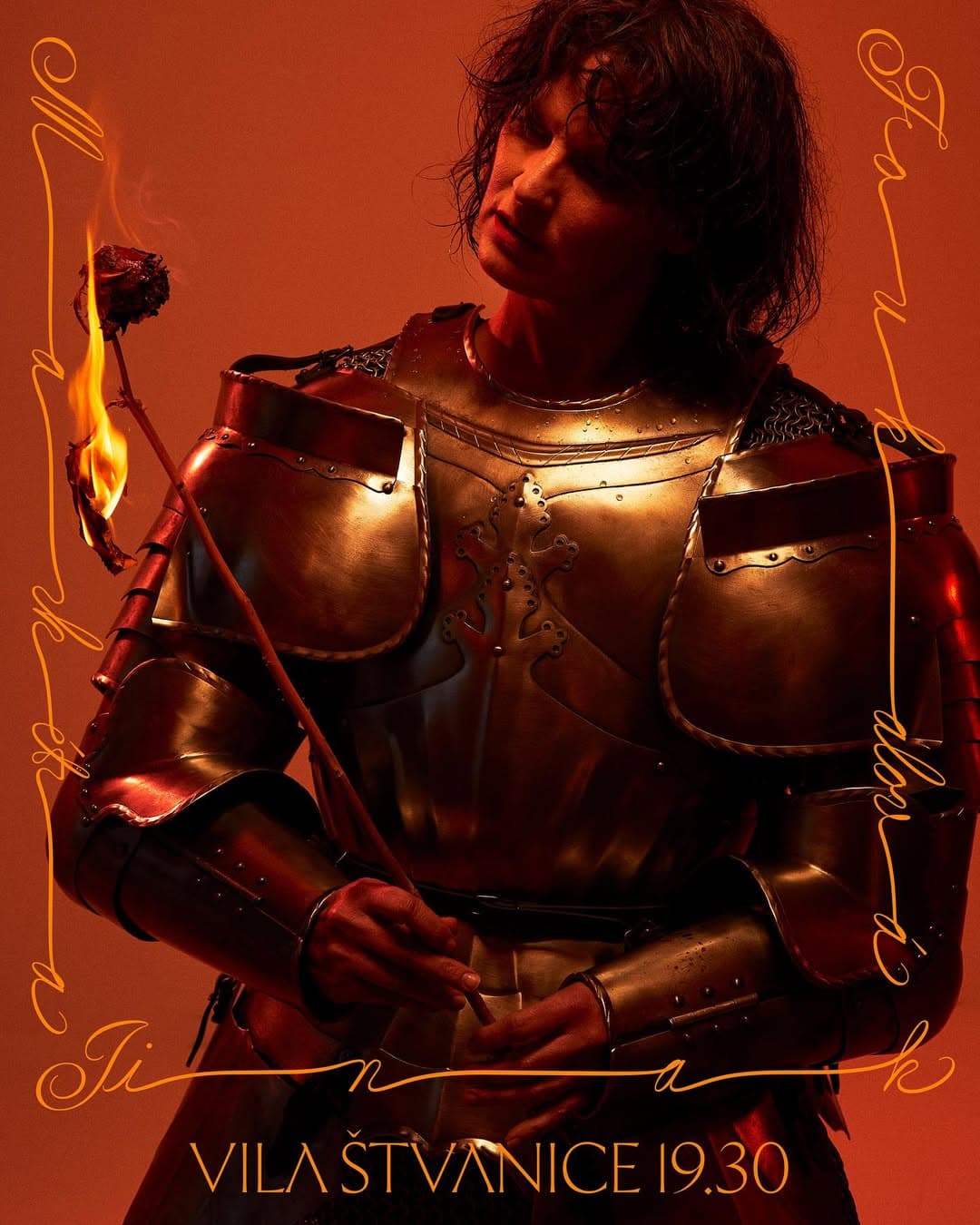
The album resists immediacy and commercial formulas, instead inviting a more active, reflective engagement from the listener. Her art direction combines the calligraphic dynamism of Cordier Script—rooted in 17th-century penmanship yet reinterpreted with expressive fluidity—with the sculptural elegance of Ceraph, a contemporary flared serif balancing classical structure and humanistic softness. Together, these typographic choices echo the album’s core tension between tradition and reinvention, intimacy and form.
Client: Theaterbaren
Designer: Josefina Karlíková
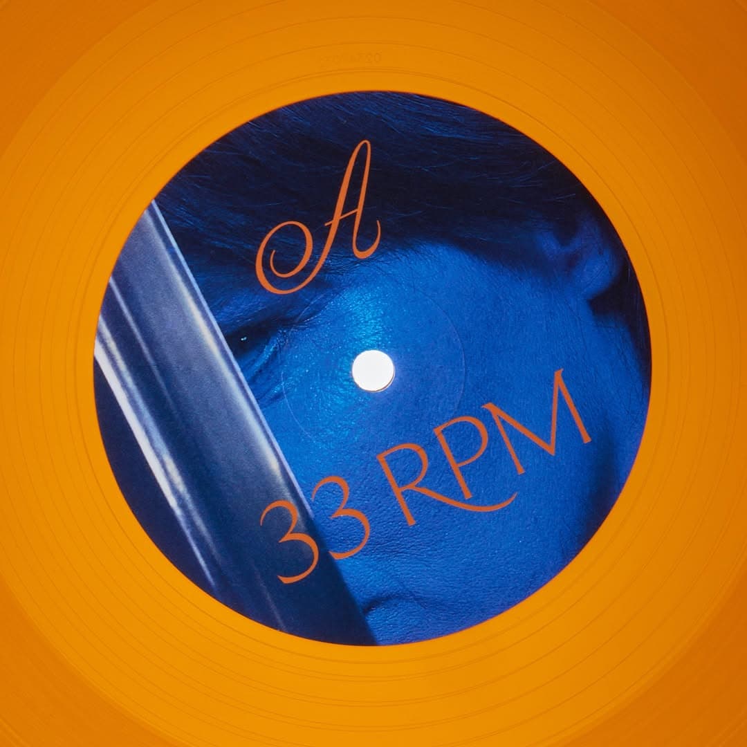
Typeface: Ceraph & Cordier Script
Show us your latest project using our typefaces by getting in touch or tagging us on social media. IG: @sharp_type TW: @SharpTypeCo
Featured Fonts
Featured Fonts