Calligraphy, Curiosity, and Craftsmanship: Examining Themes of My-Lan Thuong’s Work
Calligraphy, Curiosity, and Craftsmanship: Examining Themes of My-Lan Thuong’s Work
Calligraphy, Curiosity, and Craftsmanship: Examining Themes of My-Lan Thuong’s Work
- TYPE01
By Poppy Thaxter - July 9, 2025
- Type Foundries & Studios, Industry Interviews
Typeface design is an intricate art that thrives on details, but what happens when designers zoom out to embrace the broader socio-political and cultural landscape? My-Lan Thuong, a Vietnamese-French designer at Sharp Type, exemplifies this approach, weaving her unique perspectives into both the concepts and aesthetics of her work. Her journey began by working with Coppers and Brasses, on projects such as the type family for Radio Canada and the release of Baryton, ultimately leading to her current role at Sharp Type.
Over the past six years at the USA-based type foundry, she has gone from strength to strength, contributing to major bespoke client projects, including Prime Video, Twilio, and Williams College, as well as developing retail typefaces and families. Carta Nueva, for example, is a digital reinterpretation of a pointed-nib calligraphy model from 1851 and has been used by both the Festival de Cannes and Nike. Furthermore, she has directed Sharp Type’s extensive OmniLatin research project, sharing her findings as a speaker at international type conferences.
Elegance and Timelessness
Elegance and Timelessness
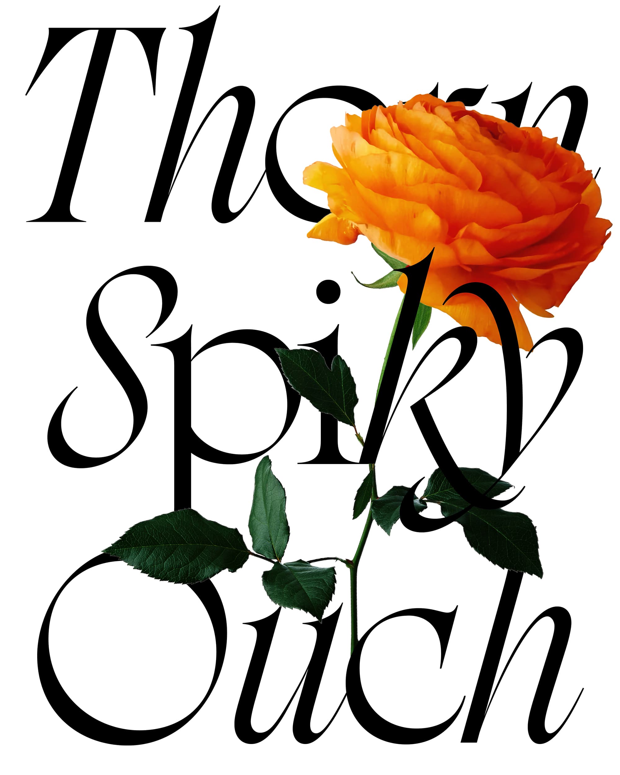
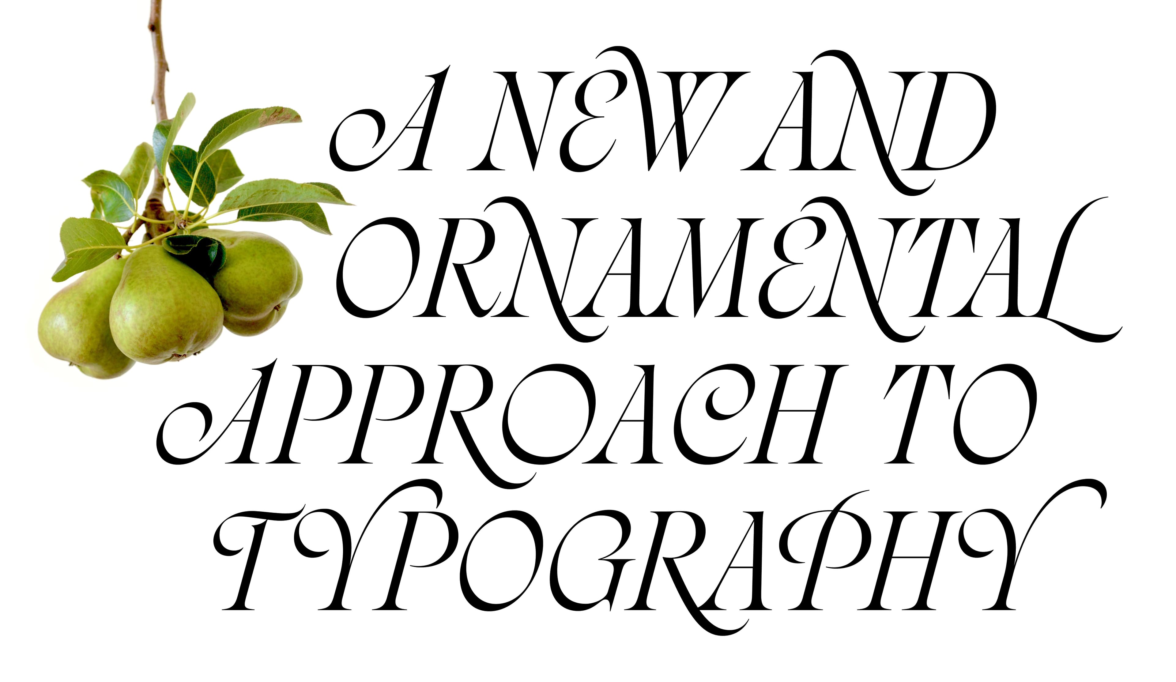
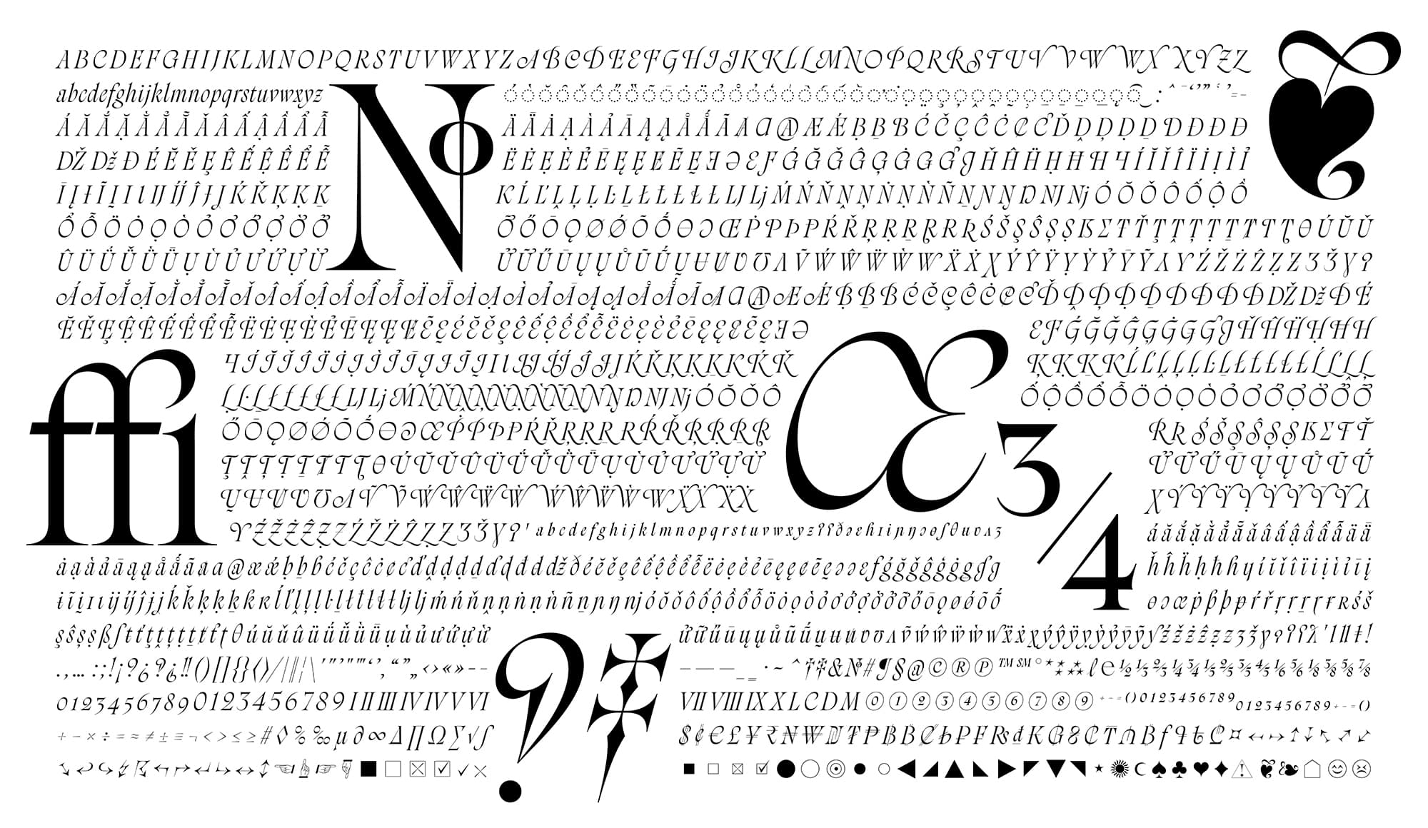
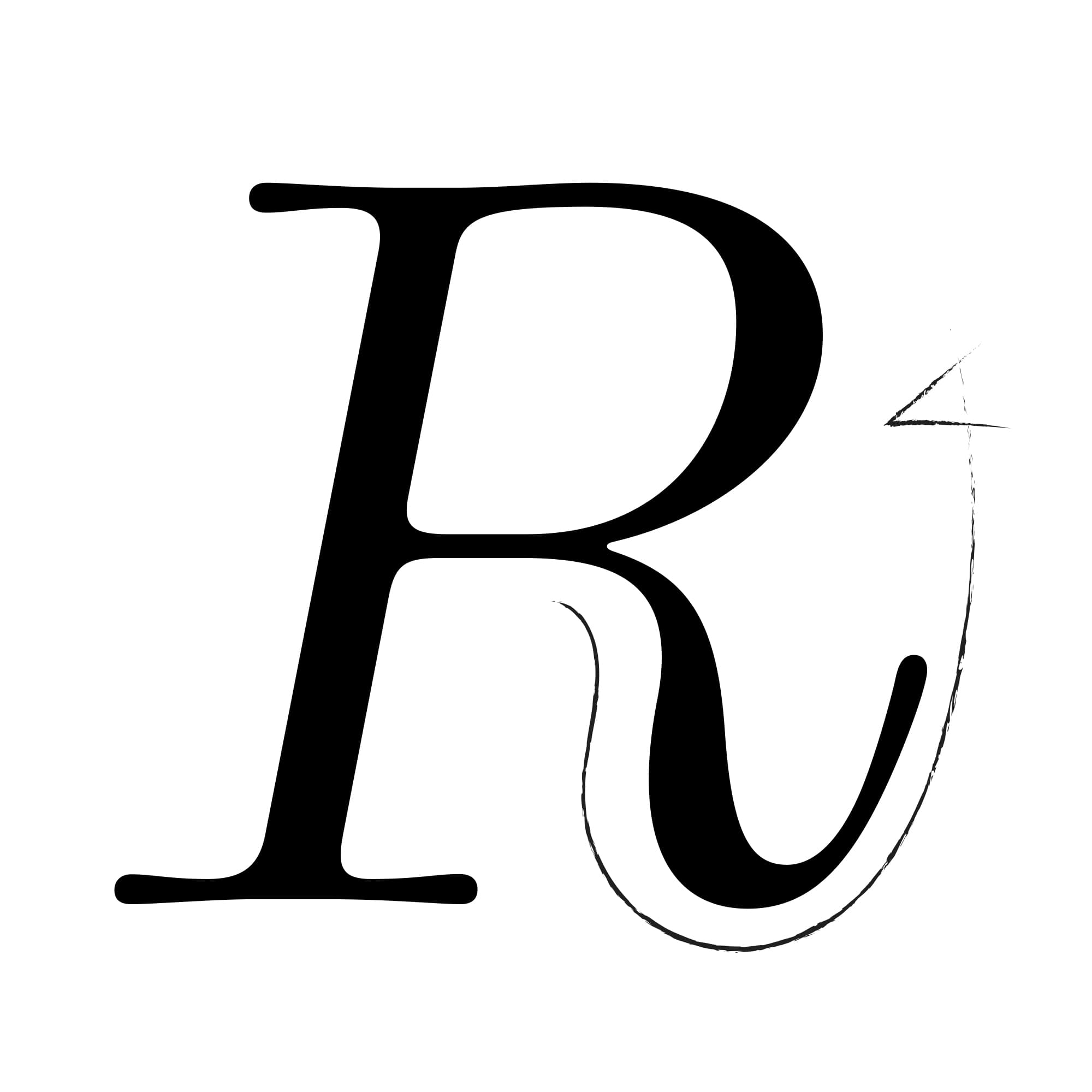
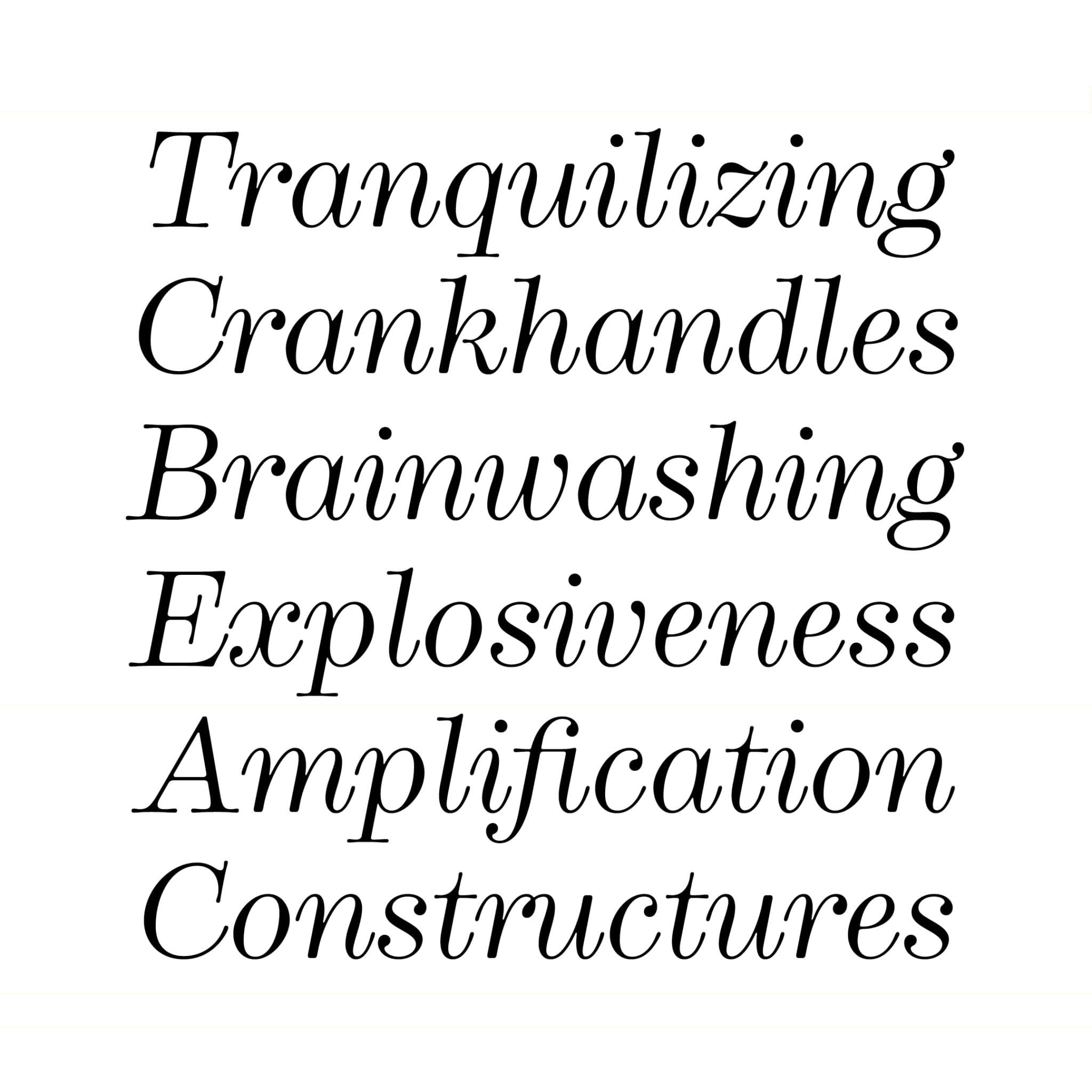
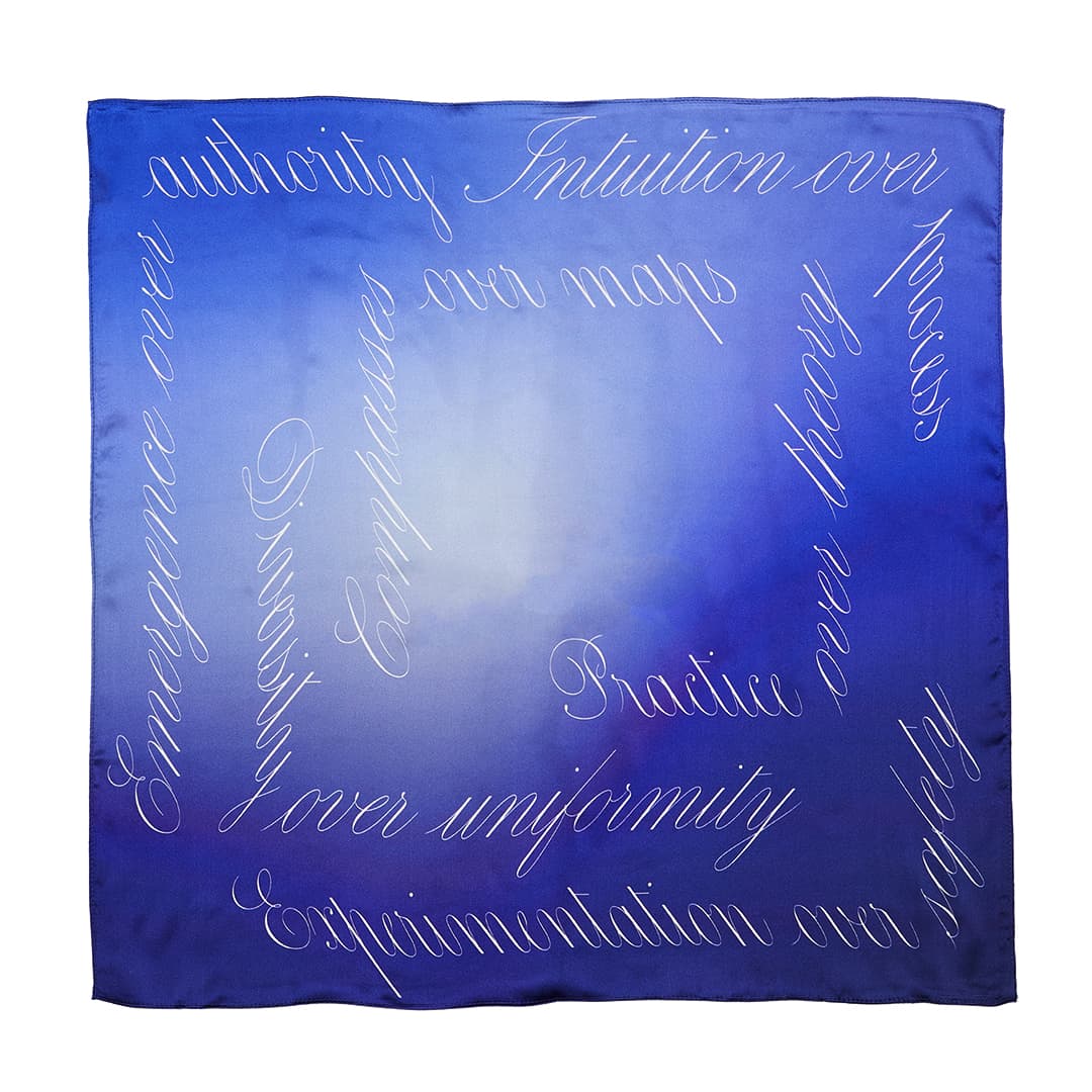
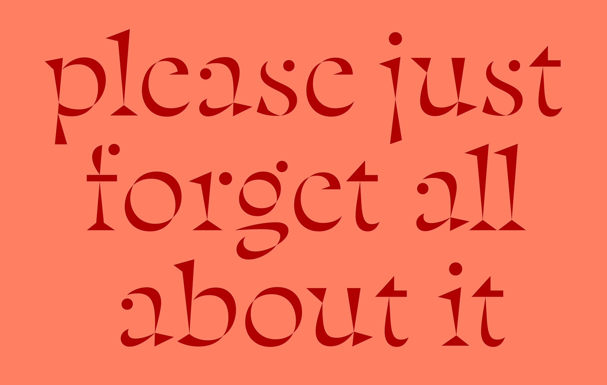
Rosalie, Thuong’s latest release, has received high praise and recognition, winning awards from the prestigious Type Directors Club, D&AD, and ADC. For her, this response has been “both very heartwarming and surprising,” having dedicated so much time refining the typeface. “Rosalie is such a special design, I was very unsure people would like it, or even if I did anymore either.”
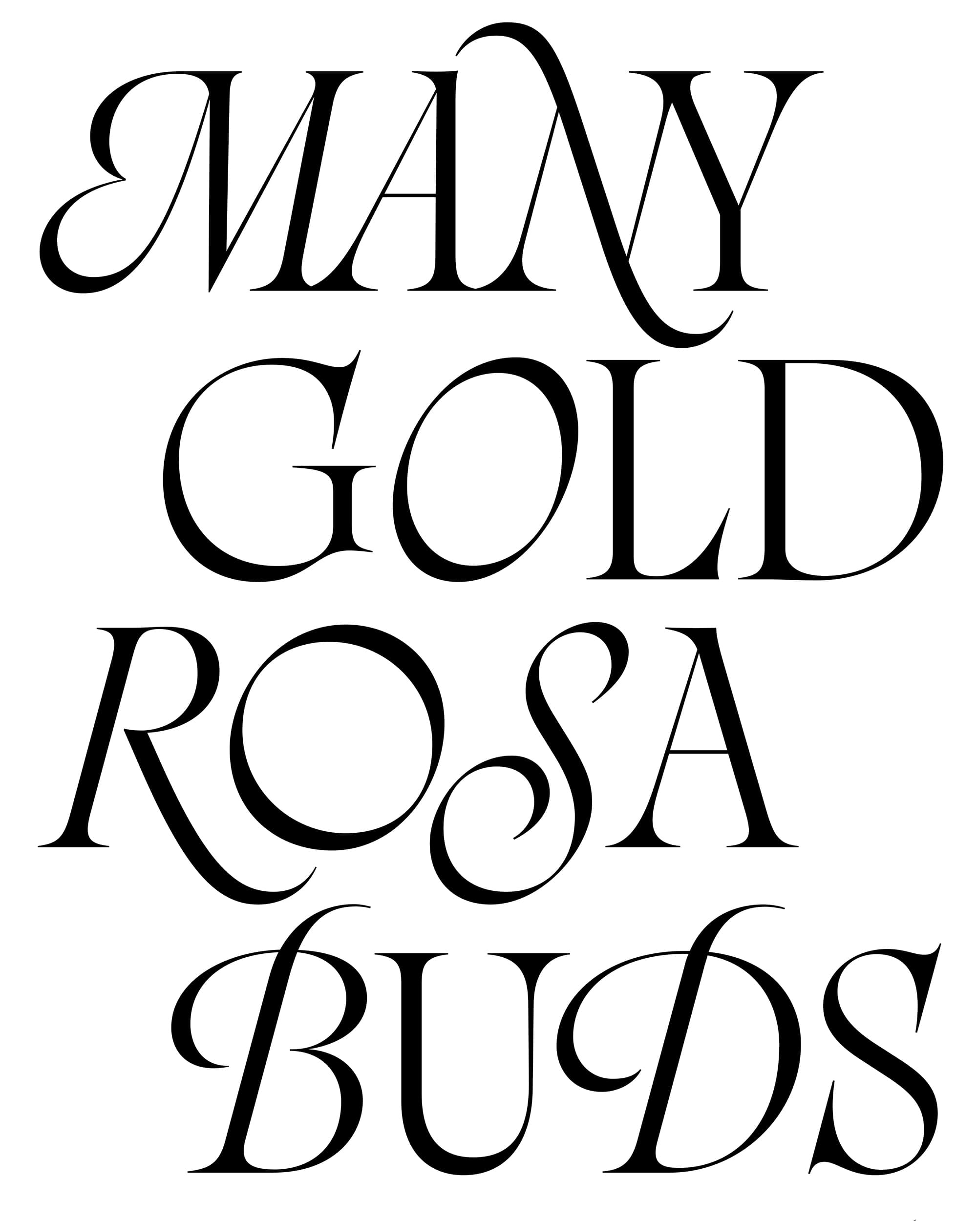
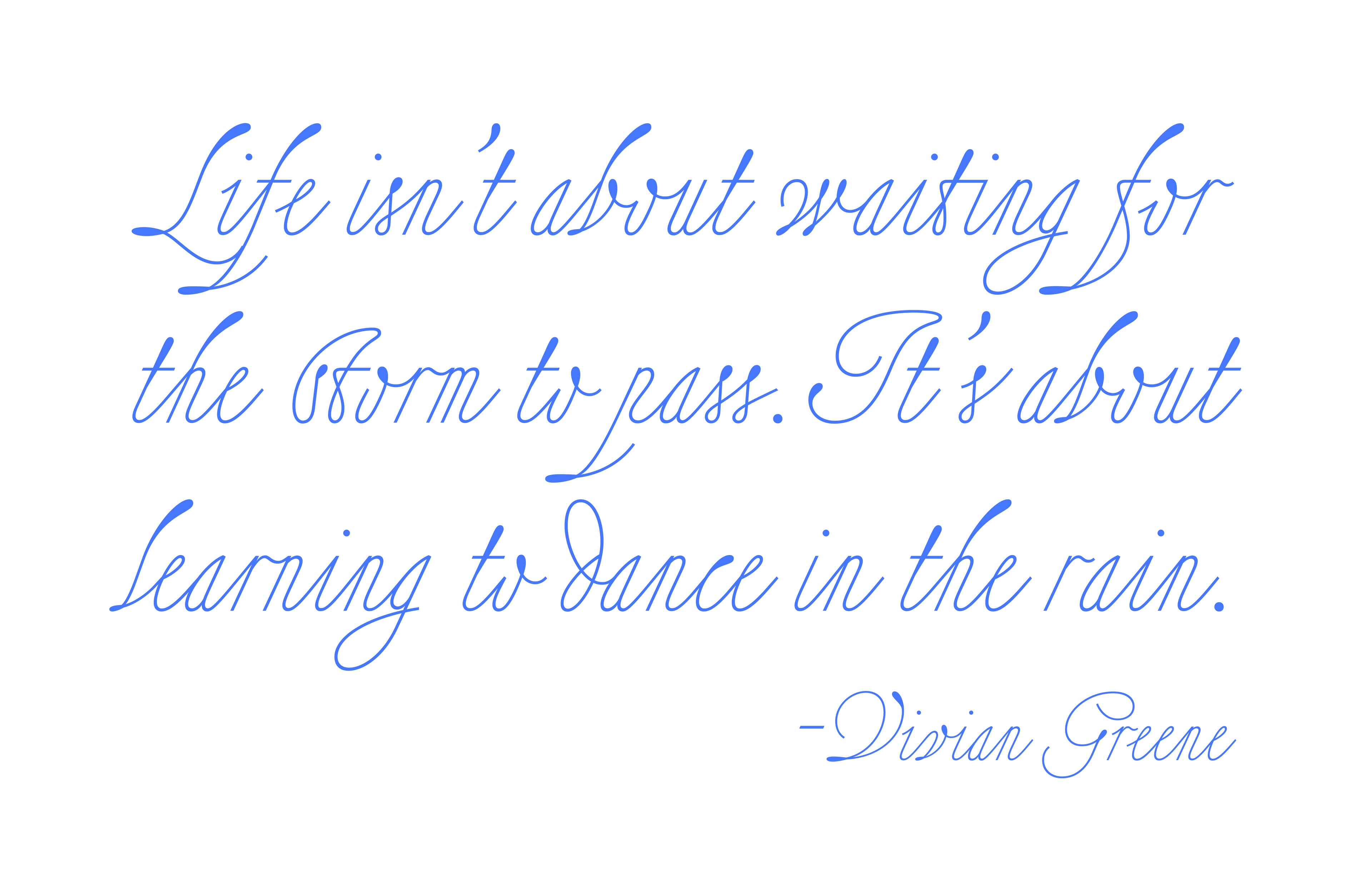
Following six years of development, every curve, taper, stroke, spine, and serif has been rigorously refined, resulting in a sophisticated and effortlessly flowing set of glyphs. The starting point of this typeface sets the scene — the Collégiale Saint-Aubin (a 12th-century church) on a rainy day in the medieval French town of Guérande. The lettering on the walls was unlike anything Thuong had encountered in her career.
Mesmerised by the dualities of its style — fussy yet elegant, medieval yet timeless — she explored how she could adapt the lettering to suit a more contemporary landscape — something more functional yet resonant with the spirit of the original. “It has been a strange quest and long journey to reconcile my temptation to draw quirky letterforms and my intention to make them both beautiful and functional,” she reflects.
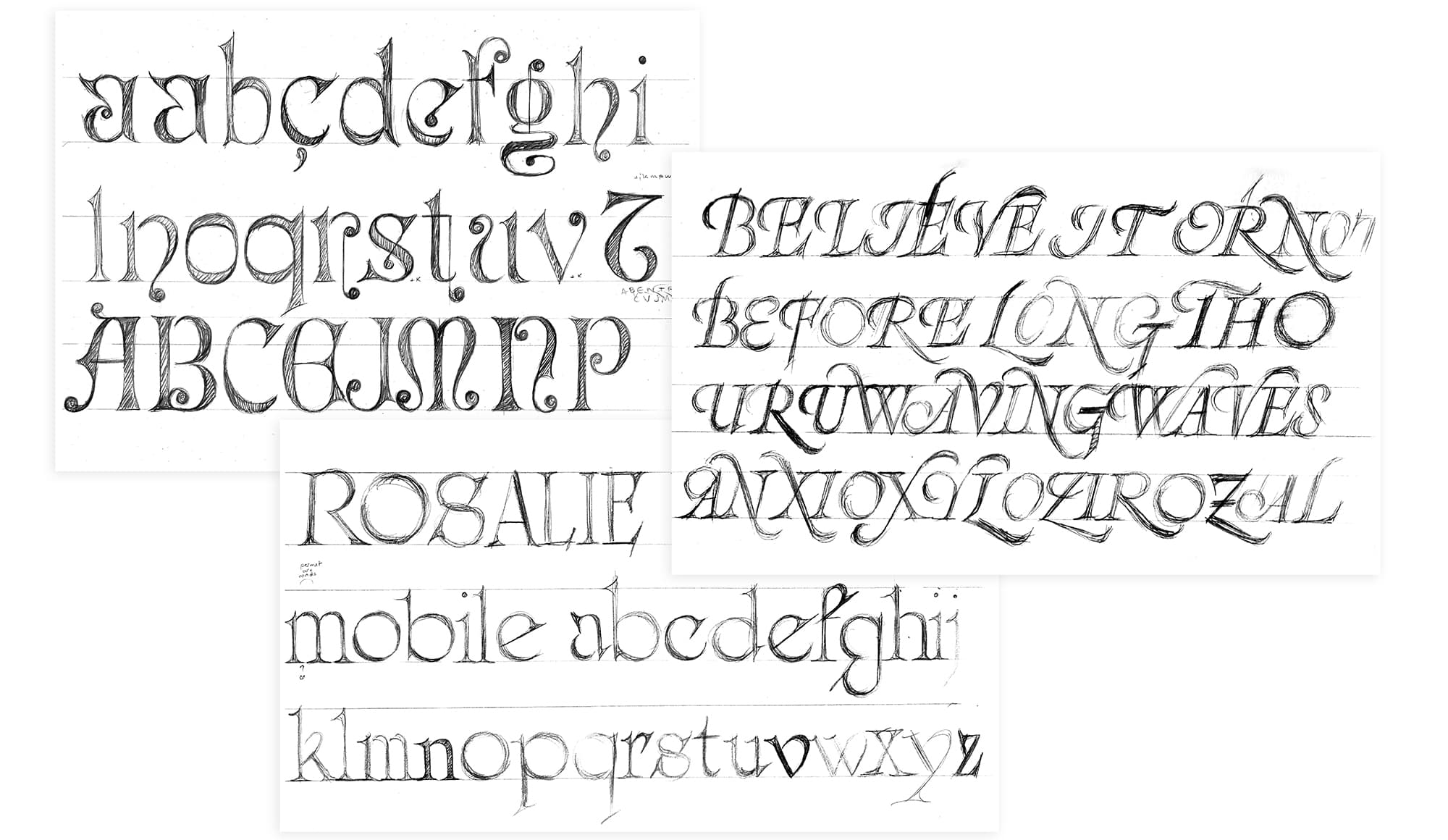
A self-confessed perfectionist, Thuong reveals that it took some time to build up the courage to publish it. “It was sort of the first time I published one of my own designs, and it was terrifying to share it with the world. Yet, I had spent so much time refining it and given it so much care, I wanted it out.” And what an impact it’s had! “I really didn’t expect it would get such a response,” she tells us of its reception from both designers and awards.
“I have been very moved to see it resonate with other people. It is a powerful encouragement for me to continue working on my designs, giving them a lot of care, and sharing them. I am very grateful.”
Calligraphy and Movement
Calligraphy and Movement
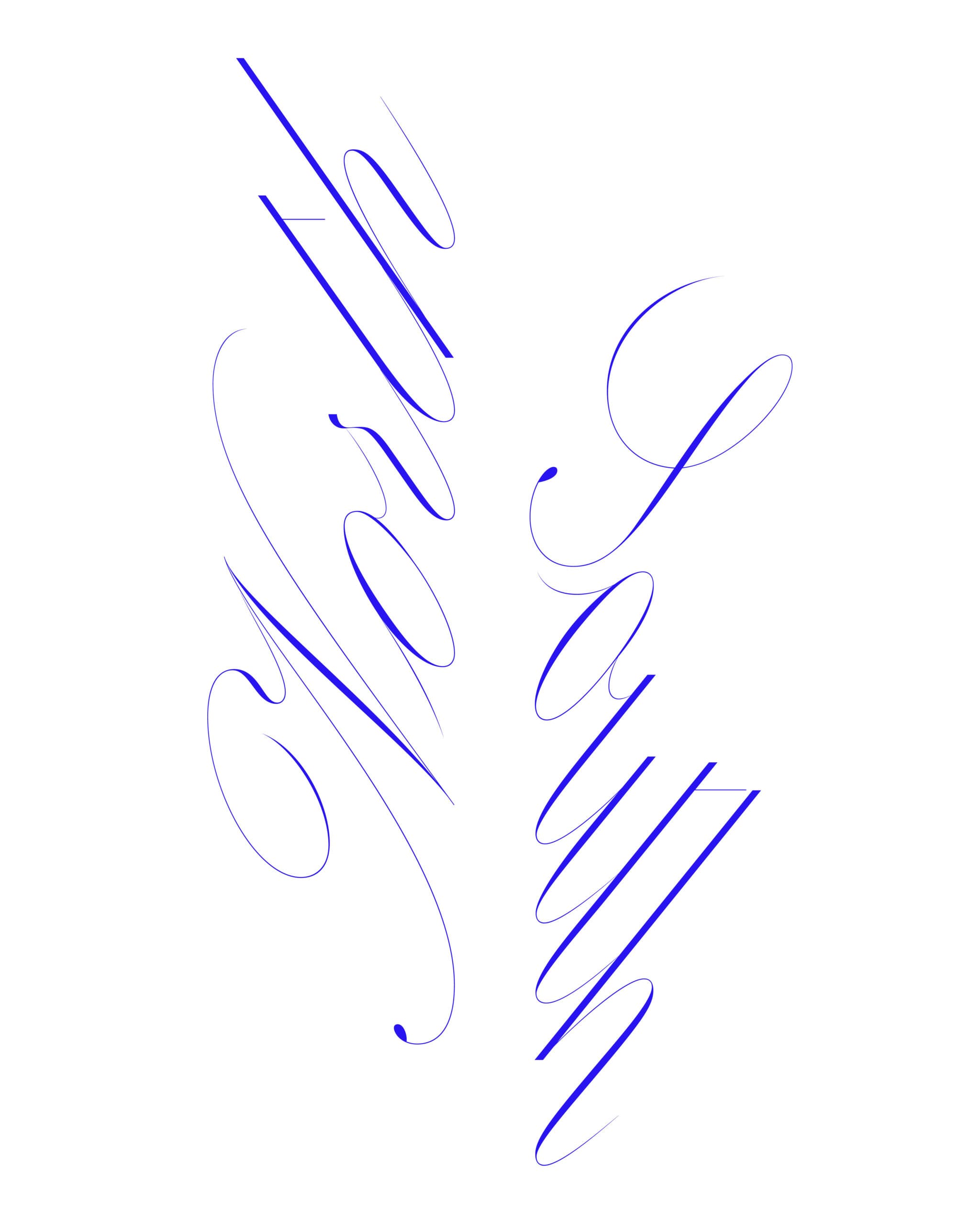
As demonstrated in her typeface, Rosalie, Thuong’s approach to typography is contemplative and thoughtful, grappling with conflicting elements to produce sophisticated and functional typefaces, driven by a passion for the art of type design. A meticulous and innovative designer, she embraces both elegance and complexity in her work, with a particular affinity for the expressive nature of italic styles.
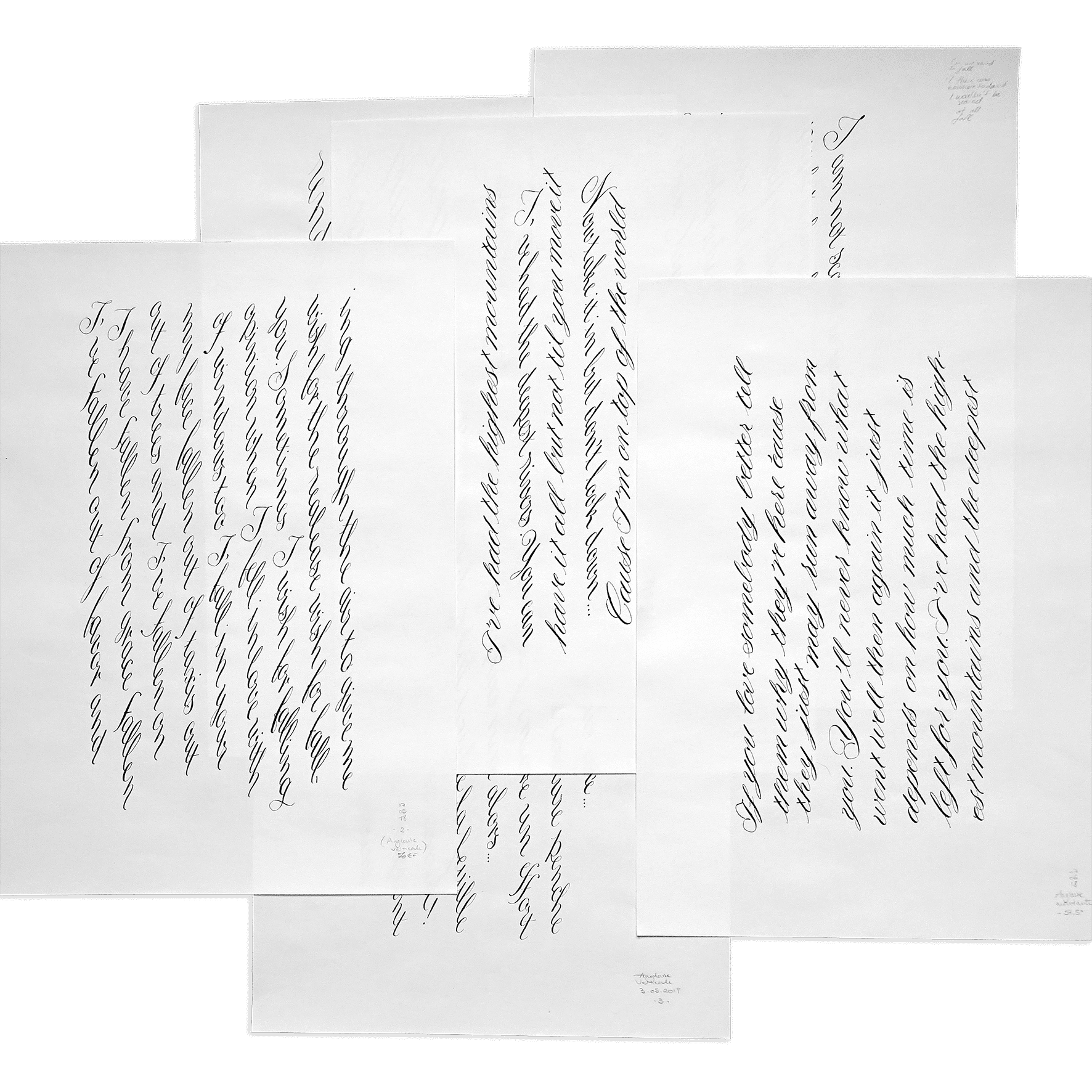
“One of the main threads that runs through my work is my fascination with movement,” she says. “However they are constructed, I try to breathe life into my designs. What a joy to see a static font seem to flow effortlessly!” For her, this originates from her long-standing fascination with handwriting, both as a practice itself and for its expressiveness.
“I love to feel the direct connection with the lettershapes through the hand.”
“I love to feel the direct connection with the lettershapes through the hand.”
“I love to feel the direct connection with the lettershapes through the hand,” she says, also enjoying the process of sketching and the feel of pencil on paper. “Calligraphy is wonderful in that sense that it’s both writing and drawing at the same time,” she continues. “With one gesture, one tool, one pace, the letters take their final shape. And there are infinite variations of ductus, style, speed, angle and tool.”
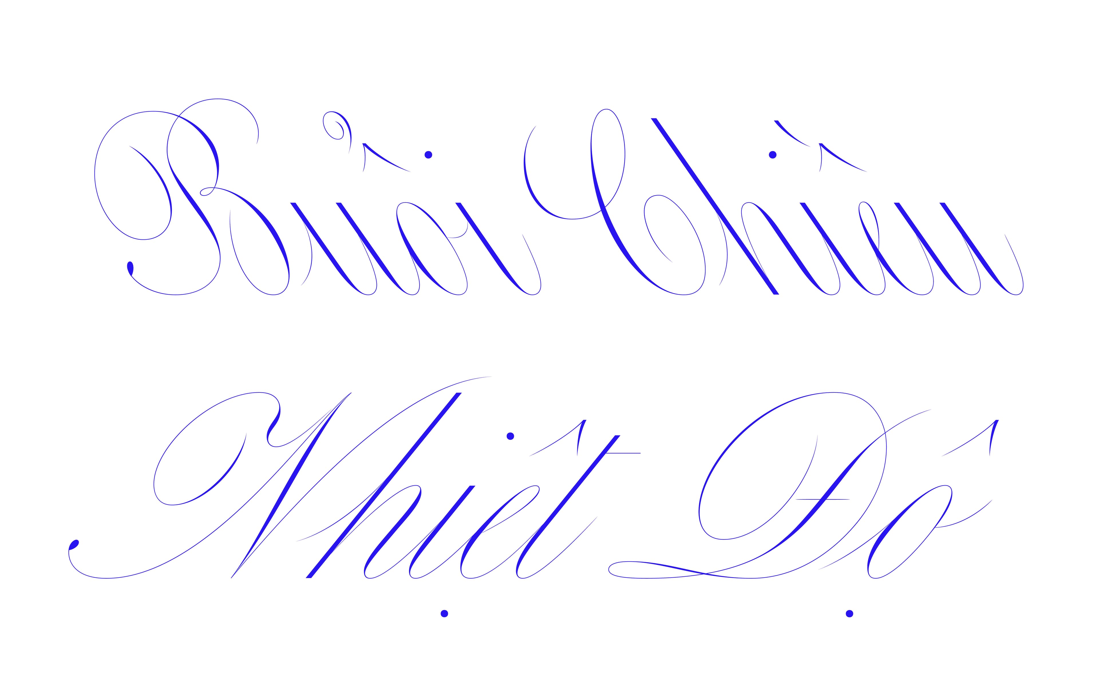
Thuong’s initiation into type design came in the form of calligraphy, and she believes it is the most effective way to understand and master a design – a means to understand its roots, and move away from a reliance on outlines. As such, all of her designs – to varying extents – are informed by calligraphy, “even if it is more obvious for some than others,” she tells us. “Carta Nueva follows the slow and steady pace of a very delicate pointed nib; Rosalie carries the contrast of a broad nib pen, both dynamic but slowing down to perfect details; Voltige runs a fast yet intricate ductus where the nib never lifts up.”
Calligraphy and the influence of the writing instrument were central to the development of Drops, a typeface designed by Thuong for the collaboration between Sharp FM and Prince Language. “I had a few letters from an old specimen as a starting point, but struggled to understand the system and parameters to draw others in my own way. I realised at some point that the design could actually result from experimenting with a Chinese brush and minimal strokes.” Instead of imagining the outlines and considering how to shape and fill them, she played on her iPad with a realistic brush, achieving prompt results and gaining a better understanding of the formal vocabulary and behaviour.
“I can and will tweak things as I digitise the design, and it will not be fully calligraphic anymore. Still, I believe something resonates with people when there are traces of a gesture. Even in the shape of a digital typeface, we perceive the underlying movement with our eyes, but also with our bodies…”
Curiosity and Innovation
Curiosity and Innovation
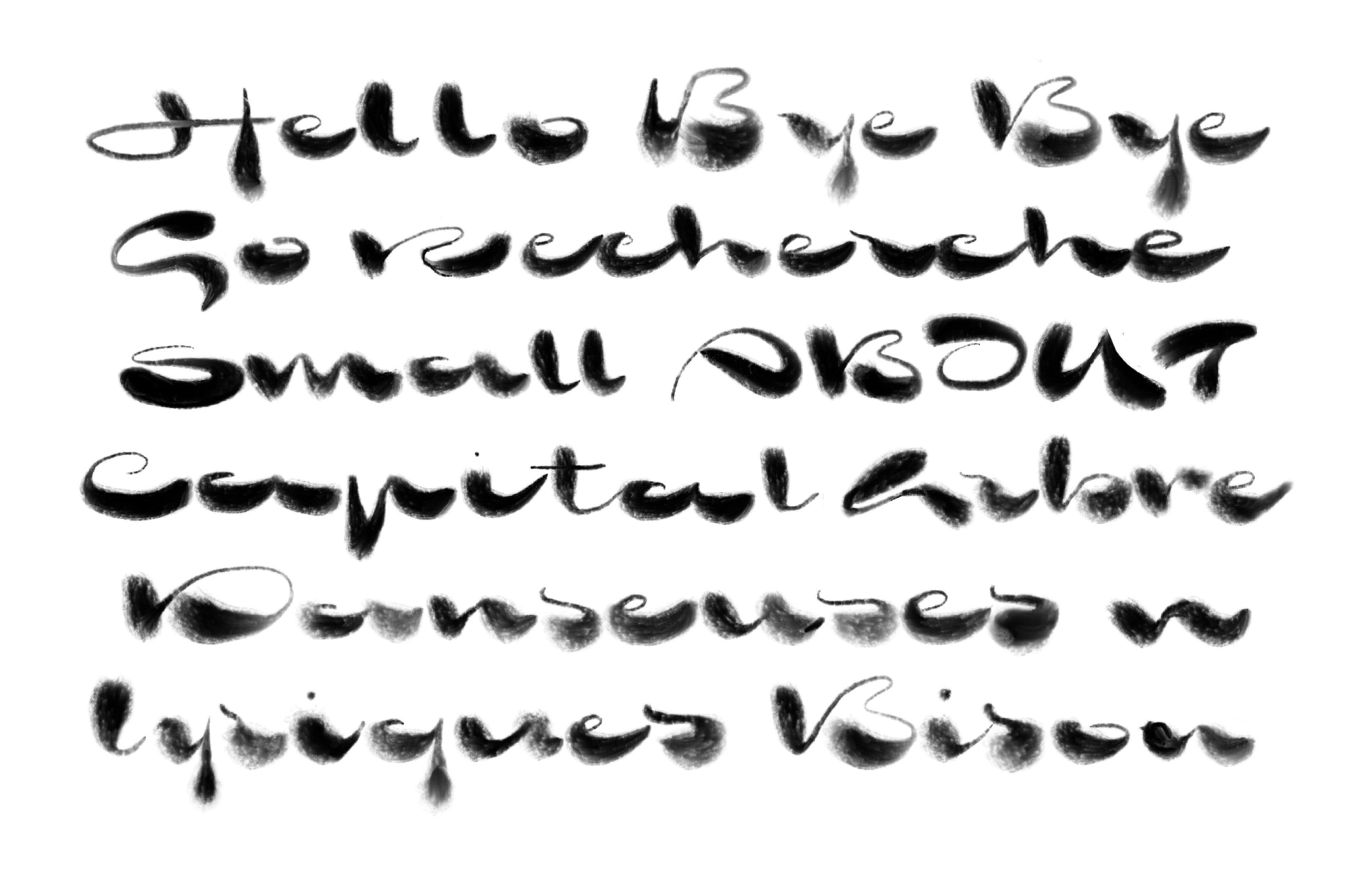
Thuong thrives on variety. Engaging in multiple projects simultaneously, she embraces styles from simple to complex, and finds inspiration across different designs. There is a continuous challenge to push letterforms to their limits. “Together, we embark on long journeys to explore new territories,” she explains. “I am curious about all the possible ways to construct letterforms: one continuous line (Voltige), seven stripes (Lux), modular geometric shapes (Wendy), cute wavy blobs (Drops)… I am always seeking innovation, even though I have recently begun to focus on more classic designs as well.”
Take her diploma project at École Estienne, which focuses on developing a method for writing Latin vertically. Through her research, she is exploring a “sweet spot” between stacking letters and rotating the text, using Copperplate calligraphy and the formation of “directional” styles, not only downward, which is the most intuitive, but also upward. That inspired an upcoming set of multidirectional styles for Carta Nueva. “This research is the creative project I am most proud of. “It’s the slowest and hardest to design, so it might not be published for a while, but I am so excited to get it out and for people to start playing with multidirectional Latin writing!”
Inclusivity and Contribution
Inclusivity and Contribution
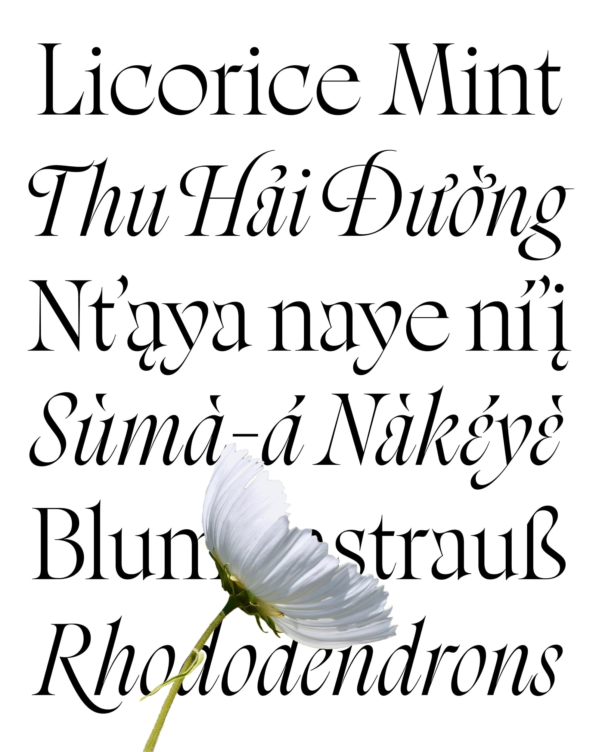
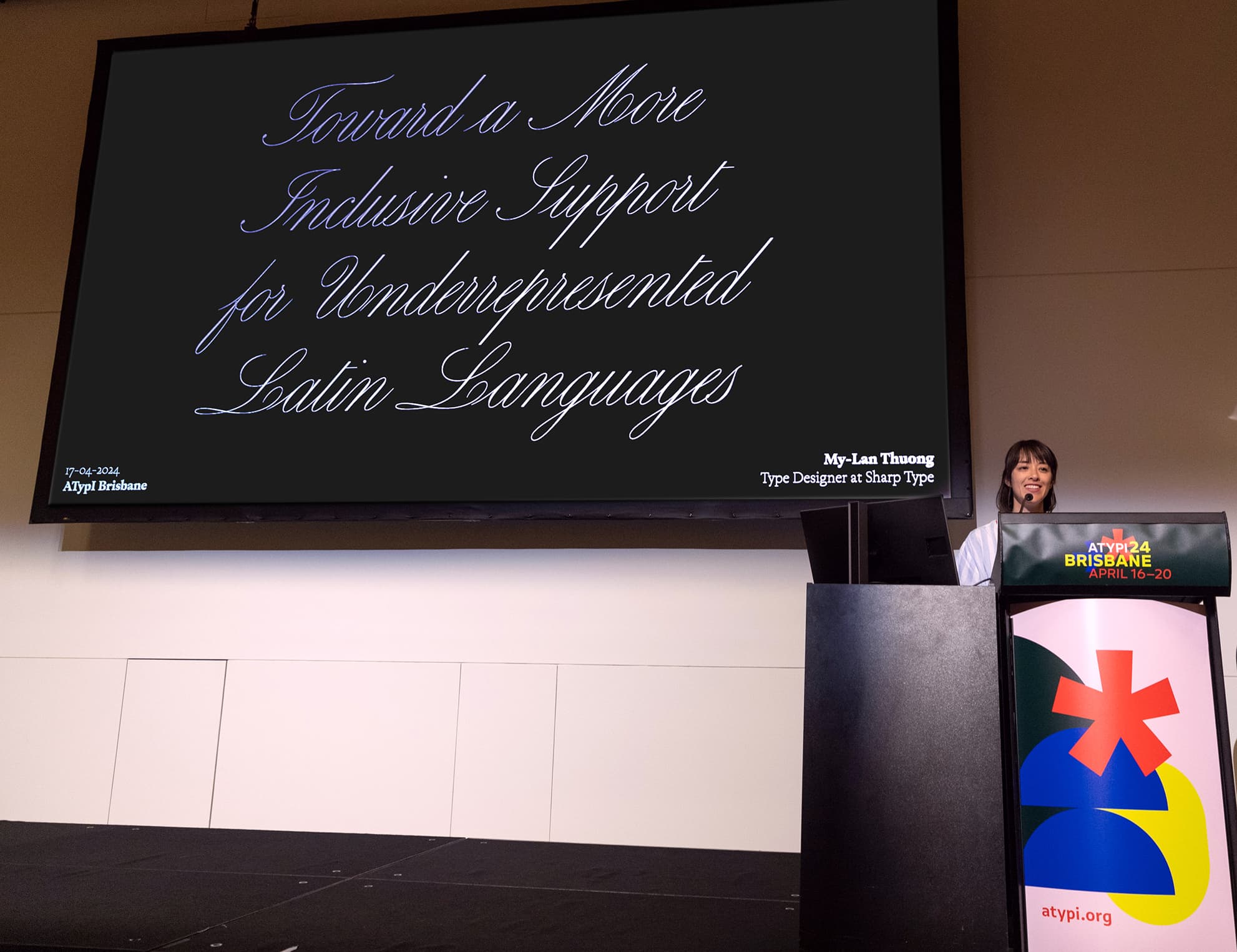
This thriving curiosity often leads her to become fascinated by various subjects, and she is eager to explore them thoroughly when she identifies a cause worth advocating for. The OmniLatin project is an initiative aimed at improving the accessibility and representation of typefaces for underrepresented languages that use the Latin script.
Recognising that many Latin-based typefaces lack essential characters and diacritics, meaning that millions of people can’t write their language correctly, Thuong was sparked to take action.
“When you see that even the Universal Declaration of Human Rights uses substituted characters for some languages, it strikes you as a concrete example of the inequalities of status and treatment of cultures,” she notes. “It clicked for me then that it was a choice we, designers, could make, to open up the language support of the fonts we design.”
“When you see that even the Universal Declaration of Human Rights uses substituted characters for some languages, it strikes you as a concrete example of the inequalities of status and treatment of cultures,” she notes. “It clicked for me then that it was a choice we, designers, could make, to open up the language support of the fonts we design.”
An ambitious undertaking, driven by curiosity and a desire to make a difference, Thuong decided to research and compile the characters to write all the Latin-based languages in active use. In 2020, the journey began with the addition of Vietnamese support to Carta Nueva. “I wish I could speak or understand my family’s language,” she says, “but, as a type designer, I realised I could still connect with it and write it. By building a few additional accented characters, we could make our typefaces available to Vietnamese designers.”
The project expanded to investigate African languages and collaborate with experts, like Cris Hernández, to support North American Indigenous languages. This collaborative spirit fostered the development of the OmniLatin character set, which continues to evolve as the designers learn and adapt. Through their efforts, OmniLatin could be implemented for four different font families distributed by Sharp Type: Sharp Earth, Sharp Serif Text, Sharp Serif Display, and Rosalie.
Additionally, the team dedicated significant effort to creating the OmniLatin Tool, an open-source Robofont plugin designed to help designers easily incorporate language support into their typefaces. “My coworker Léna Le Pommelet had the idea to compile all the useful scripts to develop the OmniLatin support into one super tool dedicated to this purpose,” Thuong recalls.
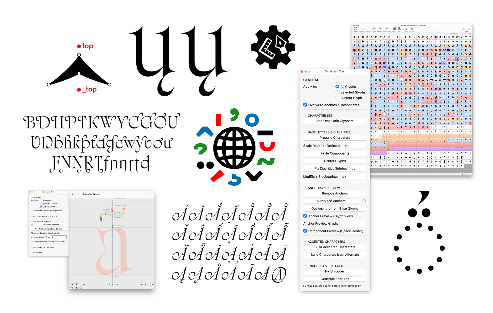
“Together with Marte Verhaegen, we compiled the data, imagined and coded the functions to go through the whole process of adding OmniLatin support to a typeface. This collaborative project took us a year to build and refine, and we finally released it publicly and for free last January. The Tool is the concrete counterpart of the research and our main contribution to the type community.”
The OmniLatin project has attracted considerable attention at various international type conferences, including ATypI, Automatic Type, and TypeLab. By promoting open dialogue and sharing resources, it encourages fellow designers to participate in the movement towards inclusivity.
Patience and the Courage of Sharing
Patience and the Courage of Sharing
This year is especially exciting for Thuong, both in typography and personally, as she stays busy; her time split between foundry work and various personal design and research projects.
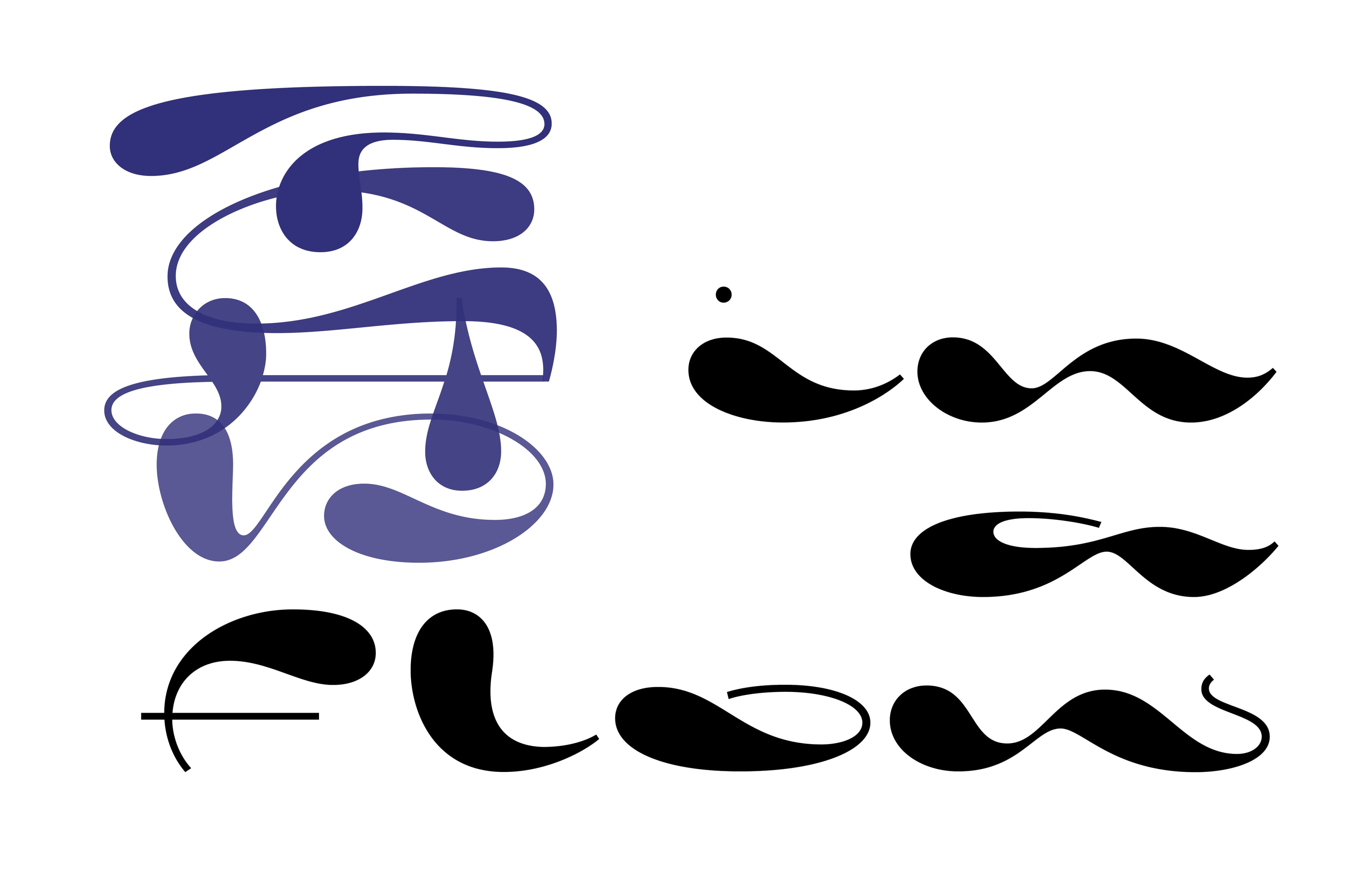
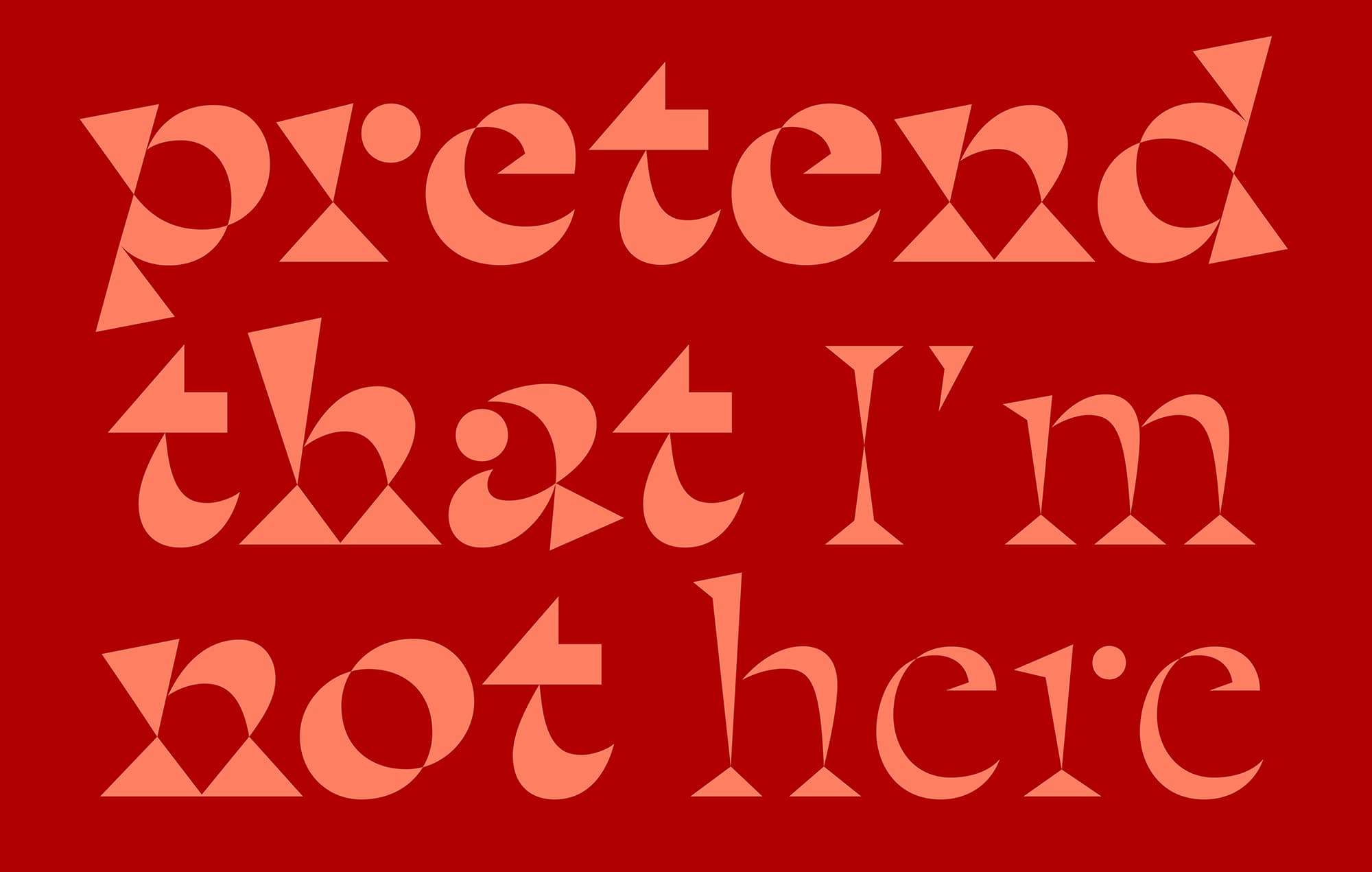
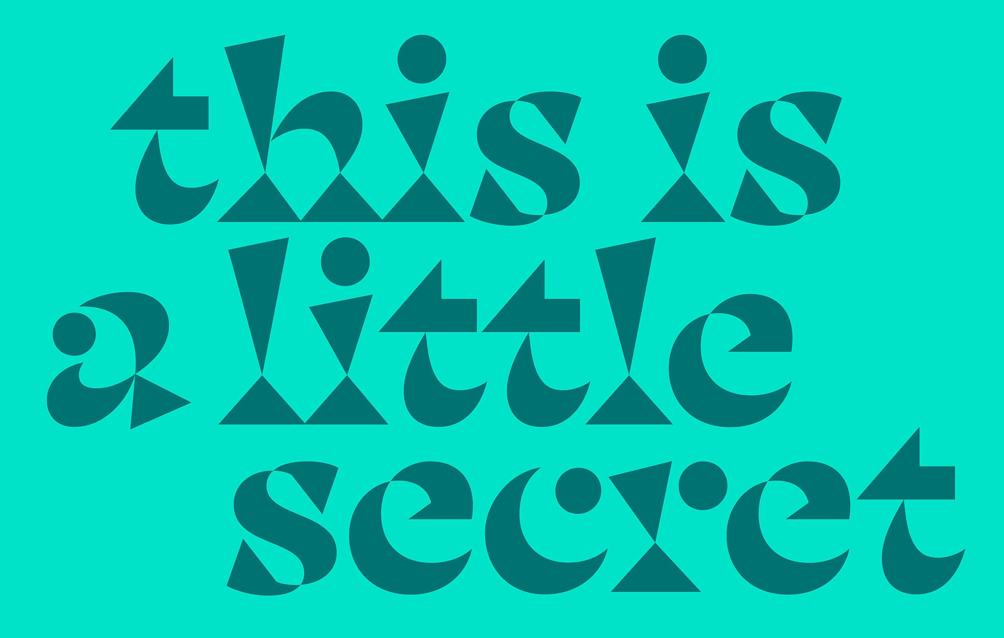
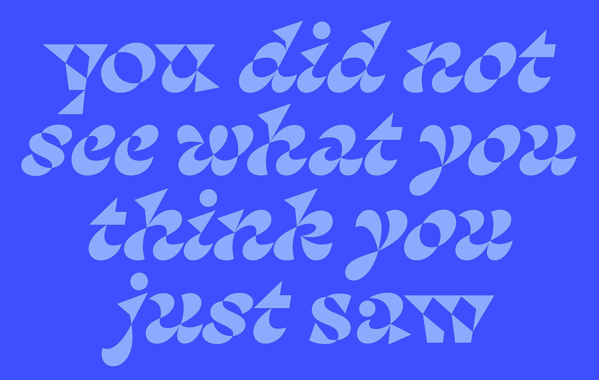
She is enthusiastic about an upcoming project, likely her next release: Wendy (a temporary name). Thuong describes Wendy as a display typeface crafted from geometric shapes that playfully intertwine and intersect. “Imagine a serif, abstracted. Zoom in and your eyes can get lost in the dance of pure shapes, or zoom out and recognise full words.” As such, Thuong compares the roman to a faceted gemstone, a tangram, or the play of refracted light, while the italic “flows and twirls around itself.”
With multiple projects in the works, My-Lan also highlights the value of patience and resting periods between design phases, allowing ideas to breathe and grow. It’s during these breaks that clarity strikes, leading to fresh discoveries and exciting new directions. My-Lan’s experience with the Rosalie typeface perfectly encapsulates this ethos. “I am so glad I took the time I needed to refine it and turn it into what it is today, even if it was also very long and frustrating!”
This release was a significant step and a reminder that sharing work, whether it’s perfect or not, is key to growth and connection. “I am trying to be more courageous,” she says, aiming to share work sooner and not wait years until the next publication. “The motivation to dare is the understanding that I’m making a tool that other people can use to make great things with. And I can’t wait to see that!”
Featured Fonts
Featured Fonts