Announcing The Malee Scholarship 2025 Recipient
We are proud to mark this milestone by recognizing this year’s recipient, Flora de Carvalho.
A designer, editor, and type founder, Flora has spent over fifteen years shaping the field with projects that merge community, craft, and experimentation. From Recorte magazine to Familiar Faces, their work creates platforms for new voices and perspectives in type design.
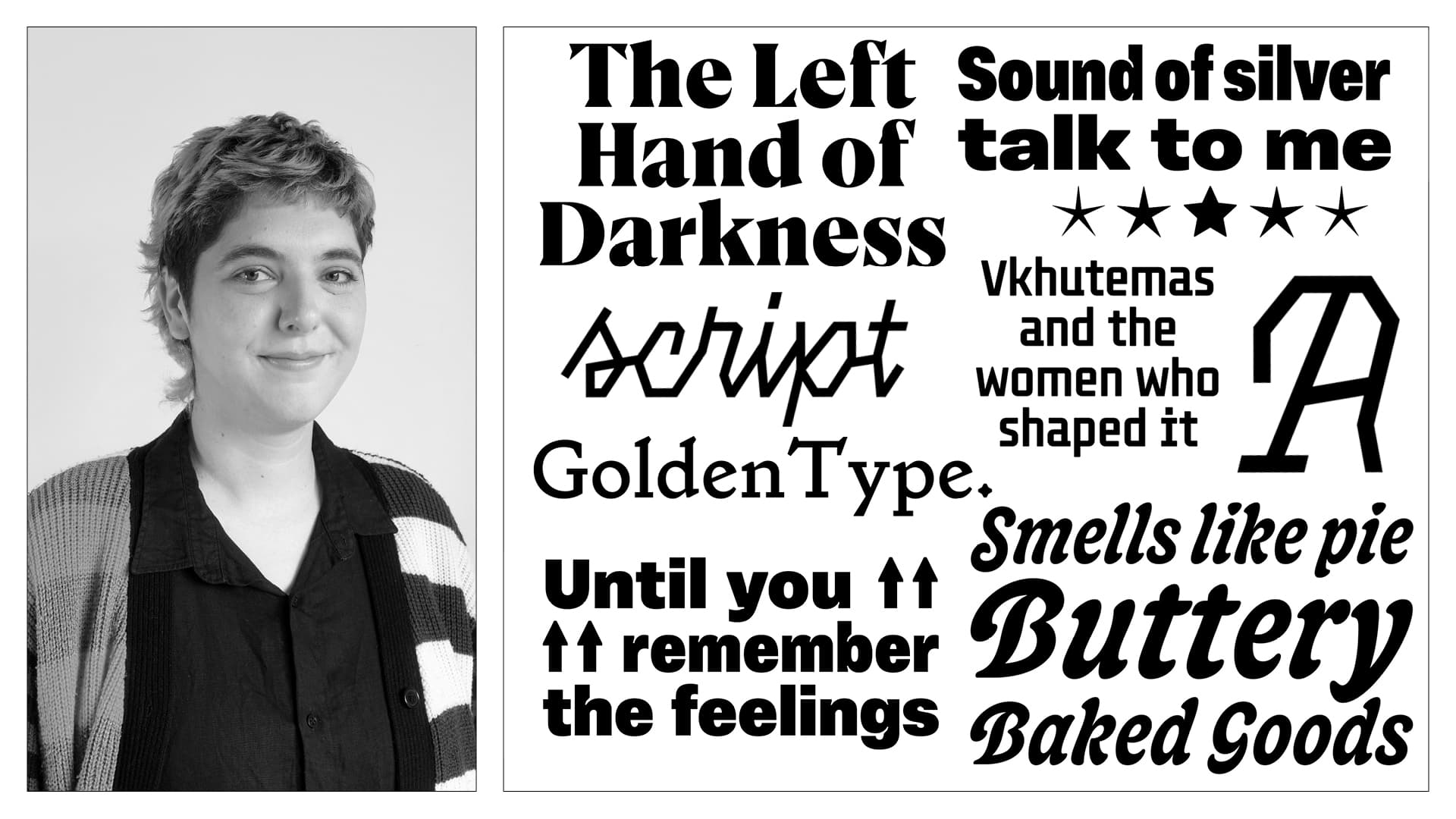
Flora de Carvalho has been working with graphic design and typography for fifteen years. They co-founded the studios Passeio (2018–2022), TODA Oficina, and the type foundry Familiar Faces. Their first type family, Vinila, was published by Plau in 2019, and since then they have independently developed original projects and custom fonts for Brazilian companies.
In 2021, they founded Recorte magazine, where they serve as coordinator, editor, and designer. Over the past four years, more than 100 essays on the profession have been published on the platform. More recently, Flora joined the Type West Online Postgraduate Program, where they have worked on type design projects such as Garment and Ursula.
Interview
M.S.: How has your background and upbringing influenced who you are today and your path to type design? Can you talk about your family, where you grew up, and how your heritage shaped your perspective? What are some of the benefits and challenges of living in Brazil, and how do you think these experiences have impacted your career?
Flora de Carvalho: It seems impossible to talk about my background in type without mentioning that my mother is a graphic designer. I grew up among piles of floppy disks and all kinds of printed catalogues-photos, clip art, and typefaces. We lived at my grandparents' house in a small town three hours away from Rio de Janeiro, and her clients were local hair salons, construction shops, and small grocery stores. Design can be a very elitist field, but I learned about it from the perspective of a freelancer who had to work around the clock to make ends meet. At 12, I started running errands to support my mother's practice. My sister and I used to go to the bank to pay bills, to suppliers to pick up samples, and to printing shops carrying files on CDs.
When it comes to type more specifically, I vividly remember the day she gifted me two old photocomposition books containing hundreds of typefaces each. She no longer needed them, but they became my most valuable assets. I used to look at these typefaces for hours, drawing versions of them and trying to come up with the letters that were missing in the specimens. Over 20 years later, these books still live on my desk, and I browse them often to find inspiration for my own projects. My mother taught me perseverance and patience. Whenever I feel lost or hopeless, I try to channel her strength.
“My mother taught me perseverance and patience. Whenever I feel lost or hopeless, I try to channel her strength.”
“My mother taught me perseverance and patience. Whenever I feel lost or hopeless, I try to channel her strength.”
M.S.: What was the original inspiration behind creating the magazine Recorte? How has your vision for the magazine evolved over time?
Flora de Carvalho:
At the start of the pandemic, hundreds of people signed up for an online book club organized by designer Tereza Bettinardi. The group’s demographics revealed two important insights: there were very few design books available in Portuguese, and most professionals didn’t feel comfortable reading in English. After writing a text to guide the participants’ discussion, I began to wonder how it might reach a broader audience. A few months later, the Recorte website came about.
Over the past four years, Recorte has published more than 100 essays by contributors from diverse backgrounds across Brazil. All of the content is freely available online, and to date we have also released three books. As the first magazine of its kind, Recorte continues to resonate widely - I still receive countless messages from young professionals and students sharing how deeply it has shaped their education.
M.S.: How do you see your design practice supporting and benefiting your community?
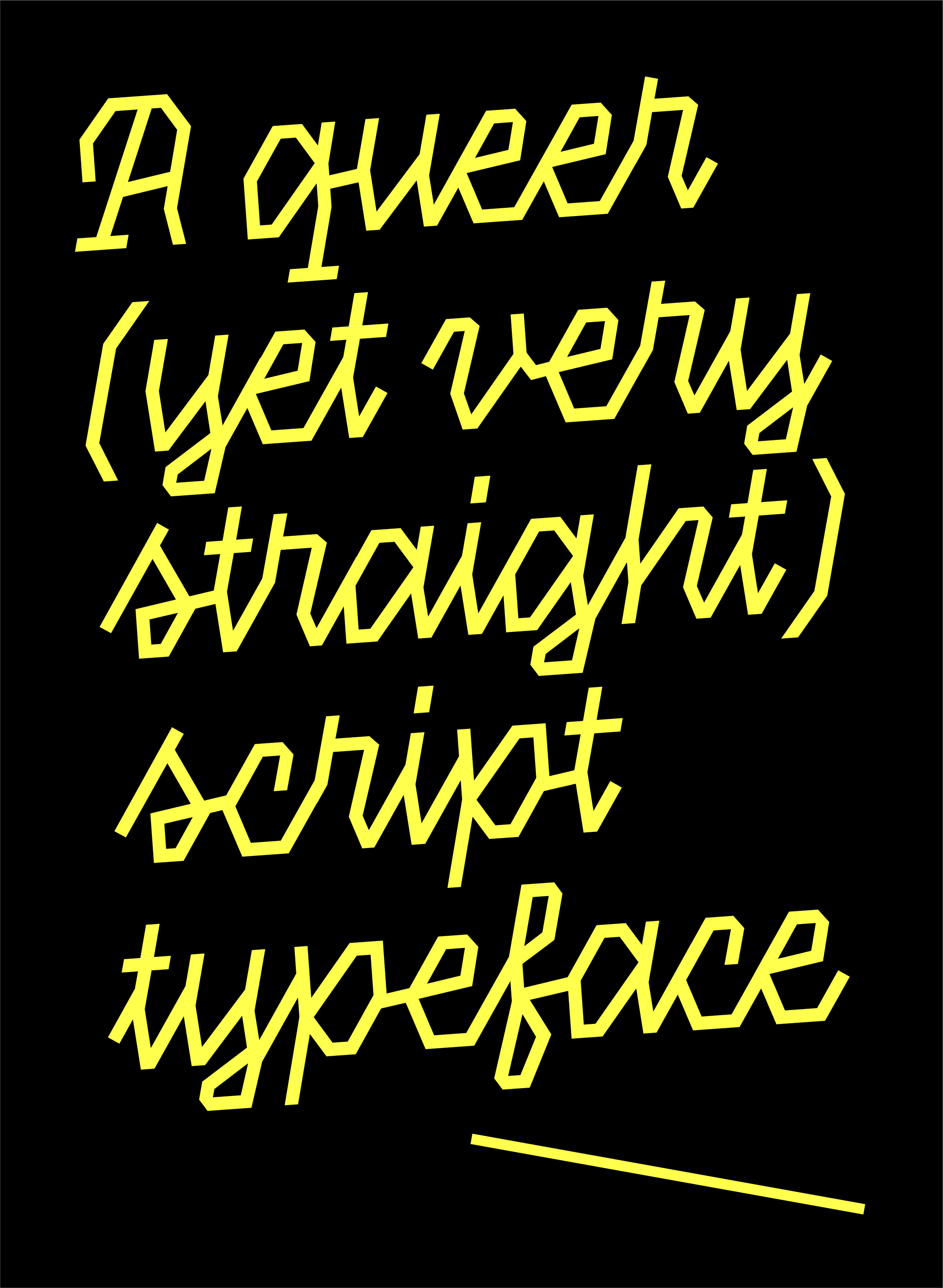
Flora de Carvalho: First, there’s representation. In Brazil, many women and non-binary people are doing amazing work designing typefaces and studying the fundamentals of type design. However, most of their projects never get published, and the industry’s landscape is still heavily male-dominated. More than a space to publish my own typefaces, I see my future foundry, Familiar Faces, as a safe space where individuals from underrepresented groups can work together. Design doesn’t exist in a void, and typeface design can benefit greatly from a more community-based, feminist, or even queer approach. In practice, that means questioning the idea of authorship, sharing knowledge, and distributing income as fairly as possible.
“Design doesn’t exist in a void, and typeface design can benefit greatly from a more community-based, feminist, or even queer approach.”
“Design doesn’t exist in a void, and typeface design can benefit greatly from a more community-based, feminist, or even queer approach.”
M.S.: What led you to the name “Familiar Faces” for your future type foundry, and what’s the story behind choosing it?
Flora de Carvalho: When I think about the name Familiar Faces, it reminds me of the relief and happiness you feel when arriving at a party full of strangers and spotting an old friend by the snacks. I know it may sound silly, but this scene captures how much easier and more enjoyable life becomes when you don’t feel lonely or intimidated. From a customer’s point of view, the name encourages people to return to the library often and feel comfortable experimenting with the typefaces.
The word Familiar also carries something quietly rebellious, because we live in a world where people are constantly pressured to produce cutting-edge work, and that creative pressure can be daunting. In a way, the name suggests that ensuring typefaces are dependable is more important than giving in to the capitalist urge to innovate at all costs.
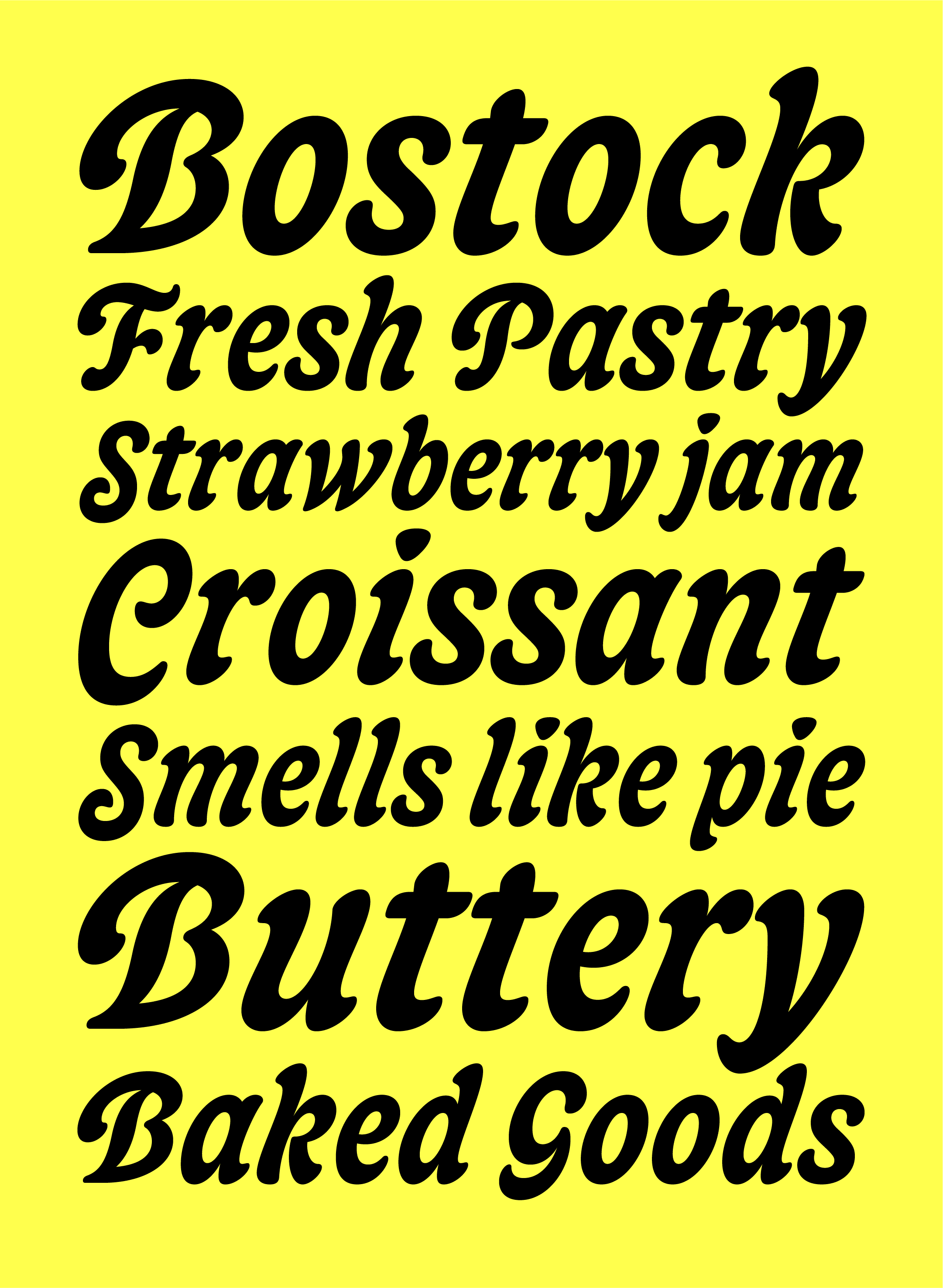
M.S.: Bostock, your revival of Belvedere is both fascinating and beautiful. Can you share more about this project and how it came about?
Flora de Carvalho: Thanks for the compliments on Bostock! I began working on it during a Type Electives workshop in 2023 called Crash Course in Revival Type Design with Libbie Bischoff and Jo Malinis. At first, it was a straightforward revival, but it gradually evolved into a softer, more playful display typeface.
A couple of months after I started designing it, I went to a friend’s bakery and ordered a bostock. The round corners of the brioche bread looked so perfect, and tasted so good, that I decided to name the typeface after that experience. Like the dessert, Bostock is sweet, chunky, and creamy.
M.S.: You seem to be curious about a wide range of styles! Could you give us a glimpse into the upcoming typefaces from your foundry, such as Fita, Pipoca, and Oma?
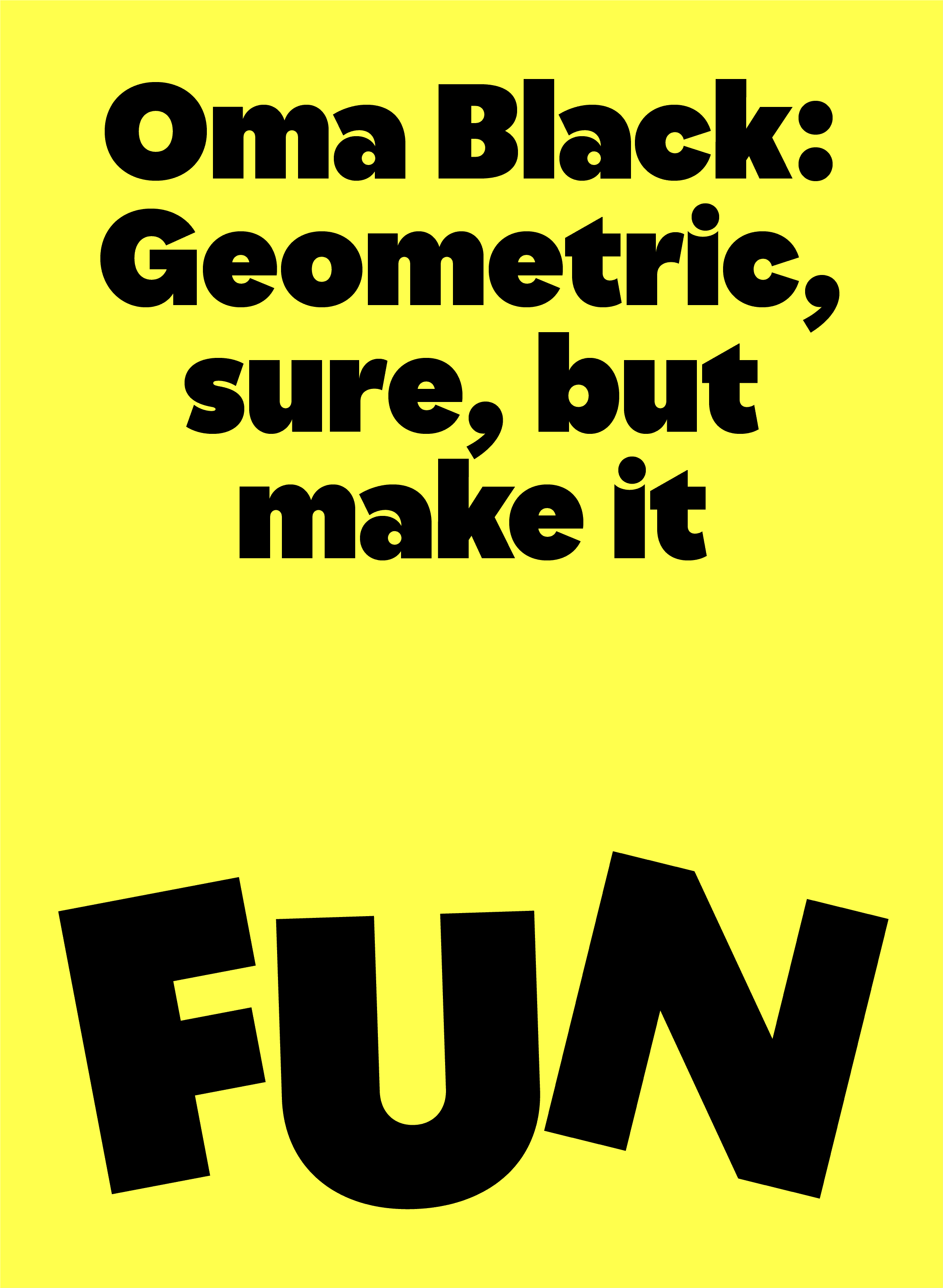
Flora de Carvalho: Most of my typeface projects have started in one of three ways: as a client commission, an educational exercise, or a collaboration with a graphic designer. Pipoca is an example of the first; it was designed for a health insurance start-up. Oma represents the second; I began working on it during the Practica Program in 2022. Fita fits the third, as it’s based on a sketch by Julia Masagão, a partner at one of my favorite Brazilian design studios, Alles Blau.
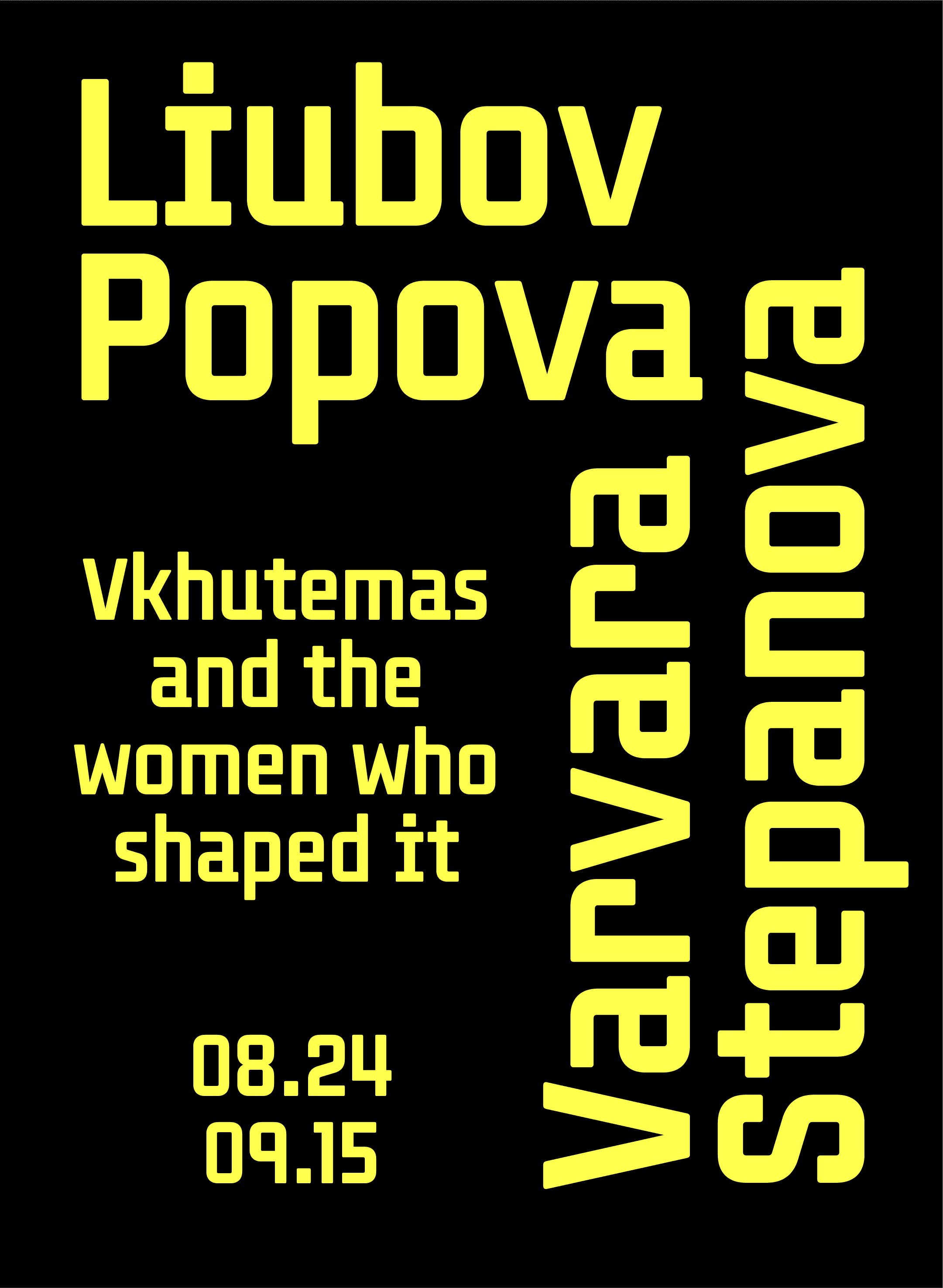
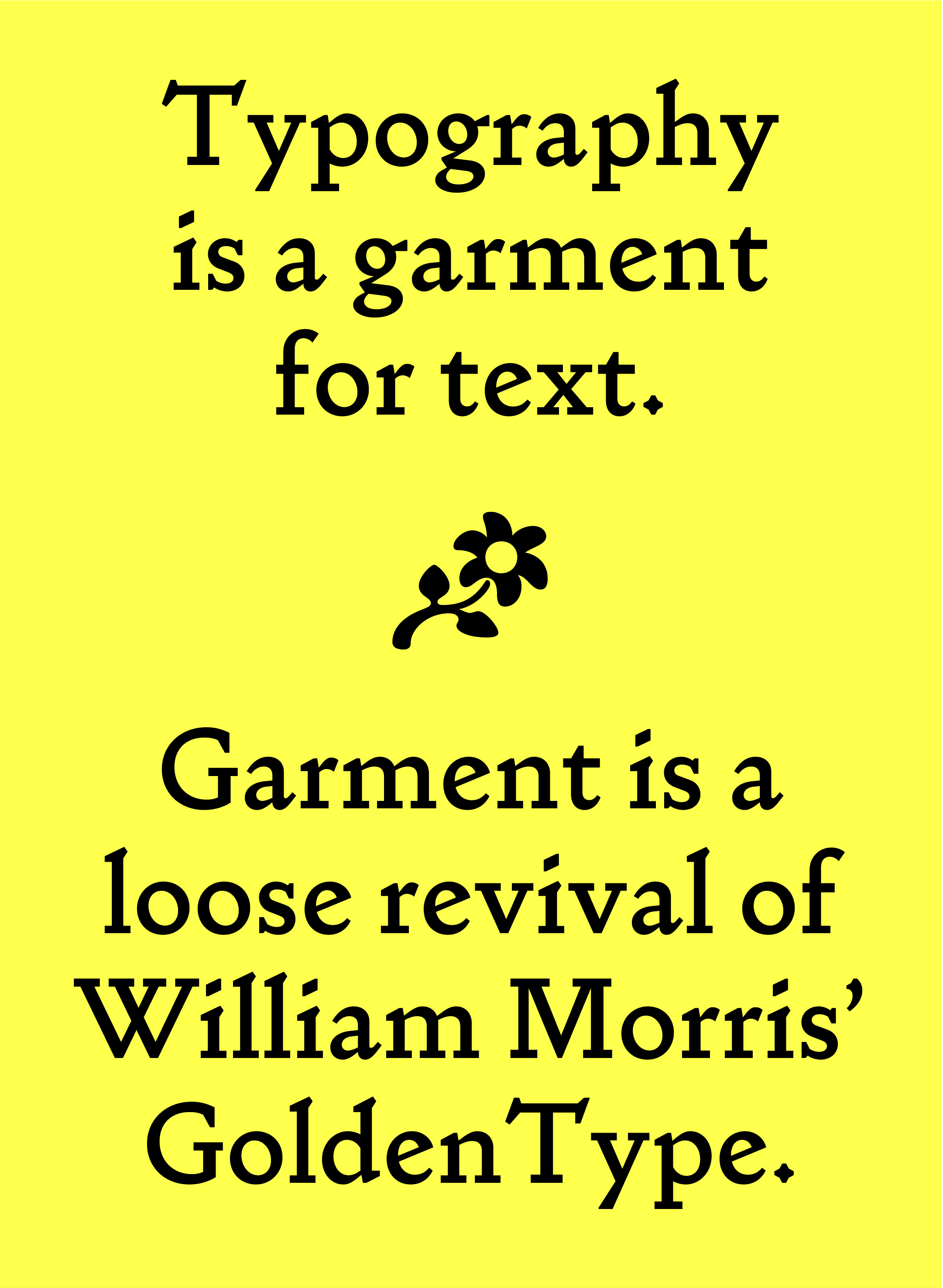
Right now, I’m enrolled in Type West Online, and two new families have already emerged from this amazing experience: Garment and Ursula. I’m also working on a typeface inspired by the Russian school Vkhutemas in collaboration with another friend, Maria Cau Levy.
M.S.: What’s next for you in your career?
Flora de Carvalho: For fifteen years, I’ve worked as a graphic designer, and for the past eight I’ve done so independently. More recently, the stress of tight deadlines and long hours has taken a serious toll on my mental and physical health. That’s why now feels like the right moment to pursue type design full-time. The truth is, drawing letters and proofing them in context is what fulfills me most professionally.
The Malee Scholarship will have a huge impact on this transition. I plan to use the grant to establish a website for Familiar Faces, which I hope will allow me to generate income from the work I’m most passionate about. I’m deeply thankful to Sharp Type for giving me this opportunity, and to all the people who have supported me through difficult times; my teachers, friends, partner, and of course, my mother.