Sharp Type Season Two: Neutral Better
Like a good typeface, building a website begins as a monastic labor of love, often takes years to design, and is finished through the support of many hands. Season Two, Sharp Type’s new hub and e-commerce platform, represents over four years of work that culminated with its release in the spring of 2024.
Like a good typeface, building a website begins as a monastic labor of love, often takes years to design, and is finished through the support of many hands. Season Two, Sharp Type’s new hub and e-commerce platform, represents over four years of work that culminated with its release in the spring of 2024.
Spearheaded by Systems Lead Justin Sloane, with direction from Chantra Malee and Lucas Sharp, the website was developed in close collaboration with Friends of the Web. Through this interview, we hope to impart some insight into the particulars of our creative process, the strategic thinking involved in the ideation and design of Sharp Type Season Two, and the technical challenges we faced and overcame during the years of its development.
Research & Inspiration
Research & Inspiration
“The primary objectives for Season 2 were simplifying the brand system and modernizing the experience of the site,” says Justin, who designed Sharp Type’s original website with Chantra and Lucas as a freelancer in 2015. This meant that besides having an established fluidity in their communication and workflow, the trio could effectively determine the needs for the new site by looking back at what they had accomplished before.
“Many of the pain points of Sharp Type’s first website came from a lack of limitations, rather than too many. With the new site, the experience of making updates is meant to feel like using software. Limitations are placed on the size and margins of elements in order to maintain consistency, to limit the chaos.”
They also decided to involve the rest of the team at the earliest stages of R&D. “We had to figure out what the website needs to accomplish and begin designing solutions with that simple idea in mind,” says Justin. “[At the end of 2020], we did a series of interviews with everyone working at Sharp Type and made a series of charts in order to determine what the site needs to accomplish.”
The global context of culture and the rapid iteration of digital technology over the past decade became important considerations, too. “The entire landscape of the web has changed. Sharp Type’s first website was designed just as Web 2.0 was emerging. Machines were simpler then, social media was less visual, and 72dpi was the standard screen resolution. Now, Web3 has fully emerged, retina displays are everywhere, and everything—even design software—is hosted on the cloud. There is just more now. More design studios, more typefaces. Being able to capture people and make them remember and come back to the site becomes an accelerated process. We’re in a new era, and Season Two needs to reflect it and be part of it.”
While the final design of Season Two inevitably reflects contemporary culture and perhaps forecasts a part of its future, a decidedly outsider approach was fundamental, too. “Unexpected sources are always the best places to find inspiration.”
Design journey starting at the end of 2020.
Principles & Aesthetics
Principles & Aesthetics
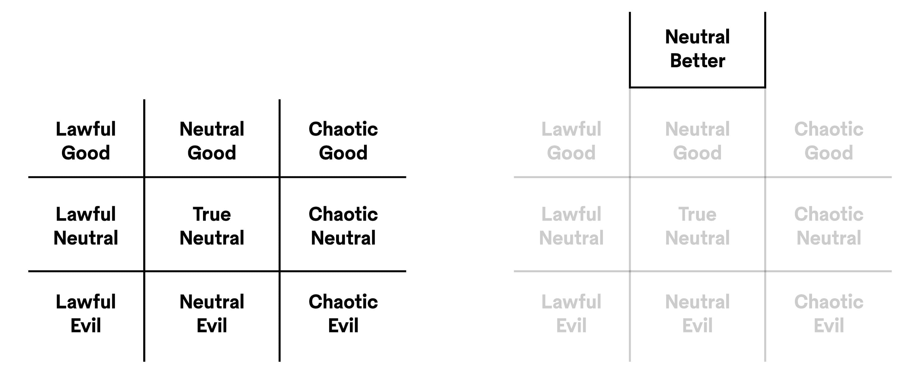
A novel concept came to define the design direction. “During our initial interviews with the team, [former intern] Florence Fu coined a new category for me called Neutral Better. I thought that was genius and kind of reinforced the idea of ultra-utility.”
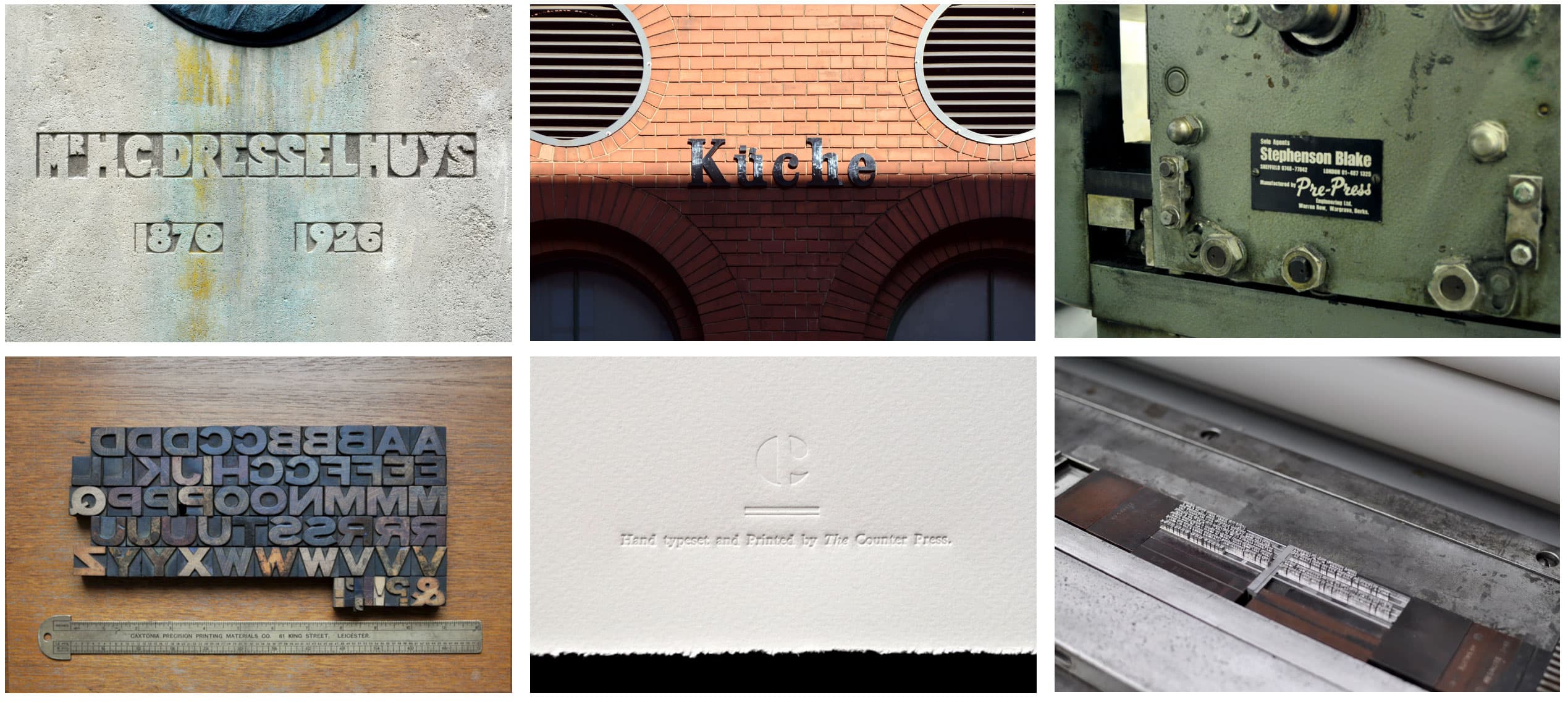
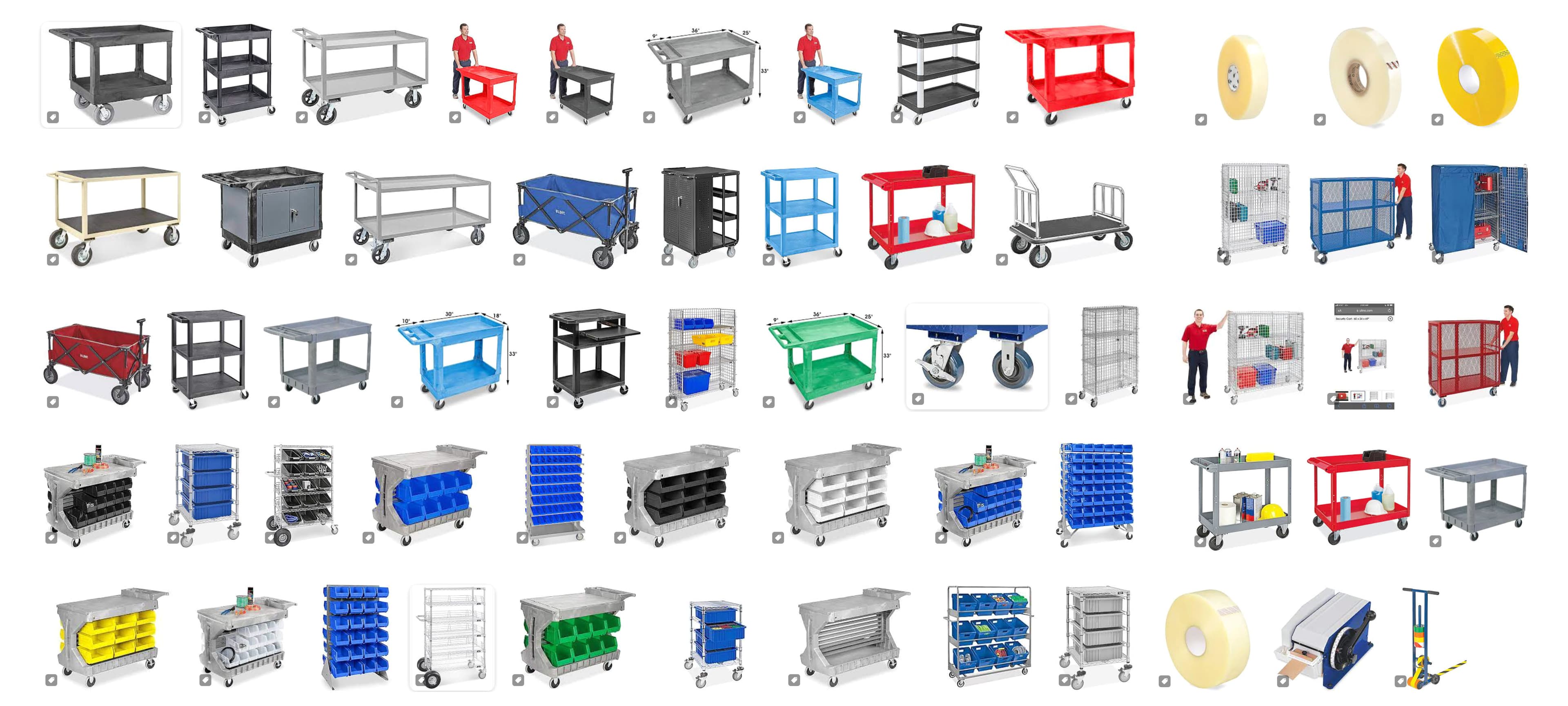
Utility as a principle naturally determined the aesthetic of the site. “I come back to the idea of tools when I'm thinking about why I like typefaces, or why making them makes sense to me. We’re not building houses, we're selling drills here.” The metaphor is anchored by two unexpected design sources, both of which foreground the idea of function as integral to form. “The McMaster Carr website has long been held in high esteem by web-designers as an absolutely fatless website. It’s a beautifully executed experience that doesn’t dress up its purpose at all.”
“We’re not building houses, we’re selling drills here.”
“We’re not building houses, we’re selling drills here.”
“Industrial product photography also has a purely functional appeal to what we are trying to do with the site. Uline product photography has a similar appeal. This is not lifestyle imagery, it belongs in a garage. They present each object in its naked truth.” These references reinforce the relentless functionality that Justin chased in Season Two’s final design, which is coupled with the idea that by removing barriers to utility and by shedding everything else that is unnecessary, the end product will be a thing of beauty.
Development & Design
Development & Design
A core tenet of the design direction was finding the simplest and most compelling ways to deliver information—which is, ironically, a difficult and often tedious process. Adding to this is the fact that Justin used Figma to design Season Two—a software platform which he had only used sparingly before undertaking this project.
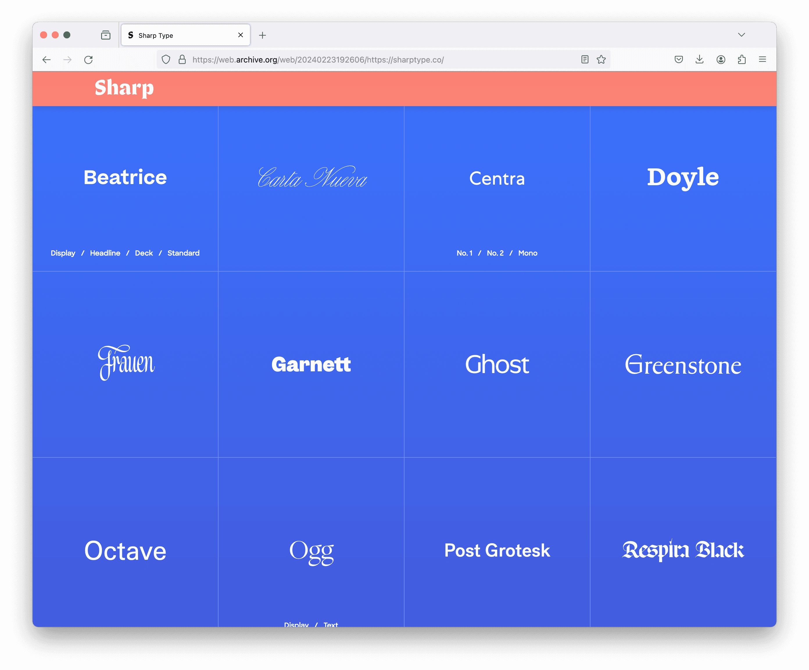
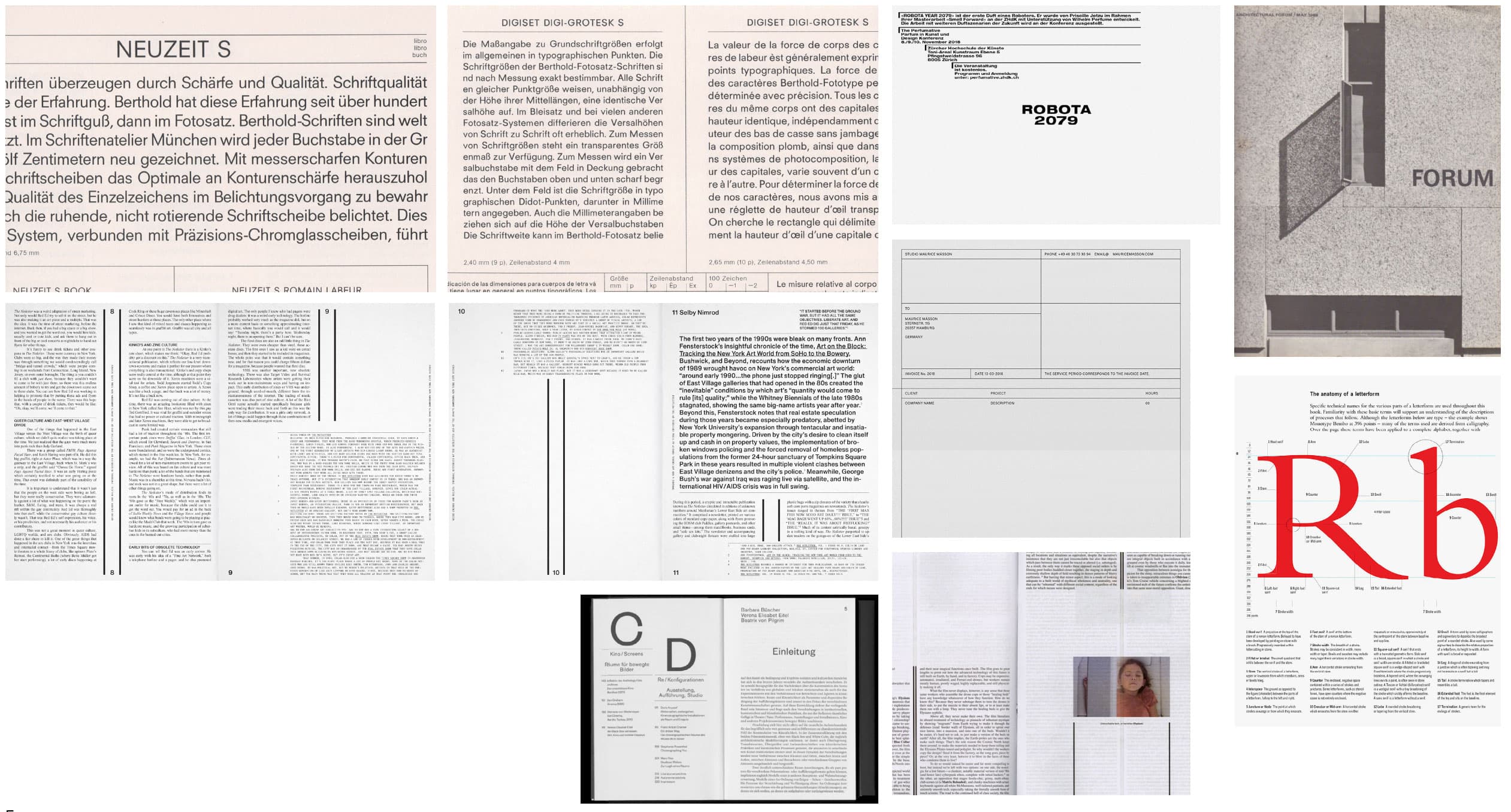
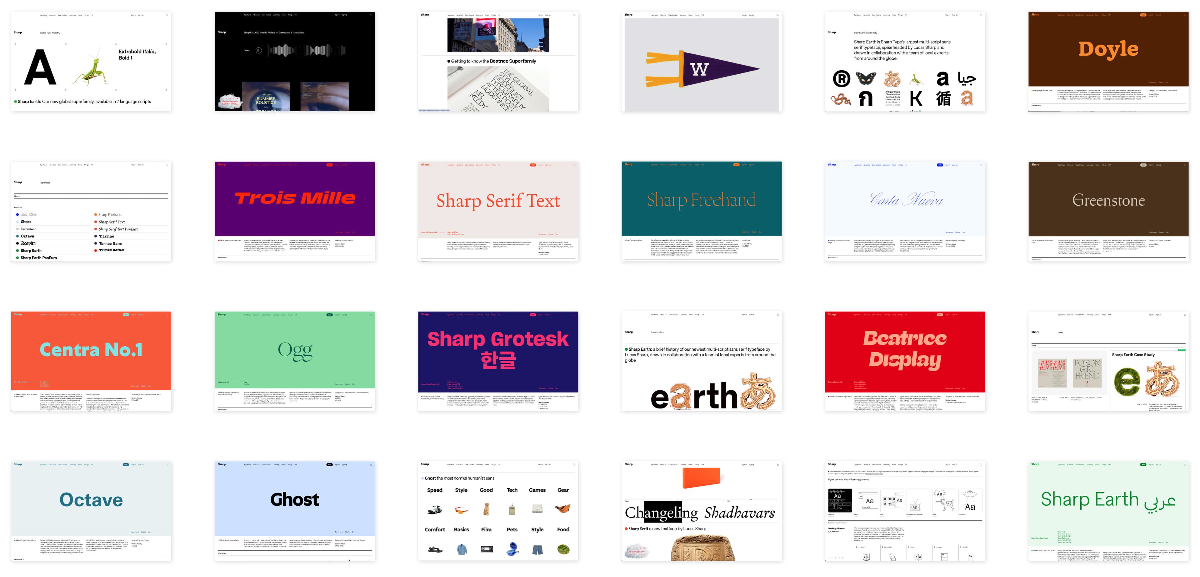
Color, or lack thereof, was a fundamental consideration, particularly in relation to showing typefaces throughout the site. “In art, there’s the idea of the ‘white cube’ as an unchanging space, or a suggestion of eternity. White space is part of the ritual of looking at things and giving reverence to whatever is on view. Kenya Hara’s book White also talks about this color being a space where the imagination is limitless.” These concepts became the basis of the site’s primary color scheme—white with black text—which served not only aesthetic purposes, but also ensured that the design met contemporary usability and accessibility standards.
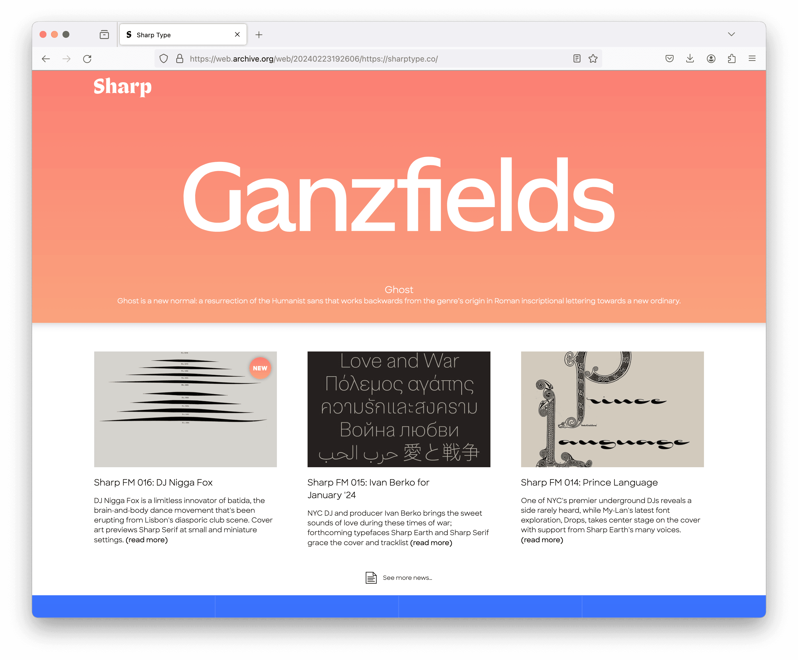
Sharp Earth and Sharp Serif were chosen as the foundational fonts used throughout the new site. Sharp Earth provides an overall balance of warmth and utility, while Sharp Serif adds a subtle addition of flavor, its texture playing against the grid system and white space. “Initially, Ghost was going to be the primary headline font,” says Justin, “but it just looked too strong alongside everything else once we began looking through the site in an actual browser.”
A fundamental challenge was also figuring out how to achieve both flexibility and utility across the site. "We eventually came up with the idea of content modules, which we can embed on any page.” Over numerous conversations with FoTW, Justin narrowed down the number of possibilities into an elemental system of six modules. “These give greater depth and flexibility as we continue to build webpages on the new site. Building a logic for the modules was challenging, but in the end, each of the six modules was designed with a set of behaviors and a breakpoint for mobile.”
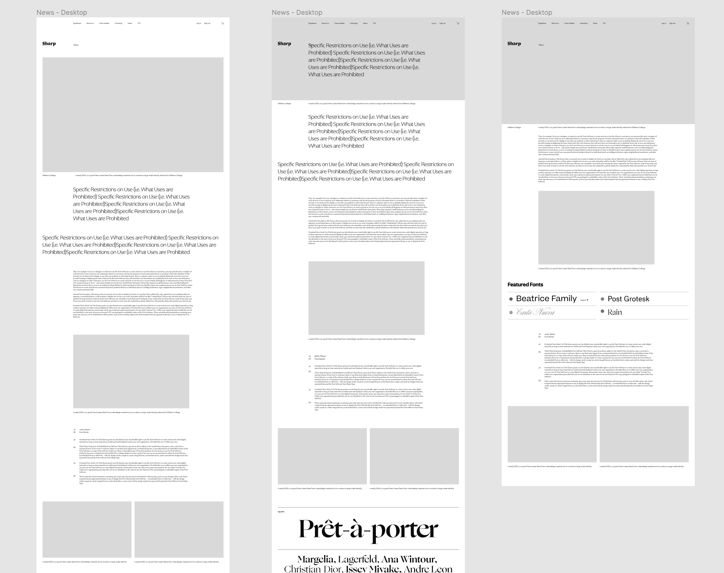
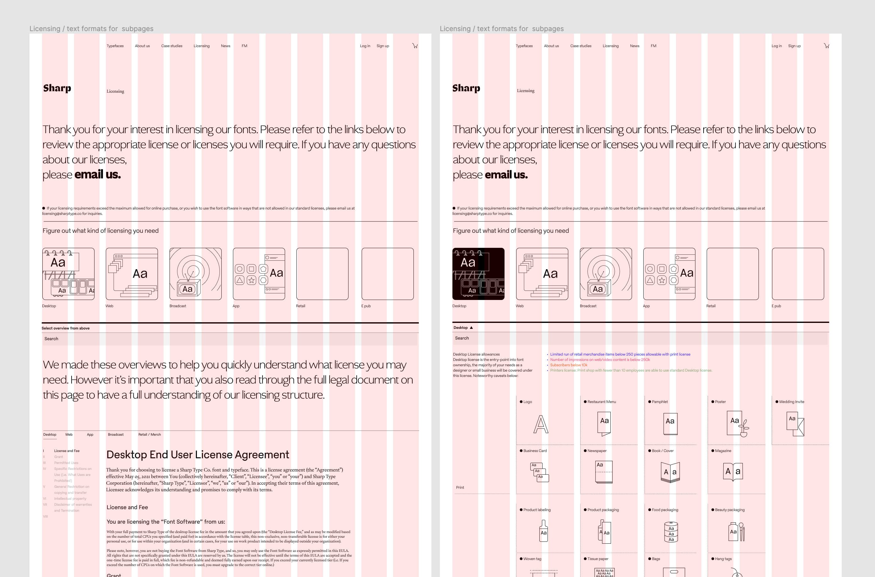
The site has been optimized for ease of use for both the Sharp Type team as well as our users while providing bridges for type enthusiasts and anyone else who might want to dive a little deeper. “The idea is to keep products and processes separate, so we created dedicated pages where someone can go to learn about the process behind each release. The typeface pages are great at striking a balance between Sharp Type as a brand and each font’s unique identity.”
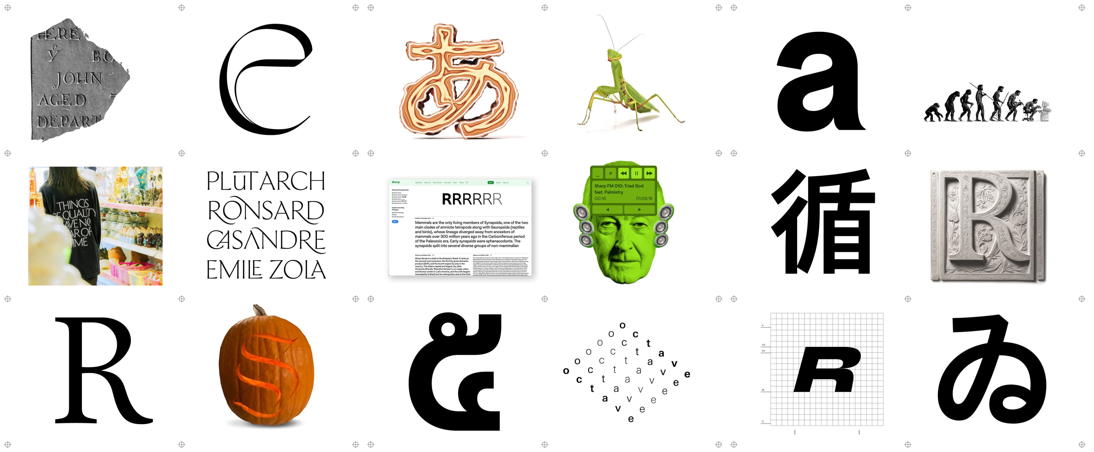
Justin implemented a unique color coding system as a way to recognize grouped font families, visually organizing our growing library for everyone—be it a first-time visitor or someone on the Sharp Type team. Having our fonts embedded throughout the site has a similar bridge effect for our users, who will hopefully recognize our fonts and get inspired by their application.
Another innovation is the omnipresence of type testers throughout the site, allowing users to explore different typefaces and sections of the site without interruption. “Many foundries only have this feature on a single dedicated page, including Sharp Type’s first site, so the progressive solution was to make it available everywhere.”
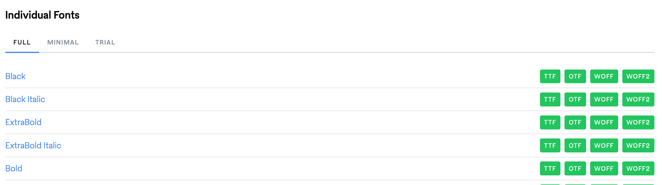
Having spent enough time working with Sharp Type’s first website over the past few years, it was clear that there are common challenges that are unique to the design of a website for a type foundry. “Loading a lot of fonts in a browser is difficult. To ensure that the site loads quickly for optimal UX, on pages where there are many fonts at once, the site only loads a limited character set for each font to avoid bogging down the browser.”
Testing & Iteration
Testing & Iteration
In the final year of development, collaboration was essential for Justin to complete the project, which included weekly meetings with Friends of the Web. “Working one on one with Andy Mangold, FoTW’s front end developer, was absolutely critical in refining the site and getting the details right.” In order to ensure that the designs worked well on different devices and browsers, the tried and true solution was simple and rigorous: “Testing, testing, testing.”
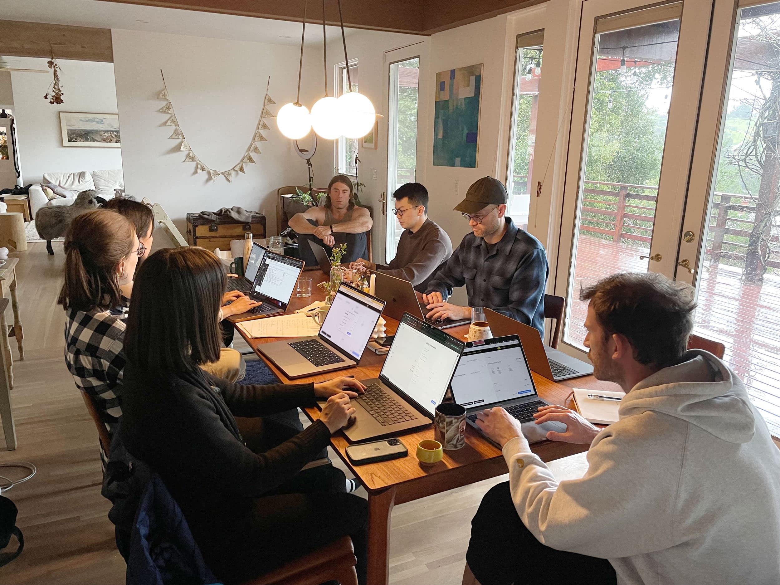
As the website began to take shape during the late summer of 2024, the core Sharp Type team was enlisted to test the site, sending notes from across different time zones and giving feedback during weekly team Zoom meetings. Team retreats in Newport, Rhode Island and San Francisco provided rare occasions for the team to work together in person.
“We had marathon work sessions with the core Sharp Type team during those retreats to ideate, test, and improve specific parts of the user experience.” Given the variety of backgrounds and expertise of the team, the work sessions felt like focus groups. Talking through what was needed on abstract and granular levels was both fun and exhausting.
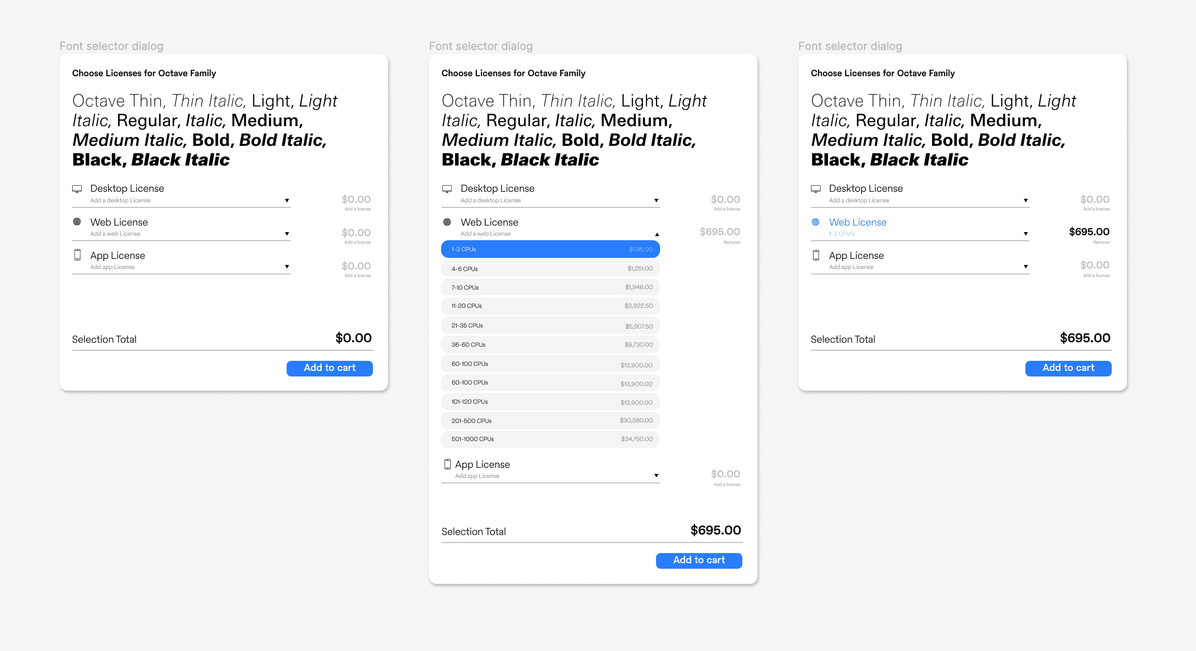
Season 2’s e-commerce platform was particularly challenging. “I have never worked on an e-comm experience this complex, and there is a lot of learning to carry forward. The e-commerce and checkout experience required a few different focus groups and a lot of retooling. I’d build new layouts and give feedback to FotW to address what wasn’t working. It was critical to have as many eyes on the site as possible. The complexity of the site is prone to leaving elements overlooked.”
Future Better
Future Better
Now that Season Two is out in the world, the true testing begins. “I’m excited to see the site evolve and get populated with new content throughout the year.” As Sharp Type’s resident art director, Justin will be in the best position to work with the site he designed. “We have many new typeface releases this year, so we plan to put the flexibility of the site to the test.”
“I didn't realize creating this site would take so long,” he says in closing. “This is the longest project I have ever worked on outside of drawing fonts. It was a refreshing change, coming from an agency background where I would work on projects for a month or two and never touch them again. Shaping something over so much time has been gratifying.”