Process: Doyle
About Doyle
About Doyle
Doyle is a period piece, a loving synthesis of 2 iconic styles that became the visual backdrop of a generation. The darkest master is Lucas Sharp’s ode to Cooper Black drawn from memory, and on the light end of the spectrum the chubby organic forms suck it in and take on a style reminiscent of ITC American Typewriter. While Doyle takes many cues from these 2 sources, their reinterpretation and amalgamation form something new entirely: a coherent family that is both structured and loose, with an inky wetness that is positively brimming with life. Doyle was designed by Lucas Sharp and Marc Rouault in 2019.
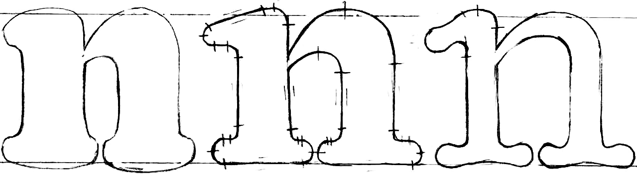
Construction of Doyle Black
Construction of Doyle Black
Cooper Black, designed by Oswald Bruce Cooper in 1922, was an instant classic. Foregoing the harsh and pointed construction of the then-popular fat-face style, Cooper opted for soft and inky organic forms with the foundational structure of a low contrast old-style serif. Now a cult classic, the muddy, bulbous forms of Cooper Black came to represent a cultural movement away from rigid traditionalism.

After a great deal of initial popularity in print-advertising in the mid-1920s, Cooper Black fell dormant for some time following Cooper’s death in 1940. After The Beach Boys used it for their album "Pet Sounds", the typeface had a huge resurgence in the late ’60s and ‘70s. Juicy serif fonts like Copper Black, Souvenir, and American Typewriter became part of the aesthetic language of a generation.

While drawing Cooper Black from memory (one of his favorite styles) for early drafts of Doyle Black, type-designer Lucas Sharp leaned into the bulbous construction, with smoother serifs, a taller x-height, and more structured stems.


Cooper Black is full of life, in fact, it is positively bursting at the seams. Part of that vitality has to do with the lumpy eccentricity resulting from its rational foundation, but mostly it's the plumpness, like it’s full of collagen. This sense greatly informed our approach to how we designed the weight spectrum of Doyle. While Doyle Black is almost busting at the seams, a healthy and rigid structure is revealed as weight is subtracted, with the lightest weight almost bowing inwards for want of filling.
Doyle Family
Doyle Family
As we began fleshing out a methodology for how the design would behave throughout its weight spectrum, it became apparent that the foundational structure was going to have to play a larger role in the middle weights than it needed to in the black, where the abundance of gloppy form could bleed out and get away with a more abstract quality. We knew our medium weight had to emphasize the importance of this underlying structure.

Doyle Black is inflated with puffy round serifs. The Medium is structured with rounded-flat slab-serifs, and the light end of the spectrum is a lean typewriter vernacular style with concave curves reminiscent of ITC American Typewriter (Joel Kaden and Tony Stan, 1974), another iconic piece of 1970’s typographic style.

Throughout the family is a tension between a state of amorphousness and of rational typographic structure. This delicate dance of form achieves an unlikely cohesion in a family that transforms over the course of its weight spectrum so drastically, an aspect best illustrated by the short, nubby serifs of Doyle Black italic, and the oversized swooping serifs of Doyle Light Italic.
Inherent in our approach was a feeling of the everyday banality of our constructed world. Perhaps it’s because these styles represent a time when our interactions with each other, and with the everyday objects around us were more tactile, when the letters of the articles we read bled into the newsprint they were printed on, and LP’s were physical objects with photo-type graphics on them. Doyle is a love letter to a bygone era, both nostalgic and forward facing.
Featured Fonts
Featured Fonts