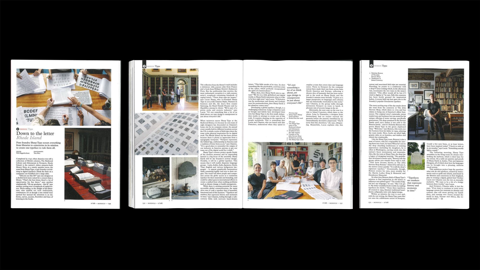
Down to the Letter: Sharp Type in Monocle Magazine
MONOCLE Magazine Issue 168
MONOCLE Magazine Issue 168
Font foundry Sharp Type scours everything from libraries to cemeteries in its mission to create one typeface to rule them all.
Font foundry Sharp Type scours everything from libraries to cemeteries in its mission to create one typeface to rule them all.
Writer: Will Higginbotham
Photography: Tara Rice
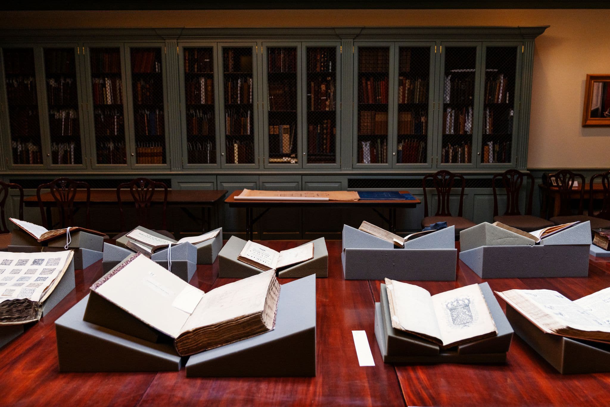
Completed in I747, when America was still a collection of British colonies, The Redwood Library and Athenaeum in Newport, Rhode Island, is the nation's oldest purpose-built library. Here, in a stately upstairs room, the team from Sharp Type, a type foundry specializing in digital typefaces (think the fonts on a computer) are huddled over a large table.
"Did you see this M?" says one designer at a decibel level more suited for a concert than a library. "That's the best letter; there’s a lot of opportunity for fun there," says another emphatically. ”Oh my goodness - this R,” says another, poring over a scrapbook of capital letters. Photo-taking, to the delight of the librarians, who seldom see such enthusiasm commences: it's as though a rare animal were spotted but instead the attention is on the forms, curves, accents, flourishes and lines of lettering in the books.
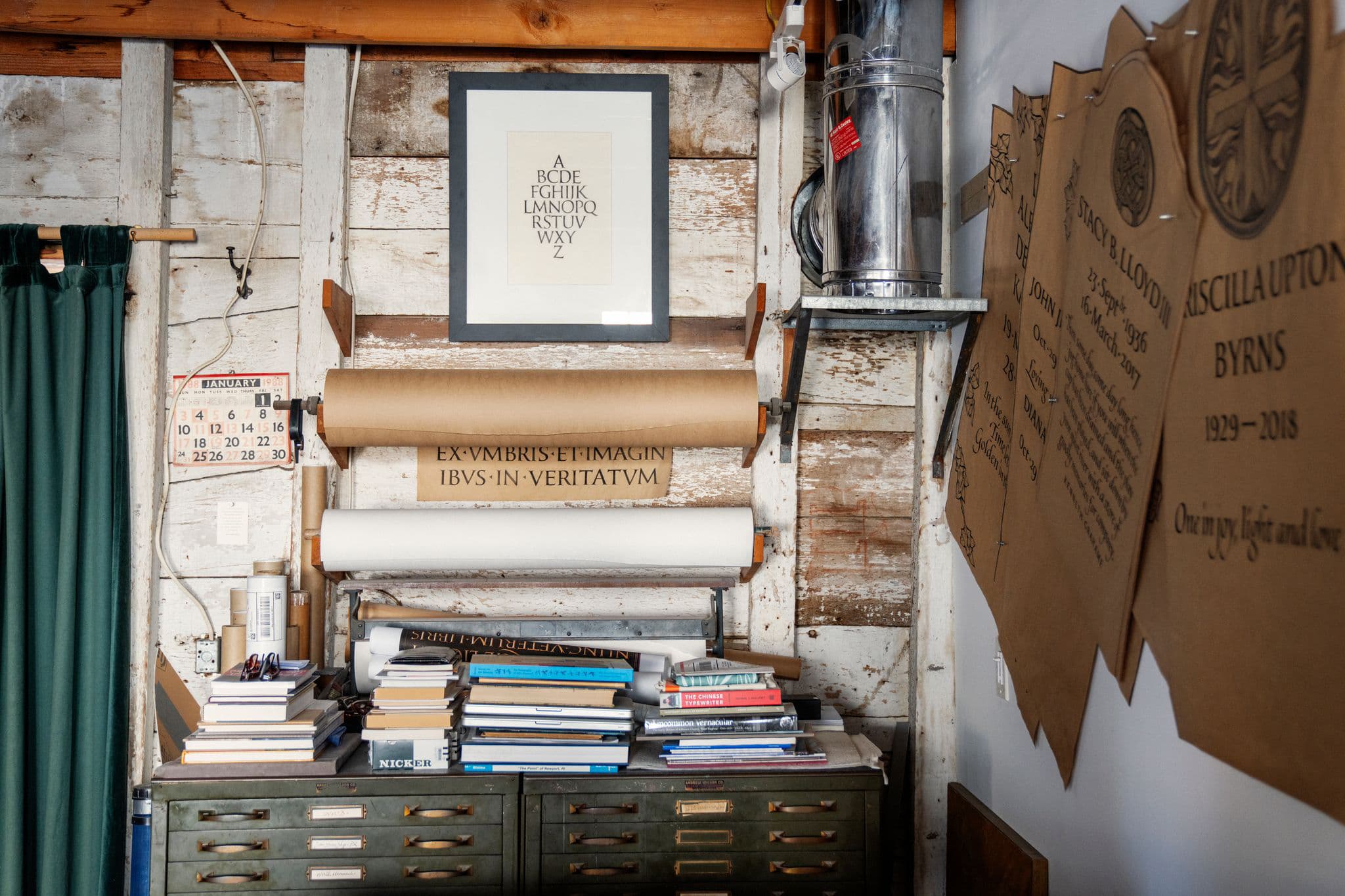
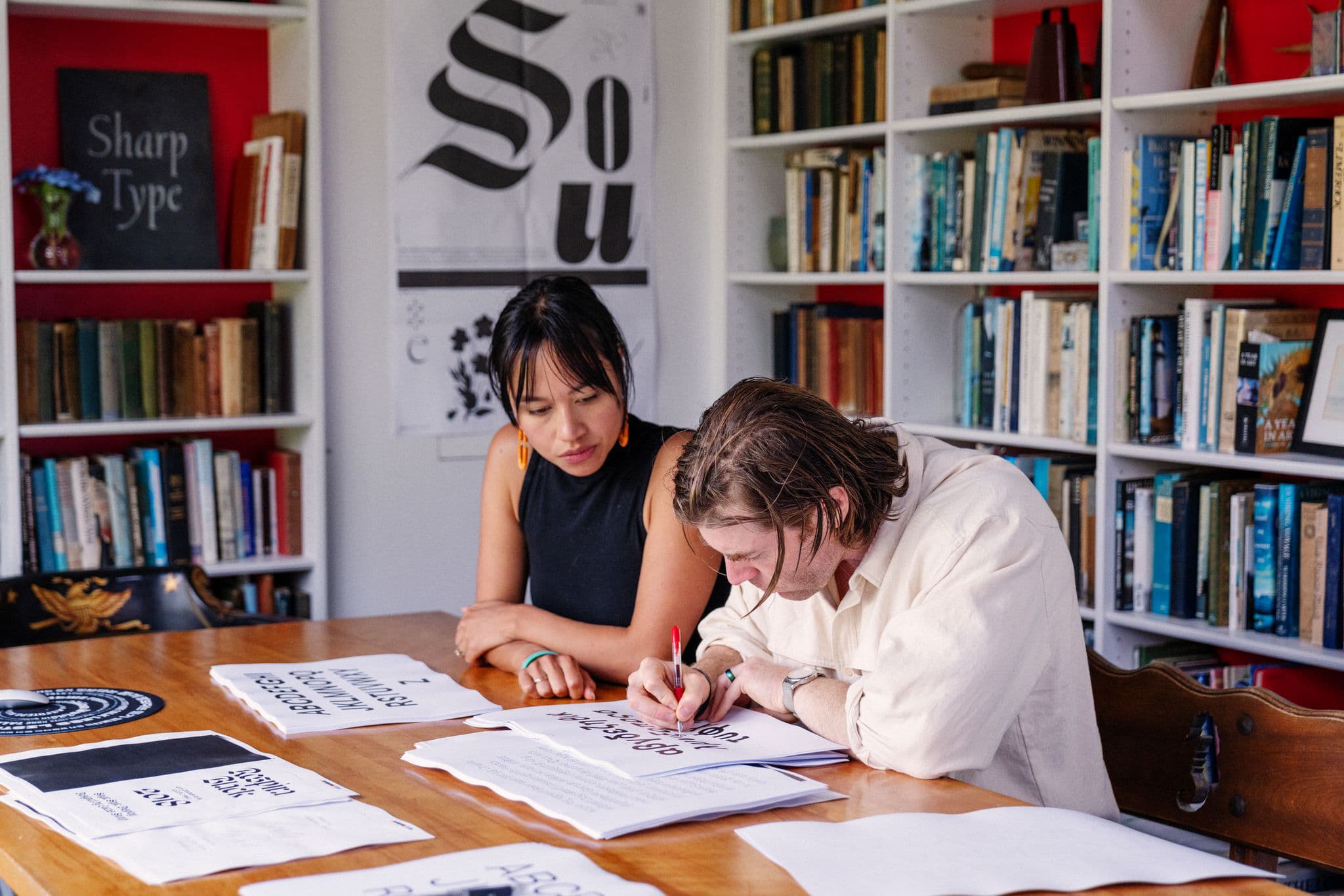
The collection from the library's vault includes a miniature I8th-century atlas from France and a book from William Morris's Kelmscott Press. But the publication that receives the most enthusiastic reception is an 19th-century artist's scrapbook containing hundreds of capital letters. "These drop caps are insane,” says Lucas Sharp, who co-founded Sharp Type in 2015 with Chantra Malee. Partners in business and life, the duo's firm counts Samsung, the Royal Danish Theatre and La Repubblica among its clients. “We're part of a pretty niche and esoteric industry," savs Lucas. "It's not something that a lot of us think about, yet type design is omnipresent in just about everyone's life."
“It’s not something a lot of us think about, yet type design is omnipresent in just about everyone’s life”
“It’s not something a lot of us think about, yet type design is omnipresent in just about everyone’s life”
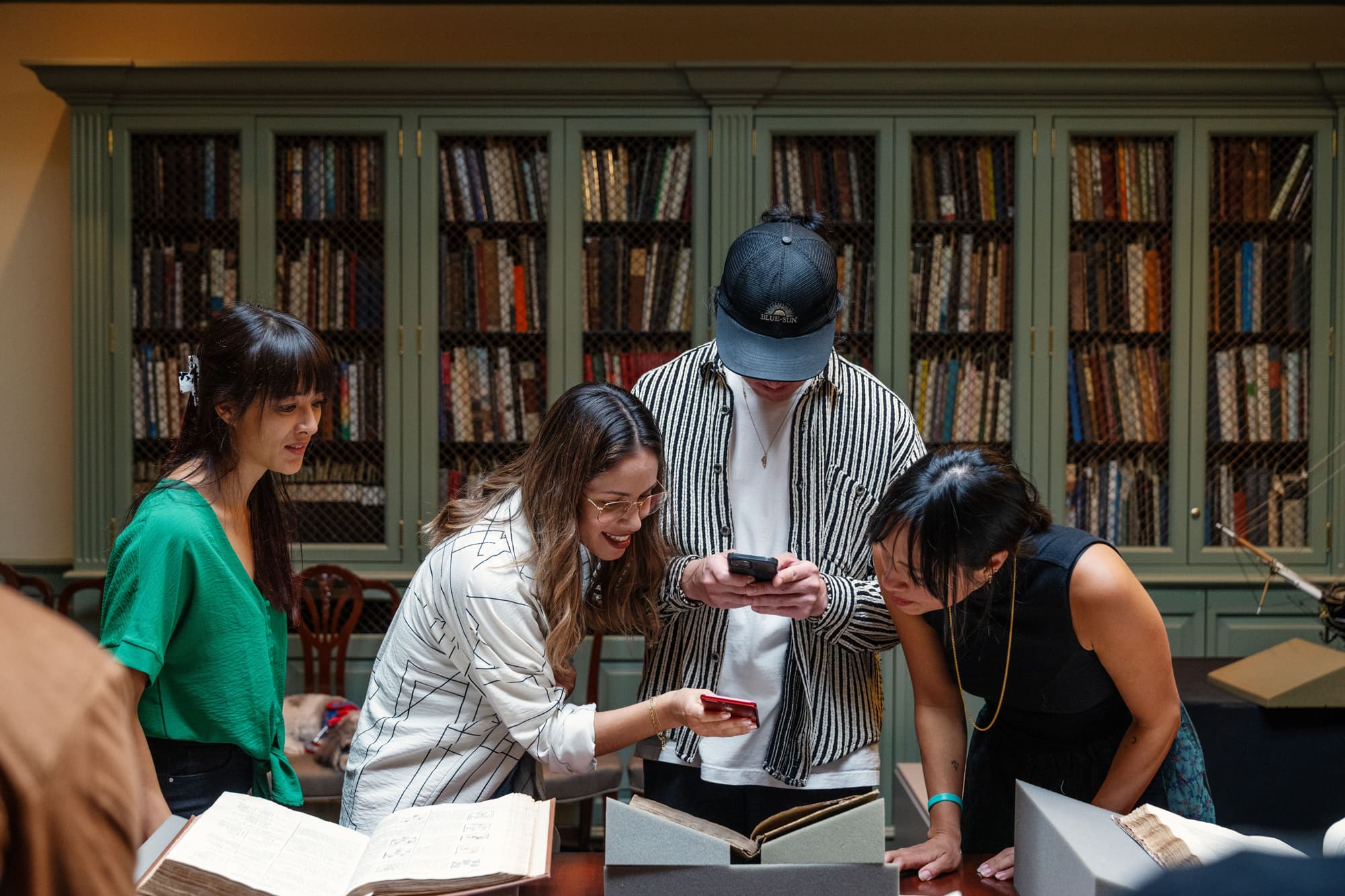
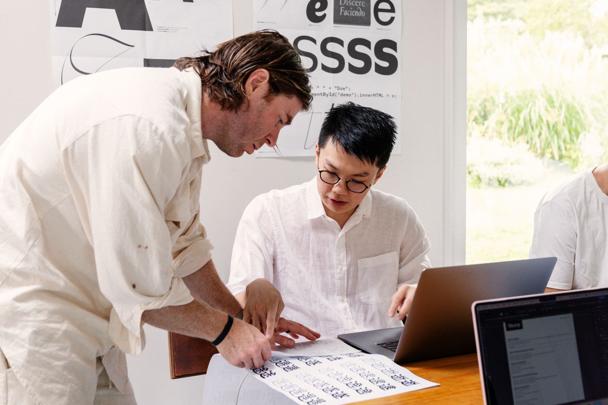
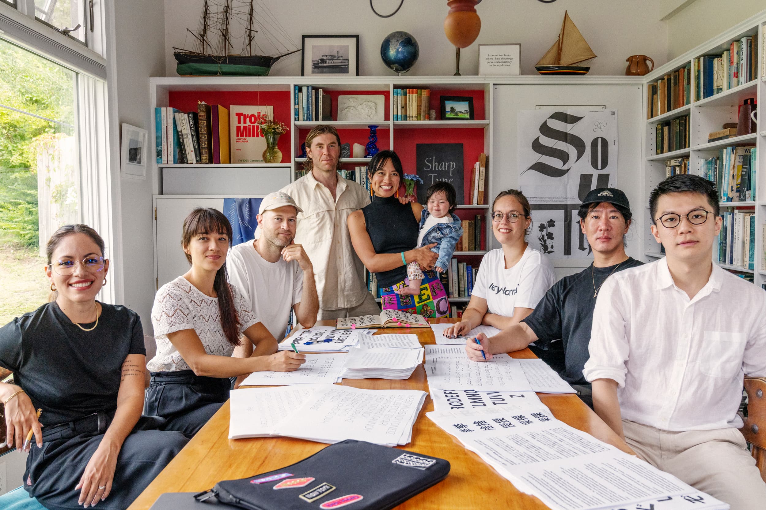
When MONOCLE meets Sharp Type at the Redwood library, it is because its core team of eight designers has descended on Chantra's home city for its company retreat. An annual event usually held in different locations across the US, it entails a series of field trips where the team seeks physical inspiration for its digital work. The Rhode Island city has been chosen because there is plenty to appreciate from a typography viewpoint. "Newport represents the Gilded Age, craftsmanship in America and a tradition of letter form as art," says Chantra. "It's a good place to remember the origins of our industry, in America anyway, to get our team out of the digital world for a while."
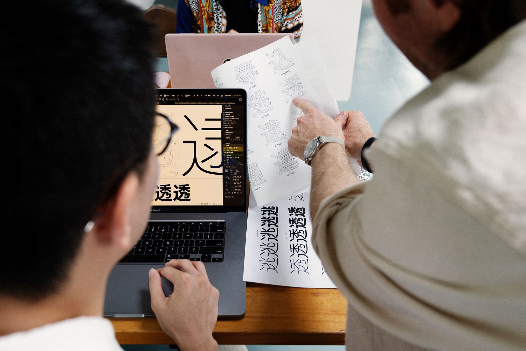
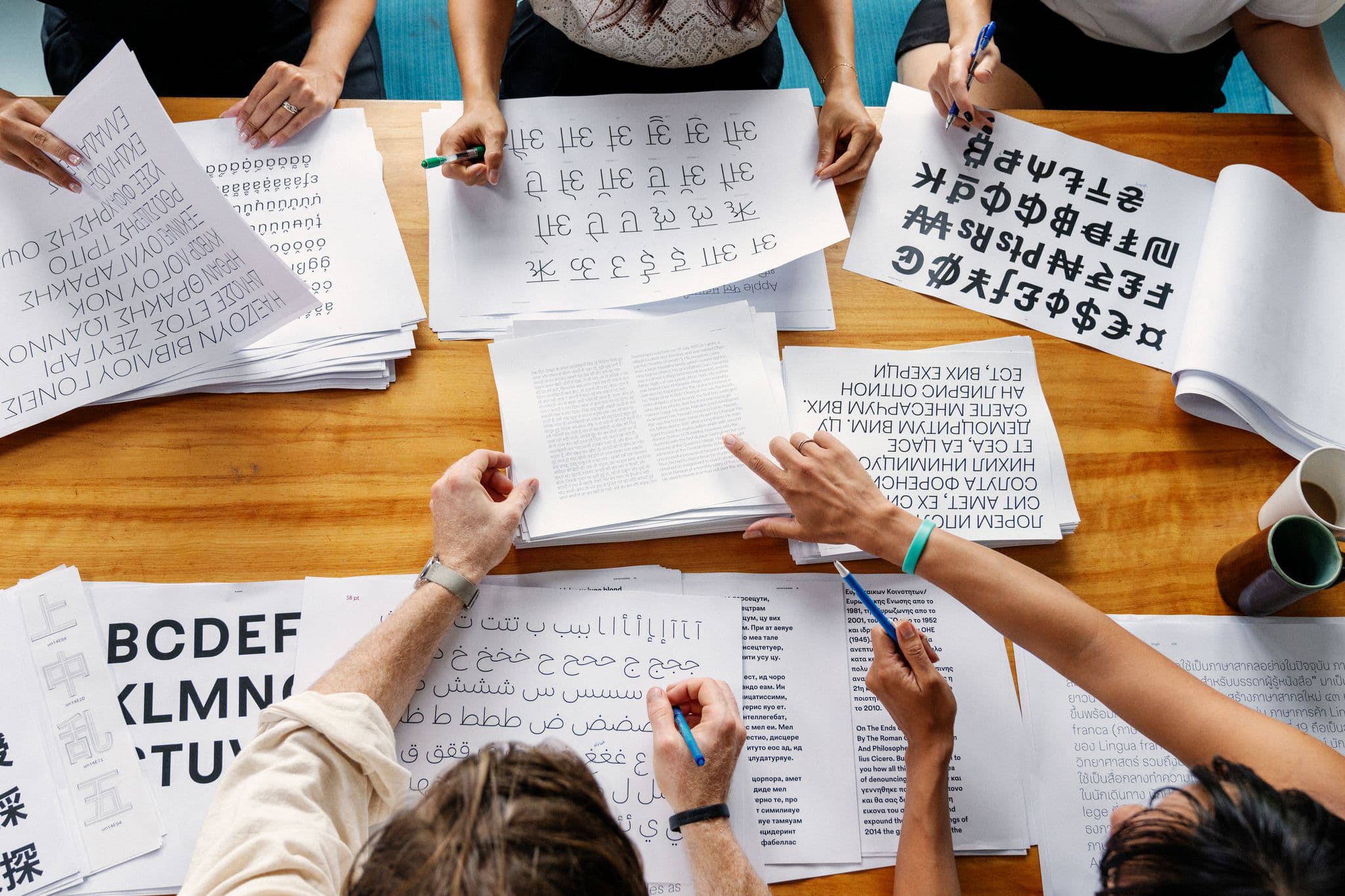
Sharp Type's newest project speaks firmly of the modern moment and its impending launch is a big focus of the assembly. Sharp Earth will be the foundry's newest design. Notably, it will be a global typeface. This means that it will enable disparate language groups -Latin, Arabic, Indic, Japanese, Greek, Thai, English and various indigenous languages - to appear graphically harmonious while remaining legible and true to their origins, The result will allow people and companies across the globe access to a consistent typeface for their materials and branding, and could be called upon in international efforts to create a unified front when tackling problems such as climate change or health emergencies.
While there is exciting potential for more accessible global communications, the main drive was to craft a typeface that is beautiful, functional and of this moment. "Typefaces are markers that represent history in time," says Chantra, leafing through drawn a I5th century bible with intricate hand-drawn letters. “This bible speaks of its time. So does something like the psychedelic, acid-font craze of the I960s, which perfectly encapsulated the spirit of counterculture."
What, then, does Sharp Earth aim to capture We live in a fully globalised and digital world, so Sharp Earth represents what it is like to be here right now," says Lucas. “If Helvetica was for modernism, and Avenir and Gotham were for postmodernism, then Sharp Earth is for whatever comes next.”
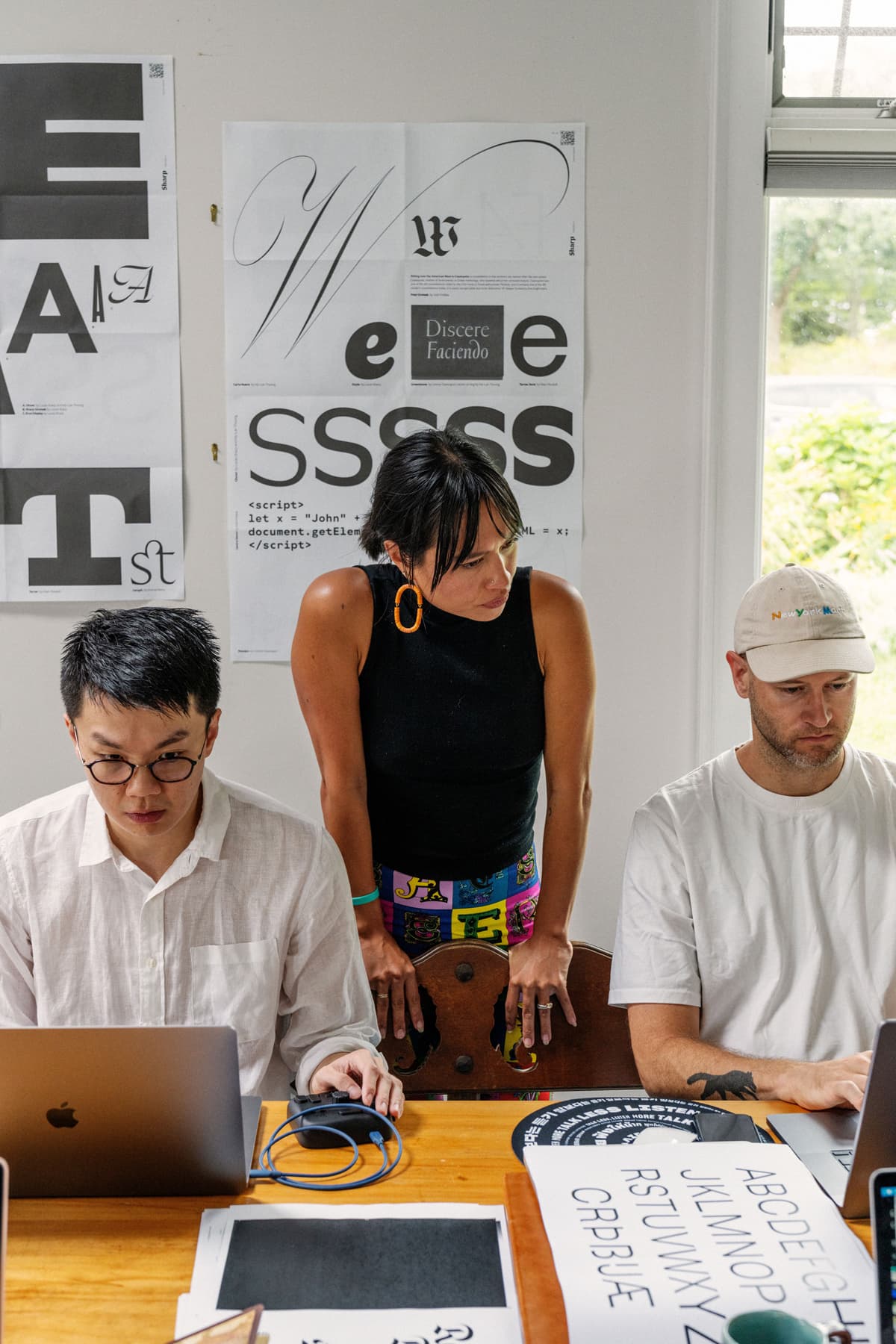
Developing a global typeface, though, is a challenging endeavour. Large companies such as Google and Adobe have developed their own but Sharp Type is the first small, independent studio to attempt to create one of this scale. It requires drawing on the expertise of people worldwide. This is something that Lucas and Chantra, who are based near San Francisco, understood when they opted to employ a team that covers time and language zones. Those in Newport for the company retreat have made their way from across Asia,North America and Europe, reflecting a diverse slice of humanity that has been essential to the work on Sharp Earth, and the foundry's mission more broadly. "It gives us a larger perspective on languages and cultures that are historically overlooked in this work," says Chantra, as the group walks through downtown Newport en route to lunch. A pleasant mix of accents hangs in the air.
Afterwards, the next stop on the tour is a visit to Island Cemetery, which dates to the I600s. Léna Le Pommelet, a designer from Switzerland, had no sooner entered the grounds before she paused, transfixed by an extraordinarily decorative ampersand. “You'll never find this elsewhere," she says, whispering. Meanwhile, Lucas explains why this retreat and associated field trips are essential. Kneeling, he points to a tombstone with a deep V letter etching which, in the afternoon sun, accentuates the two tones in the stone's mineral. "This effect would all be lost if I tried to digitise it," he says. Still, this cemetery has been fertile ground for inspiration before. A recent field trip here gave rise to the foundry's popular Greenstone typeface.
The most exciting stop of the day awaits down the road from the cemetery at The John Stevens Shop, which dates to I705 and has claims to being one of America's oldest businesses. The original store's namesake owner traded rum and molasses but was noted for his unique offering of stone carving, specifically gravestones. The shop remained in the Stevens family until 1927, before it was sold to the Benson family - and it's Nicholas Benson who greets Sharp Type in the green clapboard shop. “Welcome," says Benson, who took over the business from his father in I993, ushering the team inside. Here, books are piled high, granite slabs sit on benches, and mallets and chisels line windowsills.
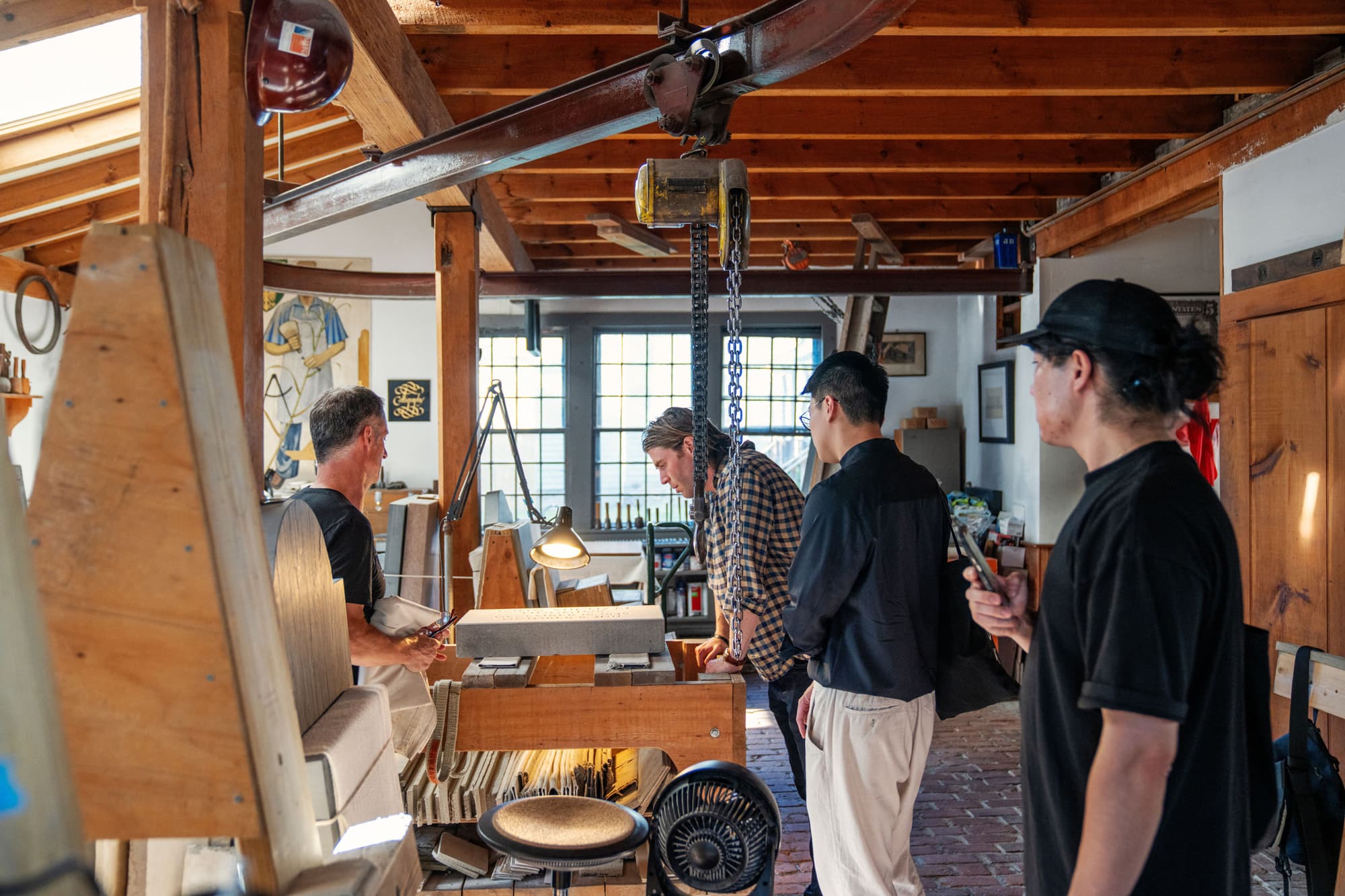
Like the Sharp Type team, Benson is also a man of letters, only he's responsible for carving them into stone, by hand. When he's not in the shop chiseling tombstones or training apprentices (including his daughter), he is often in Washington, carving words into the nation's finest monuments and museums. Also, like the team at Sharp Type, the shop has a legacy of designing lettering. ”My grandfather developed a house style," Benson tells the group, whose eyes wander from wall to wall.
“That form became known as The John Stevens Shop Roman." Asked if he still uses it, the answer comes quickly: "It is still the shop's signature typeface," Occasionally, though, Benson creates his own, most notably for 2 the Martin Luther King Jr Memorial and Eisenhower Memorial.
So what does Benson think of Sharp Type's mission to find inspiration in old letters to influence new global types? "The world of digital isn't my language," he says. "But I do get it. My father straddled both worlds by making typefaces for Adobe," Those three typefaces, all created in 1994, blended traditional hand-drawn calligraphy style with digital design.
Within 45 minutes the tour is over and, with the sun setting, the Sharp Type team files out onto the cobblestone streets of Newport.
The following morning, Sharp Type assembles in the living room of a house over-looking the harbour, which is their base for the retreat. On a table are pastries and proofs of Sharp Earth in Arabic, Thai and Japanese Hiragana, all of which show how the languages can be brought into a pleasing, uniform visual system.
This ambitious project begs the question: what role do old typefaces, created by instruments such as quills and chisels, and found in the libraries and cemeteries in New England, play in creating a digital, global font? Neither Lucas nor Chantra sees the two as mutually exclusive, "We want to be a bit of a bridge between these worlds," says Lucas.
And Newport, Chantra adds, is just the start. "1f we want to continue to cover evey language system but maintain its identity a context, that will mean getting our hands dirty, and turning over stones around the world in Asia, Europe and Africa, like we did this week."
Could a few new fonts, or at least letters, have been inspired today? "Check in with us in six months," says Lucas. “Something usually lights a spark."
Could a few new fonts, or at least letters, have been inspired today? "Check in with us in six months," says Lucas. “Something usually lights a spark."
Featured Fonts
Featured Fonts