Sharp Grotesk Global Case Study
Our largest typeface system goes global with brand new script extensions in Cyrillic, Greek, Thai, and Hangul; our first Latin variable font; plus an extended Latin character set.
Our largest typeface system goes global with brand new script extensions in Cyrillic, Greek, Thai, and Hangul; our first Latin variable font; plus an extended Latin character set.
The original Latin release is notable for its massive 7 weights and 21 widths in roman and italic styles. This variety lends the typeface an incredible range of moods, making it endlessly adaptable and scalable on a cross axis of weight, width, and now variable font technology and an expansive language extension.
From the start, we wanted to achieve a harmony of texture, rhythm, and form across these extensions, rather than enforcing any sort of superficial aesthetic uniformity. Over the last four years, we’ve worked on Greek, Cyrillic, Thai, and Hangul versions of Sharp Grotesk with native type designers. This means that components were developed from the native script and then adapted to the aesthetics and construction of Sharp Grotesk. The balancing act here was to ensure a strong historical and cultural understanding of the native scripts while not shying away from pushing boundaries and creating new forms. These energetic interpretations sit together beautifully on the same page and also succeed as independent typefaces, achieving a cultural and aesthetic harmony across this globe-spanning superfamily.
Sharp Grotesk has been one of our most popular typefaces since its release in 2017. What began as hand-drawn lettering for a poster in 2011 is now our most comprehensive family to date, with all fonts sharing Sharp Grotesk’s evergreen balance of populist feel and singular design. The expansive reach of this release is underscored by the addition of a Latin variable font—our first—and an extended Latin character set. Over two dozen sets of hands contributed to Sharp Grotesk Global’s chimeric development. The symphonic result is the culmination of years of collective work, and a prelude for what’s to come.
Sharp Grotesk Global contains an entire universe within itself. Lucas Sharp’s monument to Adrian Frutiger sits at the intersection of modernist rigor and hand-drawn vernacular, where Swiss styling collides with the unexpected construction and wonky imperfectionism of 20th-century American wood type.
Latin Construction
Latin Construction
21 weights, 7 widths for both Roman & Italic, 294 total styles
Like Frutiger’s Univers, Sharp Grotesk spans the gamut of width and weight and explores the edges of what is possible in sans-serif typography, organizing the resulting family by width and weight using a numeric system of style naming.
The Latin superfamily consists of 14 roman/italic pairs. The style names correspond with a number: 05 - 25, which represents the 21 widths of Sharp Grotesk. For example: the narrowest and boldest font in the family is ‘Sharp Grotesk Black Italic - 05’. The thinnest and widest font in the family is ‘Sharp Grotesk Thin - 25’.

R
R
R
R
R
Within the Latin family, different width and weight ranges are optimized for different optical sizes. The 20s are the most standard widths and a good starting point for designers in terms of overall utility. The extremes on either end of both the width and weight axes of the spectrum tend to require display setting, with the ultra-narrow 05 widths and the tightly-packed Black weights requiring the largest display settings.
Immediately noticeable features are the affably wonky nods to the wood type era, such as the highly swashy ear of the “g” and the curvaceous leg of the “R”. The character of the typeface shines through the construction of its letterforms, which transition from a capsule-based letter shape found in the more condensed widths, which gradually transform toward the fully round shapes in the 20-25 widths. Ink traps—a strange feature for a typeface so informed by wood type—are useful in optimizing both large and mid range optical sizes in different ways. In the mid to thin widths, they help maintain texture and legibility at smaller sizes. In the tightly-packed Black weight, they facilitate the hairline negative space that defines the letters.
g
g
g
g
g
Pan Euro: Greek & Cyrillic Construction
Pan Euro: Greek & Cyrillic Construction
21 weights, 7 widths for both Roman & Italic, 294 total styles for both Greek + Cyrillic
Sharp Grotesk Pan Euro is a microcosm of the design process that was undertaken with Sharp Type Global—not to speak of the design methodologies constantly being reappraised within the greater type community. In addition to Greek, the modern Cyrillic alphabets—Ukrainian, Russian, Bulgarian, Serbian, Macedonian—are represented in this release.
While they are completely distinct written language systems, Greek, Cyrillic, and Latin are historically related and share enough construction principles to make them well-suited to explore the adaptive possibilities of Sharp Grotesk.
In 2017, Lucas drew the first weight of Cyrillic before Connor Davenport expanded upon the designspace under the watchful guidance of Maria Doreuli, a Moscow-born type designer and founder of Contrast Foundry. Further weights were drawn by Maria herself, who then made general revisions to the initial 13 masters. In 2021, Jovana Jocić, a type designer from Belgrade, took the reins and completed the extreme ends of the Cyrillic spectrum. With expert support from Athens-based Kostas Bartsokas, Jovana concurrently drew the complete Greek extension.
““In order to best match the design of Cyrillic to Latin, I had to check everything to make sure all of the forms followed the same logic,” says Maria. “Whatever feature you are playing with needs to be related to the core structure. The proportions, the contrast, the character of the stem, the relations between black and white, the tension of the curves—these became the unifying features between Sharp Grotesk Cyrillic and Latin.”
П
П
П
П
П
Unlike Latin, the construction of Cyrillic puts a lot of emphasis on the vertical strokes, resulting in a higher number of “square” shapes. A significantly smaller number of ascenders and descenders in Cyrillic creates a further departure in texture and overall color. Maria defined the design approach by narrowing in on two Cyrillic letterforms to serve as the basis for the rest of the design. “I chose to use grotesk constructions for /б and /ф, which definitely set the typeface into a particular ‘mood’, aligning it with the Latin’s double story /g.”
When Jovana came aboard, she considered the sets completed by Maria. “One of the biggest challenges was not to give in completely to the rigidity that the Cyrillic alphabet itself imposes, but to preserve the hand-drawn qualities of the Latin. My first step was to determine the correct proportions of both lowercase and uppercase straight shapes such as -П, И, Ц, Ш, Џ.”
The complexity of certain letterforms in Cyrillic and Greek became prominent in heavier styles. “Managing their weight while keeping the right proportions was pivotal. At times, their tight spacing required me to design the counterforms and think about the negative space rather than the letter itself,” says Jovana. “The process required a lot of subtle optical corrections, but once I got it right, they became one of the most characteristic shapes in both the Cyrillic and Greek families.”

Whatever feature you are playing with needs to be related to the core structure. The proportions, the contrast, the character of the stem, the relations between black and white, the tension of the curves—these became the unifying features between Sharp Grotesk Cyrillic and Latin. —Maria Doreuli
б
б
б
б
б
“Designing the Greek and Cyrillic together meant that they inevitably influenced each other,” continues Jovana. “Just as their relation in history is direct, a lot of Cyrillic and Greek letterforms in Sharp Grotesk Global share the similar construction principles. While drawing Greek, I consulted with Kostas Bartsokas. He advised me on how to better evaluate certain proportions and details throughout the design process.”
“Texture-wise, Greek and Latin are very dissimilar. The Greek script is characterized by a large number of round letters,” says Kostas. “Latin, on the other hand, features a lot of vertical repetitive strokes. The hardest part when pairing a Greek to a Latin typeface is identifying the shared intrinsic details. Weights were adjusted [in the Greek design] to create harmony, and the proportions of individual letterforms were further adjusted to create a similar tonal reading experience, even though the texture may look different.”
“Sharp Grotesk's designspace is vast,” Kostas says in closing. “It spans from super compressed to extra wide and from hairline to Black. Proofing the super-condensed styles was very challenging for the eyes.”
Thai Construction
Thai Construction
6 weights, 11 widths, 66 total styles
Thai is an Abugida writing system distinct from alphabets like Greek, Cyrillic, and Latin. While it is read left-to-right, consonants and vowels form segmented units, with the vowel always secondary to its consonant partner. It has 44 consonants and some 20 vowels and tone marks.
In January of 2019, Sharp Type began work on Sharp Grotesk Thai with Cadson Demak, a renowned Thai design studio and type foundry based in Bangkok. In the end, it took 32 weeks to complete the project. Thai is an Abugida writing system distinct from alphabets like Greek, Cyrillic, and Latin. While it is read left-to-right, consonants and vowels form segmented units, with the vowel always secondary to its consonant partner. It has 44 consonants and some 20 vowels and tone marks. Thai is not a common script extension, but it’s an homage to studio founder Chantra Malee’s heritage. For both of these reasons, SG Thai has a special place in the world of Sharp Grotesk Global. Cadson Demak’s design director, Smich Smanloh, and designer Promphan Suksumek were tasked with finding a drawing solution to match the family construction of Sharp Grotesk, and this was challenging for several reasons.
Thai typefaces typically do not have the wide weight and width system of SG Latin since the script has so many details within the letterforms. This made translating the darkest weights and thinnest widths—the Blacks and 05s—a challenge. “This not only required a lot of visual corrections to be done to maintain the legibility but also required us to make unique design decisions with some letters.” The team at Cadson determined that they could design Thai analogs to SG Latin’s 15-25 width range and all but the darkest Black weight.
ก
ก
ก
ช
ช
ช
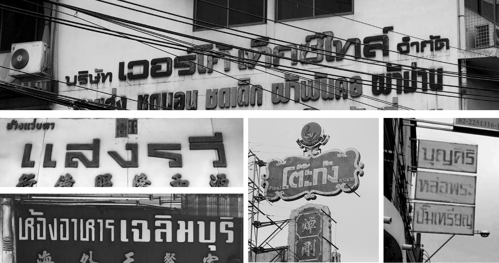
The designers had to bridge the features that make SG Latin’s construction unique–its textural sturdiness and wonky details—into the context of Thai script design principles. The eventual source of inspiration was something of a surprise but also made perfect sense: “The letterforms of Sharp Grotesk reminded us of old Thai signage, and we were inspired to use them as a basis for the design. We conducted research and had a lot of discussions to find potential vernacular letters which could be applied to Sharp Grotesk Thai,” says Smich.

Once the concept was established, the first letters that Cadson Demak designed were ‘บ (Bo-bai-mai)’, ‘น (No-nu)’, and ‘ม (Mo-ma)’ which are the main letters for establishing proportion. They then expanded the designated proportions to ‘หอกลางฐานจัตุรัส’, a Thai test word which contains letterforms with a good variety of ascenders and descenders. This test word ensures that the construction of the letterforms works smoothly across all masters.

The contemporary idea in Sharp Grotesk Thai bring about two alternative pairs of letters, “ร (Ro-rua), and “ธ (Tho-thong)”; together they are considered a confusing pair. These alternates are hidden in stylistic sets. Both of the stylistic sets provide alternates for ร and ธ, as seen in the 1980s. With ss01, we interpreted these letters toward a more sharp-cut style, and in ss02, we drew them in a curvy style. Both styles are popular in dry-transfer lettering and Thai signage during that time.
Hangul Construction
Hangul Construction
6 weights, 6 widths, 36 total styles
Korean type and graphic designer Minjoo Ham began working with Lucas on Sharp Grotesk Hangul in 2019. For the first month of the design process, Minjoo was invited to work in-person with the Sharp Type team, who were then based in Madrid.
The standard character set took a year to complete. “I was sketching and digitizing Hangul during this time and was able to discuss certain details with Lucas in person,” says Minjoo. “He suggested design directions and even drew some of the Hangul shapes. Having that first month to work in-person was very helpful to make some early design decisions.”
Modern Hangul is composed of 24 letters that were designed to be written in syllabic blocks that fit within a square system. Concepts of yin & yang and human, sky & earth are integral to the design. The language is notable because it was designed as a complete phonetic alphabet system in the 15th century, as opposed to languages whose letterforms evolved over long periods of time. Notably, the original Hangul design was a sans serif before moving into script-based designs.
There’s a distinction between designing shapes required for a particular language system and designing them well. There’s a further distinction between designing these components to work well within the same script, and designing them to sit harmoniously alongside other scripts that have fundamental differences in design. Even to a layperson, Hangul and Latin are very obviously different. Minjoo’s initial challenge was to find the right place to begin. “I started the design process by sketching keywords and basic characters that have the “ㅁ” letterform. Once I finished the “ㅁ” set, I expanded upon the design of the remaining character set based on those designs.”
ㅁ
ㅁ
ㅁ
ㅁ
ㅁ
“After the full character set was completed, I designed the letter spacing,” says Minjoo. This became the biggest challenge. Since Hangul characters are composed of three parts, there were many gaps of varying irregular size, which meant that it wasn’t possible to create a convenient system of extrapolation. This meant that Minjoo had to make manual adjustments across the set. “I had to make sure that the spaces were even and consistent across all letter combinations. The first words I successfully put together were ‘샤프한글’; ‘샤프’ means ‘sharp’ and ‘한글’ is ‘Hangul’ in Korean.”
Once the spacing was complete, Minjoo began unifying features between the two scripts. The main aesthetic consideration was the characteristics of Sharp Grotesk’s curves. “The atmosphere between the two scripts had to be alike. We wanted to make sure that the curves in Sharp Grotesk Hangul were made consistent with those of its Latin counterpart.”
“The atmosphere between the two scripts had to be alike. We wanted to make sure that the curves in Sharp Grotesk Hangul were made consistent with those of its Latin counterpart.”
춘
춘
춘
춘
춘
ㄱ ㄲ ㄳ ㄴ ㄵ ㄶ ㄷ ㄸ ㄹ ㄺ ㄻ ㄼ ㄽ ㄾ ㄿ ㅀ ㅁ ㅂ ㅃ ㅄ ㅅ ㅆ ㅇ ㅈ ㅉ ㅊ ㅋ ㅌ ㅍ ㅎ
ㅏ ㅐ ㅑ ㅒ ㅓ ㅔ ㅕ ㅖ ㅗ ㅘ ㅙ ㅚ ㅛ ㅝ ㅞ ㅟ ㅠ ㅡ ㅢ ㅣ
가 각 간 갇 갈 갉 갊 갋 감 갑 값 갓 갔 강 갖 갗 같 갚 갛 개 객 갠 갣 갤 갬 갭 갯 갰 갱 갸 갹 갼 걀 걋 걍 걔 걘 걜 걥 거 걱 건 걷 걸 걺 검 겁 겂 것 겄 겅 겆 겉 겊 겋 게 겐 겔 겜 겝 겟 겠 겡 겨 격 겪 견 겯 결 겷 겸 겹 겻 겼 경 곁 계 곈 곌 곕 곗 고 곡 곤 곧 골 곪 곬 곯 곰 곱 곳 공 곶 과 곽 관 괄 괆 괌 괍 괏 괐 광 괘 괜 괠 괢 괩 괬 괭 괴 괵 괸 괼 굄 굅 굇 굉 교 굔 굘 굠 굡 굣 굥 구 국 군 굳 굴 굵 굶 굻 굼 굽 굿 궁 궂 궈 궉 권 궐 궜 궝 궤 궷 궸 귀 귁 귄 귈 귐 귑 귓 귕 규 균 귤 귬 그 극 근 귿 글 긁 긂 긇 금 급 긋 긍 긑 긓 긔 기 긱 긴 긷 길 긺 김 깁 깃 깄 깅 깆 깊 까 깍 깎 깐 깔 깖 깜 깝 깟 깠 깡 깥 깨 깩 깬 깯 깰 깸 깹 깻 깼 깽 꺄 꺅 꺆 꺌 꺍 꺼 꺽 꺾 껀 껄 껌 껍 껏 껐 껑 껓 껕 께 껙 껜 껨 껫 껭 껴 껸 껼 꼇 꼈 꼉 꼍 꼐 꼬 꼭 꼰 꼲 꼳 꼴 꼼 꼽 꼿 꽁 꽂 꽃 꽅 꽈 꽉 꽐 꽜 꽝 꽤 꽥 꽸 꽹 꾀 꾄 꾈 꾐 꾑 꾕 꾜 꾸 꾹 꾼 꿀 꿇 꿈 꿉 꿋 꿍 꿎 꿔 꿘 꿜 꿨 꿩 꿰 꿱 꿴 꿸 뀀 뀁 뀄 뀌 뀐 뀔 뀜 뀝 뀨 뀰 뀼 끄 끅 끈 끊 끌 끎 끓 끔 끕 끗 끙 끝 끼 끽 낀 낄 낌 낍 낏 낑 나 낙 낚 난 낟 날 낡 낢 남 납 낫 났 낭 낮 낯 낱 낳 내 낵 낸 낻 낼 냄 냅 냇 냈 냉 냐 냑 냔 냗 냘 냠 냡 냣 냥 냬 너 넉 넋 넌 넏 널 넒 넓 넘 넙 넛 넜 넝 넢 넣 네 넥 넨 넫 넬 넴 넵 넷 넸 넹 녀 녁 년 녇 녈 념 녑 녔 녕 녘 녜 녠 녱 노 녹 논 놀 놁 놂 놈 놉 놋 농 놑 높 놓 놔 놘 놜 놨 놰 뇄 뇌 뇐 뇔 뇜 뇝 뇟 뇡 뇨 뇩 뇬 뇰 뇸 뇹 뇻 뇽 누 눅 눈 눋 눌 눍 눔 눕 눗 눙 눝 눠 눴 눼 뉘 뉜 뉠 뉨 뉩 뉴 뉵 뉻 뉼 늄 늅 늉 느 늑 는 늗 늘 늙 늚 늠 늡 늣 능 늦 늧 늪 늫 늬 늰 늴 늼 늿 닁 니 닉 닌 닏 닐 닒 님 닙 닛 닝 닞 닠 닢 다 닥 닦 단 닫 달 닭 닮 닮 닳 담 답 닷 닸 당 닺 닻 닽 닿 대 댁 댄 댈 댐 댑 댓 댔 댕 댖 댜 댠 댱 더 덕 덖 던 덛 덜 덞 덟 덤 덥 덧 덩 덫 덮 데 덱 덴 델 뎀 뎁 뎃 뎄 뎅 뎌 뎐 뎔 뎠 뎡 뎨 뎬 도 독 돈 돋 돌 돎 돐 돔 돕 돗 동 돛 돝 돠 돤 돨 돼 됐 되 된 될 됨 됩 됫 됬 됭 됴 두 둑 둔 둗 둘 둚 둠 둡 둣 둥 둬 뒀 뒈 뒙 뒝 뒤 뒨 뒬 뒵 뒷 뒹 듀 듄 듈 듐 듕 드 득 든 듣 들 듥 듦 듧 듬 듭 듯 등 듸 듼 딀 디 딕 딘 딛 딜 딤 딥 딧 딨 딩 딪 딮 따 딱 딴 딷 딸 땀 땁 땃 땄 땅 땋 때 땍 땐 땔 땜 땝 땟 땠 땡 땨 떠 떡 떤 떨 떪 떫 떰 떱 떳 떴 떵 떻 떼 떽 뗀 뗄 뗌 뗍 뗏 뗐 뗑 뗘 뗬 또 똑 똔 똘 똠 똡 똣 똥 똬 똭 똰 똴 뙇 뙈 뙜 뙤 뙨 뚜 뚝 뚠 뚤 뚧 뚫 뚬 뚱 뛔 뛰 뛴 뛸 뜀 뜁 뜅 뜌 뜨 뜩 뜬 뜯 뜰 뜳 뜸 뜹 뜻 뜽 뜾 띃 띄 띈 띌 띔 띕 띠 띡 띤 띨 띰 띱 띳 띵 라 락 란 랃 랄 람 랍 랏 랐 랑 랒 랖 랗 래 랙 랜 랟 랠 램 랩 랫 랬 랭 랲 랴 략 랸 럇 량 럔 러 럭 런 럲 럳 럴 럼 럽 럿 렀 렁 렇 레 렉 렌 렐 렘 렙 렛 렜 렝 려 력 련 렫 렬 렴 렵 렷 렸 령 례 롄 롑 롓 로 록 론 롣 롤 롬 롭 롯 롱 롸 롹 롼 뢍 뢔 뢨 뢰 뢴 뢸 룀 룁 룃 룅 료 룐 룔 룝 룟 룡 루 룩 룬 룰 룸 룹 룻 룽 뤄 뤘 뤠 뤤 뤼 뤽 륀 륄 륌 륏 륑 류 륙 륜 률 륨 륩 륫 륭 르 륵 른 를 름 릅 릇 릉 릊 릍 릎 릐 릔 리 릭 린 릴 림 립 릿 맀 링 맆 마 막 만 많 맏 말 맑 맒 맘 맙 맛 맜 망 맞 맟 맡 맢 맣 매 맥 맨 맫 맬 맴 맵 맷 맸 맹 맺 먀 먁 먄 먈 먐 먕 머 먹 먼 멀 멂 멈 멉 멋 멍 멎 멓 메 멕 멘 멜 멤 멥 멧 멨 멩 며 멱 면 멷 멸 몃 몄 명 몇 몌 몐 모 목 몫 몬 몯 몰 몱 몲 몸 몹 못 몽 뫄 뫈 뫘 뫙 뫠 뫴 뫼 묀 묄 묌 묍 묏 묑 묘 묜 묠 묩 묫 무 묵 묶 문 묻 물 묽 묾 뭄 뭅 뭇 뭉 뭍 뭏 뭐 뭔 뭘 뭡 뭣 뭥 뭬 뮈 뮊 뮌 뮐 뮙 뮤 뮨 뮬 뮴 뮷 뮹 므 믁 믄 믈 믐 믓 믕 믜 믠 믱 미 믹 민 믿 밀 밂 밈 밉 밋 밌 밍 및 밑 바 박 밖 밗 반 받 발 밝 밞 밟 밤 밥 밧 방 밭 배 백 밴 밷 밸 뱀 뱁 뱃 뱄 뱅 뱉 뱌 뱍 뱐 뱜 뱝 뱟 뱡 버 벅 번 벋 벌 벎 범 법 벗 벙 벚 벟 베 벡 벤 벧 벨 벰 벱 벳 벴 벵 벼 벽 변 별 볌 볍 볏 볐 병 볕 볘 볜 복 볶 본 볻 볼 볿 봄 봅 봇 봉 봐 봔 봤 봥 봬 뵀 뵈 뵉 뵌 뵐 뵘 뵙 뵤 뵨 뵴 부 북 분 붇 불 붉 붊 붐 붑 붓 붕 붙 붚 붜 붠 붤 붰 붴 붸 뷁 뷔 뷕 뷘 뷜 뷥 뷩 뷰 뷴 뷸 븀 븃 븅 브 븍 븐 블 븜 븝 븟 븡 븨 븩 븰 븽 비 빅 빈 빋 빌 빎 빔 빕 빗 빘 빙 빚 빛 빠 빡 빤 빧 빨 빪 빰 빱 빳 빴 빵 빻 빼 빽 뺀 뺄 뺌 뺍 뺏 뺐 뺑 뺘 뺙 뺜 뺨 뻐 뻑 뻔 뻗 뻘 뻠 뻣 뻤 뻥 뻬 뼁 뼈 뼉 뼘 뼙 뼛 뼜 뼝 뽀 뽁 뽄 뽈 뽐 뽑 뽓 뽕 뾔 뾰 뿅 뿌 뿍 뿐 뿔 뿜 뿟 뿡 쀼 쁑 쁘 쁜 쁠 쁨 쁩 쁭 삐 삑 삔 삘 삠 삡 삣 삥 사 삭 삯 산 삳 살 삵 삶 삼 삽 삿 샀 상 샅 샆 새 색 샌 샏 샐 샘 샙 샛 샜 생 샤 샥 샨 샬 샴 샵 샷 샹 샾 섀 섁 섄 섈 섐 섕 서 석 섞 섟 선 섣 설 섦 섧 섬 섭 섯 섰 성 섶 세 섹 센 섿 셀 셈 셉 셋 셌 셍 셔 셕 션 셜 셤 셥 셧 셨 셩 셰 셴 셸 솅 소 속 솎 손 솓 솔 솖 솜 솝 솟 송 솥 솨 솩 솬 솰 솽 쇄 쇈 쇌 쇔 쇗 쇘 쇠 쇤 쇨 쇰 쇱 쇳 쇼 쇽 숀 숄 숌 숍 숏 숑 수 숙 순 숟 술 숨 숩 숫 숭 숯 숱 숲 숴 쉈 쉐 쉑 쉔 쉘 쉠 쉥 쉬 쉭 쉰 쉴 쉼 쉽 쉿 슁 슈 슉 슌 슐 슘 슛 슝 스 슥 슨 슫 슬 슭 슲 슴 습 슷 승 시 식 신 싣 실 싥 싫 심 십 싯 싰 싱 싳 싶 싸 싹 싻 싼 싿 쌀 쌈 쌉 쌌 쌍 쌓 쌔 쌕 쌘 쌜 쌤 쌥 쌨 쌩 쌰 쌱 썅 써 썩 썬 썰 썲 썸 썹 썼 썽 쎄 쎈 쎌 쏀 쏘 쏙 쏜 쏟 쏠 쏢 쏨 쏩 쏭 쏴 쏵 쏸 쏼 쐈 쐐 쐤 쐬 쐰 쐴 쐼 쐽 쑀 쑈 쑝 쑤 쑥 쑨 쑬 쑴 쑵 쑹 쒀 쒔 쒜 쒸 쒼 쓔 쓩 쓰 쓱 쓴 쓸 쓺 쓿 씀 씁 씌 씐 씔 씜 씨 씩 씫 씬 씰 씸 씹 씻 씼 씽 씿 아 악 안 앉 않 앋 알 앍 앎 앓 암 압 앗 았 앙 앜 앝 앞 애 액 앤 앨 앰 앱 앳 앴 앵 야 약 얀 얄 얇 얌 얍 얏 얐 양 얕 얗 얘 얜 얠 얩 얭 어 억 언 얹 얺 얻 얼 얽 얾 엄 업 없 엇 었 엉 엊 엌 엎 엏 에 엑 엔 엘 엠 엡 엣 엤 엥 여 역 엮 연 열 엶 엷 염 엽 엾 엿 였 영 옅 옆 옇 예 옌 옏 옐 옘 옙 옛 옜 오 옥 옦 온 옫 올 옭 옮 옰 옳 옴 옵 옷 옹 옻 와 왁 완 왈 왐 왑 왓 왔 왕 왜 왝 왠 왬 왯 왰 왱 외 왹 왼 욀 욈 욉 욋 욌 욍 요 욕 욘 욜 욤 욥 욧 용 우 욱 운 욷 울 욹 욺 움 웁 웃 웅 웇 워 웍 원 월 웜 웝 웠 웡 웨 웩 웬 웰 웸 웹 웽 위 윅 윈 윌 윔 윕 윗 윘 윙 유 육 윤 율 윰 윱 윳 융 윷 으 윽 윾 은 읃 을 읇 읊 음 읍 읏 응 읒 읓 읔 읕 읖 읗 의 읜 읠 읨 읫 이 익 인 읻 일 읽 읾 잃 임 입 잇 있 잉 잊 잌 잍 잎 자 작 잔 잖 잗 잘 잚 잠 잡 잣 잤 장 잦 재 잭 잰 잴 잼 잽 잿 쟀 쟁 쟈 쟉 쟌 쟎 쟐 쟘 쟝 쟤 쟨 쟬 저 적 전 젇 절 젉 젊 젋 점 접 젓 정 젖 제 젝 젠 젤 젬 젭 젯 젱 져 젼 졀 졈 졉 졌 졍 졔 조 족 존 졸 졺 좀 좁 좃 종 좆 좇 좋 좌 좍 좔 좝 좟 좡 좨 좼 좽 죄 죈 죌 죔 죕 죗 죙 죠 죡 죤 죵 주 죽 준 줄 줅 줆 줌 줍 줏 중 줘 줬 줴 쥐 쥑 쥔 쥘 쥠 쥡 쥣 쥬 쥰 쥴 쥼 즈 즉 즌 즐 즘 즙 즛 증 지 직 진 짇 질 짊 짐 집 짓 짔 징 짖 짗 짙 짚 짜 짝 짠 짢 짤 짧 짬 짭 짯 짰 짱 째 짹 짼 쨀 쨈 쨉 쨋 쨌 쨍 쨔 쨘 쨩 쩌 쩍 쩐 쩔 쩜 쩝 쩟 쩠 쩡 쩨 쩽 쪄 쪘 쪼 쪽 쫀 쫄 쫌 쫍 쫏 쫑 쫓 쫘 쫙 쫠 쫬 쫴 쬈 쬐 쬔 쬘 쬠 쬡 쭁 쭈 쭉 쭌 쭐 쭘 쭙 쭝 쭤 쭸 쭹 쮜 쮸 쯔 쯤 쯧 쯩 찌 찍 찐 찔 찜 찝 찡 찢 찧 차 착 찬 찮 찰 참 찹 찻 찼 창 찾 채 책 챈 챌 챔 챕 챗 챘 챙 챠 챤 챦 챨 챰 챵 처 척 천 철 첨 첩 첫 첬 청 체 첵 첸 첼 쳄 쳅 쳇 쳉 쳐 쳔 쳤 쳬 쳰 촁 초 촉 촌 촐 촘 촙 촛 총 촤 촨 촬 촹 최 쵠 쵤 쵬 쵭 쵯 쵱 쵸 춈 추 축 춘 출 춤 춥 춧 충 춰 췄 췌 췐 취 췬 췰 췸 췹 췻 췽 츄 츈 츌 츔 츙 츠 측 츤 츨 츰 츱 츳 층 츼 치 칙 친 칟 칠 칡 칢 침 칩 칫 칬 칭 카 칵 칸 칻 칼 캄 캅 캇 캉 캐 캑 캔 캘 캠 캡 캣 캤 캥 캨 캬 캭 캰 컁 컄 커 컥 컨 컫 컬 컴 컵 컷 컸 컹 컽 케 켁 켄 켈 켐 켑 켓 켕 켘 켜 켠 켤 켬 켭 켯 켰 켱 켸 코 콕 콘 콜 콤 콥 콧 콩 콰 콱 콴 콸 쾀 쾅 쾌 쾡 쾨 쾰 쿄 쿠 쿡 쿤 쿨 쿰 쿱 쿳 쿵 쿼 퀀 퀄 퀑 퀘 퀭 퀴 퀵 퀸 퀼 큄 큅 큇 큉 큐 큔 큘 큠 크 큭 큰 클 큼 큽 킁 킄 키 킥 킨 킬 킴 킵 킷 킸 킹 타 탁 탄 탈 탉 탐 탑 탓 탔 탕 태 택 탠 탤 탬 탭 탯 탰 탱 탸 턍 터 턱 턴 털 턺 텀 텁 텃 텄 텅 테 텍 텐 텔 템 텝 텟 텡 텨 텬 텼 톄 톈 토 톡 톤 톧 톨 톰 톱 톳 통 톺 톼 퇀 퇘 퇴 퇸 툇 툉 툐 투 툭 툰 툴 툼 툽 툿 퉁 퉈 퉜 퉤 튀 튁 튄 튈 튐 튑 튕 튜 튠 튤 튬 튱 트 특 튼 튿 틀 틂 틈 틉 틋 틍 틑 틔 틘 틜 틤 틥 티 틱 틴 틸 팀 팁 팃 팅 파 팍 팎 판 팓 팔 팖 팜 팝 팟 팠 팡 팤 팥 패 팩 팬 팯 팰 팸 팹 팻 팼 팽 퍄 퍅 퍝 퍼 퍽 펀 펄 펌 펍 펏 펐 펑 펖 페 펙 펜 펠 펨 펩 펫 펭 펴 편 펼 폄 폅 폈 평 폐 폘 폡 폣 포 폭 폰 폴 폼 폽 폿 퐁 퐅 퐈 퐝 푀 푄 표 푠 푤 푭 푯 푸 푹 푼 푿 풀 풂 품 풉 풋 풍 풔 풩
Variable Font Construction
Variable Font Construction
Available as a 3-axis variable font
“When drawing a typeface family, typically we use interpolation in the production phase to produce static instances between our sources, e.g. a Medium weight can be generated from a Thin and Black weight,” says Connor. “With a VF, this interpolation happens on the user's end via a design application with sliders. Practically, this minimizes the font’s overall file size, saving crucial space; in the case of Sharp Grotesk Latin, we see savings of around 2000%, going from 294 files to 1.”
In the winter of 2022, Connor Davenport began engineering a Sharp Grotesk variable font after years spent developing the workflow and tools to produce font files in this relatively new format. Given Sharp Grotesk’s wide spectrum of weights and widths, it was the logical evolution for the typeface.
In 2016, when Lucas originally published Sharp Grotesk, he designed it as a “variable static” font. The original 21 widths gave the user an extraordinary range of options to determine how headlines fit into a text block. Now, in 2023, the technology is finally at a place where we felt comfortable developing Lucas’ original idea into a true variable designspace.
“A variable font is like a normal OpenType font, but they have what we call ‘OpenType Variations’ features. These features contain bits of information that are embedded in the font to instruct the way each glyph’s points should move along any given axis,” says Connor. This variable font has 3 axes: weight, width, and slant. The weight ranges from 250 – 900, corresponding to the static family’s current weight structure. The width also follows the original structure of going from 05 – 25. We have also included a slant axis, ranging from 0 – 10, with each number corresponding to a degree of slant.
“When drawing a typeface family, typically we use interpolation in the production phase to produce static instances between our sources, e.g. a Medium weight can be generated from a Thin and Black weight,” says Connor. “With a VF, this interpolation happens on the user's end via a design application with sliders. Practically, this minimizes the font’s overall file size, saving crucial space; in the case of Sharp Grotesk Latin, we see savings of around 2000%, going from 294 files to 1.”
Featured Fonts
Featured Fonts