Ogg Superfamily Case Study
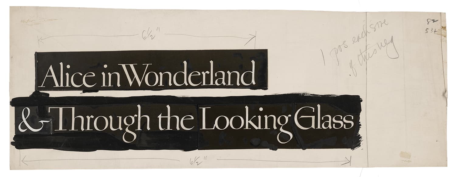
Inspired by the hand lettering of 20th century book designer and calligrapher Oscar Ogg, Ogg captures the unique mix of calligraphic and typographic form achieved through his use of hand carved pen nibs, brushes, and white-out.
Inspired by the hand lettering of 20th century book designer and calligrapher Oscar Ogg, Ogg captures the unique mix of calligraphic and typographic form achieved through his use of hand carved pen nibs, brushes, and white-out.
Ogg Construction
Ogg Construction
Regular and Slant
The foundational forms for the italic were a combination of invention and inspiration, mostly pulled from the deck sized script calligraphy found throughout this same volume. Although there is not a direct connection between these samples and the signature multi-kinked serif construction that forms the basis of the Ogg italic bouma, the design of Ogg amplifies many of the telltale moves found throughout Ogg's calligraphic works such as Ogg's signature italic ascenders. Although the foundational forms of the italic lowercase were more invention than direct inspiration, the uppercase forms found in the above sample were mined extensively for the italic majuscule.
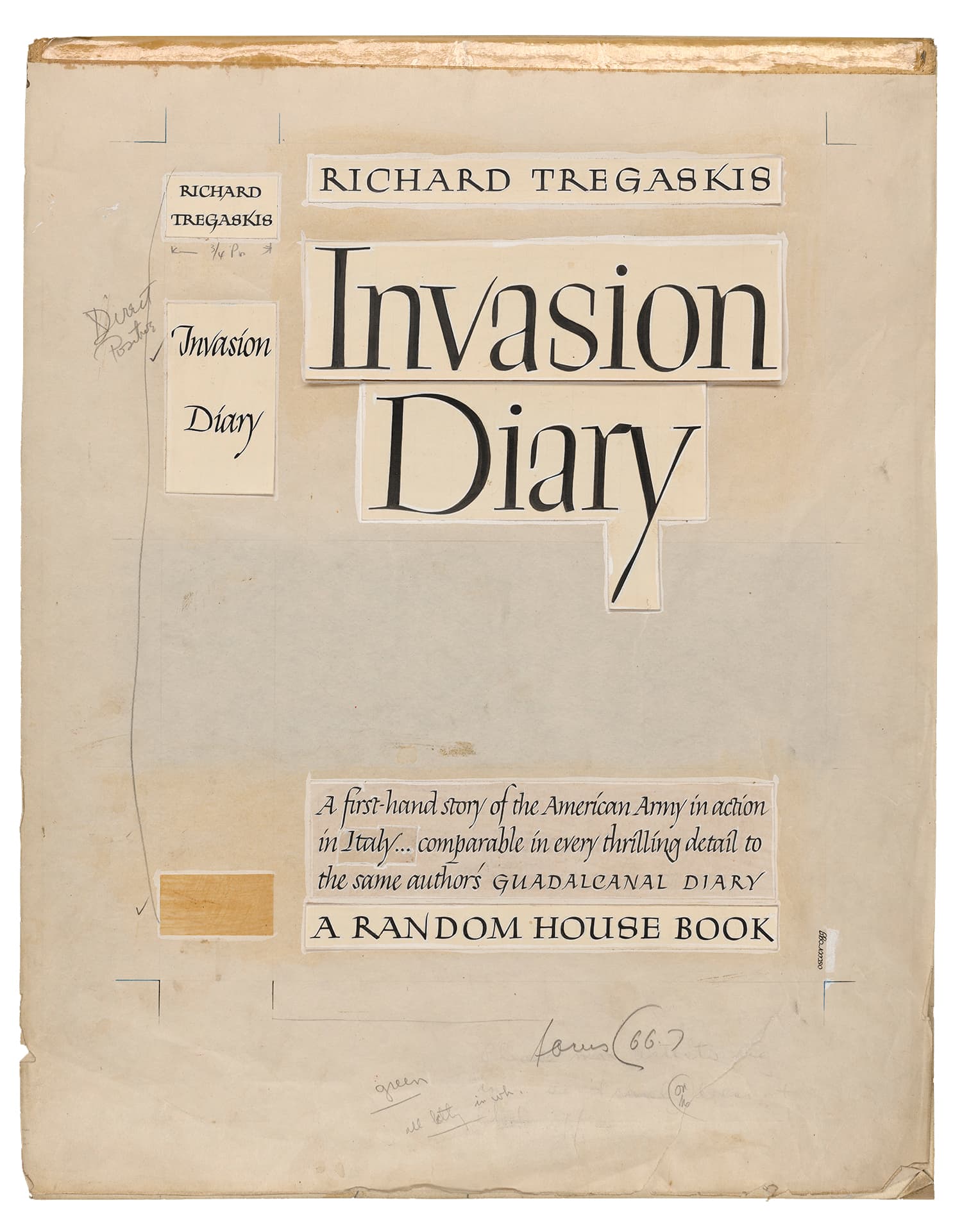
These signature moves found throughout Ogg’s calligraphic works were explored, exaggerated, and refined in the high contrast design space of Ogg. The original lettering samples are a combination of calligraphic stroke, contour drawing, and white-out (reduction). This combination of calligraphic and constructed forms became the perfect jumping off point for typographic exploration.
Weight Expansion
Weight Expansion
5 weights, 10 total fonts
In the spring of 2016, we set out to expand the weight spectrum of the original Ogg typeface.
Given the complexities of the italic, with its extreme 24° italic angle, correctly adding weight could only be accomplished by using our existing calligraphic model to determine the maximum possible pen nib width to x-height ratio.
Rotating nib angle, stroke modulation, and full stops allow ink to build at extremes. Kinked corner joints are made by expert pivoting of the pen nib.


As the original Ogg typeface has taken on a life of its own out in the world, we exercised extreme caution with this update, often opting to leave in small “mistakes” we ran into for the sake of fidelity. Some small technical updates were of course included, as well as the addition of localized forms and a small number of contextual alternates to address sub-optimal character pairings that have grown to bother us over the years.
Ogg Text
Ogg Text
5 weights, 10 total fonts
In late 2017, we began the first prototypes of Ogg Text. Adapting the strange and irreverent Ogg (display) original into something useful for long-form reading was no small task.
While its intricate details, interconnected letterforms, 24° italic angle, and swash italic capitals would prove to be difficult attributes to translate into text, there were many moments in the roman that were well suited to this adaptation. We also wanted to capture the beautiful hierarchy he achieved with his book jacket designs, where extravagant, high-contrast display titles would give way to beautifully legible sub-headers and captions.
The transitional stroke ductus of Ogg roman made for maximum legibility with an extremely compact word-shape, even when set at 8pt and below. In this vein, Ogg Text came to take on an unmistakably Dutch flavor, given its emphasis on the calligraphic underpinnings of the letterforms, and was no doubt informed by the process of drawing an entire Bram De Does inspired Old Style text face the year before. The multiple serif constructions of the roman lowercase stems proved to be unique devices for letter differentiation. While many of the original constructions served as uniquely functional devices for text optimization, other forms were changed completely, adapting to their new format in novel ways that maintained the character of the family while providing functionality at smaller sizes. The "y" descender above is a good example of this.
The final italic design has a 14° italic angle and less angular bowl-to-stem joins. These changes provided improved legibility and rasterization at small sizes, and were necessary for manually hinted webfonts. Subtle references to the swashy flavor of the original display italic can be found in the text, such as the top serif of the uppercase "A". There are also subtle nods to Oscar Ogg’s caption lettering found throughout. In the future we are hoping to release a build that will include this current 14° version, as well as the 18° version which will also include a text adaptation of Ogg’s signature italic swash capitals.
The Ogg superfamily is a bold type system that finds cohesion in wildly different forms and genres. The family tracks the progression of its designer, from his early days exploring the irreverent imperfectionism of the original display, to the unexpected functionality and studied execution of the text.
The superfamily is an amalgam of disparate references and ideation, both an inventive homage to one of the great underappreciated lettering artists of the twentieth century, and a new take on calligraphic text typography.
Featured Fonts
Featured Fonts